Parachute X Baba au Rum: typography is the go-to spirit in the Bauhaus-infused awarded catalog for one of our World’s 50 Best Bars 2022
Premium cocktails for the win! The World’s 50 Best Bars 2022 14th edition once again honors the “bartenders, bar owners and brands at the forefront of the international cocktail scene.” Featuring new entries from across the globe, the 1-50 ranking was revealed on Tuesday 4th October 2022 with Paradiso, the Barcelona speakeasy located in the trendy El Born district, honored with the top position.
With more than 26 cities represented on this year’s Best Bars, the list brings into the limelight 50 bars that push the envelope forward. Baba au Rum, a bar located in Athens, Greece, and a brand that commissioned Parachute, the digital type foundry and design agency specializing in bespoke type design, corporate typefaces, and lettering, to infuse its catalog with an artistic flair, deeply rooted in the 20th century’s iconic art and design scene is listed once again in the list’s top 20th entry.
“Now in its 14th year, Athens’ Baba au Rum continues to lead the trends in what has quickly become one of the cocktail capitals of Europe. The secret behind the bar’s endurance is found in the impeccable taste of manager and owner Thanos Prunarus, whose love for the modernist movements of Bauhaus, Dada, and the Avant-Garde can be felt in the bar’s decor and sensibilities. It feels tropical but there are no trappings of the cabana kitsch – Baba feels urban, vital, and authentic. Even the hand-bound menu is a thing of beauty and the recent recipient of the Greek Design & Typography Awards EBGE 2022” notes the panel that consists of more than 650 drinks experts, renowned bartenders, consultants, drinks writers, and cocktail specialists from around the world.
Opted for a heavy-in-type result, Parachute’s art director Manos Daskalakis delved deep into the history of the early 20th-century art movements that reshaped the visual language of our times and delivered a catalog that stands on its own as a design tribute to that seminal era. “A period in time that challenged the precedent art styles with the force of the ground-breaking industrial revolution should never go unnoticed” notes the studio.
“As beauty and aesthetics gave way to abstraction, expression, and symbolism, a massive visual metamorphosis ensued. Numerous distinct art movements enriched our visual language with fierceness and this is exactly what we infused into our collaboration with Baba Au Rum, embracing its evolution with a refreshed identity form rooted in the past whilst hinting at its future.”
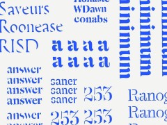
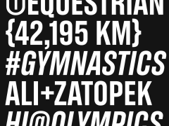
Featuring signature elements of Dadaism and Bauhaus across its pages, the catalog is a visual cocktail that keeps evolving. Typeset in a variety of type designs from the extensive portfolio of Parachute Typefoundry, the catalog is a beauty to look at, a spirited mix of carefully modeled designs and highly crafted letterforms.
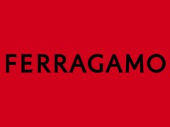
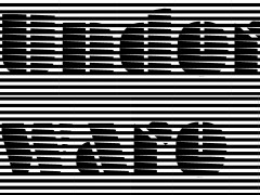
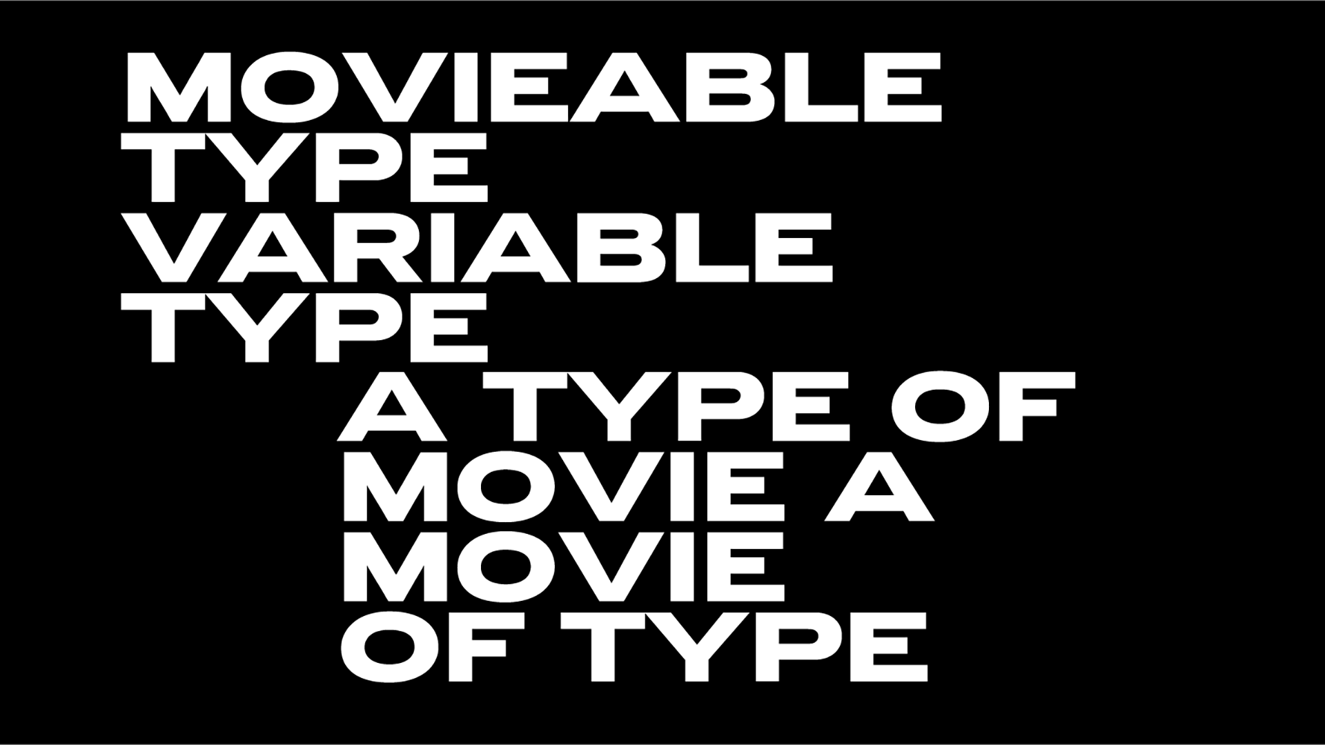
Its distinct design is attributed to the use of three typefaces, all created by Parachute’s founder and head designer Panos Vassiliou. With the postmodern, multiscript, multifaceted, and variable type system of PF Grand Gothik as its pillar – a type design that pays homage to the grotesque/gothic typefaces of yesteryears – the design is complemented by the geometric forms of PF Online and the independent multi-awarded type foundry’s latest release, enter PF Expo.
“Eschewing ornamentation, PF Expo’s design is nobly rooted in simple, rational, and absolutely functional Roman forms. Circa the 17th century the contrast between the thick and thin strokes of letters increased, oblique stressing transformed into upright stressing, round letterforms were compressed and bracketed serifs grew edgy and delicate. During that period and throughout the late 19th century, wood type manufacturers marketed design variations more quickly than type founders did, by devising a system to condense or expand type and creating secondary styles to bracketed serifs such as triangular shapes” explains the studio. “Expo takes its cues from several condensed typefaces of that period, particularly Latin Condensed as well as mid-20th century designs such as Vendome Condensed. The type design conveys a sharp elegance and gives birth to a cohesive typefamily with solid and provocative quality.”
Baba au Rum’s catalog evolved into a printed material that speaks volumes, an ode to the trailblazing spirits that inspire us in printed material. Dadaists would drink to that!
Tags/ typography, typeface, manos daskalakis, parachute, panos vassiliou, fonts, dadaism, award, bauhaus, typedesign, parachute typefoundry, pf grand gothik, baba au rum, ebge, pf online, parachute fonts, bars, pf expo

