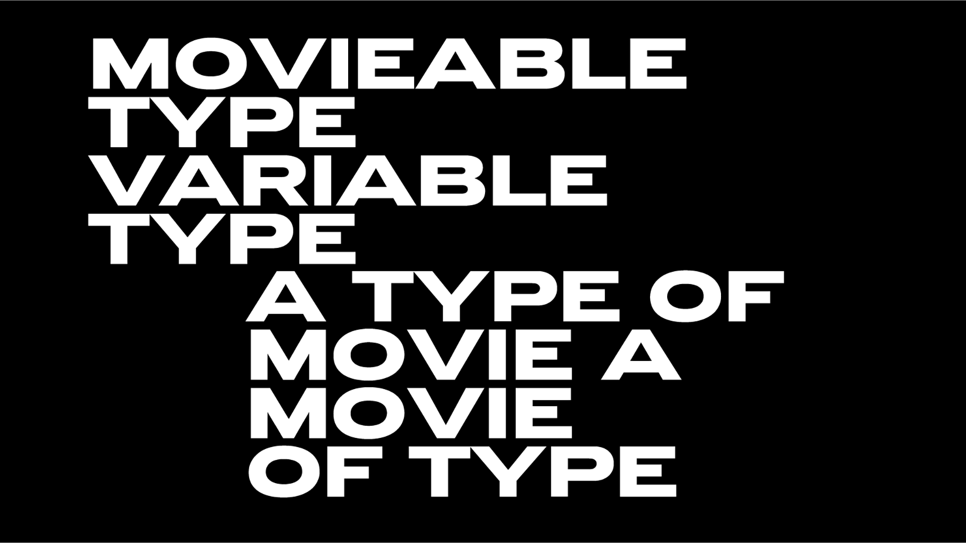
Between London and New York: The transatlantic harmony of Commercial Type
An exclusive interview with the creative minds behind Commercial Type on the release of their new book, Double Acts in Pop.
The collaboration between Paul Barnes and Christian Schwartz, co-founders of the type foundry Commercial Type, represents a partnership defined by synergy, innovation, and a deep appreciation for artistic and historical influences. Operating between London and New York, Barnes and Schwartz have transformed geographical distance into creative strength, shaping their work into a dialogue of diverse perspectives. Their partnership has been pivotal in creating iconic typefaces for institutions like The Guardian and cultural landmarks such as MoMA, blending historical fidelity with contemporary functionality.
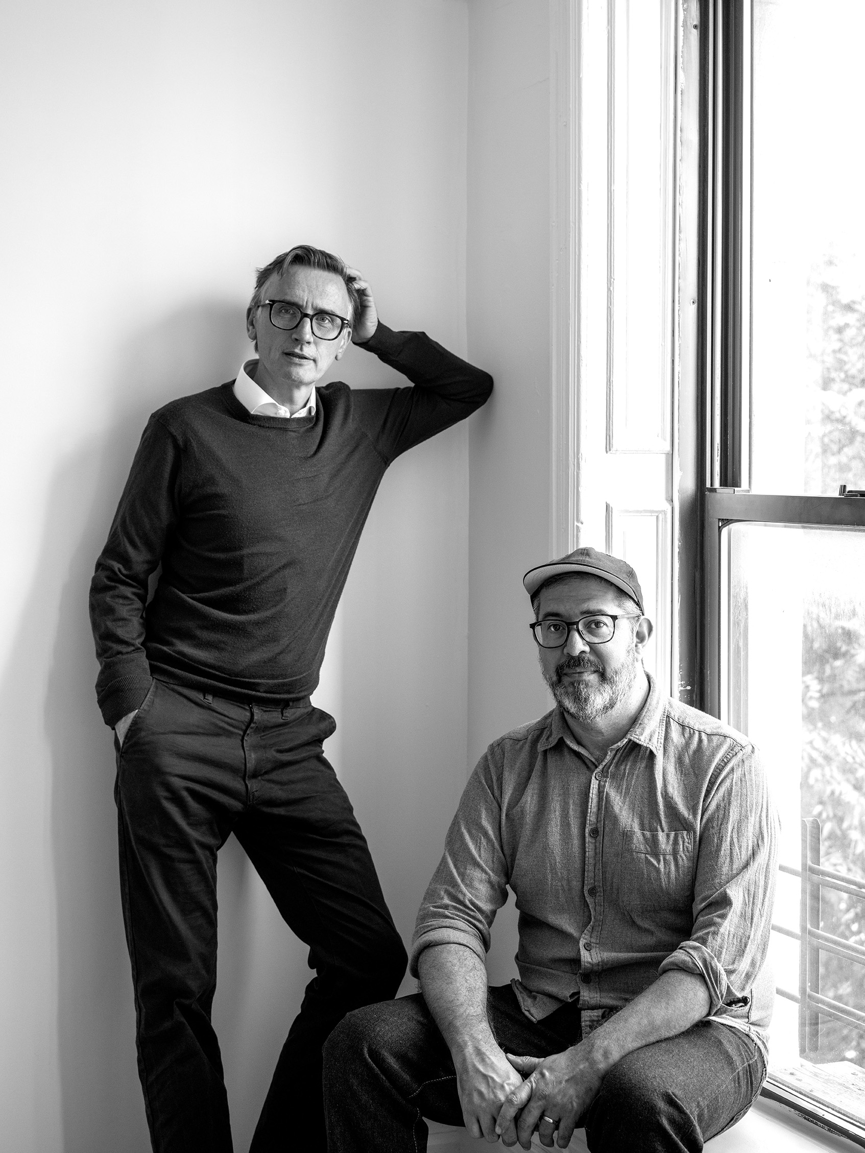
Their book, Double Acts in Pop: An Incomplete Survey, exemplifies their fascination with collaborative creativity. Written by Molly Lambert, an LA-based journalist and former MTV podcaster who has written for Pitchfork, the book examines musical duos that have left indelible marks on pop culture, from Lennon and McCartney to Sparks and Wham!. While the selection of duos reflects Lambert’s perspective, it resonates with the ethos of Barnes and Schwartz: the unpredictable magic of creative partnerships. This project complements their philosophy of embracing collaboration, not just within their company but also by inviting external voices that enhance their vision.
Commercial Type’s ethos—balancing history, practicality, and the idiosyncratic quirks of collaboration—renders their work as both timeless and strikingly modern. Their story and endeavours remind us that innovation often emerges from the harmony of two distinct yet convergent minds.
TR: How has remote work impacted your collaboration? What tools and techniques do you use to maintain a smooth workflow?
PB: The physical distance between us—Christian in New York, and myself in London—has proven advantageous, giving us both the space we need for individual development before coming together. The full Commercial Type team (12 of us!) spans across multiple cities, so Christian and I talk a few times a week about what we are all working on, and also about broader things. As a company we all come together in person two or three times a year, typically.
CS: Because it’s rare for us all to be in one place, we find that we’re much more focused than we might be if we were in the same studio all the time, and these shared work sessions really help move projects forward. We don’t have any special tools to facilitate remote work—just email, Slack, and Dropbox.
TR: Can you discuss specific examples of successful collaborations between musicians and/or type designers that have inspired your own partnership and design process?
PB: So many partnerships come to mind—Lennon and McCartney’s dynamic, where even small contributions from one could transform a piece, is perhaps the most obvious. Beyond them, duos like Sparks, Pet Shop Boys, Benny and Björn, Ralf and Florian, or any number of Eno collaborations inspire us.
In type design, collaborations such as Mike Parker and Matthew Carter at Linotype demonstrate how type directors and designers can complement each other’s strengths to create enduring work. But further back, the collaboration between Plantin and various punchcutters redefined the typographic landscape in the sixteenth century, and the influence is ongoing.
TR: Does your choice of music duos on Double Acts in Pop reflect your own collaboration between two artists?
CS: For Double Acts in Pop, we invited MTV podcaster & Pitchfork writer, Molly Lambert, to explore enduring musical duos, fleeting collaborations, side project partnerships within music—from Wham! to Lennon and McCartney. We didn’t select the duos ourselves; Molly took the lead on that.
PB: We enjoy collaborating with people who excel in their domain, trusting them to bring their unique vision. It leads to surprising and delightful results.
TR: Are there any lessons learned from unsuccessful collaborations between type designers that have informed your approach to working together?
CS: Off the top of our heads, we can’t think of any notable failed collaborative projects between type designers like Axl Rose’s Chinese Democracy or the original version of Smile by the Beach Boys, though client collaborations sometimes don’t go as planned or as hoped. However, we’ve found that what might feel like the wrong solution for one client can later be the right solution for someone else.
TR: How has your collaboration contributed to the growth and success of your type design business?
PB: Initially, working across the Atlantic gave us an extended workday—one of us could meet with a client, and by the next day, the other had already made progress and the client was delighted. This setup allows us to handle multiple tasks simultaneously, ensuring the business continues to run smoothly, even if one of us is away giving talks, going to a meeting, or even just going on holiday.
CS: I feel like my collaboration with Paul almost makes us like three designers instead of two. The projects either of us does on our own are different from the projects we do together, and I think this has been true of the projects I’ve done with Berton Hasebe and Miguel Reyes, too. Working collaboratively gives us more ways to solve problems and not get stuck.
TR: What and when was the turning point in your career that led to the success you’ve achieved?
PB: Meeting pivotal people was transformative for both of us—both of us working with Roger Black, me meeting Peter Saville, and Christian working with Tobias Frere-Jones were all defining moments. The Guardian project was another turning point, as it garnered widespread recognition—we no longer had to explain who we were and what we did.
TR: What inspires you when designing typefaces? Do you draw inspiration from specific historical periods, cultural influences, or personal experiences?
CS: We’re both interested in history, so that ends up being a big influence—not just from centuries ago but also from the very recent past. Greg Gazdowicz’s Focal and my recent release Control draw from the ’70s and ’80s, while Paul’s Original Sans reflects early nineteenth-century design. We go back and forth between latching onto a particular feeling in a historical reference and trying to preserve old typefaces more faithfully. The main inspiration, though, is how the typeface will work in a layout.
PB: Everyday experiences, like walking through galleries, exploring different countries, or observing lettering in places like graveyards, spark ideas—Chiswick, for example, originated from looking at gravestones in Cornwall.
Music also plays a role: everything from production aesthetics to the warmth of analog synthesizers influence us. However, the key is making sure inspiration serves the typeface’s functionality rather than overshadowing it.
TR: Can you walk us through your typical design process, from initial concept to final typeface? How do you balance experimentation and practical considerations?
PB: Our approach involves balancing the experimental and the utilitarian. Some typefaces are made to be more functional, suited for daily use, while others are intentionally experimental, reserved for distinctive projects. This balance ensures our library offers a wide variety, catering to diverse design needs.
TR: What is your underlying design philosophy? Are there specific principles or aesthetics that guide your work?
CS: We don’t have a strict philosophy; instead, we focus on creating typefaces people love to use. We thrive on variety, whether working on an identity for a corporation like Visa, a cultural institution like MoMA, or a sports brand like Puma. Each project offers unique challenges with differing visual languages to explore and understand. Whether you think of typefaces as tools, ingredients, or building materials, a typeface only comes to life once someone is using it, so it needs to be useful.
TR: In a world increasingly dominated by technology, how do you maintain the human element in your designs?
PB: Humans remain at the heart of our work. Technology is simply a tool—it serves our creativity, not the other way around.
TR: What percentage of your business is dedicated to custom typeface design? How does custom work differ from your regular typeface releases?
PB: It fluctuates—sometimes it’s all custom work, other times it’s focused on retail releases, or a mix of both. Custom typefaces are driven by specific client needs, while retail projects offer creative freedom, albeit with the challenge of setting one’s own deadlines and only having oneself as a sounding board. That’s why we like collaboration, with everyone in the company offering a differing voice and opinion.
TR: What sets your type foundry apart from other type foundries? What is your unique approach to typeface design and distribution?
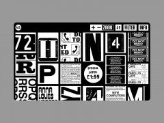
PB: Well, all foundries are the same at the base level; there are niches, but we all work for similar clients, and we all sell typefaces. And many sell the same kind of typefaces because that’s what the market wants. The difference often is in the personalities and the collaborations. For us there’s some uniqueness in the variety of people we work with, starting in the editorial field. We’re also somewhat multinational, with designers in different places with varying cultural references, and we come together and collaborate. And then we’re pretty unique in the way we promote our typefaces: we do tours to places like Australia to talk about our work, we’ve flown banners at major cycling races, we put up billboards—we even did a pop-up exhibition in a storefront in Lower Manhattan for Marian. We collected these more ephemeral promotions in the companion volume to Double Acts in Pop.
CS: We have one of the biggest libraries of all of the independent foundries, but I think our taste comes through, making it cohesive. I feel like the best foundries have a clear point of view, understand their audience, and follow their own interests over time.
TR: How do you envisage the impact of AI on the future of type design? Do you see AI as a tool to enhance the design process or a potential threat to traditional methods?
CS: AI has become such a hyped-up catch-all term that it’s almost meaningless now. Some of it is genuinely innovative, but most of the AI I read about is just statistical predictions from big data sets. And of course some of it is nonsense—what was called a “virtual assistant” twenty years ago, like Clippit in Microsoft Office, is now branded as AI. Type design exists at an interesting intersection of culture, history, aesthetics, and psychology, so it’s hard to imagine a generative tool that could take all of type history and output new typefaces that people will actually want to use, or read, without being bland or the equivalent of the six-fingered hands on AI-generated images of people. To what extent are we willing to settle for “good enough,” in illustrations, in writing, and in type design? I do see a lot of potential for tools that can help with the tedious and repetitive parts of producing a typeface—but type designers have been doing that already, from counterpunches in the sixteenth century to Python scripts now.
PB: The full extent of how AI will change our lives remains uncertain, but it will bring both benefits and challenges. Like any tool, its effectiveness depends on how it’s used and to what ends.
TR: How do you envision the future of your business? Do you plan to continue as an independent foundry or consider joining a larger group?
PB: We’ll carry on as we are, try to do good work, keep ourselves interested, have some fun, and make some money. We don’t think we want to get any bigger, as the problems with that would outweigh the benefits. We are part of Fontstand, which is a font-streaming service for independent foundries, but there are no plans to be part of something bigger.
CS: We like our independence and being in charge of our own destiny as much as possible. We don’t have to ask others if we can do our next silly idea—if we like it, and we can afford it, we do it.
TR: How do you see the future of typography evolving, especially in the digital age? What trends and challenges do you anticipate?
PB: Typography will continue to evolve as reading habits and technologies change. Developing typefaces for diverse global scripts will remain a vital area of innovation, ensuring that type design meets the needs of a multilingual and interconnected world.
Photo Credits: Maria Spann / Rashad Rastam Dahsar
Interview by: Giannis Papaioannou | Typeroom
Tags/ music, typefaces, book, interview, music bands, fonts






.gif)


