Inspiration overload with Anthony Burrill’s bold archive of graphic ephemera
You can’t get enough of Anthony Burrill’s black-and-white online archive of graphic design ephemera, all forming a curated selection of the many inspirations that influenced the renowned graphic designer’s soulful work with a human heart embedded in each design.
Created in collaboration with designer/developer Neal Fletcher and Richard Nicholls the site aka anthonyburrill.xyz is an inspiring treasury of letterforms and forms organized in a very straightforward, no-nonsense style that makes it easy to navigate and just absorb it.
The archive features 500 pieces, all of which can be filtered by various exciting categories, including Ampersand, Arrow, Icon, Illustration, Letterform, Numeral, Stamp, Stencil, Ticket, and Woodtype.
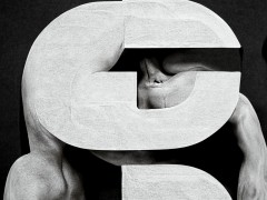
Each piece has been altered to appear in black and white, referencing and reflecting Burrill’s signature style of using bold, punchy shapes and lettering reports Firebrand Press’ Jack M. Hernandez.
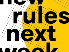
“My work is mostly black and white, with maybe a little bit of yellow here and there. I think the power of black and white – how strong it is and the contrast – is just amazing,” says Burrill.
An open resource that sheds light on all things that grab Burrill’s attention and therefore evolve his craftsmanship and artistry through typography, the archive is full of Easter eggs.
“It’s good to share this material, especially the weird and bizarre bits that I find fascinating for people to access. It shows the kind of graphic language that has always fascinated me, the weird typefaces, and other things that have slipped between the cracks of design history. These weird things are so full of character and probably wouldn’t be designed today. They’re also forms of old-school production: all analog gear, lots of examples of typography, stencils, stickers, and Letraset” says Burrill.
From train tickets to CHS, this amalgam of printed ephemera organized chronologically is literally a visual journal of Burrill. “That’s what makes these fragments so important because they are a tangible link to the past” he notes.
An ongoing project, XYZ accumulates “inspiring lo-fi graphic design, characterful typography and discarded ephemera” and is already bookmarked under the must-check inspirational hotspots online.
It also brings into the limelight Burrill’s appreciation for “strong, graphic, and bold letters” and how his signature visual language came to be.
Burrill, a creative who frequently collaborates with other forward-thinking creatives across disciplines spanning music, architecture, curation, education and more enriching his traditional discipline of choice, letterpress printing, provides pure inspiration that ignites projects and ideas with no borders.
“You have to constantly cultivate your sense of creativity by looking for new inspiration in unlikely places. Sometimes it’s good to look back and see the things I’ve been involved in with a sense of satisfaction. But I’m always more interested in what’s to come. Next” he says.
True to Burrill’s practice that is “created through a longstanding passion for creativity without limitations, the power of simplicity and an innate curiosity about the world and people in it,” the archive is live here.
Tags/ typography, inspiration, graphic design, printing, letterpress, collection, anthony burrill, ephemera, archive, resources

.gif)

