Universal Favourite X Super Future: this unapologetic digital first design system is superpowered by type
Making a difference is essential, communicating the task is elemental. Using the power of typography Universal Favourite has rebranded Future Super, Australia’s retail superannuation fund that offers superannuation services, focusing on zero fossil fuel investment and on holistically ethical investment with an emphasis on clean energy projects.
“The influence of fossil fuel money in Australia is everywhere — from sport to politics to pension funds, it’s the fourth largest pool of assets in the world. After decades of it feeding into the country’s economy and a lack of action by the government in the face of an undeniable climate emergency, an increasing number of Australians are feeling helpless and hungry for change. Putting their belief in people power into play, Future Super asked us to work with them to not just push beyond the realm of expectation of what a superannuation company can look and sound like, but to reframe superannuation from a means for merely saving for the future to a way in which people can actually save the future” writes the studio.
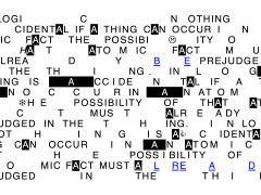
“In a traditionally vague and murky industry, Future Super strives to create transparency. Using this idea of shining a spotlight on both the (deliberate) lack of clarity most funds provide and the power our super can have, we began with a logo. Well, many logos, really.
Designed for motion and interaction, the mark is responsive — there’s no limit to its number of iterations. It adapts and flexes, shifting size and shape to suit where it sits and do what it needs to, from small format digital applications to expansive billboards to the 3D space. At any touchpoint, it anchors the design system and serves as an infinitely flexible tool to push away unnecessary noise and put what needs to be said front and centre.”
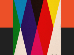
Striving for the maximum visual impact, Universal Favourite delivered a truly flexible and responsive design system with a set of layout and motion principles that would guide the Future Super brand.
“It can push, uncover, frame and give perspective to the content and works seamlessly across every pillar of brand communications. As a direct response to the stock-image-saturated world of super, images are only ever used to support messages — never as filler” explains the studio.
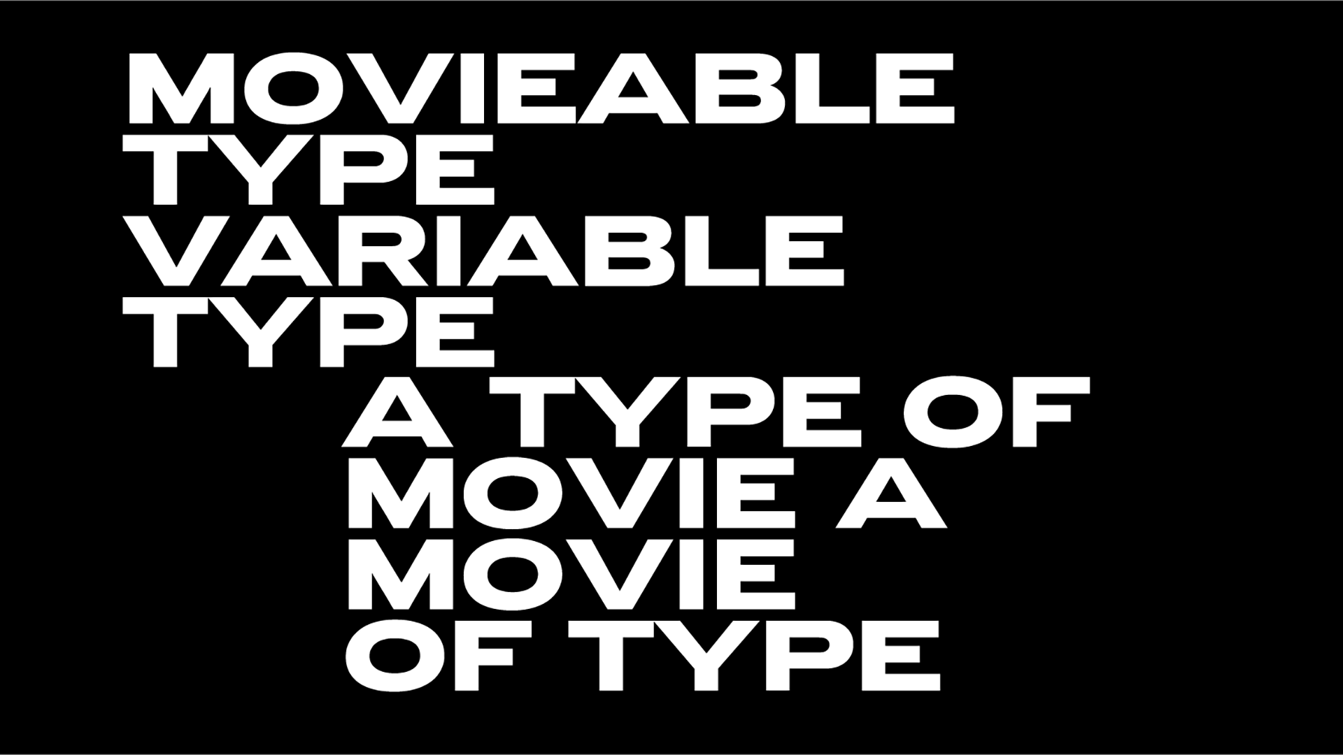
Championing legibility and clarity, Universal Favourite’s new design system for Future Super is almost entirely type-based set in ABC Monument Grotesk, the sharp sans serif typeface that “owes its point de départ to a few intriguing contours that the Swiss design studio Kasper-Florio stumbled across in an online scan of the foundry Palmer & Rey’s 1884 New Specimen Book” that is available to the public via Dinamo since 2018.
“DIA brings its bold and confident character to the logo and, though used sparingly across the rest of the system, also lends additional expression to the brand, extending across headings within type frames and pullout text. The matter-of-fact and Swiss-like nature of Monument Grotesk as our core typeface makes for an effective and striking contrast with its DIA counterpart. It’s highly robust, comes in multiple styles and weights (useful for a brand with so many copy-driven touchpoints) and includes tabulated figures, fractions and a full set of mathematical operators, which makes sense for a company that deals in numbers” notes the studio.
Set in a distinctively confident, raw and pleasingly unpolished typeface Universal Favourite provided Future Super with a bold and robust rebranding that speaks volumes as it highlights the urgency to address our ongoing environmental and climate crisis through actions.
“Your super has the power to combat climate change” reads Future Super’s tagline. In this case and thanks to Universal Favourite, type has brilliantly supercharged the task.
Tags/ typography, typeface, rebranding, australia, environment, dinamo, climate crisis, universal favourite, monument grotesk, super future


