Vignelli90: Amijai Benderski on the celebratory poster online exhibition
From Uruguay through Norway, China, Cambodia, and Greece, a whole world of creatives celebrate the 90th anniversary of Massimo Vignelli online.
Launched last week, Vignelli90 is a poster exhibition that aims to create a reflection on the relevance of Vignelli’s legacy.
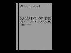
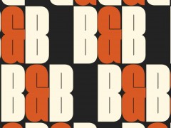
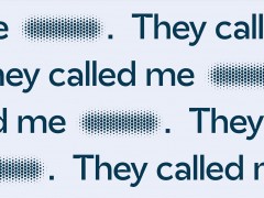
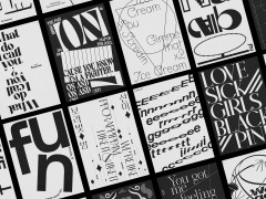
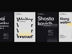
The initiative of Amijai Benderski, Juan Martín Lusiardo & Santiago Ternande with support from The Vignelli Center for Design Studies & The Vignelli Archive features 252 posters from 46 countries that pay tribute to the Italian designer and co-founder of Vignelli Associates along with his wife Lella.
So, why are the Vignellis so relevant? “Both were born in Italy, they ended up being known for opening their design studio in the United States. It was first conceived as an international company” notes Benderski.
“Both Lella and Massimo were designers, but Lella also led the company; that is, she was the businesswoman, the person who tied the knots of the negotiations. Without Massimo, there was no studio; without Lella, there was no company. This was vital and should be mentioned because its activity defined the modern designer, the professional with a studio. When they started, they were alone; there were no other companies of their type.”
“Therefore, it can be said that they filled a gap in the design offer. They were avant-garde. Maybe they still are” he adds.
“The Vignellis bequeathed two precepts that became the rule. The first rule was sobriety as they were the two designers who best understood simplicity. The second rule was constancy in the approach given to design since that establishes a style. The Vignellis were not guided by fashions; they achieved, on the contrary, their own design style and they never abandoned it” says Benderski, an independent graphic designer from Uruguay who values simplicity achieved by the sensitivity of transmitting an interesting visual synthesis.
“The truth is that Vignelli’s designs are concise and vigorous. In a sense, they have accumulated a lot of time ahead, that is, they had and continue to have a future; because they last a long time, they are not disposable, they have life. Quality is what lasts, and that is why they earned the respect of the creative community across the globe” he adds.
Vignelli90 asked designers to think about him in a unique way, through means he would appreciate and understand.
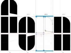
This massive tribute to Massimo Vignelli that combines image and typography applied to a poster is finally unveiled -its dedicated website designed taking Vignelli’s business card as a reference and set in Helvetica Medium.
Explore more here.
-
On the occasion of the Vignelli90 poster exhibition, Typeroom remembers Vignelli’s everlasting wisdom in his own words via a book he authored, The Vignelli Canon.
On the importance of white space in typography
“I often say that in typography the white space is more important than the black of the type. The white space on the printed page is the correspondent of space in architecture. In both situations, space is what qualifies the context. Naturally, the organization of information needs a structure to hold together, but one should not underestimate the importance of white space to better define the hierarchy of every component. White space, not only separates the different parts of the message but helps to position the message in the context of the page. Tight margins establish a tension between text, images, and the edges of the page. Wider margins deflate the tension and bring about a certain level of serenity to the page. Tight type setting transforms words into lines just as loose type settings transform words into dots. Decreasing or increasing the letter spacing (kerning) confers very distinctive character and expression to the words. All this is space manipulation and it is this device that is used in layouts to achieve a desired expression. The relationship between the size of type and the space around it is one of the most delicate and precious elements of a composition. I must say that the masterful handling of white space on a printed page is perhaps the most peculiar attribute of American graphic design. Just like space is the protagonist in Frank Lloyd Wright’s architecture. Somehow, it relates to the epic grandeur of the American landscapes. For many artists white space is the essential element of the composition. It is the fundamental qualifier and protagonist of the image. Almost all the great American graphic designers have used white space as the significant silence to better hear their message loud and clear. Such is indeed the power of the white space.”
On contrasting type sizes
“One of the most exciting elements of typography for me is the contrast of scale on a printed page. I love the play between a very large type size for headlines versus a much smaller type size for the body text, with proper white space in between. White space for me is a very important element in graphic composition. It is really the white that makes the black sing. White, in typography, is what space is in Architecture. It is the articulation of space that gives Architecture the perfect pitch. Another element is the relationship among type sizes in the same printed page. Our first rule is to stick to one or two type sizes at the most. If necessary, there are other devices such as bold, light, roman and italic to differentiate different parts of a text, but even there, stick to the minimum. Type weights can be used to great advantage when dedicated to a specific function, rather than be used for color purposes or even worse as a phonetic analogy. Some people who talk loud and tend to scream trying to persuade you, love to increase the size and weight of type to make the message louder. That is exactly what I consider intellectual vulgarity - something we try to stay away from. In a world where everybody screams, silence is noticeable. White space provides the silence. That is the essence of our typography.”
On typefaces, the few & basic ones
“The advent of the computer-generated the phenomena called desktop publishing. This enabled anyone who could type the freedom of using any available typeface and do any kind of distortion. It was a disaster of mega proportions. A cultural pollution of incomparable dimension. As I said, at the time, if all people doing desktop publishing were doctors we would all be dead! Typefaces experienced an incredible explosion. The computer allowed anybody to design new typefaces and that became one of the biggest visual pollution of all times. In order to draw attention to that issue, I made an exhibition showing work that we had done over many years by using only four typefaces: Garamond, Bodoni, Century Expanded, and Helvetica. The aim of the exhibition was to show that a large variety of printed matter could be done with an economy of type with great results. In other words, is not the type but what you do with it that counts. The accent was on structure rather than type. I still believe that most typefaces are designed for commercial reasons, just to make money, or for identity purposes. In reality, the number of good typefaces is rather limited and most of the new ones are elaborations on pre-existing faces. Personally, I can get along well with a half a dozen, to which I can add another half a dozen, but probably no more. Besides those already mentioned, I can add Optima, Futura, Univers (the most advanced design of the century since it comes in 59 variations of the same face), Caslon, Baskerville, and a few other modern cuts. As you can see my list is pretty basic but the great advantage is that it can assure better results. It is also true that in recent years the work of some talented type designers has produced some remarkable results to offset the lack of purpose and quality of most of the other typefaces. One of the most important elements in typography is scale and size relationship. Naturally, there are many ways of understanding and expressing typography. I am not interested in describing all the different possibilities as much I am in expressing my point of view and my approach. I see typography as a discipline to organize information in the most objective way possible. I do not like typography intended as an expression of the self, as a pretext for pictorial exercises. I am aware that there is room for that too, but it is not my language and I am not interested in it. I don’t believe that when you write dog the type should bark! I prefer a more objective approach: I try to make as clear as possible the different parts of a message by using space, weight, and typographic alignments, such as flush left, centered, or justified. There are times when a specific type design may be appropriate, mostly for a logo or a short promotional text, particularly in very ephemeral or promotional contexts. These are not our typical areas of involvement but whenever a brilliant solution is found I appreciate both the intent and the results. I strongly believe that design should never be boring, but I don’t think it should be a form of entertainment. Good design is never boring, only bad design is.”
On his everlasting love for design
“Throughout our creative lives, we have sifted through everything to select what we thought best. We sifted through materials to find those for which we have the closest affinity. We sifted through colors, textures, typefaces, images, and gradually we built a vocabulary of materials and experiences that enable us to express our solutions to given problems - our interpretations of reality. It is imperative to develop your own vocabulary of your own language - a language that attempts to be as objective as possible, knowing very well that even objectivity is subjective. I love systems and despise happenstance. I love ambiguity because, for me, ambiguity means plurality of meanings. I love contradiction because it keeps things moving, preventing them from assuming a frozen meaning or becoming a monument to immobility. As much as I love things in flux, I love them within a frame of reference - a consistent reassurance that at least and at last I am the one responsible for every detail. And that is why I love Design.”
Tags/ graphic design, exhibition, massimo vignelli, poster, gabriel benderski


