The Foundry Types X Thonik for Dutch Design Week: Fernhout is a bespoke typeface inspired by Wim Crouwel
The Foundry Types aka the independent type foundry by David Quay and Stuart de Rozario pays a true typographic tribute to the renowned Dutch graphic designer and cofounder of Total Design Wim Crouwel for Northern Europe's the biggest design event aka Dutch Design Week's 20th anniversary with a bespoke typeface based on one of Crouwel's posters.
Named Fernhout the custom font is designed by The Foundry Types in collaboration with world-leading Amsterdam design agency, led by designers Nikki Gonnissen and Thomas Widdershoven, Thonik.
The new display face is based on the simple primitive forms, rectangles, and quarter-circles by the late great Wim Crouwel’s ‘Edgar Fernhout’ exhibition poster and catalogue for the Van Abbemuseum in 1963.
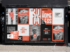
"Thonik approached The Foundry Types to create a typeface based on the new logo they had designed, expanding the character set to include a-z in lowercase, figures, and punctuation glyphs" notes The Foundry Types.
A clear expansion of the Mr. Griknik's ‘Edgar Fernhout’ letterforms that seamlessly integrates with the new DDW brand identity was about to begin.
"The Foundry Types' ethos throughout the design process was clarity, integrity and authenticity; the constructed ‘Edgar Fernhout’ letterforms consist of a simplistic rectangle block system, two columns wide and four oblongs tall, circled segments and angled indentations. Although the glyph shapes are playful and simple – these basic forms often throw up challenging complex problems and limitations."
"The purist, basic forms of ‘Fernhout’ offer little scope to break the grid without diminishing the overall visual virtues" writes Stuart de Rozario.
"Crouwel's carefully devised grid often allowed many glyphs to design themselves, but complex glyphs with diagonal strokes, ‘k, s, x, z, 2, 4, 5, 7’ needed to be stripped back and simplified. Characteristics within the letterforms also threw up a few dilemmas – how to design an ‘i and j’ dot along with readable punctuation? The Foundry Types decided to introduce another element – the square, this allowed a little more freedom to express the concept in a more refined way. Problematic junctions to the center section of the ‘3 and 8’ were the trickiest to achieve, a double quarter-circle was added to allow these glyphs to be easily recognizable."
The Foundry Types: David Quay on the rebirth of an iconic type design affair
"Festival logos tend to morph over the years and sometimes lose touch with the rest of communications. This happened to the Dutch Design Week tulip" writes Thonik who gave the almost 20-year-old logo a new lease on life by styling it as the W in the event name. "The image becomes language and logos becomes logo" says Thomas Widdershoven.
"DDW's tulip is a constellation of rectangles and quarter circles. These elements were also used in typographic experiments from the 1920s that were revised in 1963 by the late Wim Crouwel. For the Van Abbemuseum retrospective of Dutch painter Edgar Fernhout, Crouwel developed a rather sophisticated take on the typeface by subtly adding indentations to the E, A, R and T. This added rhythm to the logotype and gave it character beyond strict geometry. Having been designed for a museum in DDW's native Eindhoven – Thonik thought Crouwel's Fernhout typeface would make a fitting candidate for the new house style."
Yet, there was a problem. Crouwel's design holds only 13 letters and not all the characters that spell Dutch Design Week. Judith Cahen, Crouwel's partner, approved studio Thonik's aim to design the other half of the alphabet, a full set of numbers and punctuation marks and Stuart de Rozario and David Quay of The Foundry Types were the ideal collaborators. After all, Quay in particular has worked extensively with Crouwel in the past.
"This project allowed us to continue Crouwel's ethos and vision which we got acquainted with during a collaboration we hold dear" say de Rozario and Quay.
Just like in the original Fernhout poster where "the letters are cut in half by two areas of colour" Thonik placed the DDW acronym, with the W a dead ringer for the old logo, against a similar horizon with the colour scheme also taking its cue from Crouwel.
"Crouwel loved monospaced letters so the fact that Edgar Fernhout's name doesn't contain a W, M, L or I must have appealed to him" recounts Widdershoven on the challenges expanding the Fernhout font to a fully-fledged typeface. Crouwel himself never meant it to be a font.
Happy birthday Mr. Gridnik: remembering Wim Crouwel
"We did have to tackle those letters and have tried to finish the game while playing by the same rules. We've chosen all lowercase letters since they feel more democratic and look sympathetic. The use of indentations has helped increase legibility, but it's a work in progress. For example, we’re still busy putting together a good 3."
The bespoke typeface that consists of just a single weight with a very limited character set due to its elemental forms will be commercially available and its use is open to all, except festivals in the Netherlands and design events worldwide.
DDW's typeface and brand identity is currently being rolled out across The Netherlands.
This year's DDW event -hosted on October of each year in Eindhoven- presents work and ideas of more than 2600 designers to more than 350,000 visitors from home and abroad. In more than 110 locations across the city, DDW organizes and facilitates exhibitions, lectures, prize ceremonies, networking events, debates and festivities under a theme. This year's theme is "The Great Number."
DDW all began back in 1998. In that year the Vormgeversoverleg (a designers collaborative) organised the first Day of Design introducing entrepreneurs to designers. Eventually, the successful event grew exponentially, The Day of Design became the Week of Design in 2002 and ultimately in 2005 it was renamed Dutch Design Week (DDW).
"DDW is optimistic and believes in the problem-solving capabilities of designers. They have demonstrated that they dispose of the inventiveness and flexibility of mind that can lead to innovations that our rapidly changing world so craves" notes DDW.Since 2009, DDW has appointed two parties from the design field to champion Dutch design in general and the week in particular. The DDW ambassadors "fulfil a representative task and utilize their network to create links and provide fledgling designers with a helping hand." For 2021, DDW appointed architect and urban designer Floris Alkemade, designer and the founder of Faber Futures Natsai Audrey Chieza and artist and designer Christien Meindertsma.
Jan Middendorp on the reprint of his iconic typographic treasure “Dutch Type”
"DDW does not just see Dutch design as a label for a certain group of designers or design aesthetic, but as a permanent reflection of a culture and attitude that is characteristic of the Netherlands and of Dutch people" reads the event's manifesto. "We identify with a solution-oriented approach, functionality, humanism, free thinkers, brutality, humour, ability to put things into perspective, single-mindedness, not hindered by thinking in terms of hierarchical barriers, the unconventional. But also the readiness for taking stakeholders seriously and involving them in the solution, in the creative process. Dutch design is an attitude and does not by definition refer to a nationality."
Although during the event every imaginable discipline and aspect of design is on offer, the emphasis is on experiment, innovation and cross-overs as "exceptional attention each year goes to work and development of young talent." Always concentrating "on the design of the future and the future of design" DDW aims to show how designers from around the world shape a positive future and to strengthen the position and meaning of Dutch designers.
The Fernhout typeface will be available to licence later this year at The Foundry Types exclusively and a pdf specimen is available on request.
The Dutch Design Week commences 16–24 October 2021.
Tags/ typeface, brand identity, dutch, wim crouwel, bespoke, the foundry types, thonik, dutch design week

