Can you design a typeface with your very own eyes? Julia Schäfer explains
With society's growing concern over the digitized body, loss of privacy through tracking, and surveillance, Julia Schäfer’s project Eyes as a Tool is driven by a mode of personal expression that comes from an urgency of reclaiming the digital self.
In collaboration with Yale's Haskins Lab, a research institute investigating speech, language, reading, and their biological basis, Swiss graphic designer Schäfer conducted a series of experiments using eye-tracking technology -i.e. the process of measuring where someone is looking. “Can you use a tool, commonly used in science and consumer environments, to create a reflexive typeface simulated from human attention?” Schäfer wondered, launching this one of a kind project at the intersection of biology and type design.
“By mapping our vision, the Russian psychologist Alfred Yarbus discovered some fundamental patterns of our visual behavior that he described in ‘Eye Movements and Vision’ translated into English in 1967” Schäfer tells Typeroom.
“Eye-tracking revealed that the pupils are rarely stationary—they jump around from point to point, like a water strider on the surface of a pond. These micro-adjustments are known as ‘saccades,’ and they are at the core of our visual perception and how we build the world around us, they are literally essential to vision; as the eyes dart from place to place, landing on the most information-rich areas, constructs reality. Yarbus speculated that the eye instinctively gravitates toward details that pin down a picture’s story, or promise to find an ‘explanation.’ He also found out that eyes are drawn to areas of high contrast and fine detail, and especially to human and expressionistic areas, such as eyes and lips.”
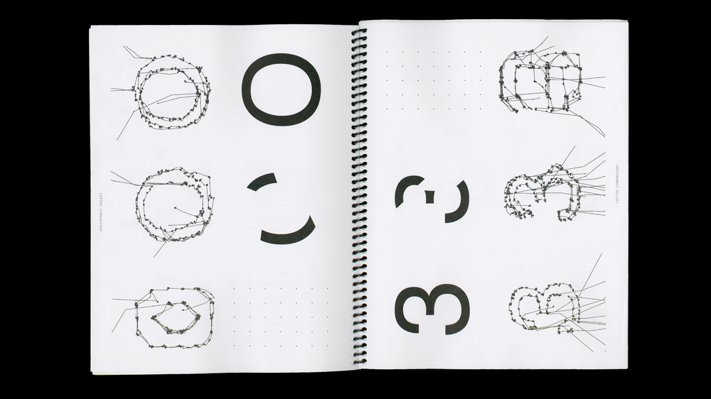
Having Yarbus research in mind, Schäfer set up three experiments to create a typeface from the invisible act of looking. Following are three data visualization outputs she worked with: saccades, fixation points, and heatmaps.
In her first experiment, Schäfer looked at each letter of the alphabet one by one in its entirety. In the second experiment, components of each letter were subtracted so only certain parts of each letter remained visible. In the final experiment, the letters were drawn by memory on a dot grid.
Schäfer’s intention was to draw a font that evoked human features with her eyes, questioning the very notions of mechanical efficiency that the source typeface aka Helvetica Regular that was used for the experiments, inherits.
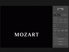
Enter Schäfer’s immersive typographic realm here.
Tags/ typeface, type design, science, yale, eye tracking, julia schafer


.jpg)


