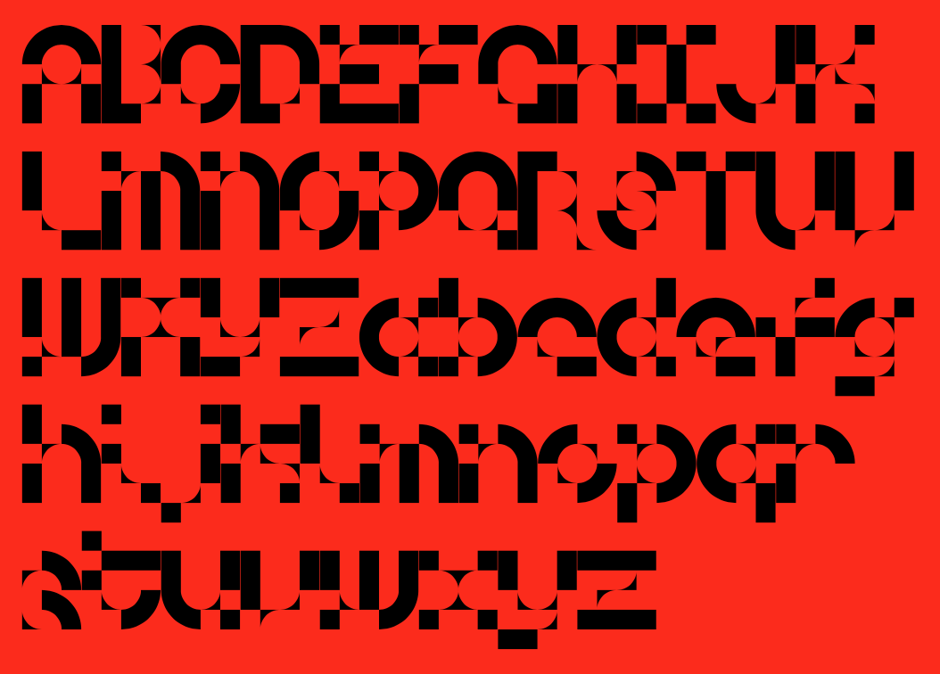
MuirMcNeil X Natasha Lucas present Diode: an abstract yet legible modular type system build in harmony
Unconventional and experimental in form and aesthetically pleasing, Diode is a modular geometric type system to love.
Developed by MuirMcNeil in collaboration with Natasha Lucas, a London-based graphic designer working in visual identity, brand communications and typography, the Diode project is part of a visual experiments series examining “the interdependence of positive and negative spaces in typographic forms” -a feature Lucas first begun to investigate in her Bisect type system, published by MuirMcNeil, the collaborative practice of Hamish Muir and Paul McNeil, back in 2018.
Offering a diverse range of visual interactions these ongoing typographic explorations are part of a larger body of work: the design of a coordinated visual system to promote a series of dramas by British playwright, screenwriter, director and actor and Nobel Prize winner, Harold Pinter, one of the most influential modern British dramatists with a writing career that spanned more than 50 years.
In Pinter’s ‘memory plays’ protagonists narrate events drawn from memories that may or may not be factually accurate. In Old Times (1971), No Man’s Land (1975), and Betrayal (1978), Pinter questioned how false memories and perceptions lead to negative emotions and harmful conclusions. Bisect and Diode alphabets are intended, Lucas says, “to express the progressive fragmentation of language as it is eroded by the selective, faulty nature of memory.”
Using only three different geometric modules to build the Diode alphabet, Lucas explored the ways in which “form and counterform could operate reciprocally, each defining the boundaries of the other, in the construction of letters and words that are playfully ambiguous while always remaining true to their alphabetic origins.”
The impressive on its own right result Diode is a type system that is structurally incomplete but maintains its visual integrity and legibility by optimising the use of space.
MuirMcNeil developed the alphabet in three matching versions, one positive and two negative, and in three sets of individual letter component fonts designed to register precisely with one another in layers, offering a huge range of visual possibilities.
Explore more memory through type here.
Tags/ alphabet, type system, experimental, hamish muir, paul mcneil, muirmcneil, modular, natasha lucas

.jpg)


