A’ Design Award & Competition: from Beirut to gender fluid branding a call for entries with 20 winners to inspire
A design is inspired by Beirut, another one is destined to challenge the proportions of our human lifestyle. In many unexpected ways visual communication challenges stereotypes so here is a chance to celebrate the best of the best with a feature that pictures an ideal world to live in. A world awarded at an annual A’ Design Award & Competition aka the world’s leading international annual juried competition for design, open to all design enthusiasts and professionals to participate.
If you are obsessed with numbers this is the A’ Design Award & Competition in numbers.
2.500.000.000+ impressions, 115.341.752 pageviews, 128.300 registrations, 48.773 project submissions, 36.627 eliminated projects, 12.146 award winners, 180 nationalities, 212 judges, 110 categories, 100 press partners, 40 languages, 11 years, six award levels. Well, they are impressive.
A’ Design Award & Competition has been established to promote and recognize the best design works in all countries and in all creative disciplines. The primary aim of the A’ Design Award & Competition is to create a global awareness and understanding for good design practices and principles by highlighting the best designs in all countries and in all industrial fields. The ultimate aim of the A’ Design Awards is to push designers, companies and brands worldwide to create superior products and projects that benefit the society.
The A’ Design Accolades are organized in a wide range of creative fields to highlight the very best designers from all countries in all disciplines. Entries to the competition are peer-reviewed and anonymously judged by an influential jury panel of experienced academics, prominent press members and established professionals. A’ Design Award & Competition promises fame, prestige, publicity and international recognition to all A’ Design Award Winners through the A’ Design Prize which is given to celebrate the awarded designs.
The “A’ Design Prize” is a coveted and comprehensive winners’ kit for awarded designs.
“A’ Design Prize” includes but not limited to: international design excellence certificate in metal frame, invitation to the exclusive gala-night in Italy, online + offline exhibition of awarded projects, A2 poster of awarded projects, hardcover printed best projects’ yearbook publication, special 3d printed metal award trophy in luxury black box, project translation to 20+ languages in order to truly reach international audiences, an exclusive interview with the winner, press release preparation and distribution, license to use “A’ Design Award Winner Logo” in your communication, promotion of awarded works to thousands of other publications, media appearances through our press partners, inclusion in World Design Rankings as well as access to further marketing and PR tools.
The A’ Design Award & Competition has a philanthropic goal to advance society by pushing the frontiers of science, design, creativity and technology forward by creating incentives for innovators to come up with better ideas. The A’ Design Competition aims to create incentives that ignite and reward creativity, original ideas and concept generation in all industrial sectors. The “A’ Design Award Winner” logo, given to award winning designs, signifies original, functional and efficient designs that help the world become a better place.
Designers worldwide are called to take part in the accolades by entering their best works, projects and products and all entries are accepted as long as they were designed in the last 10 years.
Following are Typeroom’s all time favorites. Well, at least 20 of them -as there are plenty of inspiring projects to check here.
The reason is to inspire our readers in participating in a multicultural, diverse competition so do check the gallery for a thorough presentation.
ArchiTypo-524A Corporate Identity by ZHOU Wenjun
“Typography is Architecture -Design integrated Modularized Traditional Chinese Character 5.2.4, Arabic numerals 5.2.4, and English word Architecture to construct the Logo of 524 ARCHITECTURE. Making people with different languages could well understand what the meaning it is, show the Architecture studio’s characteristics.”
LEUVEN Beer packaging by Wonchan Lee
“Differentiation is probably the most important factor in packaging these days. It is a new approach and concept for beer packaging: not breakable, costs less to produce, lighter to carry, therefore an advantage in delivery and production. From brainstorming to branding, choosing materials, and finishing, the solution differentiates itself from other premium Belgian beer competitors in the market.”
METAXA ON-METAL Packaging Design by The House of Metaxa
“The look and feel of METAXA On Metal combines the universe of the METAXA brand and the specificities of the material. The metal is shaped similarly as in the auto industry, calling extensively on metal-forming techniques, including blanking, shearing, stamping among others. The finish is in METAXA yellow, blue and white colors and the metal presents a 'wax' effect like that of a high-performing automobile. The signature, brand name, and other codes are embossed or debossed giving added textures to the metal.”
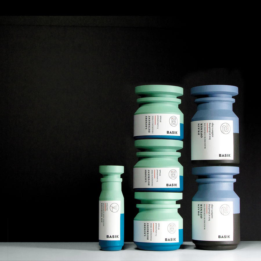
Basik Packaging by Saana Hellsten
“Basik criticizes packaging that perpetuates gender stereotypes. By using gendered visual language as a tool for communicating an attribute of a product, the traditional stereotypes are being enforced. In Basik, the focus is on the function, which in the case of household products is being stackable. Shaving products use highly gendered visual language to communicate the gender of the intended customer. Basik gives the option to choose and customize the product based on its purpose, not gender.”
The Architecture of the City Theatre Performance by Mathias Woo
“Zuni theatre is eternal experimentation, conducting technological experiments in the theatre. Theatre is a space constructed by technology. Theatre technology defines the possibilities of performance. Technology and theatre are inseparable. Understanding technology allows the invention of the future of theatre. What is the future? The relationship between watching and performing in the age of cellphones. The theatre of the future, the imagination of the audience. The creation of an artist. A more proactive audience? Or, with technology, all options are but one kind of option.”
The Edge-Beirut Collection Lamps, tables, stools by Tarek Elkassouf
“The Edge Beirut is inspired by the designer's home city. It takes a cue from the city of Beirut, a city always on the edge of instability, chaos, creativity, and adaptability. It is an interpretation of these often conflicting characteristics, with designs that reflect the vulnerability yet resilience and adaptability of Beirut. The Edge is also inspired by the designer's Middle Eastern upbringing and his architectural background, with precepts of repetition and geometric patterns of Arabic architecture engaged.”
Alphathreat Book by Rasesh Patkar
“Made to look like a regular children’s book, Alphathreat is directed at parents in peaceful countries. It looks at the English alphabet from the perspective of children suffering in war-ravaged countries. It disguises the grave truths of our world behind illustrations as innocent as the little kids stuck in war zones.”
Tag Tag Mark disposable cups by Jiani Zeng and Yi Teng Shih
“Once after the break in a meeting, I heard a conversation that inspired me to design Tag Tag: I forgot which cup is mine and which is yours. No worries, let’s take two new cups. Does the conversation sound familiar to you? Seriously, that is how we produced so much waste.”
Thanatos Digital Agency by Thanatos Digital Agency
“The web design choice is certainly based on the new Ui trends but contaminated by elements that come from the new horror, fantasy and sci-fi Tv series, and films. The structure of the pages and contents has been designed to improve the user experience on all devices. The result is an easy site that transmits attention to detail, professionalism, and the agency's dark mood.”
“Design for the website was inspired by the maps we use while traveling. The main page is a map of Downtown LA made in a minimalistic way. Also in website circles and lines are used which represent the movement of a person on a map. The website promotes Laround tours around LA. The website is very minimalist and clean. Bright colors and big bold typography make a modern feel and look. Also, pictures of places and videos add a visual atmosphere of the places tourist will see.”
San Francisco Ballet Digital Transformation by Method Inc
“Method’s work for San Francisco Ballet is one of the first projects that aim to expand participation through the innovative design of their new web experience. We were asked to redesign San Francisco Ballet’s online presence to illuminate the organization’s heritage and story, provide a richer informational and transactional experience, bring broader awareness and appreciation to the art form, and inspire audiences through dance.”
Festival Over de Vloed website Website by RTRN Branding and Activation
“The festival takes place on and directly behind the seawall. Hence maritime design; think of signal flags fluttering in the wind. The color palette comes directly from the Groningen province flag: red, green, and blue. Regional pride and supraregional allure.”
Eyesbound Portfolio Website by Julia Hell
“The design focuses on the strong imagery of the photographer and emphasizes this by using full-screen images as the main detail. The navigation elements are kept simple and it is possible to hide them, so the images will not be covered by them. The typographic logo is displayed in full-screen mode as well but scales down and transparentizes. To set the focus on the images, the only used colors are black and white.”
MAU Vegas 2019 Event by Shreya Gulati
“Online research to understand the audience and create an experience for them which will be relatable yet inspiring. We created several different options and experimented with grids, type, colors, and patterns before finalizing on the finished design. We also pitched the experiments to people from various sectors to get their feedback. The final result was highly appreciated for its tangibility and uniqueness.”
Etsy Annual Report Publication Design by Isidora Spajich
“Etsy as inspiration made me decide to create an artistic design using hand lettering and illustrations to create a unique work. By designing the annual report I attempted to rise above the standard expectations and make everyday item entertaining.”
Architectural Decoration Book by Jesvin Yeo
“This book introduces the reader to the symbolic images of Singaporean temples built in the Hokkien style. Each of the texts explains the meaning, mythology, setting, and materials behind the symbolism. To enhance the value of these cultural images, the book is designed as a traditional bamboo scroll, which allows for the depiction of a continuous narrative; the viewing is a progression through time and space. Each book consists of 225 bamboo strips, measuring 4.35 meters in length, and takes about five days to be produced.”
refresher.sk Logo by Miro Kozel
“Client wanted to create a unique logo that will symbolize the portal and its objectives. Creating a logo with a negative space is very difficult. Get into the symbolism of the logo non-violent way is always a challenge.”
PWPW (Polish Security Printing Works) Calendar by Izabela Jurczyk & Małgorzata Boszulak
“Tell the audience about protected documents and their security features in an original and unexpected way. Draw attention to intriguing solutions applied to secure documents and banknotes. Show that document designs are works of applied art and their security features have elements of graphics in them, such as, e.g., banknote designs (steel engraving), secure protected prints designs (watermark), designs of guilloches used as background in different documents.”
Silhouette Typography by Cheolhong Kim
“To make a graphic font in the 3D world, I planned the modeling process constructively. I put meshes of the letter backside of a plane and I used them as modeling guides. Each letter has been made separately, therefore, I can put letters to make any words.”
Sizes - When size matters Poster by Matteo Ruisi
“This is a series of posters that explain funnily the differences between the sizes of the same kind of items. The mix between the infographic and the isometric style has inspired the dynamic typography and the packagings included in 3 of them. Colors and shapes have studied to create a harmonious composition both in the poster and within the entire project.”
Register your project here.
Tags/ awards, register, call for entries, winners, a design award

