Craig Black X Monotype: a new display typeface for the Renaissance man in all of us
The always ingenious independent designer, lettering artist and typographer Craig Black has unveiled a brand new project for the Renaissance man in all of us.
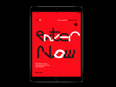
The Scottish born artist partnered with Monotype creative type director Pedro Arilla to create a single style font which explores the intersection between art and design. Enter FS Renaissance.
Black has crafted each letter crafted as a standalone piece of art, while working harmoniously with Arilla to make this non-traditional font a full functioning typeface.
FS Renaissance is obviously different to traditional stencil design. The typeface’s cuts “are not rigid but interactions that are hand crafted between each element, emphasising the idea of a typeface as a piece of art or sculpture.”
Arilla’s aim was to take the core DNA of Craig's work and apply it to a typographic base with a solid internal consistency, balanced with an external elegance and the creators managed to present a final product which does not compromise its original art concept.
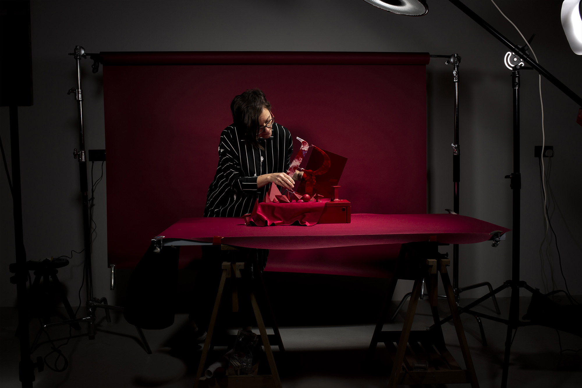
To celebrate the launch of the font, Black created a series of handmade typographic sculptures that were photographed by Susan Castillo with the images encapsulating “the spirit of the project, showcasing the letterforms as pieces of physical art.”
Typeroom talked with Black, a modern day Renaissance man, on this project at the intersection of art and type design, the challenges and the iconic legacy of the ultimate genius by the name Leonardo da Vinci.
Typeroom: How long have you been working on the FS Renaissance typeface?
Craig Black: FS Renaissance has been a few years in the making. I first reached out to Fontsmith -part of the Monotype family since January 2020- in February 2019 regarding the collaboration. They loved the concept and wanted to help me develop the typeface into existence.
Prior to reaching out to Fontsmith, I must have played about with the typeface on and off for a year, fine tuning and tinkering with it in between client projects. I believed there was something exciting and interesting about the typeface and I’m a huge believer in collaboration so it was a delight to work with Pedro Arilla, Fontsmith and Monotype.
TR: What inspired you to design FS Renaissance?
CB: The term Renaissance man was coined in reference to some of the most talented artists, inventors, scientists, and thinkers who lived during (and were the drivers of) the Renaissance, a period of flourishing progress in the arts, sciences, learning, and philosophy generally accepted to have begun in the 14th century and lasting through to the 16th century.
I’ve always admired the men and women of this time and how they diversified their skillset at incredible levels across different disciplines. One area in particular that fascinates me is the sculpture work and the stone carving of typography. I love the intricacy and admire the patience that must have been needed to create such beautiful artwork.
All of this inspired me to create a typeface which symbolises all these admirations by combining it with a modern influence of stencil typography. By collaborating with the skill and experience of the Fontsmith and Monotype team, I knew we could take this original concept to the next level and create something special together.
TR: Is there a single person you admire the most from the Renassaince?
CB: The genius of Leonardo da Vinci has always inspired me, a man who excelled in many fields. He was a painter, sculptor, botanist, mathematician, and so much more. He invented prototypes of flying machines, he studied human anatomy, and he achieved great (and clearly lasting) fame during his own lifetime.
What set da Vinci apart from the other men? One piece of the puzzle is that he was an absolute genius. But the fact that he tirelessly pursued his interests is what led to his many accomplishments in life and his legacy as a Renaissance man. For me Da Vinci’s legacy has inspired modern man and thinking.
Of course, being a modern day Renaissance man doesn’t mean you have to be an accomplished poet or master sculptor. Rather, it means being as open to the world as possible and embracing all opportunities as they come your way.
It means keeping your mind sharp and your body in good shape, for the mind needs a healthy body to achieve its full potential. It means learning as much as you possibly can. It means traveling and seeing the world, experiencing its people, and learning its language. It means not being afraid to be who you are and feel comfortable in your own skin.
These characteristics influence my own nature and I wanted to represent this through a typeface therefore FS Renaissance was created.
TR: Which was the most challenging aspect of the project?
CB: The marketing images were probably the most challenging aspect of the project.
I was influenced by the paintings, sculptures and architecture of the Renaissance period where the shapes and combination of colours seamlessly work so well together to create a beautiful balance and this motivated me through my acrylic fusion painting technique.
I wanted to represent this period through my own interpretation of typographic sculptures and fusion of colours.
It was important to combine the world of design and art and showcase how they can influence one another therefore these typographic sculptures were created as a piece of artwork in their own right.
When I apply my acrylic fusion paint technique to the typographic sculptures, I’ve essentially got one shot to get it right. Preparation is key in this process because once the paint goes on the sculpture there is no going back.
Thankfully, it all worked out and Susan Castillo, the photographer of the project, did a fantastic job in shooting the typographic sculptures.
TR: Which is your all-time favorite stencil typeface you wish you had designed?
CB: I hugely admire Dala Floda typeface designed by Paul Barnes and released through Commercial Type in 2010. Dala Floda is a serif typeface which is similar to classic Renaissance faces but with the added twist of having stencil letterforms, inspired by the worn and eroded lettering found on gravestones.
TR: What are you working on now?
CB: I’ve literally finished up working on a dream project of mine which was creating a brand typeface for my boyhood football club. I can’t reveal anymore than that at this stage but I got to combine my two great passions of football and typography and it literally was a dream come true.
I’m also working on a branding and packaging project for a wine brand. Creating a limited edition shoebox artwork for a client in India and branding for an architectural firm in San Francisco.
Explore more Renaissance-infused craftsmanship here.
Tags/ monotype, stencil, craig black, fontsmith, leonardo da vinci, pedro arilla, renaissance


