Fonts to navigate humanity: Fabio Mario Rizzotti on his Atlas about Letterforms thesis
Our world is ancient, our civilisations entwined. In this journey into time, humans used Atlases to map our very existence. But in this digital times of ours what is an Atlas today?
Graphic designer Fabio Mario Rizzotti questioned himself and in his quest to redefine what an Atlas format could stand for nowadays, the Italian creative used typography to navigate our world.
Having recently graduated from The Basel School of Design, Mario's master thesis "An Atlas about Letterforms" is insightful and impressive.
In his research to understand how and why the format of the Atlas today is "a popular document used by designers and why it threads any content and not just geographical" Rizzotti -helped by Joost Grootens, Kate Wolff, Leander Eisenmann, Philipp Stamm, Jinsu Ahn and Matthias Pauwels- delivered an outcome which maps the world through type.
"I started exploring letterforms and what defines the shape of a letter and I found six parameters" says the Milan-based designer. "Then I selected 12 fonts based on the two extremes of each parameter."
"The atlas is divided into 4 chapters, the first one is an introduction to the 12 fonts, the second one a structural analysis of the letterforms, the third is a data analysis, and the last one is a connection of all parameters I’ve found in the previous chapters and I created 4 letterforms per each letter" he adds.
"Seeing that the differences between the Theatrum Orbis Terrarum, the first Atlas ever published, and Jost Grootens' Atlas are many -in fact they are two completely different things- kicked off my curiosity" says this explorer of the letterform.
Here, Rizzotti explains to Typeroom the process of a magnificent journey into type.
"Regarding the research part, I compared various kinds of Atlases. Atlas of the Copenaghens by Joost Grootens, The Collection Book del Museum Boijmans Van Beuningen by Joost Grootens, Atlas Exhibition of Fondazione Prada, Atlas of Shrinking Cities, Palermo Atlas of Manifesta 12, I swear I use no art at all by Joost Grootens, Atlas of Gerhard Richter and Mnemosyne Atlas by Aby Warburg.
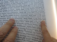
This research provided me with lots of common points in this variety of Atlases. An Atlas today is not anymore about geography, it can be about anything. What defines an Atlas is the attitude from the designer/author towards the content that defines a document as such. At this point I understood that an Atlas need to have a non-linear narrative of the content, it needs to be more precise and detailed chapter by chapter, it has to have an Index where the reader can refer to and it needs to be as objective as possible using all possible visual languages available.
Another essential element I discovered during my research is that the state of an Atlas today is essentially mapping the many significant technological elements of humanity's progress. We generate and create a complexity of data that is too difficult to explain and synthesise with just maps and this is why Atlases started to embody many elements of visual communication as it evolves. Also, we are so used to scroll and check data very fast nowadays that we need to visualise them most efficiently and straightforwardly.
Eventually the connection to typography was an exciting element added to my research, after all I was studying in Basel, where typography is everything.
Just like the Atlas, letterforms are evolving into new shapes because of the progress of our civilisation -from stone carving to retina displays and more- and I wanted to show that an Atlas can, and will, be about any content one demands.
Before starting to analyse the variety of the letterforms, trying to understand how they are defined, I came up with these six parameters: proportions (narrow - regular - wide), from (geometric - constructed - humanistic), weight (light - balanced - heavy), contest (none - low - high), attitude (static - dynamic) and terminals (serif - sans serif).
Then I selected twelve typefaces that represented the two extremes of each parameter.
With the data of these 12 fonts available, I started to follow the structure of the Atlas I studied in the research part and I divided this Atlas of mine in four different chapters.
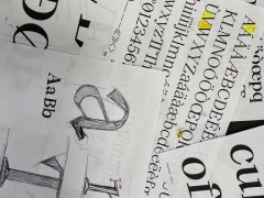
In the first one, OBSERVATION, I introduce to the reader the selected dozen of fonts providing some information regarding the parameters of the fonts, like the foundry etc.
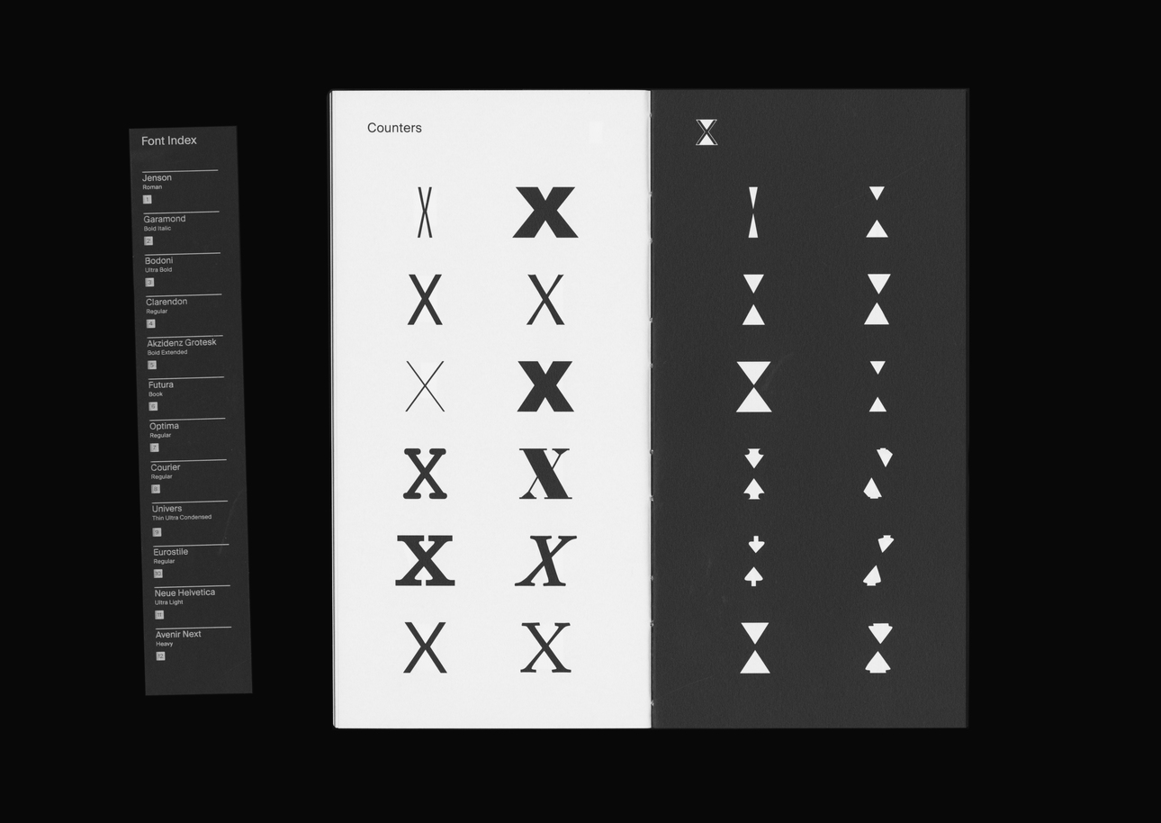
In this chapter the letters are shown based on form order and not alphabetical so you have circle, square, triangle, double circle, double square and double triangle.
The second chapter is DECONSTRUCTION. Here I compared each letter of all 12 fonts showing the most compelling structural part of each letter.
The third, ANALYSIS, is where I used all the technical aspects of the 12 fonts to design graphics like infographics, data visualisation, maps etc.
The last chapter, CONNECTION, is a kind of metaphor for the Atlas. After studying the whole information provided in the content of this Atlas bout Letterform, one can make the connection between things.
Sometimes these connections make no sense but, at the same time, they may provide the reader with insights one could not trace before.
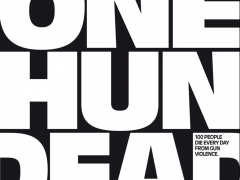
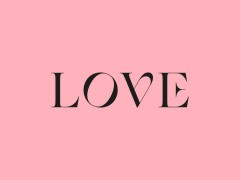
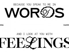
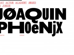
This is why I decided to design some crazy letterforms. This is my attempt to decontextualise the letterforms, to show them used not strictly in a text like we are used to, to provide to anyone some information on what works, what doesn’t and why.
Therefore this Atlas about Letterforms is my answer to the question: WHAT IS AN ATLAS TODAY?
This format, the Atlas, has enormous power in tracing the past and define the future of a society that is becoming more and more complex as time goes by.
An Atlas explains this complexity, especially in a book format that invites the onlooker to spent some time to read it and not just scroll for a few seconds."
Enter Fabio Mario Rizzotti's quest to understand humanity through type here.
Tags/ typography, typefaces, fonts, thesis, letterforms, the basel school of design, atlas, mario rizzotti, joost grootens

