Whispers in type: when typography conquered Vancouver
We love typography when it rules the world, therefore Whispers, a typographic public art series created by Fivethousand Fingers in Vancouver, Canada, provides both inspiration and motivation to spread the word of type in public spaces.
“Whispers was a public art project that installed a series of works from local writers in large-scale typography throughout the city of Vancouver” notes Fivethousand Fingers, the design studio working globally from Montréal.
“Our intention was to intervene in the public realm where advertising and municipal signage have a monopoly over the written word, by giving volume to the ever active voices of poets and artists.”
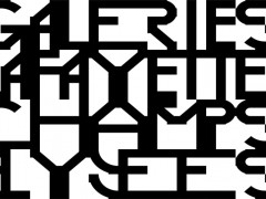
“The result was a series of typographic installations which employed the scale and style of commercial hand-lettering to give dramatic authority to creative writing.”
Whispers Project was hosted with help from Elee Kraljii Gardiner and participation from local writing groups Thursdays Writing Collective and Intrepid Pens where content was generated and selected for including in the final installation.
Whispers was conceived in collaboration with Jordan Bent, and made possible by the City of Vancouver to commemorate its 125th anniversary.
Whispers developed a language which is driven neither by capital nor dissent, drawing on the finality of commercial hand-lettering and the immediacy of graffiti, exploring the human experience in this urban landscape.
Writing has been selected for this project in a series of workshops during the past and applied in a number of locations around the city as murals.
People collected their voices as content for the murals, and various writers and artists joined their forces in the writing process.
The Whispers were designed to reference the scale and style of commercial hand-lettering, but intended to communicate creative content instead of the commercial sales pitch.
Enabled by barriers of economy and policy, the medium of advertising appears to have monopolized the realm of large-scale public communication.
Despite the term “public space” being commonly accepted as equating a sort of commons of the people, most of the physical property in a city is either privately owned, or highly regulated.
While plenty of space has been made available for voices willing to pay (namely advertisers), the simple expression of an individual without economic means is rendered illegal.
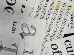
The typeface used for the Whispers was designed specifically for the project to follow the aesthetics of historical commercial type, including the quirks and irregularities found in many hand painted signs.
Explore more here.
Tags/ typography, typeface, graffiti, murals, anniversary, public spaces, vancouver, fivethousand fingers, montreal

