2024 Paris Olympic Games: Graphéine's visual identity is better than yours
Almost a month ago Paris unveiled a gold-medal-shaped emblem for the 2024 Olympics and Paralympic Games. According to the official press release “the emblem embraces the shape and color of the most beautiful medal of all to express one of the core values of sport: striving for excellence. That same commitment also informs every step that Paris 2024 is taking in organizing the Olympic and Paralympic Games Paris 2024, so that it can fulfill the pledges it has made to stage a different, grounded, sustainable and inclusive Games.”
Eventually, Twitter-verse had its own take of the Paris 2024 Olympic logo which was mercilessly mocked -even though the gold design (apart from representing gold medals), the variable custom-designed typeface and Art Deco styling is a nod to the last time Paris hosted the games, in 1924.
"Its pure, understated lines and its original typeface take their inspiration from Art Deco, the first complete artistic movement, which reached its height at the 1924 Games in Paris," says a statement announcing the logo which per Creative Bloq's Rosie Hilder “looks like either a) the Tinder app logo, aka a sexy flame b) a condom packet or c) a hair salon logo. There's nothing about it that makes us want to jump off the sofa/out of bed/away from our screen to do the javelin or the long jump or pursue some other Olympic dream.”
After all the buzz another visual identity emerged with rave reviews from many -even though it was not selected. Graphéine's team studied the question of the visual identity of the 2024 Paris Olympic Games and its answer is presented in the agency's blog.
“Imagine an impossible timetable (only 3 weeks to send a response....) and all the conditions that we usually denounce (no financial compensation for submitting a project). Nevertheless... it's the Olympic Games! What's more, in Paris, our city capital! So we offered a creative sprint to our teams. 48 hours to find an idea. Here is the project we have collectively imagined” writes Graphéine.
“For a branding project to be successful, the logo must be based on an idea that is sufficiently 'fertile' to inspire the multitude of necessary variations. Indeed, it is in the polysemy of a sign that the richness of the declinations will be able to sprout. Thus some signs can easily be imagined in movement, volume, space... while others will seem 'static and uninspiring'. In our opinion, this visual polysemy is a guarantee of sustainability. Indeed, the strong repetition of a sign inevitably causes a form of habit, even weariness. A sign that has several levels of reading will be much more resistant to time.”
“Baudelaire used to define modernity as the meeting of fashion ("mode" in French) and eternity. It is precisely in the conjunction of these two temporal notions that a logo must be found. On the one hand, he must be in tune with the times to make himself desirable in the eyes of its contemporaries. On the other hand, it is destined to go down in the annals of sport and Paris, and it will continue to live for many years after the end of the Games” notes the agency of its proposal.
Building the logo around the concept of an Eiffel Tower sports track the proposal is sporty with “fluid curves, fast lines. A sports track emerges before our eyes, telling the story of movement and speed.”
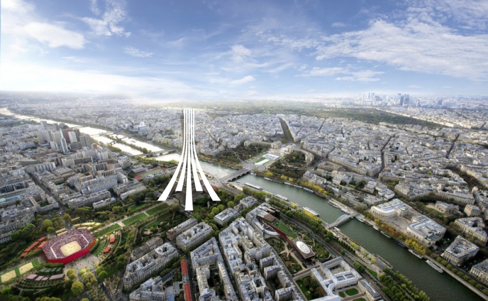
Solidly placed on the ground, a 3D Eiffel Tower is emerging and “the magic of this sign comes from its possible double reading. In turn sports track and Eiffel Tower. The eye seems not to want to choose.”
This is a logo “that tells a story of encounter and convergence. It is a profoundly humanistic and optimistic sign that offers a perspective of collective progress.”
The agency's open invitation to the world with five colors for the five continents of our world echoes “the IOC motto with the symbol of the Eiffel Tower. It affirms the audacity to go further, thus illustrating the idea of surpassing oneself.”
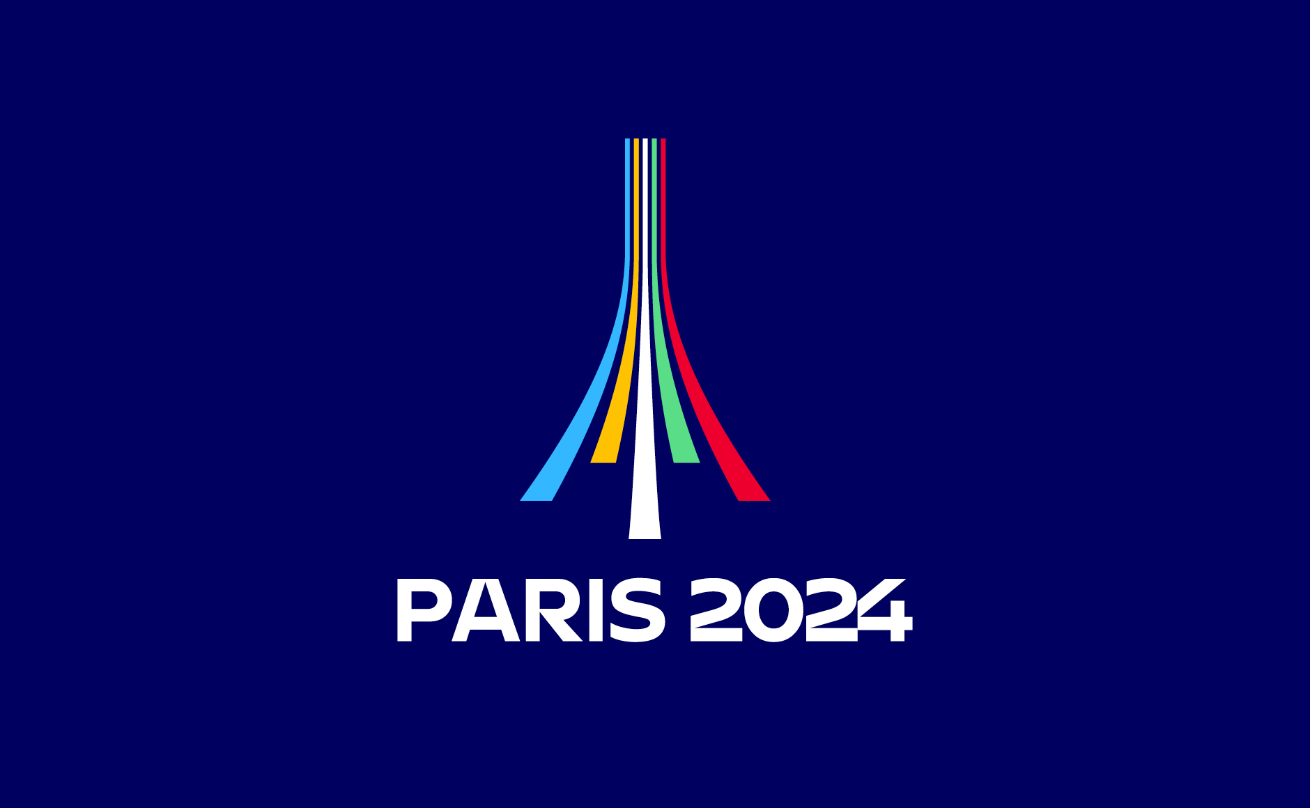
“For a branding project to be successful, the logo must be based on an idea that is sufficiently 'fertile' to inspire the multitude of necessary variations”
“The two logos are from the same shape” notes the agency of its two logos for a shared vision.
”A simple change of angle of view makes it possible to switch from the logo of the Olympic Games to that of the Paralympic Games. This symbolic rapprochement between the two logos is a strong gesture that can act as a bridge between the world of able-bodied athletes and that of athletes with disabilities.”
“This project was not selected... But, as Pierre de Coubertin said, the most important thing is to participate!”
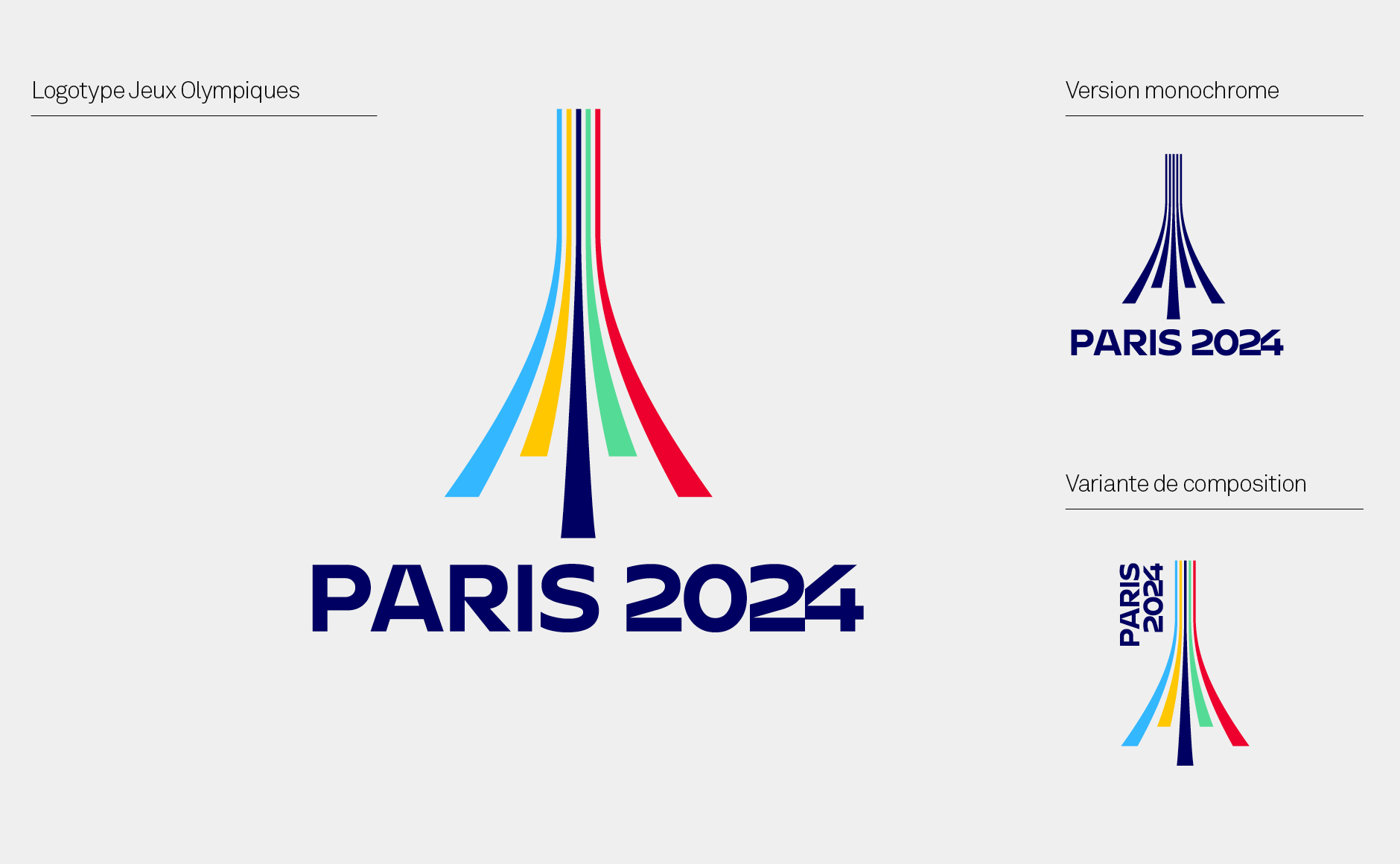
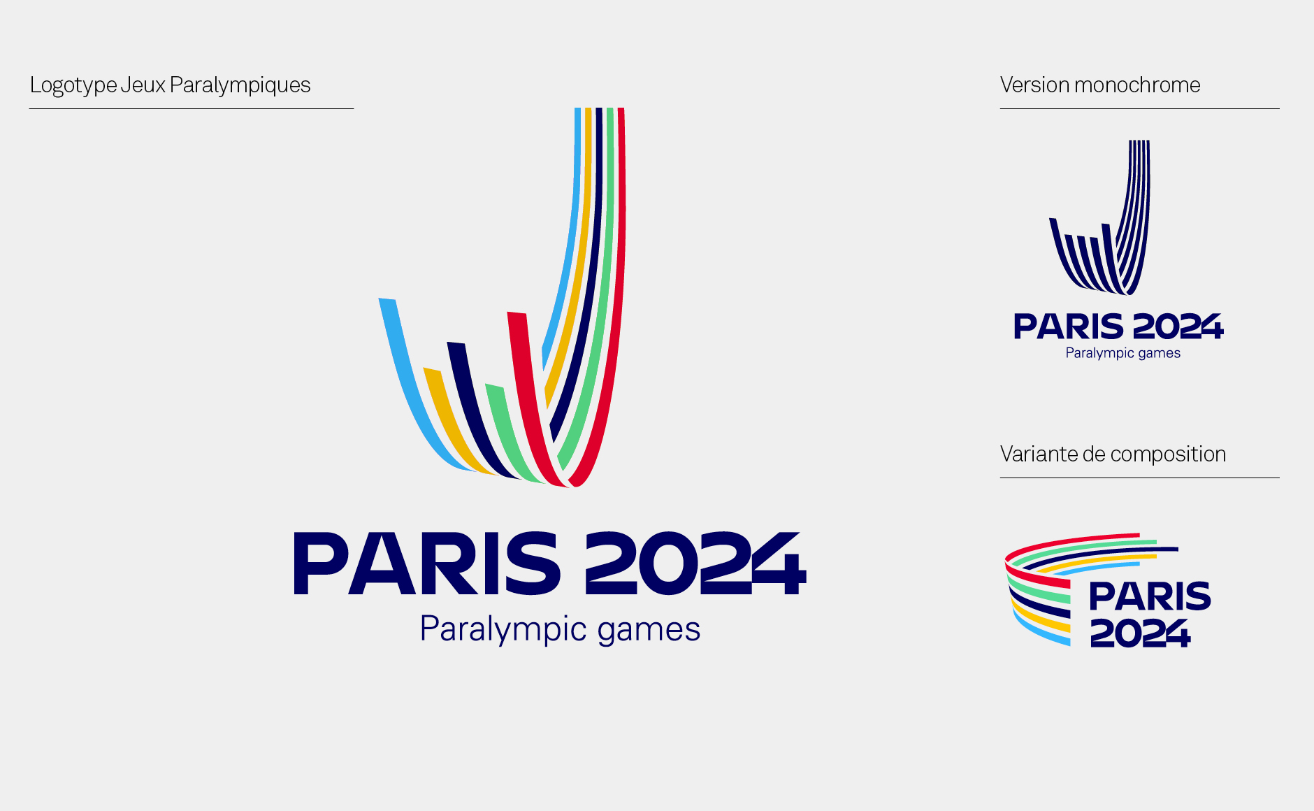
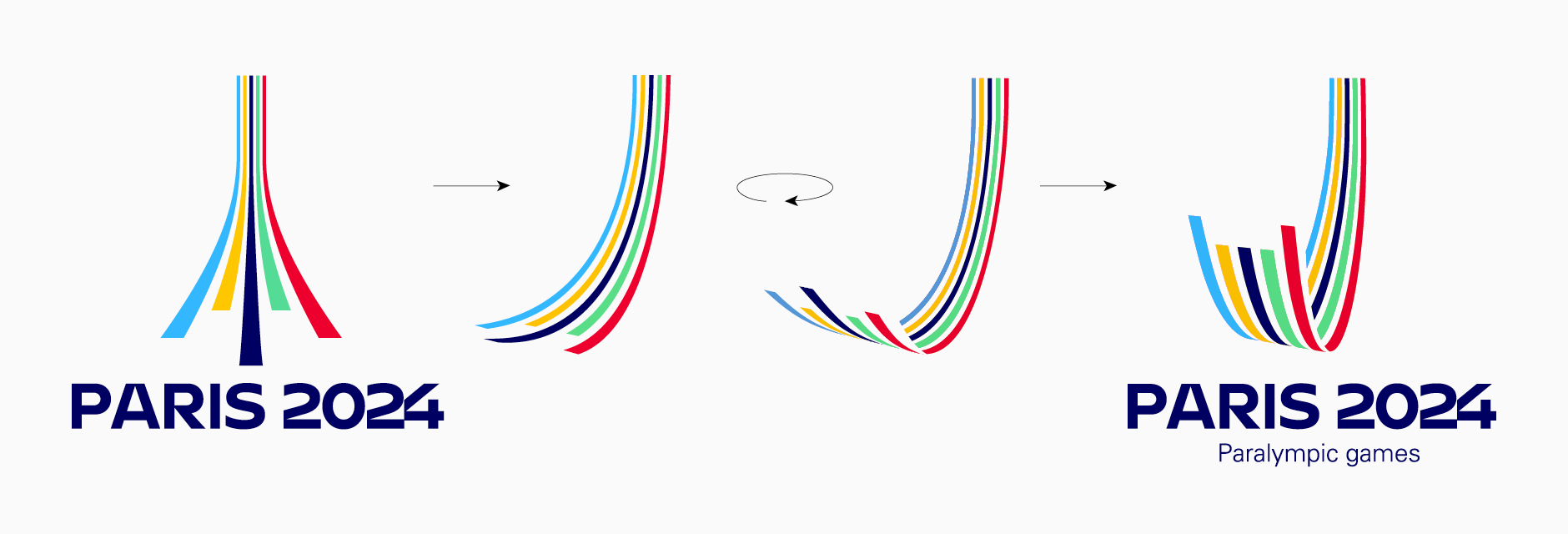
”A simple change of angle of view makes it possible to switch from the logo of the Olympic Games to that of the Paralympic Games. This symbolic rapprochement between the two logos is a strong gesture that can act as a bridge between the world of able-bodied athletes and that of athletes with disabilities.”
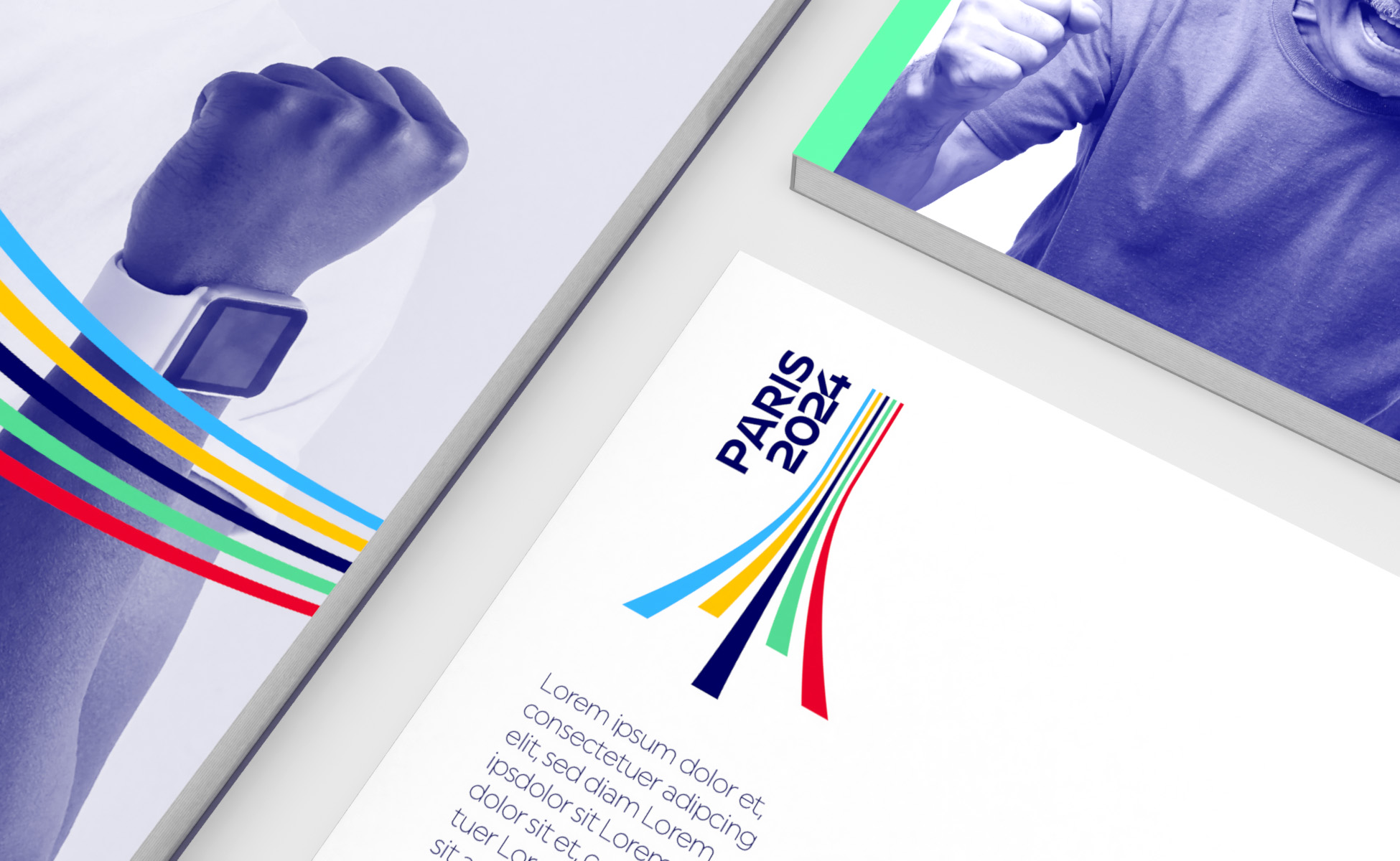
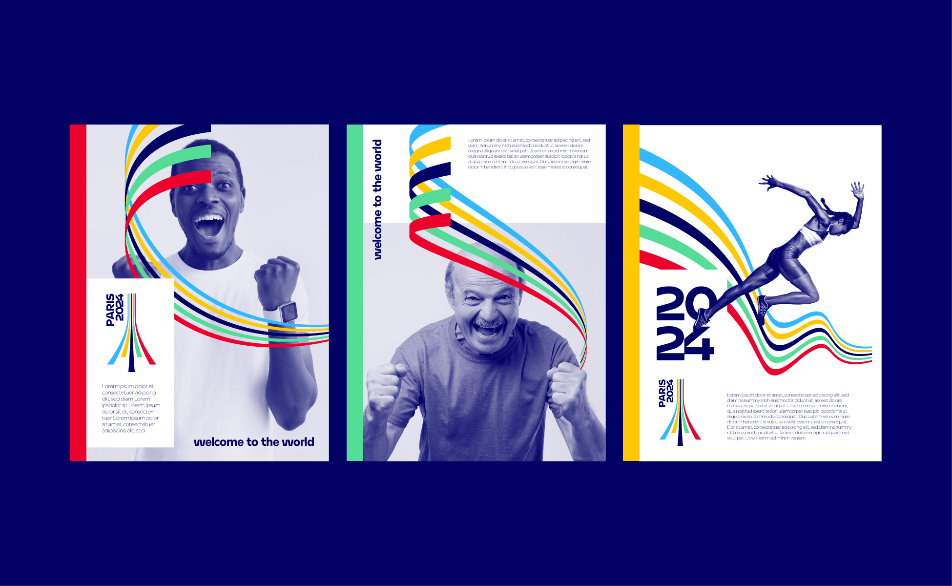
All images via Graphéine
Tags/ inspiration, visual identity, logo, france, paris, olympics, graphéine, agency, eiffel tower, emblem, symbol, paris 2024


