Typography as raw material: République Studio on their AJAP 2018 visual fest
Simple is not boring -at least not in the portfolio of one of our favorite design studios made in France aka République Studio, who infused their modernity to AJAP 2018.
“AJAP” (Albums des Jeunes Architectes et Paysagistes) is a biennial competition organized by the French Ministry of Culture. They distinguish young European architects and landscape designers under 35 who have realized a project or participated in a competition in France.
The exhibition presents the work of the twenty winners constituting the 2018 promotion, fifteen teams of architects, five landscaping teams.
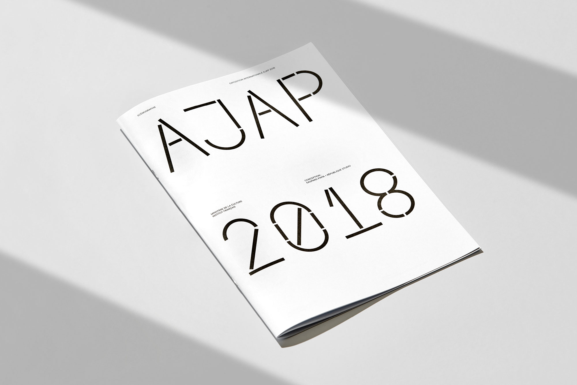
République Studio, a team of creatives “often inspired by the zeitgeist” did all the design, catalogs, and signage for AJAP 2018 which will be exhibited in all the French Institutes around the world for the next couple of years.
Typeroom's Loukas Karnis caught up with the award-winning creative direction and graphic design practice based in Paris to discover how type makes the life of creatives a place of wonders and versatility.
How did you approach the design of AJAP 2018?
As the exhibition is traveling all around the world, we discussed with the scenographer on which kind of printed matter would be best to showcase the architects and their works.
It had to be lightweight, easy to build, easy to print, in short, easy to travel. Gaspard came up with the idea of a wooden module, easy to assemble, that could carry two posters aboard.
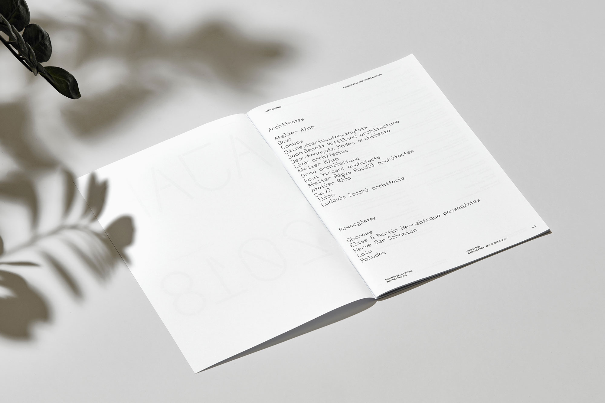
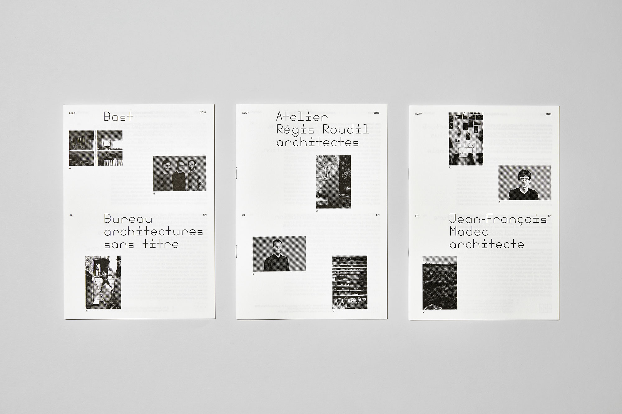
The traveling exhibit is bilingual, French and the native language of the country where it is shown. We figured that the posters would display only big images and the explanatory texts would be shown in small booklets on the board. Therefore the visitor could take a booklet with him and bring a small part of the exhibit home.
As for the design, we wanted something that would work well with the wooden modules, unique and light.
Which are the most important elements in AJAP 2018’s visual language?
Type was definitely the most important part. The typeface Past Perfect, used for titles, emphasizes the wooden modules. The letters look like wooden sticks and give to the whole project an «architectural and playful vibe».
Plus, it contrasts with Basis Grotesque, used for body text, which is more shapely yet more comfortable for the reader to focus on content.
Which was the most difficult part of this project?
Keeping things simple without being boring.
How long have you been working on it?
It took us around 3 weeks to design all the booklets, catalog, signage and make the layout of the posters.
How important is type in creating a unique voice for the branding of a project?
At Republique Studio every work begins with a typeface. We think a typeface is a big part of the identity of the project because it can provoke different emotions. That’s why you really have to choose well the fonts you will use.
We always want to find the typefaces which will tell the good story, and which speak the same language as the project itself.
A typeface, and the way you use it, has real power on the identity of a brand. By looking at a typeface, it can remind you of a brand, or a movie poster, or an album, etc. That’s why when you start working with a new client, it’s important to choose a typeface that doesn’t have a recognizable history already.
The typeface has a real impact on your memory whether you want it or not. That’s why we try not to use the same typeface on many projects.
Would you consider bespoke typefaces the most important factor to express attitude though letterforms?
Typography is not just about choosing a typeface, what is most important is also how you use it, where, for which audience, in what size, in which color, etc. If you choose a well-known typeface but use it in a unique and intelligent way, then your message can be just as bold.
What is Republique Studio’s motto to live and work by?
Don’t overuse the same typefaces, because you don’t want the whole world to look the same! Or at least, change the way you are using them.
We don’t want to see the same identity everywhere. Diversity makes our world beautiful!
What are you working on now?
We are working on signage for museums, which is really exciting because we love to see big type in action. Also websites, branding and poster/communication for exhibitions.
How would you describe the French typographic scene? What's your take on it?
There are many good type designers in France! Too many to name all of them. Sure thing is that the type game is global today, and you can find good designers all around the world.
We are living in a liberating era where type design became very accessible and talented people can very easily make their point and live from their art. Typography is our raw material and type designers our best friends :)


“The typeface has a real impact on your memory whether you want it or not. ”


All images via République Studio. Set design by Gaspard Pinta / Photos by Julien Lelièvre
Tags/ inspiration, typeface, exhibition, posters, fonts, france, signage, architecture, catalog, république studio, ministry of culture


