The fonts, the experiment, the semantics: TwoPoints.Net on their latest bespoke collaboration with NIKE
TwoPoints.Net, aka the design studio that aims to do exceptional design work ever since 2007 when it was founded by Martin Lorenz and Lupi Asensio, has another hit to offer.
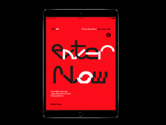
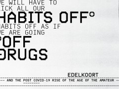
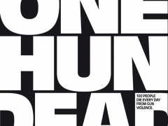
Just some months after the studio’s viral typographic hit for ESPN magazine’s NEXT -TwoPoints.Net and ESPN have an ongoing partnership that delivers ever since the bespoke typeface for NFL issue, followed by an NBA issue and another on the Olympic Games-, the creatives continue to translate sports stories into typography in their latest collaboration with NIKE Europe.
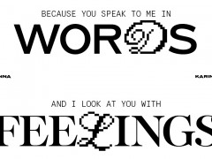
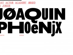
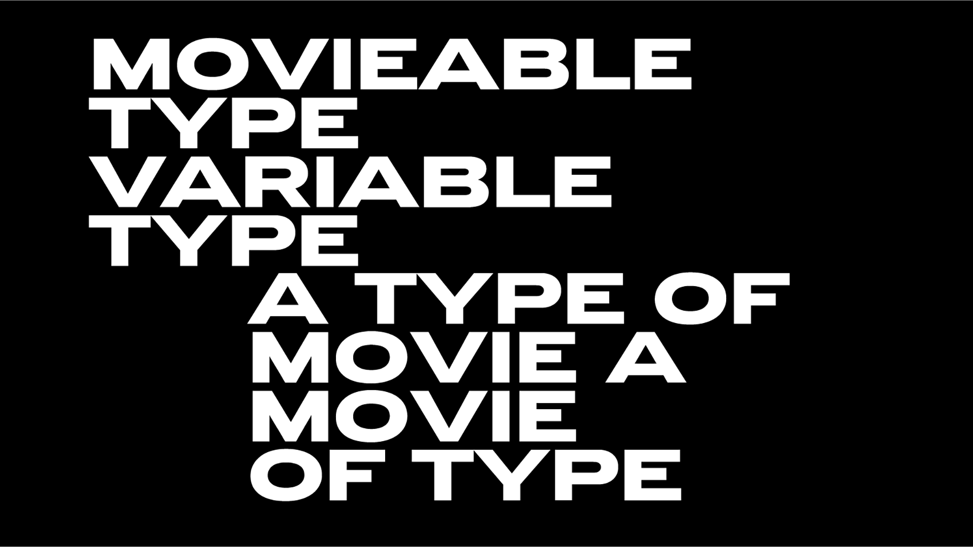
“We had the pleasure to design some type for NIKE. Along with three different fonts, we designed proposals for the retail design and campaign for the new NIKE shop at the Chelsea Football Club Stadium” notes TwoPoints.Net of their bold experiment that strikes gold.
“Work that is tailored to the client’s needs, work that excites the client’s customers, work that hasn’t been done before, work that does more than work” is the motto of “a small company that thinks big.” Here we catch up with Martin Lorentz on the studio’s latest sport activity through the means of bespoke type design.
Typeroom: You designed three typefaces for NIKE lately, one of the many bespoke fonts you produce for selected customers. What was the brief and which part of it was the most challenging and why?
Martin Lorenz: NIKE opened up a shop at the new Chelsea Football Club Stadium. We had images of the stadium and the shop design at that state. All renders. Thats it. Which is actually a dream brief. We were allowed to experiment freely.
TR: This is another collaboration of yours related to the sports industry with your latest ESPN fonts being quite a viral hit in the community. How long are you working before delivering a final product?
ML: For the NIKE fonts we had two weeks. The fonts we develop for ESPN took longer - about a month or two for the final release-, but this is as well because we often do not just develop fonts, but entire flexible visual systems that find their application in fonts, pictograms, more complex illustrations or data visualizations and “look and feel”applications.
If the relationship with the client is great, you can do a lot in a really short time. Actually calling them clients sounds weird. They are more like co-workers. We all have the same goal. To develop something that excites us all.
TR: How do you approach the design of a custom typeface?
ML: We take in account how and where the font is going to be applied and take these informations as our boundaries in which we experiment.
When working for such big companies, our design has to function like a design tool the fantastic in-house design teams can use to play around with. Too rigid solutions would not work.
Apart from creative freedom, the systems also need to be flexible to be applied efficiently and effectively on all media, devices and viewports.
TR: Which is the one single rule a graphic designer should never ever break?
ML: Trust your intuition. The moment you become too rational, your work becomes boring.
TR: Which is your favorite bespoke type that you wished you had designed?
ML: Oh, there are sooooo many! We are huge fans of Herb Lubalin. So, just to mention one, lets say Avant Garde.
TR: Which are the core elements a type designer should take into account after being commissioned with a visual campaign?
ML: In which context is your font or lettering going to be seen. The purely morphological context already plays a big role. How big will the type be displayed? Is it going to be shown on printed matter or screen or both? Will it be animated or is it going to stay static?
On another note, the semantics are essentials as well. How are the aesthetics going to be perceived in their cultural context?
TR: What keeps you inspired?
ML: We try to take as much inspiration from the project itself as possible. We love to learn from our clients/partners. Learning new things with each new project keeps us on our toes. Often the inspiration is not even visual, but conceptual.
We like to start working with a few key words. We hate mood boards. Too often you get stuck with the aesthetics someone else developed and thats just frustrating, boring and lazy.
Explore more here
Tags/ typeface, magazine, nike, fonts, herb lubalin, experimental typography, twopoints.net, martin lorenz, stadium, retail


