Precious cuts of type: Yorgo Tloupas on Cartier’s brand new bespoke fonts by Yorgo&Co
Yorgo&Co aka the Paris based multidisciplinary creative studio led by Yorgo Tloupas has provided magic for unity.
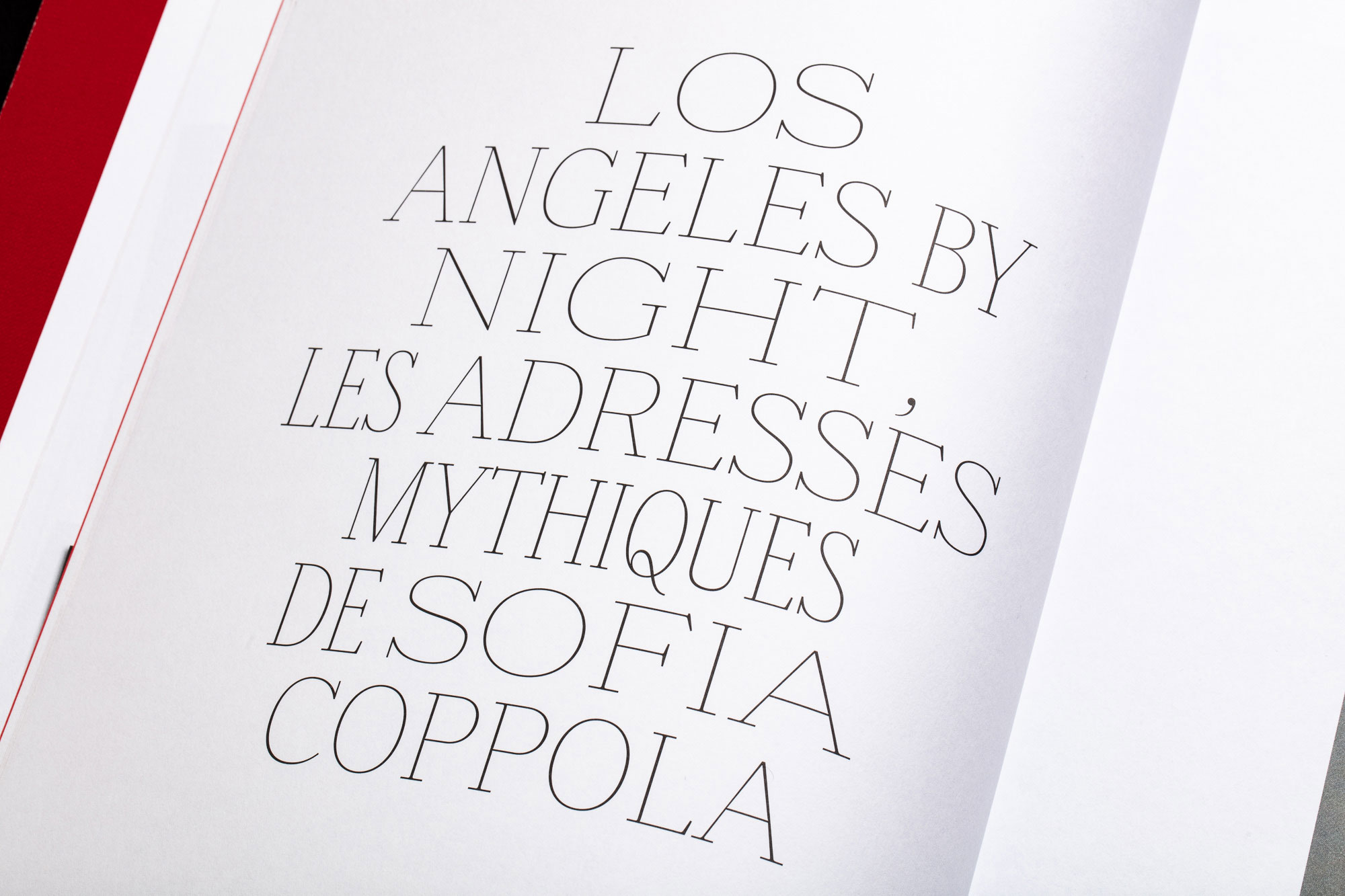
The team has teamed up with French luxury goods conglomerate Cartier bringing into the limelight two brand new bespoke typefaces for the brand.
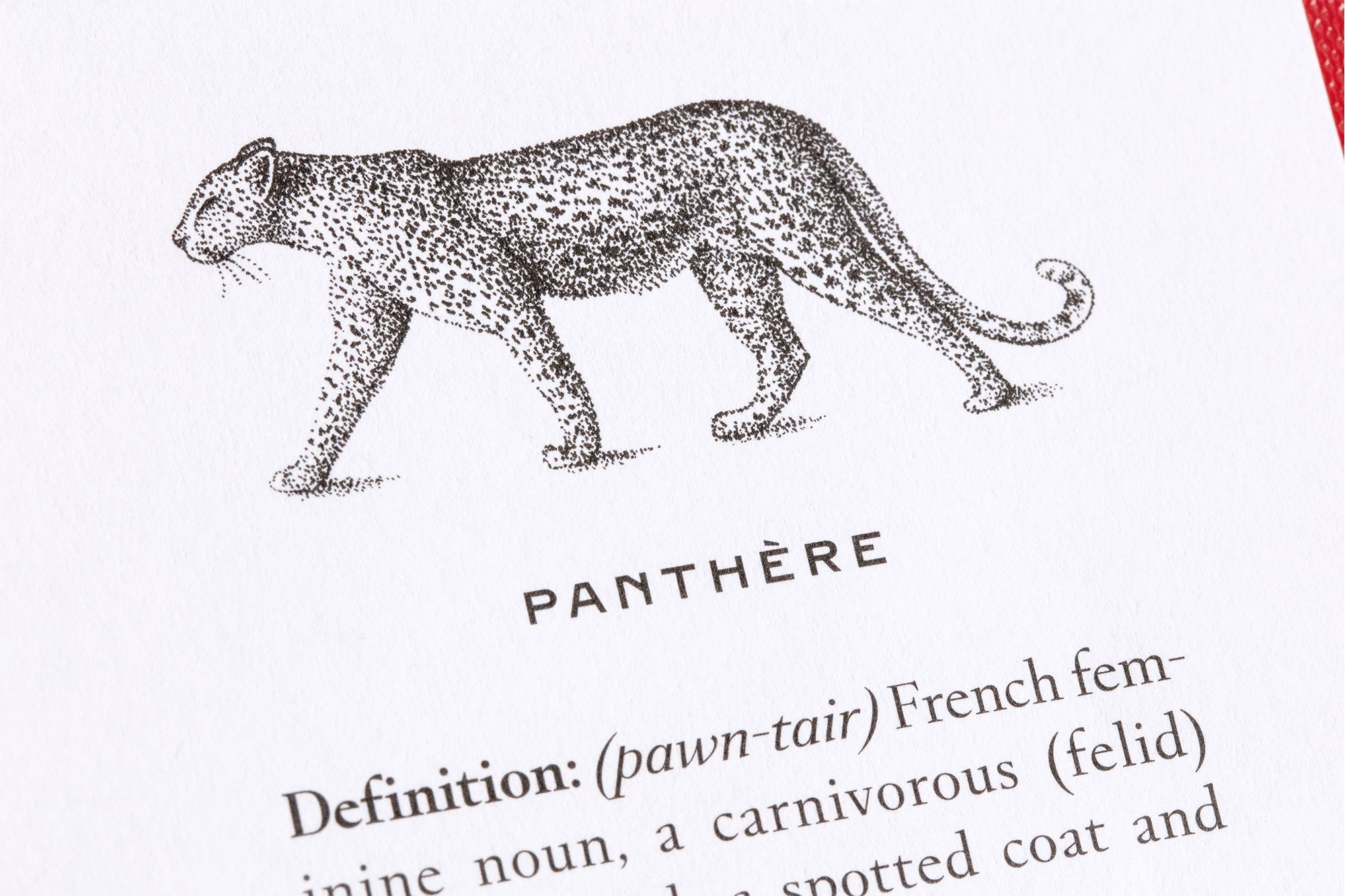
Founded by Louis-François Cartier in Paris in 1847, Cartier needed a coherent visual identity across all products and platforms. Tloupas and team delivered two precious type designs aka Fancy Cut serif and Brilliant Cut sans-serif improving Cartier's collective visual landscape.
We caught up with the renowned art director and logotype expert Yorgo Tloupas to talk of his studio’s latest typographic elements of desire for Cartier as legacy and modernity combined.
Typeroom: What was the briefing for Cartier's bespoke type design?
Yorgo Tloupas: The in-house design team at Cartier knows a lot about typography and design, and the head of that department, Nicolas Guiramand, felt the need for a set of bespoke typefaces, in order to stop all the branches of the brand using whatever they felt like using. Perfume was using Gotham, jewelry was using some Didot-like fonts, watches were using something else again, there was basically no coherence.
A few years ago I had designed for them a very basic sans serif based on a picture of a truck I saw in the NYC Cartier store. I remember taking a shot with my digital camera (this was before smartphones) and being almost kicked out of the store. The markings on that old truck became the base of this simple title font, with my limited knowledge of type design back then. This inspired them to ask us to design proper bespoke fonts, and they specifically asked for a serif and a sans-serif, to be able to use only these families on every support, from web to print.
TR: How long have you worked on the project? How many people were involved? How did you go about dividing / sharing the work?
YT: It took about 8 months, from the first research in their archives to find the sources, to the delivery of the families with their usage guidelines. Martin Pasquier, our in-house typographer, did most of the work, with guidance from me. It was quite intense and quick, as we were designing the Cartier Magazine, 365, at the same time, and refining the different versions of the fonts as we were validating layouts.
TR: What are the main differences between Brilliant Cut and Fancy Cut?
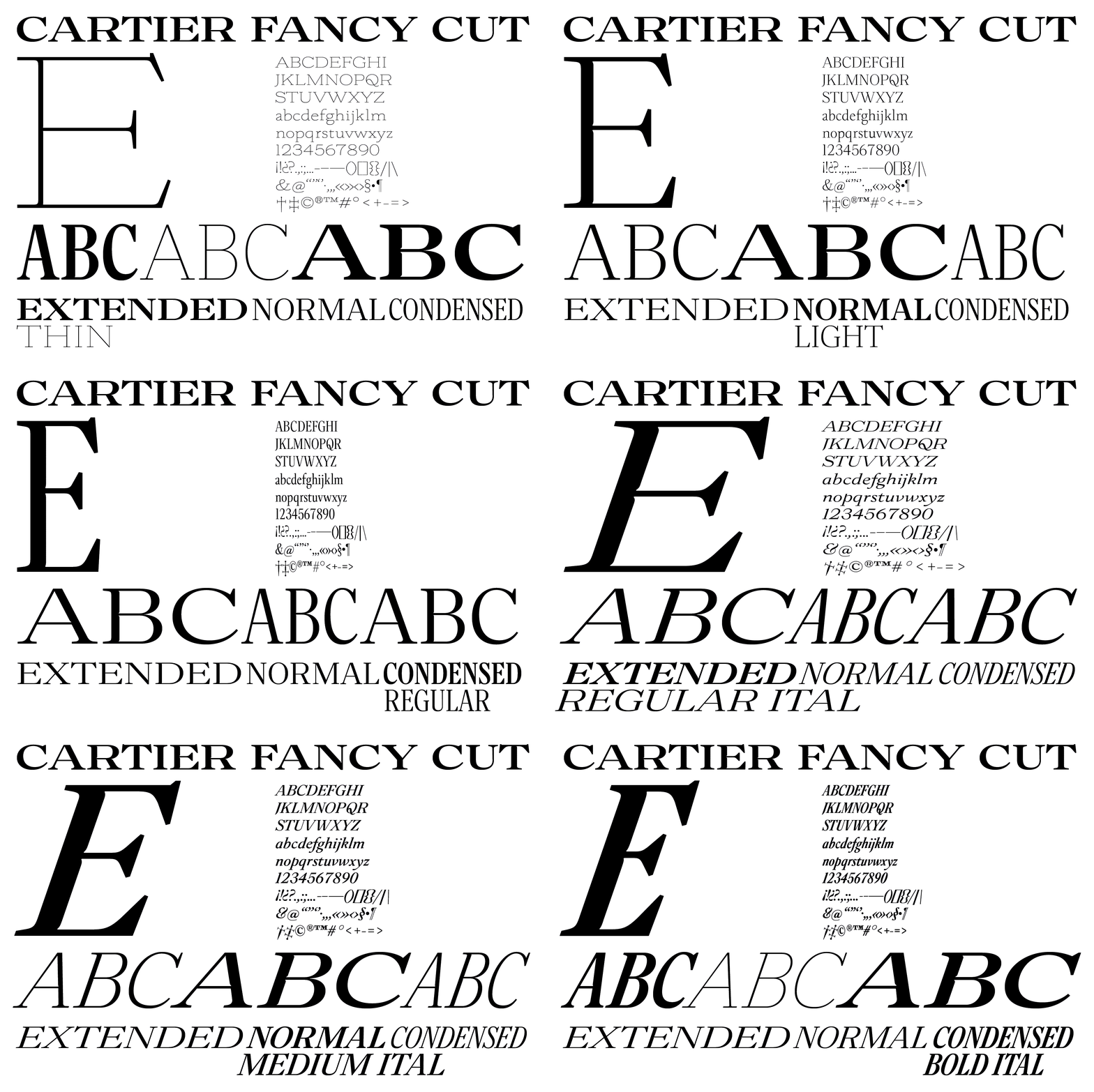
YT: Brilliant Cut is the sans-serif, inspired by that truck I mentioned and some other sources, and Fancy Cut is the serif, based on the lettering on the dial of the watches, mixed with other sources as well.
TR: Would you consider these type designs as “luxurious”?
YT: The luxury is already present in the fact of having your own typefaces. In this case, the link to the long and glorious history of Cartier adds a layer of excellence, and the details in both fonts are clearly refined and hopefully as delicate and detailed as the products made by the house.
TR: Are they meant to work strictly together?
YT: Yes, they are very different, and pair up well. They end up using more the sans serif, naturally, because I think it has a bit more modernity, and a very recognizable character, with its beveled angles on the A in particular.
TR: Which typographic elements do they have in common to provide unity to Cartier, the brand.
YT: The top of the upper-case As are flat, and both families have a wide range of weights, from hairline to black.
TR: So they are the pillars of the brand’s unified brand identity...
YT: They are going to force the many departments of the house to use the same typographic language, so everything is hopefully going to look coherent, to accompany the very strong elements that exist already, i.e. the Cartier logo, the red, and the iconic box.
TR: What influenced you more? Contemporary trends or historical elements of the brand’s visual language?
YT: We looked exclusively into their archives, but obviously we live in the present, and both Martin and I look at the modern tendencies in type design, and some elements such as the angular ink traps could be considered “modern”, but beyond that, both type families could have been designed 100 years ago.
TR: Which was the most challenging aspect of designing Fancy Cut and Brilliant Cut bespoke fonts for Cartier?
YT: I’d say the range of weights and widths for the serif brought a lot of challenges. Designing a family working for titles and text without variants for optical sizes was a challenge. We wanted to keep the family simple to use for employees of Cartier, most of whom aren’t graphic designers.
The sans serif is obviously much simpler. We also created lower-cases for the sans, on the client’s demand, but we ended up not using them at all in 365, the Cartier magazine we design. Consequently, in the Cartier type guidelines, the lowercase sans-serifs are in the “don’ts” section, not to be used anywhere in the brand identity. But at least they are designed!
TR: When you designed the typefaces did you start with certain letters or words to determine how the entire type system would look like?
YT: The word Cartier was clearly something we focused on, and I’d say the Sans-serif A (with its iconic shape) and the serif E (with its ink traps) are the most important letters of the whole project. They kind of determined the aspect of the rest.
TR: Which characters do you find the most difficult to design?
YT: Martin worked quite hard on the rounded letters of the serif, which were quite difficult to keep consistent from condensed to extended.
TR: What makes bespoke typefaces so significant nowadays?
YT: I think the perception of the general public has evolved, they are more sensitive to details like typography, and even if they don’t know that Mercedes, Audi, Prada, et al. have their own typefaces, their eye has become sharper, and they can sense the added layer of quality that bespoke fonts bring.
TR: What are the most important things to consider when you start working on a new typeface?
YT: The final usage is key, and in our case, we knew that we needed to give Cartier tools that would need to work from body text to the various logotypes of the Cartier corporate entities, from Cartier Philanthropy to Cartier Women's Initiative, etc.
We also worked a lot on presentations that showed how the fonts would end up looking at Cartier adverts, Cartier objects, office signage, digital, in order to convince the head management to give the go-ahead to a very unusual project for them.
TR: What one thing would you like every designer to know about type?
YT: I’d like the trend of ironic fonts to end soon please. Enough fake 90s-provincial-sports-goods-shop design now.
TR: A lot has been said about the lack of diversity in the creative industry. What's your take?
YT: Our office sometimes looks like a Benetton advert, with a mix of origins and genders that just happened naturally.
TR: What would you change, if so?
YT: I’d educate the young kids early to design, so that they develop a sensitivity to it, whether they end up working in that field or not.
TR: How is the French design scene different from other countries?
YT: Well the French do love to complain as a whole, about most things. In design terms, we have always been a bit behind Nordic countries, where the environment is much more penetrated by qualitative design, and designers here have been complaining about the level of understanding in clients, and consequently in the general public. Things are changing a bit, but we still have a lot to catch up on.
TR: If you were a letterform of Cartier’s brand-new bespoke fonts which one would you be and why?
YT: I’m clearly the upper-case Sans serif N black. Rigid, thick, short, asymmetrical.
TR: What is the ideal soundtrack to accompany these two type families of yours?
YT: I’m very much into mid-70s Iranian music these days… Googoosh, Kourosh, Nooshafarin…
TR: What are you working on right now?
We were lucky during lockdown, and have been working non-stop on a variety of projects, mostly graphic design. Pictograms for Cartier, a collection of candles for Diptyque, the identity for a trans-European night train company I’m art directing and a partner in, skis, clothes and ad campaigns for my ski brand Blackcrows, the redesign of a French magazine with a bespoke slab serif font family, and many more exciting visual identity projects. And of course Yorgaki, my Kafeneion in Paris is doing well with the summer days!
Tags/ typography, french, yorgo tloupas, bespoke typeface, bespoke fonts, luxury, yorgo-and-co, cartier
