Studio Output X CALM: a bold, heavy on type campaign against suicide saves lives
Every year 703.000 people take their own life and there are many more people who attempt suicide. With every suicide a tragedy that affects families, communities and entire countries the toll of taking ones life has long-lasting effects on the people left behind. Suicide occurs throughout the lifespan and was the fourth leading cause of death among 15-29 year-olds globally in 2019.
Suicide does not just occur in high-income countries, but is a global phenomenon in all regions of the world. In fact, over 77% of global suicides occurred in low- and middle-income countries in 2019, WHO reports.
To tackle the problem Studio Output worked with the Campaign Against Living Miserably (CALM), a charity that helps counter suicide in the UK, to develop a new visual identity bold enough to reach more people struggling with life's daily burdens.
As noted annually, in UK alone, over 6,000 people take their own lives and The Campaign Against Living Miserably aims to change that, uniting the country against suicide.
"CALM is a helpline and webchat, an online resource, content creator and campaigner. Its people spark change, give advice, start conversations, organise events and build communities. Our goal was to create a visual and verbal identity system with enough flexibility to cover it all. A brand that can fight for change and make you laugh, help someone in crisis and support anyone struggling with life.
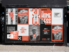
"Irreverent, bullish and empathetic. Everything the brand does is rooted in its character. All three traits are always present, dialled up and down depending on the message. The logo is a bold statement of CALM’s mission and we used its extruded text style to define the graphic language beyond it. Together, the character and ownable design language give the flexibility the brand needs, without losing cohesion – so all applications and experiences look and feel unmistakably CALM."
"Mixing cuts and weights of the typeface ‘Obviously’, from Oh no Type Company, allows CALM to augment messages creatively, but reduce for sensitive information where function is the priority. Three colour palettes, one for each character trait, can be combined to stand out boldly, or toned down to encourage people to open up."
"CALM talk about grief and suicide without tip-toeing, and reject ‘us and them’ narratives of the strong helping the weak. We’ve closed the distance between the organisation and anyone interacting with it by embracing reality and human connection in the visual identity. Physical textures and tactile hand-drawn scribbles place the brand in the real world, frame devices hero real stories, and illustrations communicate tough subjects" explains Studio Output that delivered a brand system that "ramps up to its most bullish and irreverent – focusing on life and the reasons for living, creating the momentum and energy needed to unite more people against suicide."
The campaign aims to get people involved, motivated and excited, to "acts as a Trojan Horse into talking about suicide and mental health."
Studio Output built a ‘brand+’ element to the system "to support this kind of content. Building from the core brand, the assets and logo use design codes relevant to the message, making each one aesthetically distinctive and expressive." The goal is to get people talking sooner, before they reach a crisis point, get help when they need it and don’t die by suicide.
CALM has to be noticed and the creative team developed CALM’s unique characteristics into a bold, vibrant, super-flexible, contemporary, loud, heavy on type identity taking advantage of the abundance of tools that can and will spread the message.
The campaign aims to convey "hope, optimism and empathy in more ways than ever – be it on a pub toilet door poster, a bus stop ad, or a Twitter post. It’s a perfect, natural progression for CALM and we couldn’t be more excited for the future."
Explore more here.
Tags/ campaign, studio output, suicide, mental health


