K-Pop with Typography: introducing Junki Hong's jun.playlist poster series
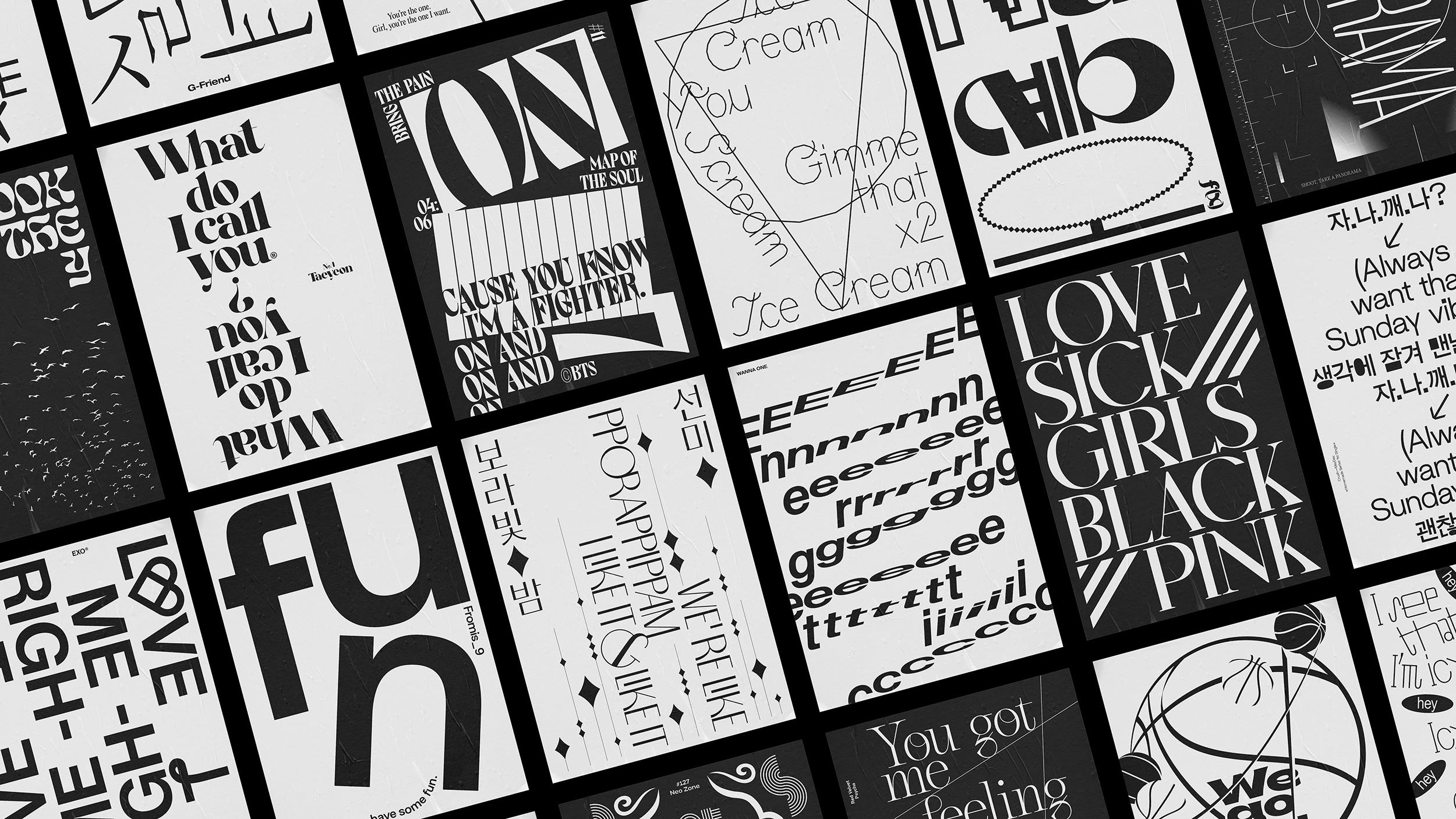
An ongoing heavy typographic K-Pop poster extravaganza aims to make the popular music genre even more inspiring.
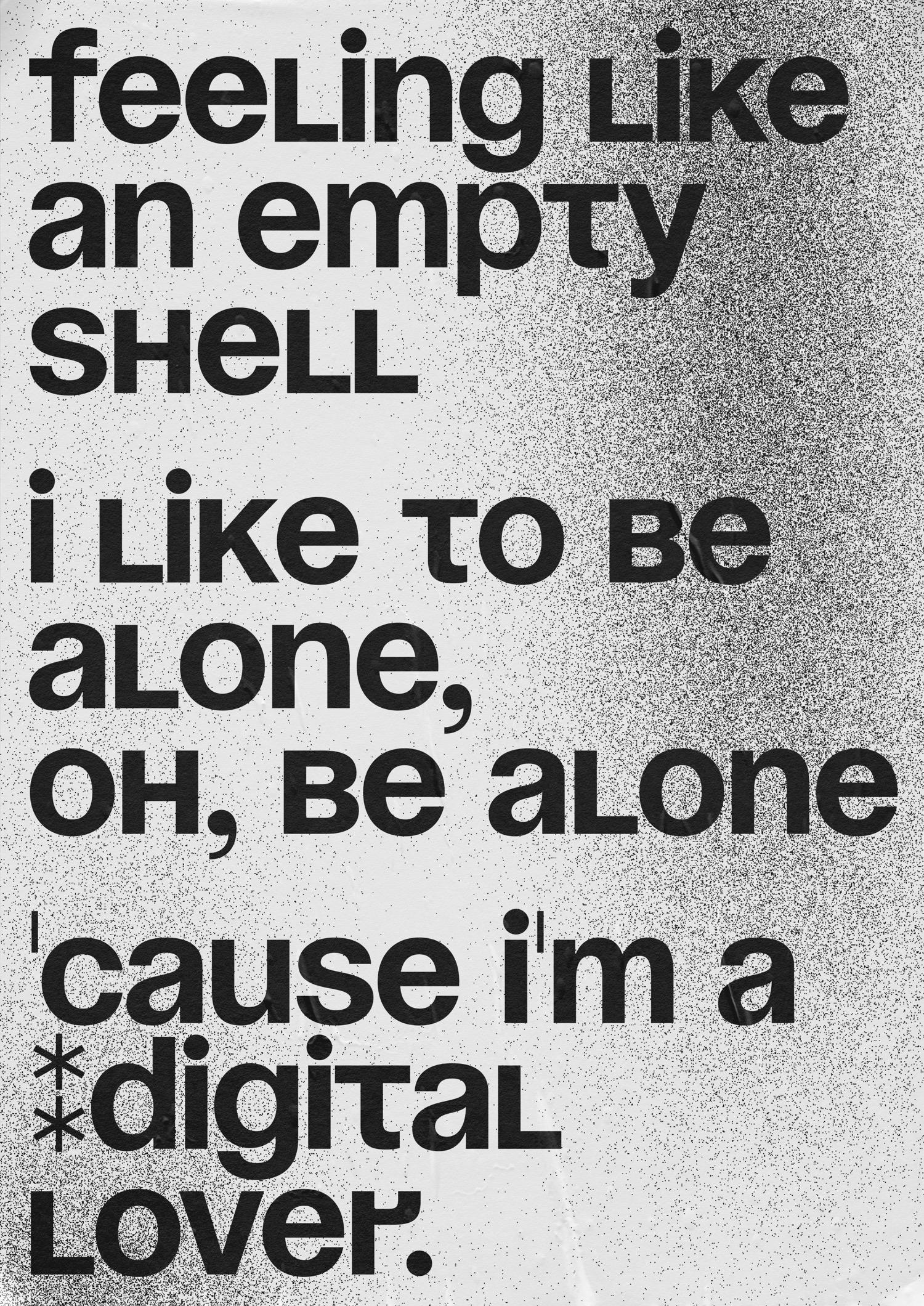
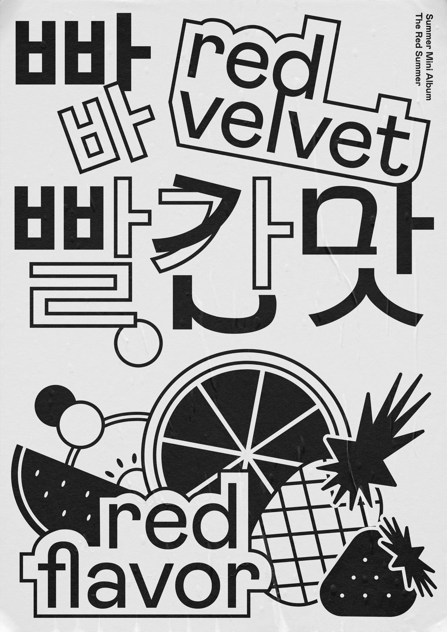
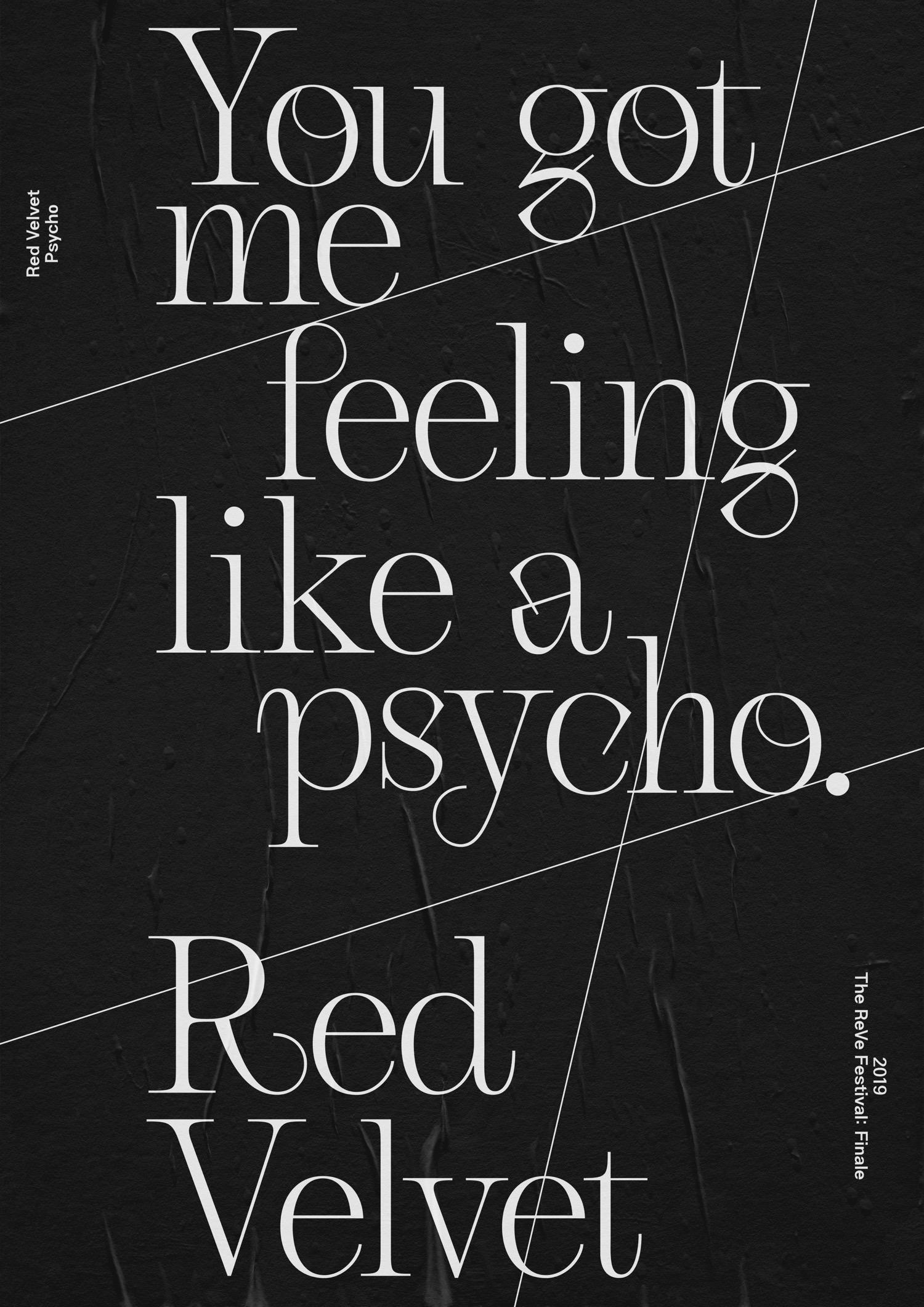
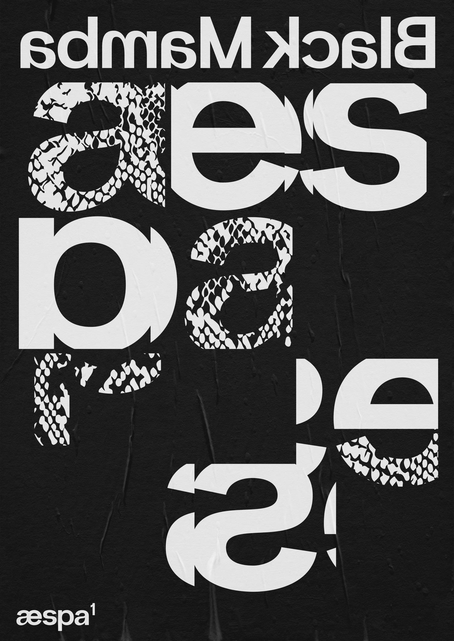
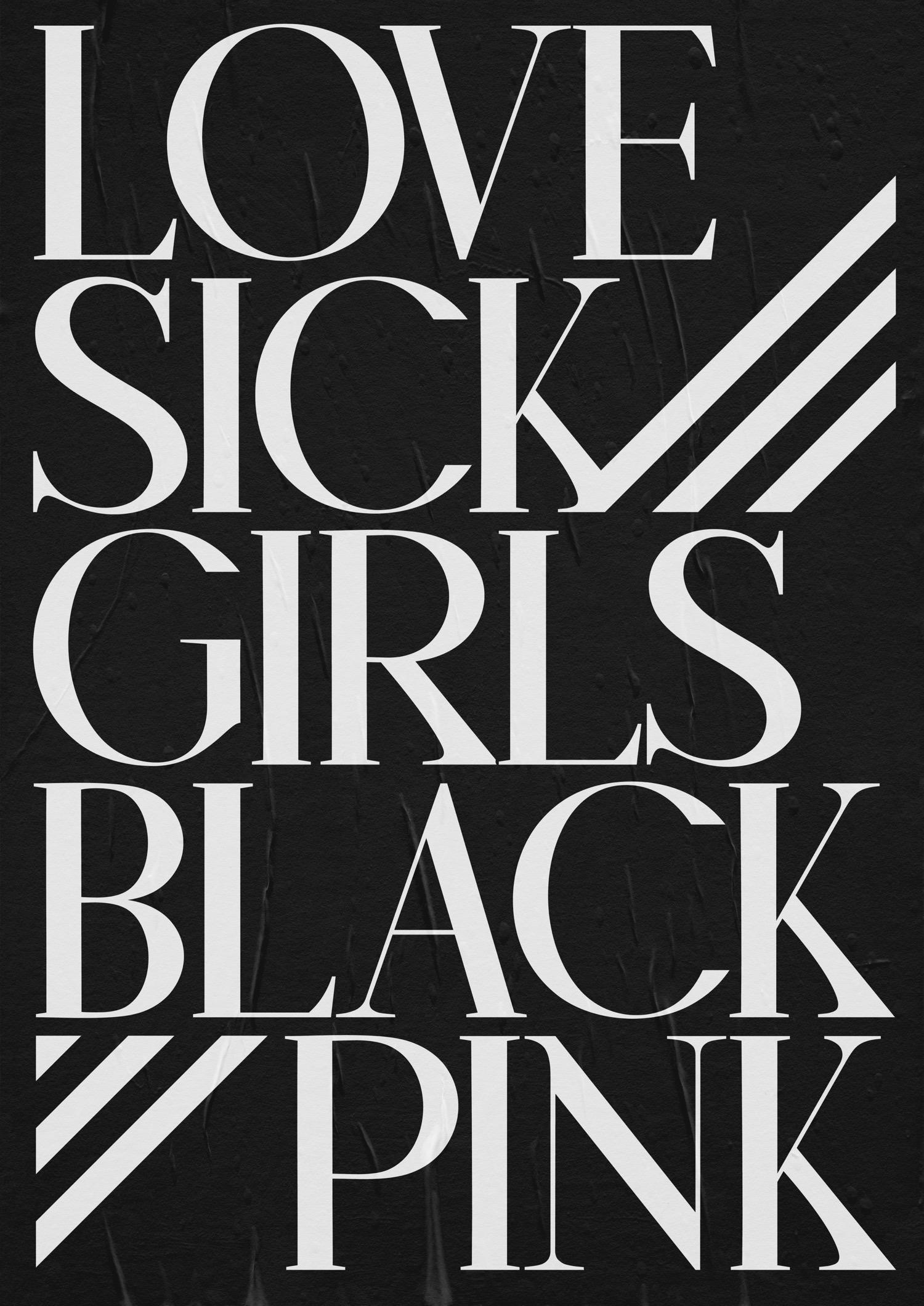
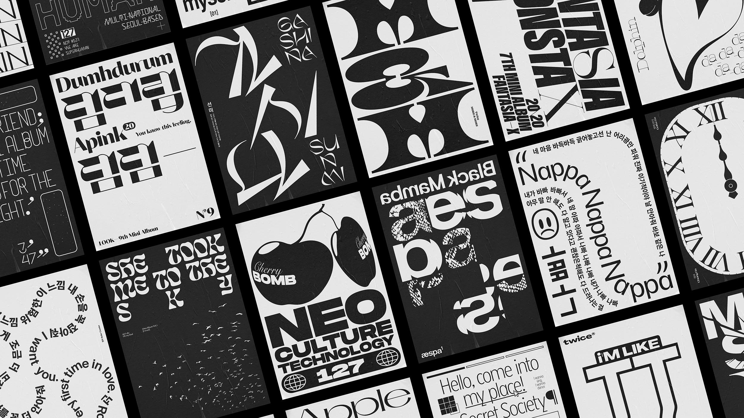
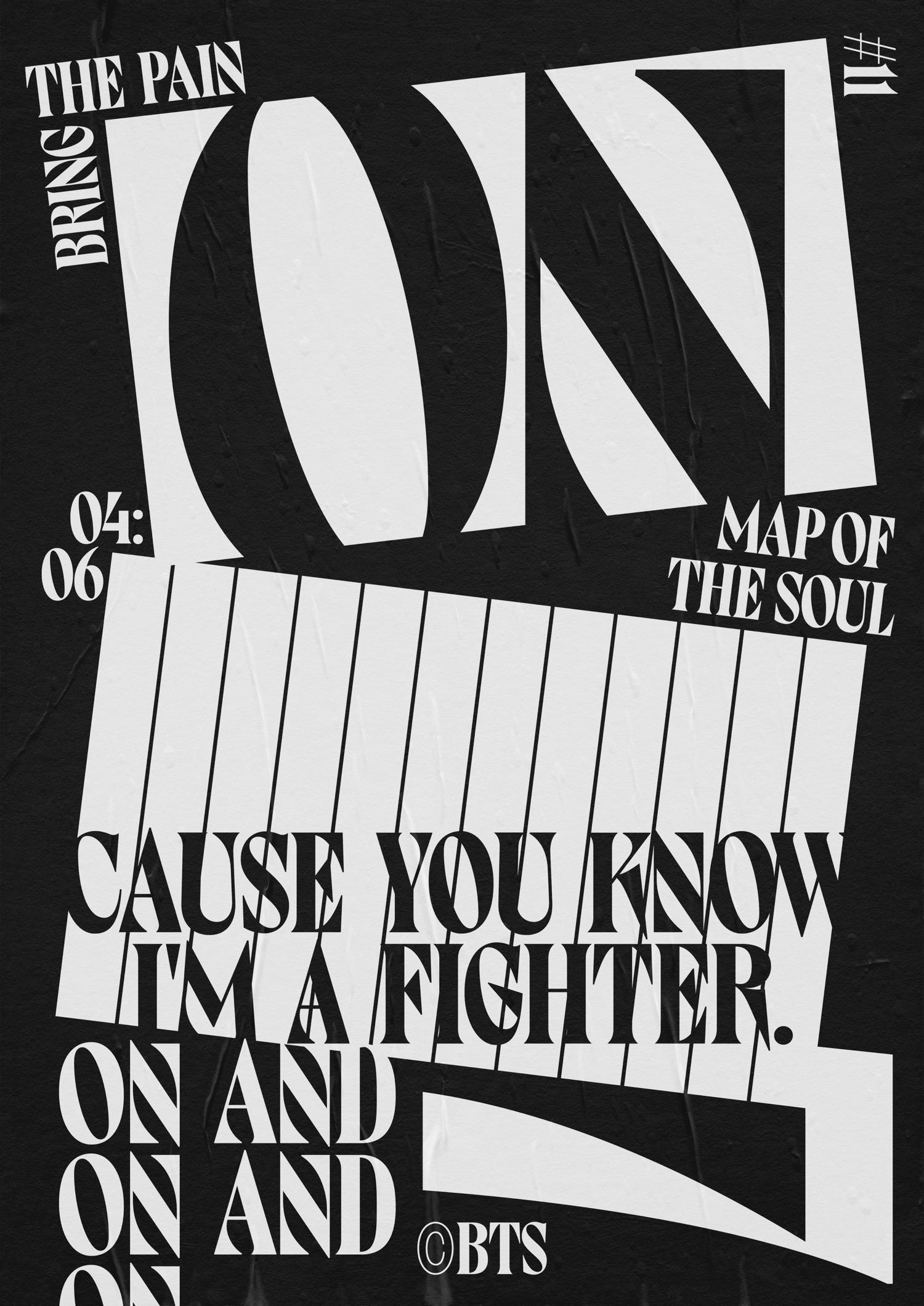
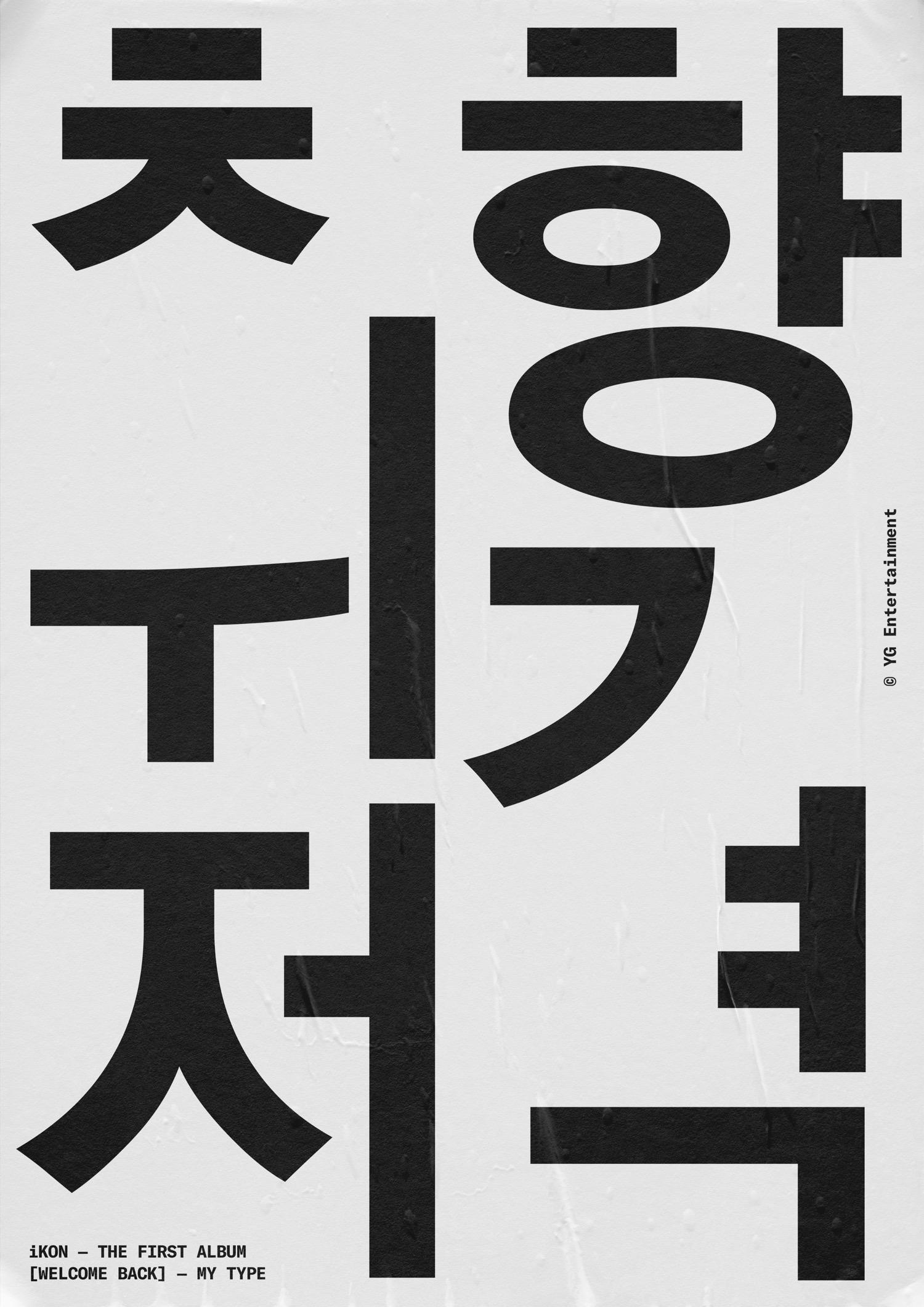
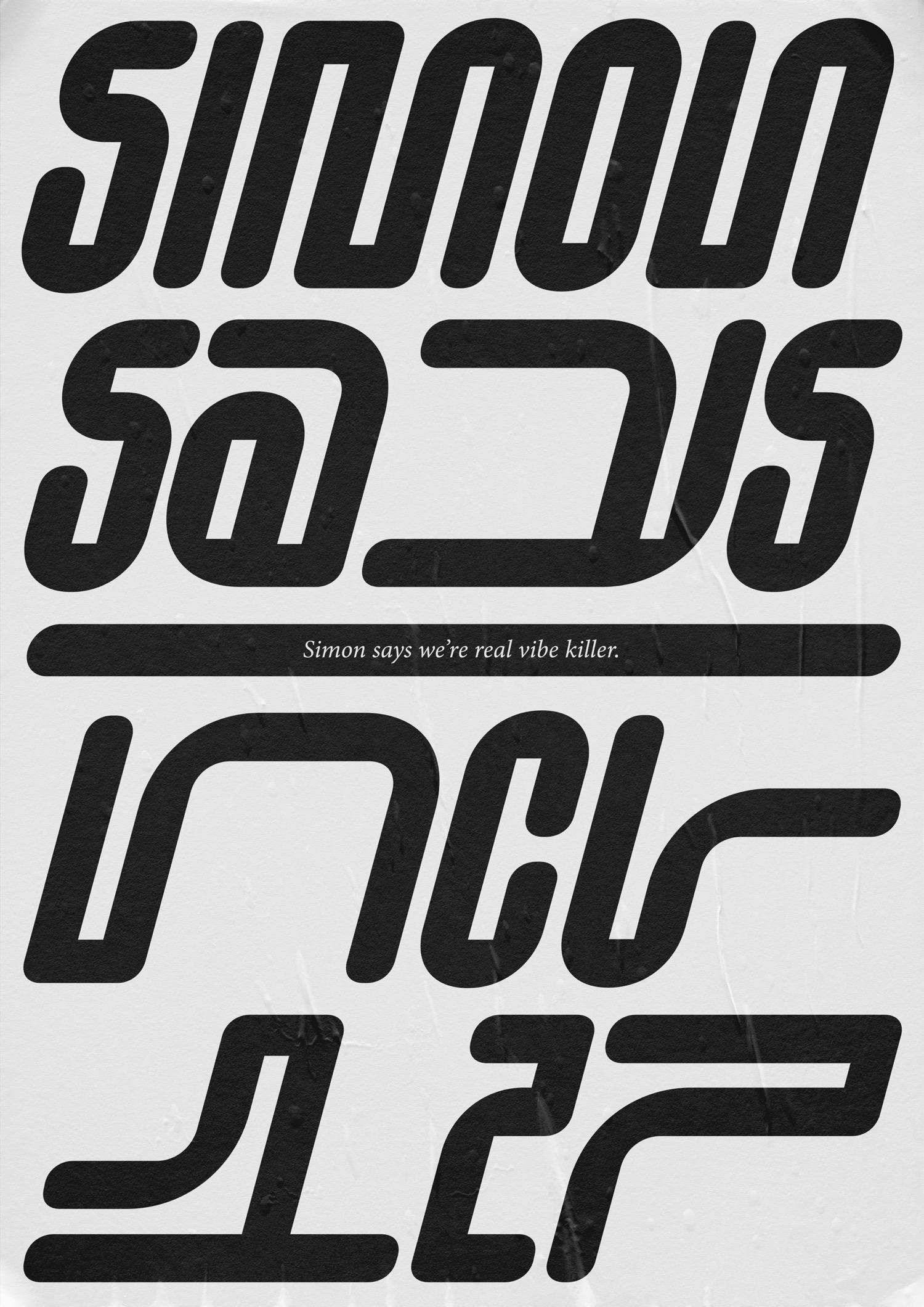
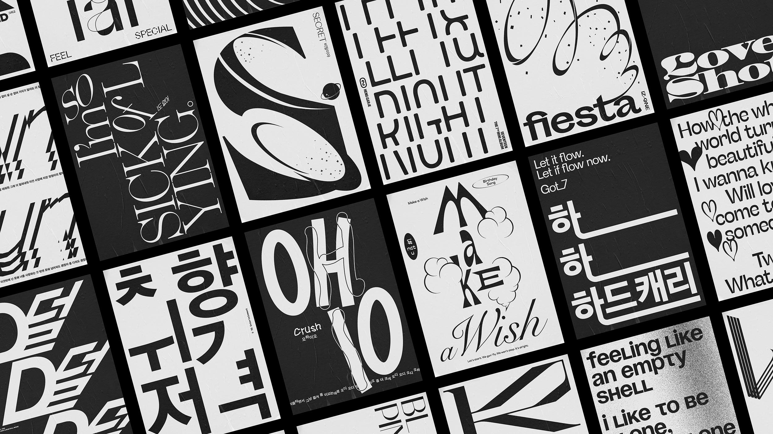
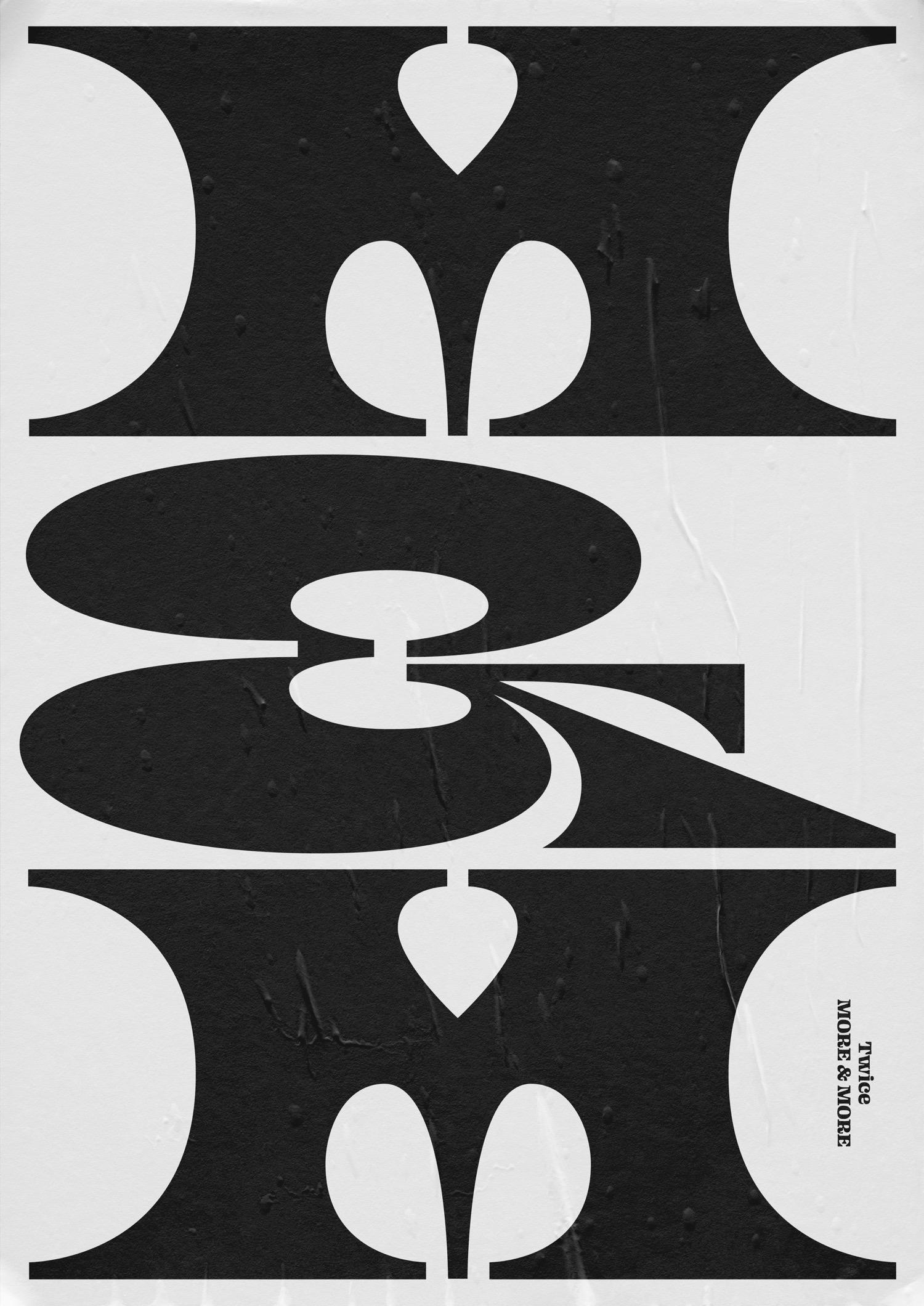
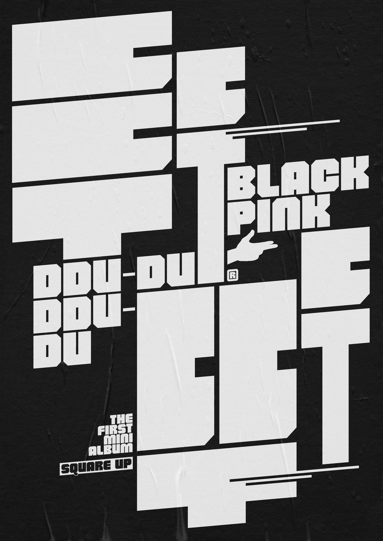
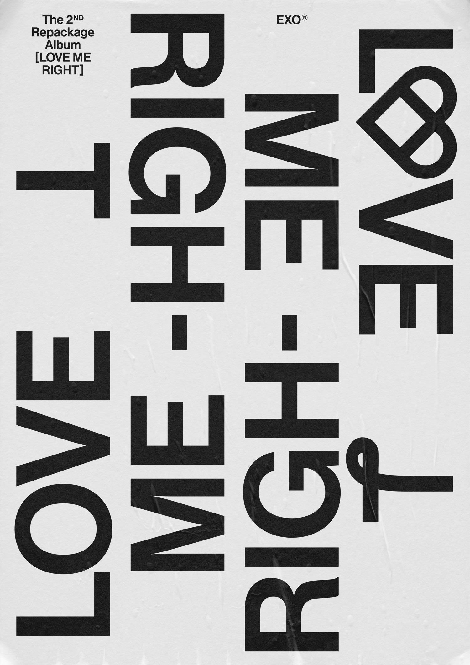
A self-initiated project designed by Junki Hong <jun.playlist> and its K-Pop Music Poster Series started in June 2020. The archive website was launched in January 2021 bringing the designer's main passions into the poster limelight.
As K-Pop songs are always an input that inspires him as a designer, Jun expresses his love for K-Pop. To accompany his playlist a series of typographic posters were made as an outcome.
"Each design is based on a specific song and draws on different elements such as the title, lyrics, and rhythm" notes the creator.
Speaking of his project to the Brand Identity the New York-based South Korean designer Junki Hong explains his method: "My method for the design was making layouts with repeated words. In addition, I mixed Korean and English lyrics like the actual songs."
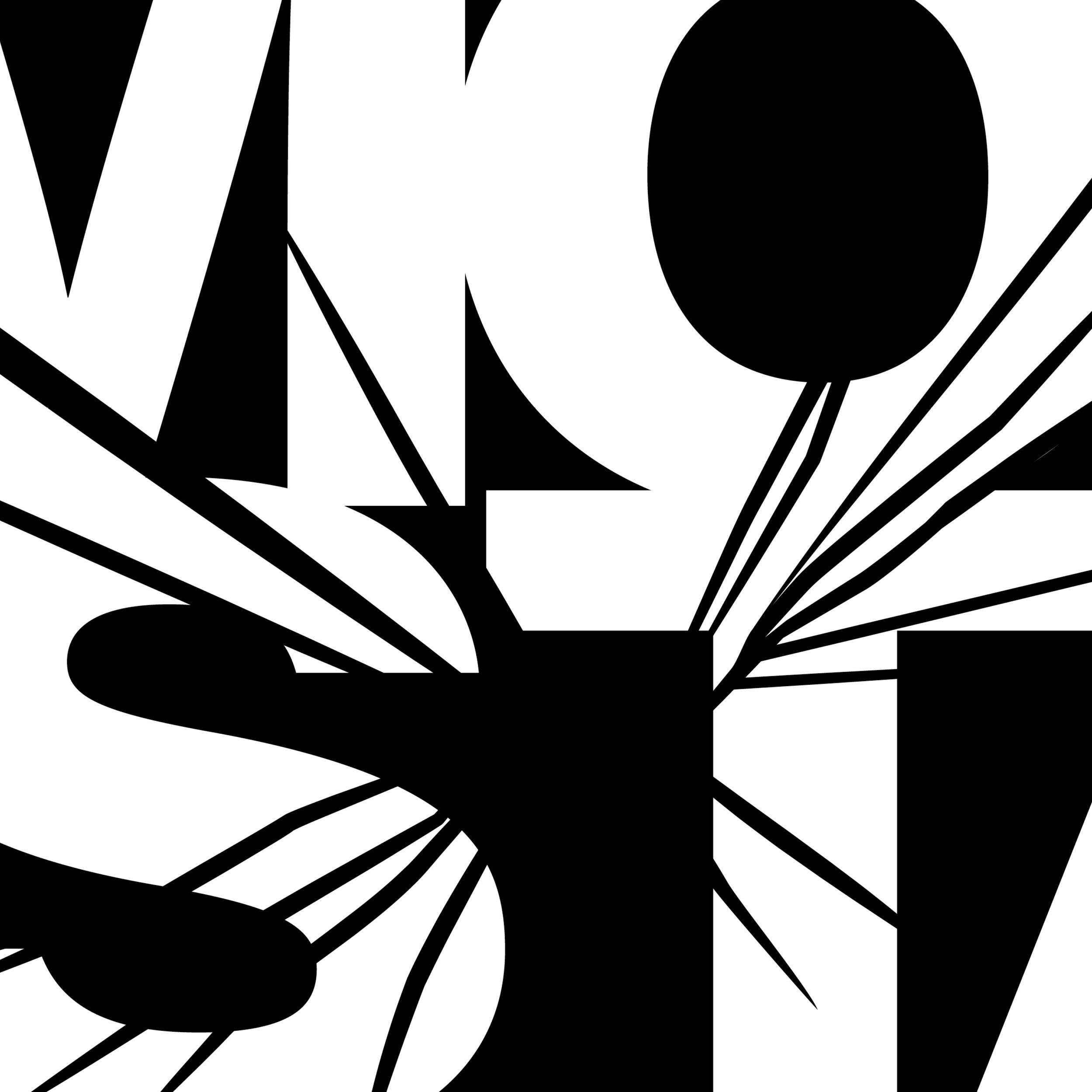
With Hangul's bold forms having a striking effect on the strictly black and white poster designs Hong's poster campaign for K-Pop's addictive rhythms is going strong.
"Before sketching, I tend to get a lot of inspiration from music videos. Graphic motifs were collected based on fashion, makeup, choreography, story, and worldview in the video. When I started making the poster, I picked out repetitive words, choruses, and titles from the lyrics that could effectively convey the feeling of each song. Then, I selected a typeface that suited each song well, and started typography using appropriate characters from the Korean alphabet or the Roman alphabet. After testing the layout, I made several versions of slightly different posters, and among them, the work that best expressed the song was shared with the people" he says to BeAttitude.
ATypI: Sandoll Inc on how to design Hangul type
Through trial and error, Jun literally came up with a project that combined his personal hobbies like listening to music and watching music videos with his favorite fields as a designer: typography, typeface design and lettering design.
"At first, it was more of a light approach, trying to express my favorite K-Pop music using a variety of typefaces. While pondering which typeface would be the most effective to express the feeling of a song, I materialized the project, and experimented with various methods before releasing my first work. After that, when I sorted out the poster design style, my decisions were made faster, and the work started to pile up, and I even started to create an archive website. The website has made the posters more accessible, and has been organized so that you can watch it along with the music video or group it by artist" he adds.
Showing the diversity of typography using Hangul and Roman alphabets, Jun's various experiments of type design and typography makes an interesting, almost pulsing, project.
Jun hopes that ‹jun.playlist› will be an opportunity to discover new songs in the K-Pop genre and a pleasant experience for listening to music.
Designing mainly in Seoul and New York. Junki Hong is interested in experimenting with the relationship between the shape change of characters and the degree of readability, and he produces new works by incorporating this into branding or identity design.
After graduating from the Department of Communication Design at Konkuk University and the MA in graphic design from the California Institute of the Arts, he started working in New York and is currently working in various fields in graphic design in Korea.
<jun.playlist> works as an archive to make an enjoyable experience for listeners and is also available on Youtube and Spotfiy.
Press play here.
Tags/ typography, type, music, poster design, poster, korean, korea, k pop
