DIN Max: A must evolution of an iconic type design
Parachute® has announced an epic new variable version of the iconic DIN, which delivers for the first time, a limitless number of styles within the most extreme design spectrum ever.
“The landscape of visual communication is changing with a fast pace and this new release redefines DIN in order to handle the demands of modern technology” notes Panos Vassiliou, Parachute’s Creative Type Director.
“DIN Max is based on the PF DIN Text type system, a series of typefaces originally designed in 2002, quoted by Publish magazine as being “an overkill series for complex corporate identity projects” says Parachute.
The purpose of the original DIN 1451 standard was to lay down a style of lettering which is timeless and easily legible. Unfortunately, these early letters lacked elegance and were not properly designed for typographic applications. Ever since its first publication in the 1930’s, several type foundries have adopted the original designs for digital photo composition.
“By early 2000, it became apparent to us that the existing DIN-based fonts did not fulfil the ever-increasing demand for a diverse set of weights and support for non-Latin languages” Vassiliou explains.
Aiming to fill this gap Parachute® introduced the PF DIN series which set out to become “the most comprehensive and sophisticated multilingual set of DIN typefaces at the time.” Based on the original standards, yet specifically designed to fit typographic requirements, PF DIN's letterforms diverted from the stiff geometric structure of the original, adopting a subtle humanist warmth.
Almost two decades later, PF DIN Max brings DIN into the variable era.
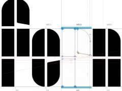
“This is a cutting-edge variable type system completely re-designed and re-imagined from the ground up with 3 design axes” says Vassiliou who literally expanded the utility of PF DIN Max via the introduction of a series of new novelties.
Two newly developed widths -Extra Compressed and Wide- were added at both ends of the design spectrum, with the very narrow widths to be well suited for display use, whereas the wide version to be equally comfortable for display and text use.
With robust strokes, revised spacing, cleaner shapes and higher legibility even at the smallest sizes imaginable, PF DIN Max's expressive character is optimally retained.
“This is due to the adopting of alternates which respond automatically to variations in width and weight and preserve the rhythm of the design” Vassiliou explains.
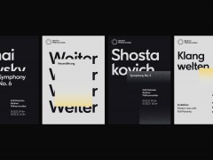
PF DIN Max features a palette of 100 predefined styles (including a variable font file with unlimited variations) and language support for Latin, Greek and Cyrillic. Finally, DIN Max is powered in every variation by 303 symbols for packaging, environmental graphics, signage, transportation, computing, fabric care.
In an era of re-evaluation of our principles and needs, PF DIN Max is the rebirth of an iconic typesystem with a contemporary, fully adaptable design that truly addresses even the most demanding typographic environments. Literally, an epic type design that will meet any designer's needs to the max.
Explore more here.
Tags/ typography, parachute, type design, panos vassiliou, type foundry, type system, din, new release

