Thriving & resilient: The D&AD Awards 2022 winners
Brilliant, inclusive, socially aware and innovative. In its 60th year “nearly 400 of the world’s leading creative minds came together to recognise work that has made a significant impact and will inspire creatives globally” notes D&AD as it wrapped this year’s ceremony that awarded five Black Pencils, two White, 78 Yellow, 188 Graphite, and 421 Wood Pencils.
“In the wake of political and social turmoil, creative excellence continues to not only survive, but thrive” says D&AD chief operating officer, Dara Lynch. “In the backdrop of what feels like a never-ending stream of global crises, it is incredibly reassuring to see that our community remains so resilient, and continues to move in a progressive and vibrant direction.”
Google was awarded a Black Pencil in the product design category for its work on Real Tone, DDB New Zealand was awarded the prize in the media category for Samsung iTest, Adam&eveDDB was awarded its Black Pencil for Hopeline19 and Leo Burnett Chicago won two Black Pencil awards and four Yellow Pencils for The Lost Class, a campaign that addresses in the most heart-wrenching yet incredibly smart way the country’s devastating gun epidemic.
Here, Typeroom highlights some of this year’s Pencil Winners across many disciplines.
Congratulations to all!
-
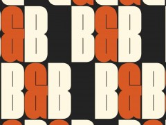
Sinéad O'Dwyer by Greenspace in collaboration with Swiss Typefaces for Sinéad O'Dwyer
Graphite Pencil / Typography / Integrated / 2022
“Having graduated from the Royal College of Art in 2018 with a collection unlike anything seen before, one of London’s most exciting designers — Sinéad O’Dwyer — made her debut at London Fashion Week 2019 to showcase her SS20 collection.
Inspired by Sinéad’s recollections of her and her school friends’ unhappiness with their own body shapes, and with the way bodies are conventionally presented in fashion and the media, the pieces, made from life-moulded silicone swirled with shades of fuchsia, aquamarine, and canary yellow, were worn by a succession of unconventional catwalk models. Greenspace collaborated with Sinéad on the event, ‘Wear me like water’, and designed the accompanying photo zine. Following this, Sinéad asked us to help her to define and design her own brand. We interviewed her collaborators and mentors, whose insights helped us summarise her approach in the words, ‘For the love of every body’. This became the jumping off point for the identity design. We drew a wordmark, informed by the shapes of undulating body forms, and by the materials Sinéad works with, such as silicone casting. We asked writer Anastasiia Federova, one of Sinéad’s key collaborators, to reflect on Sinéad’s ethos and capture her thoughts in words. Inspired by the body, Every Body Suisse is an ever-fluctuating bespoke font designed in collaboration with Swiss Typefaces.”
-
13865 Black Dots and 2 Red Dots by Dentsu Inc. Tokyo for Nagasaki Shimbunsha
Yellow Pencil / Press & Outdoor / Press Adverts / 2022
“As long as nuclear weapons exist, there is a risk that they will be used. *The red dots indicate the number of used nuclear weapons in armed conflict, whereas the black dots indicate the number of existing nuclear weapons in the world (13,865 as of January 2020, Sipri Tearbook). For Nagasaki, August 9 is the Atomic Bomb Memorial Day. The Nagasaki Peace Memorial Ceremony is held annually and is broadcast live. However, Nagasaki faces an urgent matter. 76 years have passed since the end of the war and war survivors are aging. How to pass on the memory and experience of the atomic bomb, as well as increasing public’s attention on nuclear weapons have become top priorities. In addition, this year’s August 9 was the day after the closing ceremony of the Tokyo Olympics. Although Nagasaki mourns every year the loss brought by the war, there is a fear that the importance of this day is being forgotten by others.”
-
The New York Times - Independent Journalism for an Independent Life - Vera by Droga5 New York for The New York Times
Yellow Pencil / Art Direction / Integrated / 2022, Yellow Pencil / Art Direction / Film
“This campaign shows that what you read inspires who you are. For this film, we look to tell the story of one subscriber, Vera, through headlines—using journalistic imagery, typographic sound design and shot footage to 'fill the screen with life'. The story weaves her interests and reading history together into rhythmic prose supported by the voice of Vera herself—bringing you closer to her world. Just like her life, Vera's film is dense with layers, meaning and idiosyncrasies. All these dimensions come together to show how central our journalism is to the identity of its readers.”
-
Social Bullets by Area 23 for Stand for the Silent/ Kazoo
Yellow Pencil / Spatial Design / Installations / 2022
“Research revealed that for every 233 bullying posts online, one teenager attempts suicide. To show this staggering number to parents, we trained an AI on a database of over 2 million human-moderated posts from social media. With machine learning, our algorithm was able to capture bullying posts from 4 major platforms used by American students, collecting more than 70,000 toxic comments/day. That is how Social Bullets was born—an experiment created to warn parents about the dangers of the internet by replicating 24 hours in a typical American student’s life on social media.”
-
Malnutrition Facts by Lanfranco & Cordova for Dole Sunshine Company
Yellow Pencil / Spatial Design / Creative Use of Budget / 2022
“Dole wanted to continue their efforts to shed light on issues like food insecurity and food waste in a purposeful and creative manner. We made use of actual trash as a media space. We placed ‘malnutrition labels’ on trash cans, bags, dumpsters, and trucks across New York City to call attention to staggering statistics on food waste and food insecurity. We effectively made something that often goes ignored, unignorable.”
-
Rio Carnaval - Typography by Tatil Design for LIESA
Yellow Pencil / Typography / Integrated / 2022
“How to think of a symbol that translates the contagious energy of the greatest show on Earth? The parade of the samba schools of Rio de Janeiro. Rio Carnaval is a lively and pulsating brand, which can adapt to the colors of all schools and react to the sounds moving with each turn of the samba of the drums, thus representing carnival. Through programming, it reacts to the sound of the snare drum and tambourine. Its processing allows the adaptation of colors and the unfolding of motion to different formats in an automated way.”
-
Contour Watch Face by Apple Design Team for Apple
Yellow Pencil / Typography / Digital / 2022
“Designed for Apple Watch Series 7 and inspired by the passage of time, the Contour watch face gradually changes throughout the day to highlight the current hour. Custom numerals fit the Apple Watch display and transition seamlessly from one hour to the next. Upon wrist raise, the numerals dynamically grow into focus and recede into a quiet, uniform composition when returning to rest. Turning the crown navigates through the variable weight axis offering a glimpse into the past and future. Regular and Rounded type styles can be personalized to complement the colors of Apple Watch bands.”
-
The Cookie Factory by DDB Paris for UNESCO France
Yellow Pencil / Experiential / Use of Technology / 2022
“Today nobody knows how our data is being exploited on the Internet. When we ‘accept the cookies’, what do we really accept? What are the consequences? For UNESCO, it is truly important that every person has control over their own data. To raise awareness about the exploitation of personal data UNESCO has launched the Cookie Factory. An online extension which browses the web on the user’s behalf in order to organically replace their cookies with those of a fictive profile. The goal is to show them the impact of their data’s collection in a playful way by fooling the algorithms.”
-
Rejected Ales by Howatson+Company for Matilda Bay
Yellow Pencil / Direct / Direct Mail / 2022 & Yellow Pencil / Writing for Design / Storytelling & Yellow Pencil / Experiential / Retail
“It took the Matilda Bay brewers 27 batches to create a beer that met their master brewer’s standards. They called it the Original Ale. To promote this perfect brew, we released the almost perfect rejects. Rejected Ales, the best beers you were never meant to taste. With names like ‘Yeah…nah’, ‘Keep dreaming’ and ‘Ballpark’, each of the 27 cans tells a story of its rejection, brought to life in fridges, outdoor, press, film, radio and sample packs for journalists. Rejected Ales and Original Ale were distributed in leading bottle stores, allowing Australia to discover the journey to perfection.”
-
58th Golden Horse Awards by Bito for Taipei Golden Horse Film Festival
Yellow Pencil / Branding / Motion / 2022
“We created a brand-new vision for the Taipei Golden Horse Film Festival (TGHFF), one of the most prestigious Asian film festivals. During the pandemic, humans began to reflect upon the definition of distance while refocusing our life goals. For this project, the visual system was built to resonate with the public.We focus on Chinese typography in motion, using the concept of blurriness to convey the theme of refocusing.”
-
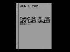
National Magazine Awards by Rethink Canada for National Magazine Awards Foundation
Yellow Pencil / Branding / Campaign Branding / 2022
“The National Magazine Awards celebrate excellence in journalism and visual creation. For over 45 years, it has been considered one of the most prestigious awards in Canada’s publication community. For their 2021 showcase, they needed a creative expression to help celebrate the best in Canadian journalism. We created an identity centered around the printed magazine in its most distilled form: the spine. From there, the design system explores a range of perspectives – inspired by the wide range of publications that submit to the award each year.”
-
The New York Times for Kids: Covers by The New York Times for Kids for The New York Times
Yellow Pencil / Magazine & Newspaper Design / Newspapers / 2022
“In keeping with The New York Times dedication to innovating in print, The New York Times Mag Labs produces these singular, visually driven, print-only broadsheet sections. The New York Times for Kids is published monthly, with a new issue in the paper on the last Sunday of each month. Since their inception in 2016 these sections have become a much-anticipated feature of the Sunday paper. This section aims to entertain and stimulate kids, to engage them creatively with the news, while never talking down.”
-
SF Symbols 3 by Apple Design Team for Apple
Yellow Pencil / Type Design / Multi-Style / 2022
“SF Symbols 3 features over 600 new symbols including localized variants across eight scripts. New rendering modes provide greater control over how color is applied to symbols. Hierarchical rendering adds depth and emphasis using a single tint color that is automatically applied in varying levels of opacity. Palette rendering allows symbols to be customized with multiple contrasting colors. Multicolor rendering provides intrinsic color across hundreds of symbols. An updated SF Symbols app offers a new inspector, image export options, and improved support for custom symbols.”
Winning projects are to be showcased in the D&AD annual later this year.
Explore the selected projects that push the limits of visual communication here.
Tags/ typography, type design, advertising, branding, apple, social change, gun epidemic, bullying


