European Design Awards 2022: Verve, Chevalvert, Parachute Typefoundry, Beetroot & more winners to inspire
Europe of creatives united. The European communication design scene celebrated the 16th edition of the European Design Awards in Tallinn, Estonia on 18 June 2022, and this year’s winning projects will inspire, motivate and impress.
The European Design Awards Ceremony 2022 attracted guests from more than 100 creative studios and agencies, arriving from 19 different countries from all over Europe, in a warm and optimistic event that took place at the Kultuurikatel Creative Hub Tallinn.
In this first post-covid gathering, the majority of the winners did not shy away and showed up to pick up their Awards in person, even if for some of them it was an emotionally difficult journey notes the EDA team that “aims to celebrate European design
with all its regional distinctive elements as well as its common grounds, to facilitate European designers and build a network of talented individuals and teams in order to raise standards for communication design throughout the continent.”
In their 16th edition, ED Awards once again recognized excellence in all areas of communication design whilst offering the European professionals and students the opportunity to promote their best work on a pan-European scale across 44 distinct categories.
“Among the many projects submitted for 2022, the 139 that made it to the top, prove that visual design can have an impact in our lives, connecting people of all cultures” adds EDA.
In total 33 projects received Gold prizes, 53 silver prizes, and 53 bronzes. These winning projects came from 23 different European countries.
The 2022 European Design Agency of the Year is Verve by Vruchtvlees, a “group of designers, developers, and strategists who transform good brands into great ones. They take pride in having grown up as a digital agency, and they love the possibilities it gives them to work faster (and better), jump on new technologies and forge deeper relationships with users. They combine their digital-first mindset with razor-sharp strategy and outspoken design to distill their clients product’s energy into an unforgettable story.”
“We’re insanely proud of the team” said Verve. “Out of over 1400 submissions that came from 34 different countries, the renowned jury of the European Design Awards especially appreciated the work we've done for Flutterwave, Tuum and Nederlandse Reisopera, resulting in four awards: gold, silver and bronze! From Fintech to opera and from Nigeria to Estonia, we’re more than proud to receive such appreciation for our team's work.” “Being crowned European Agency of the Year feels like a fuelled rocket engine that fired” added Roman Stikkelorum, co-founder and managing director at Verve.
-
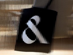
The Best of Show Print distinction was awarded to the visual identity applications of a new institution dedicated to creation and innovation around the french language and uses in the contemporary world aka Château de Villers-Cotterêts - Cité internationale de la langue française, created by Chevalvert.
“The Château de Villers-Cotterêts was built in 1556 in the Hauts-de-France region, in the north of Paris (France). It has been for a long time an emblematic place of the French language, where King Francis the First decided in 1539, that French would replace Latin in legal and administrative acts of the country. The castle and the city of Villers-Cotterêts also are internationally known for having been the place of renowned writers such as Molière, Racine and Alexandre Dumas. In 2022, the Château de Villers-Cotterêts will be opened to the public for the first time. The Presidency of French Republic gave the mission to the Centre des Monuments Nationaux to lead a deep restoration project, in order to create in its walls the upcoming Cité internationale de la langue française, as a tribute to its past. This new institution will be dedicated to creation and innovation around the french language, its evolution, spreading and uses in the contemporary world. Chevalvert designed the visual identity of the Château de Villers-Cotterêts around a typeface (Exclusive typeface, CVC, designed by Production Type, in this common project), which became a graphical key element of the logotype and of the whole visual system based on a frame. The logotype was designed as a mesh of capital letters. The set of greases gives a reflection to the logo, as well as the frame, which may be animated on digital versions of communication. The waves and reflects generated by the movement of the characters remind the French language and its constant unpredictable evolution” explains Chevalvert
-
The Best of Show Digital distinction was awarded to Redis Agency’s Sakharov.space, a digital museum, dedicated to the centenary of the great scientist and human rights activist Andrei Sakharov.
“Sakharov.space is a digital museum of Andrei Sakharov, dedicated to the centenary of the great scientist and human rights activist. It is the first and only large-scale project of its kind. Its purpose is to tell the life story and preserve the legacy and contribution of Sakharov to the struggle for human rights. The structure of the museum allows you to reach and interest a wide audience with varying degrees of immersion: a visitor can learn about Sakharov's personality in 7 minutes by watching a video or immerse himself for half an hour in an animated timeline of his life. A Library has been made for the most curious: it contains a detailed biography of Sakharov, texts about the scientist, and his own works. Visitors will have access to an extensive archive: hundreds of photos, unique documents, video, and audio materials. We took the liberty to integrate modern design solutions into this project so that it turned out to be spectacular. For example, we created a 3D imagery of Sakharov and implemented it using WebGL technology. The archive images helped us make the features of the 3D model similar to real Sakharov ones. Then we animated it, recreating the atmosphere of an old movie. The work is unique from the point of view of development: the site is assembled by 85% on the Webflow platform and by 15% using WebGL” explains Redis Agency.
-
As for the Jury Prize, this was awarded to Identitätsstiftung for their project Courage, a display typeface designed for the ZeitZentrum Zivilcourage, an interactive place of learning about Hannover’s urban society during National Socialism and an open discussion space for civil courage.
“Our Challenge: The ZeitZentrum Zivilcourage is an interactive place of learning about Hannover’s urban society during National Socialism and an open discussion space for civil courage. To manifest an open and flexible design system, the visual identity is not bound to strict rules of space and layout. Its core design takes place in the typeface development which is distributed as a corporate font – a democratic tool to create and communicate the core values of ZeitZentrum Zivilcourages identity. The Solution: Courage was developed as a display typeface for the Zeitzentrum Zivilcourage. An exciting headline dynamic is created by the selective combination of Sans-Serif and Blackletter shapes. This basic idea of tension through stimuli and traces of the past was the conceptual basis for developing the type. The font can be used to start up a discourse. The corporate font combines a geometric Sans-Serif structure with Blackletter script. A reference to historical German typefaces. In their basic form, they are oriented towards a circle (sans serif) and a rectangle (Gothic) - two opposing forms in one type. The Blackletter typeface disrupts its sans serif companion and leaves a historical trace: The decision to use Blackletter shapes for the typographic system of [Z] is a reaction to the so-called »Normalschrifterlass« from 1941 – a decree by the National Socialists prohibiting this kind of script by calling it Jewish letters. A pseudo-scientific cognition that was instrumentalized to enforce political interests. Thus the font gives impulses of visual interruption, raising questions and seeking answers – a typeface as a conversation starter” explains Identitätsstiftung.
-
Typeroom’s parent company, Parachute Typefoundry had a winning streak with two gold distinctions.
Parachute’s biggest website upgrade ever captured the jury’s attention and was awarded the gold Prize in the E-Commerce category -an acknowledgment of a project that was two years in the making to provide a unique typographic experience coupled with a secure and easy-to-buy procedure.
“After two years in development, the brand wanted to deliver an elevated e-commerce experience and offer a transparent look into the world of Parachute Typefoundry. Designed by design studio Typical Organization in collaboration with Parachute's in-house creative studio, the new website is a fresh take on an all-time classic typographic affair. It brings the full spectrum of the brand's work into the limelight and positions Parachute as a type design agency that offers cutting-edge services and eclectic typefaces for some of the world’s most iconic brands and institutions. Structured around highly-responsive layouts and grids, the new website invites the user to browse the variety of typefaces via an elaborated font tester. Parachute’s unique Test Drive mode lets you discover the many styles and supported scripts of each typeface, type in any writing direction whilst making -for the first time online- pairing simultaneously multiple variable and non-variable fonts an easy task. The intention with this particular tester was to provide an online experience similar to the one designers are accustomed to when they work with desktop applications such as Illustrator or InDesign. The website’s grid structure which combines a swipe and scroll experience showcases fullscreen animations of detailed typeface imagery and limited edition goods in an environment that makes the beauty of the letterform stand out. In black or white, the website features other built-in colour themes as well, in order to elevate each type system’s different mood and context, whilst its mobile version offers a comparative user experience by including tester and buying options. The homepage opens with a set of still images and animated type which one may view by either scroll or swipe, followed by the main section which includes a showcase of each typeface, a tester, and an integrated buying section. With the needs of branding and design professionals in mind, it combines its minimal and rigorous aesthetic with functions that let the user explore and buy fonts effortlessly via a non-complicated ultra-fast buying procedure. Overall, Parachute’s highly-configurable and dynamic new online presence engages the visitor with a real type-heavy narrative in an authentic manner” explains Parachute.
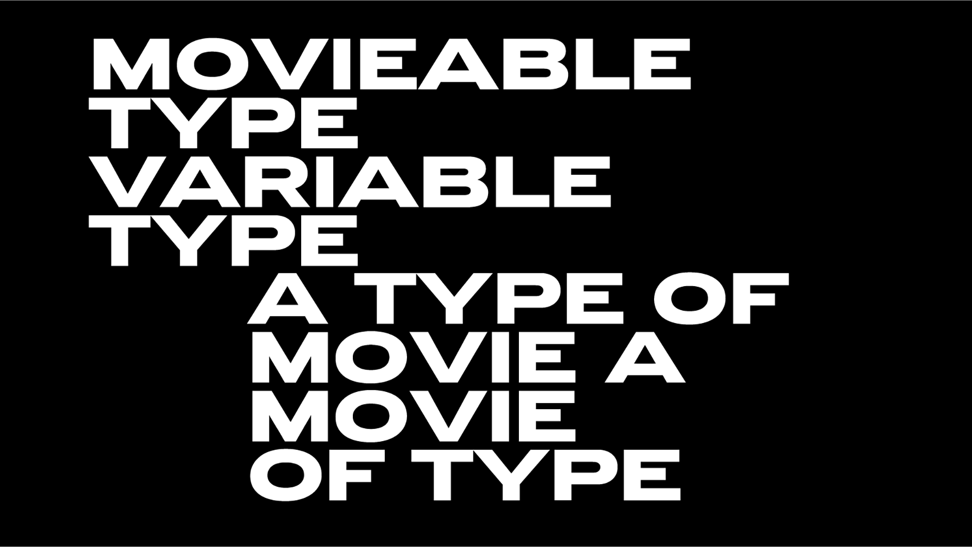
In the Motion Graphics category the vibrancy of PF DIN Max, Parachute Typefoundry’s variable type system as presented in the dedicated video created by Beetroot Design Group, was another gold winner.
“Communication calls for flexibility, freedom of expression, the ability to choose. The new DIN MAX font by Parachute is a variable typographical system with an expanded width range for cleaner shapes, higher legibility, and an expressive typographical character. In a universe where communication channels multiply at a dizzying rate, DIN MAX ensures clarity and adaptability to address demanding typographic environments. We created a presentation video that employs impressive, colorful and fun motion graphics to highlight the advantages of using DIN MAX. The multiple variations of typeface used in the video are the best proof of how flexible and effective it is, especially for digital and animated channels” explains Beetroot.
The creative and design agency won another gold distinction in the Book & Editorial Illustration category for Hatzopoulos Book Illustration and a bronze in the E-commerce category for the multifaceted food, design and education project Yiayia and friends.
Bringing Europe’s creative forces under one roof for excellence, this year’s EDA sees Germany returning to the top spot in the country listings for the first time after a decade with 6 gold, 6 silver and 3 bronze prizes, followed by the Netherlands and Norway.
The Awards Gala was a crowning conclusion to the European Design Festival, curated and co-organized by the Estonian Design Centre. Next year’s EDA Festival will be hosted in Luxembourg, with the care of Design Luxembourg.
Heartfelt congratulations to all winning entries and a big shout-out to the people that make European Design Awards a highly successful event that nurtures creativity made in Europe and calls for unity via means of creativity.
Tags/ typeface, branding, awards, competition, european design awards, europe, parachute typefoundry, e-commerce, beetroot, motion design, agency of the year, verve, chevalvert, pf din max


