High type! Five branding projects that destigmatize the cannabis industry
Times are high! According to a recent Gallup survey more Americans smoke marijuana (16%) than tobacco cigarettes (11%), a milestone that shows the power of the cannabis industry. “The surge in new cannabis users has been a boon to marijuana companies, which are looking to expand the existing $30-$40 billion US weed market” reports Quartz.
As cannabis is increasingly normalized, packaging and branding values play a vital role in creating a new visual language for the industry rooted in typography and bold graphics.
Here Typeroom highlights five case studies that demystify and destigmatize the cannabis universe.
-
“As a new player in Canada’s competitive cannabis retail market, Alchemy distinguishes itself from the competition by providing clients with a fully immersive experience in a space designed by Studio Paolo Ferrari” explains Underline Studio which was commissioned to design a brand identity for Alchemy.
Inspired by the company’s name and its product “the wordmark is in a constant state of change, echoing the meaning of the word ‘alchemy’—a seemingly magical process of transformation—and the feeling of transcending from one state to another that cannabis can evoke.”
Underline Studio’s brand program was extended across packaging, signage and print and digital collateral set in Helvetica Neue and Mabry typefaces.
The fluid-like circular gradient mark changes colour with each application with the final project delivering a minimal, high-end aesthetic to the cannabis experience.
-
“We worked hand in hand with Road, who brought us into the project, and together we took on a trip of defining a coherent strategic proposal, and a correspondent visual output for the brand” explains Morillas on Roor’s vibrant packaging that takes cues from the psychedelic 60s and the acid 90s.
“The wordmark is expressed in a simple, direct, friendly way. Its design aims to bestow the new identity with a solid image of broad appeal along with a strong brand promise: Experience the highest. Our strategy team came up with this brilliant idea of a brand concept that fully conveys Roor’s experiential approach to smoking. It’s a witty word game that plays with the slang used to describe the effects of smoking cannabinoids and hints at their high-quality rolling papers that offer the best smoking experience.”
“Roor’s corporate colors are cheerful and eye-catching to consistently deliver our ‘Experience the highest’ concept and bring it to life. We carefully selected a chromatic hierarchy and range for the brand: Black being the most important color, followed by orange, green and yellow. This coding, together with all the identity elements based on the acid graphic, such as the stickers, the wild trippy typos and the 90s analogic vibe, results in an amazing packaging design for the brand.”
The creatives have also created the term Cannasseurs “for those who cannabis represents a way of being, a philosophy that inspires and allows their personality and creative soul to be expressed. Cannasseurs can now experience the highest with RooR rollings papers. A brand that dignifies and destigmatizes the cannabis universe and elevates its consumption moment to a lifestyle experience.”
Set in Monument Extended the overall brand strategy and design for the “pioneering German brand of the world-first rolling papers with CBD-infused natural gum” Roor aims to “bring a new meaning to cannabis.”
-
Serviceplan X Freedom Grams
Founded by Last Prisoner Project, a non-profit dedicated to cannabis criminal justice reform, AROYA, a cultivation management platform specialized for cannabis and GABY Inc., one of the largest cannabis retailers in the California market, Freedom Grams is a platform for the cannabis industry and its consumers.
“While most people in the U.S. enjoy the benefits of cannabis legalization, 40,000 are still in prison for it, forgotten by the public. Freedom Grams is a cannabis brand that makes consumers aware that others are still in prison for amounts they can legally buy today. All proceeds fund legal action to get them out” notes Freedom Grams.
Global advertising agency Serviceplan Group was commissioned to design and brand the initiative. The agency came up with the open source generative label design system for all needs that features bespoke generative typography.
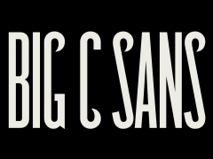
Condensed and extended the responsive bubble-like typeface created by type designer Michael Classes is paired with Akkurat Regular, Bold and Mono for neutrality.
“The design system is based on prison bars from which generative typography literally breaks free, symbolizing the project’s theme of liberation” explains the agency.
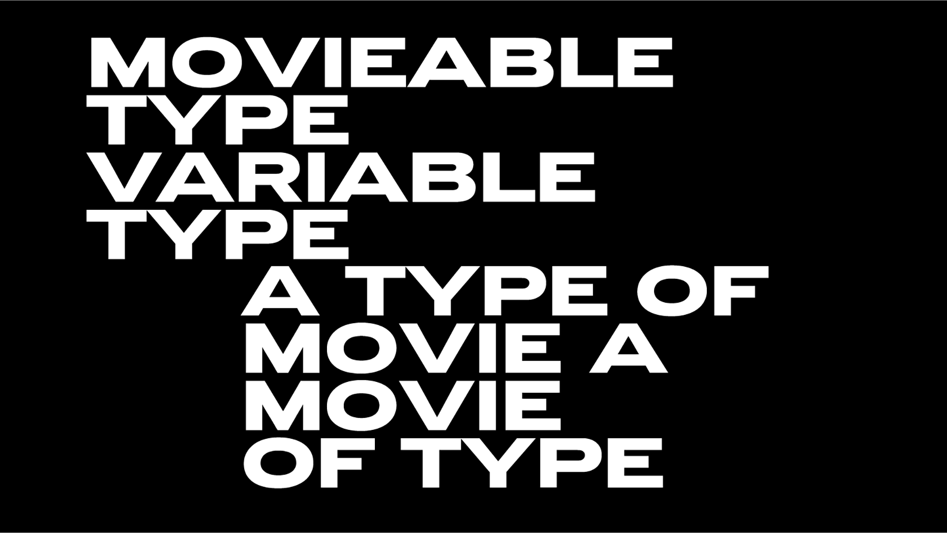
“The custom variable type has two fonts, extended and condensed, with each character constructed from two perspectives — from inside the grid and outside. This visualizes the contradiction between the treatment of consumers and those in prison.”
“The custom label generator and type tool uses generative design to produce labels based on user-submitted data.”
Freedom Grams enables consumers to use their freedom to free others. Find out how you can act to support the initiative and free cannabis prisoners here.
-
Founded by long-term collaborators and friends – actor Seth Rogen and writer/producer Evan Goldberg Houseplant is a cannabis and homeware brand that made headlines ever since it premiered in Canada. On the occasion of Houseplant’s launch in the US market, the company commissioned MA-MA and Pràctica to rebrand the line for a brand new audience.
The modernist redesign features a wide typographic system set in custom typeface designed by Tipografies’ Jordi Embodas.
“Taking Houseplant’s existing logotype and symbol as the starting point, we developed a typographic and illustration system that helped unify and revamp the brand’s new wide range of products and overall communications” explains MA-MA.
“The redesign includes the introduction of a wider typographic system with a custom typeface that is based on the original logotype, a unifying illustration system that helps represent the forms of the products packaged within, and a fresher color palette with brighter hues to convey the vibrancy of the company.”
“The structural packaging itself maintains a simple design; a solid colored drawer system, in which the complimenting color is featured within the typography, line illustration, pull tab, and eco-foam within. In line with the company’s goal to be more sustainable, we also designed a series of recyclable tin ‘jars’ to house the cannabis goods, as well as, tin cases for pre-roll joints.”
“The ‘jars’ have been designed such that they can stack like legos, acting as a collectible and reusable keepsake. In efforts to keep the packaging as sustainable and with as little waste as possible, we designed a simple label wrap for the tins made out of cardstock paper with printed graphics.”
-
“Glaze is a modern cannabis company whose goal is to improve the consumer experience through smart gadgets. They came to us with a need for an exciting, trustworthy brand” explains Navarra about its eye-capturing project.
“As big fans of disproving the validity of the zero sum game mentality any chance we get, we decided to create an identity that is fun and proper at the same time. We stayed away from your run-of-the-mill stoner brand aesthetic, while also steering clear from the generic consumer brand territory. We wanted it to have a fiery, cinematic nature - a strong presence. We wanted it to burn.”
“From the name and logo to the typography and packaging - we created a potent brand narrative without using one element too many. The logotype is made out of custom black Grotesk letters created from scratch that have an organic touch to them.”
Glaze’s bold typographic system is “based on Arial Regular worked into a classic grid system. Color scheme: black, white and red. All are powerful tools when used well” notes Navarra.
Tags/ typography, typeface, logotype, branding, rebranding, bespoke, custom type, cannabis

