Print for the win: ten awarded magazines that inspire
“Being print only will ensure a slower experience, allowing the reader to take time to savour the high production values and unique content” Matt Willey told Typeroom about his latest publishing venture aka INQUE.
The annual literary magazine “dedicated to extraordinary new writing” aims to document what is going to be an era-defining decade, runs no advertising, have no web version, and is to be published for ten years only in 10 limited edition issues.
INQUE has been awarded a Pencil at this year’s D&AD Awards and is available to purchase here.
Typeroom presents you with the Pencil awarded independent titles that push the magazine envelope forward either in print and in digital format. Enjoy:
-
Kindling 02
Kindling is “the new magazine for people with children from the team who make Kinfolk. Packed with thought-provoking features, fun activities and playful photography and illustrations, it’s a place to explore the fresh perspectives that come with raising a child.”
In the awarded #2 Body Issue the Kindling team partnered with Wow in the World to answer children’s most curious questions about their bodies, interviewed the Swedish social worker who successfully campaigned for the “snippa”—a neutral word to replace the many euphemisms used for female genitals, and reported on the important role of parents and caregivers in making children feel good about their bodies.
All these coupled with fashion shoots that feature “DIY hi-vis outfits and customizing crutches, wheelchairs and casts!”
Now in its third issue dedicated in Imagination, Kindling is available to purchase here.
-
The New York Times for Kids
Published monthly, with a new issue in the paper on the last Sunday of each month since its inception back in 2016, the New York Times for Kids is one of the most anticipated features of the acclaimed newspaper’s Sunday edition.
The New York Times for Kids section aims to entertain and stimulate children while engaging them creatively with the news – all without talking down to them.
The New York Times is dedicated to innovating in print, and the singular, print-only broadsheet sections produced by The New York Times Mag Labs is one example of that.
-
Acne Paper 16: Age of Aquarius
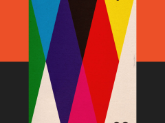
Following the launch of the Acne Paper Book in June 2021 and after a seven-year hiatus, Acne Studios resurrected its in-house print edition with its 16th issue title “The Age of Aquarius.” A hybrid between a book and a magazine, the new Acne Paper was reimagined with a new format and bold design direction, expanding to 500 pages, a revised size format and a cover that unfolds into a poster, in keeping with its legacy as a collector's item.
From Indonesia to Bangladesh, Colombia to China, India to Mexico, the United States to Europe – from outer space to the deep blue sea, from our ancient ancestors to thinkers of tomorrow, all of this and more is featured in this issue of Acne Paper dedicated to the new astrological age aka the Age of Aquarius.
“As a sign, Aquarius represents community, humanitarianism, and innovation. In line with these values, Acne Paper 16 features figures including activist and author Djamila Ribeiro, ecologist Sam Gandy, and Hilton Als of The New Yorker. The volume also includes fashion editorials styled by the likes of Lotta Volkova and Ib Kamara, along with profiles on artists such as Nam June Paik and Melanie Bonajo. The issue's dust jacket — a vibrant rendering of the astrological signs — was designed by Yousef Sabry, a 23-year-old artist from Cairo.
Acne Paper was commemorated in a coffee table book compiling the title's back issues from 2005 — the year of its inception — to 2014. According to Acne's chief executive, Mattias Magnusso, the company decided to pause Acne Paper to avoid the publication becoming too repetitive.
Find Acne Paper, Age of Aquarius, in selected Acne Studios stores here.
-
New York City Times
New York City Times is the second in an ongoing series of digital travel zines by Will Hindson, senior designer at Netlife in Oslo, Norway. Following the 2019 project eightdaysin.tokyo, New York City times is “an exploration of digital editorial design and interaction in a single page scrolling format, combining candid photography, illustration, animation, type experiments and writing.”
“When the pandemic hit, I realised I wouldn’t be travelling any time soon, and that I have a huge back catalogue of photos and some illustrations sitting unused. I embarked on what would become a nearly 2 year project to bring together material from various previous trips to New York, as well as creating new illustrations; these would be combined into a designed-from-the-ground-up website containing a series of mini articles. It is intentionally overflowing with content, with an attempted balance of personal, nerdy and more generally relatable observations in the hope that at least some will find an audience” explains Hindson.
“As well as being a not-so-subtle play on words with the New York Times newspaper, navigation was conceptually inspired by the historical “stacked” headlines on its front page. In this case a variety of contemporary sans serifs were chosen to allow for some variation while still keeping a clean modern feel. Thematically, the XX Condensed and Wide Druk could represent the highs and lows of the city, with GT America extended providing the solid backbone of body type (the design with both European and American influences I feel is a good parallel for the project).”
“I wanted to convey the feeling of each article through title treatments combined with animations and interactions that the user can control at their pace—i.e. the flight path of a helicopter, raising of prison bars, radar scope, dragging old images around. For the ATM section, a variable font of 5 weights was created and animated based on the variety of type found on the machines (the machines themselves illustrated in a glyph).”
“Even though the site has a heavy focus on visuals, I have tried hard to make the site enjoyable for those with vision impairment, with sometimes overly descriptive alt descriptions for screen readers that might even give other insights behind the images that may not be initially obvious. All text is accessible and care went into implementing curved titles with svg paths, rather than using flattened vectors.”
“A fully fluid design means that content is presented appropriately all the way from the smallest smart phone to largest cinema display, and technically, I have attempted to implement the latest React, Next JS and Tailwind CSS techniques” he adds.
A limited edition 48-page A4, digitally printed and hand bound companion zine to the website nyctim.es will go on sale so stay tuned here.
-
Buffalo Zine
A “shapeshifter of a magazine” ever since 2011 when it premiered Buffalo Zine is bold, unapologetic and unique. “Serious fashion mags are over. Buffalo Zine is one of the publishing world’s most fun-loving art and fashion mags” per Dazed, “intelligent without conceit, funny without focusing on funny people, and with an ever-changing aesthetic identity, it really is a magazine at the vanguard of print culture” per Vice and “one of the bravest new independent magazine titles investing in high quality content” per Monocle, Buffalo Zine is a radical publishing project of Adrian Gonzalez-Cohen and David Uzquiza who “hates Instagram.”
With each issue ripping apart the very fabric of fashion magazines and reconstructing itself with a brand new logo, design and format, Buffalo Zine has a cult following for a reason.
Available to purchase here.
-
The Paris Review
Having helped launch the careers of the world’s most influential writers -from Jack Kerouac, Philip Roth, Adrienne Rich and Samuel Beckett to David Foster Wallace, Jonathan Franzen, Zadie Smith and Ottessa Moshfegh to name a few- The Paris Review is a publication with a stunning legacy.
Pentagram partner Matt Willey has provided to the quarterly English-language literary magazine that was established in Paris in 1953 by Harold L. Humes, Peter Matthiessen, and George Plimpton an updated visual identity and editorial design “with an elegantly minimalist look that signals a new era.” The refresh launched with the Winter 2021 issue.
“Willey worked closely on the project with new editor-in-chief Emily Stokes, who joined the Review in May 2021, and art director Na Kim” explains Pentagram.
“The clean, modern aesthetic of the redesign is a significant departure from the previous iteration, which crowded the covers with copy, but has its roots in the magazine’s heritage. During research in the archives, the team was drawn to the cool minimalism of issues from the late 1960s to the early 1970s, which also had a smaller book-like size that felt more intimate.”
“This accessibility is reflected in the new nameplate, which has been changed from the serif of the previous logo to a bold, simple wordmark (set in the sans Founders Grotesk) that still reads as literary but is more contemporary.”
“The size has been slightly reduced, so the publication is small enough to be easily held in one hand or stuffed into a bag or tote, but still feels substantial, like a book. This utility extends to a softer reading experience, with tighter page margins and warm, textured paper reminiscent of book stock.”
Available to purchase here.
-
The Big Issue Magazine
As the world's most widely circulated street newspaper, The Big Issue exists to offer homeless people, or people at risk of homelessness, the opportunity to earn a legitimate income. To mark its 30th anniversary on November 2021, the newspaper implemented a complete overhaul.
Redesigned throughout, from content to layout, to “create a high-impact magazine that is designed to meet the needs of both magazine vendors and readers” the revamp of the magazine was led by Matt Willey and Paul McNamee, editor of The Big Issue.
The cover featured a new custom font, masthead and layout system inspired by posters. Vendors reported that more noticeable covers are more likely to lead to a sale, making the design of the newspaper all-important.
“Following the recent relaunch of the website, the redesigned magazine has been crafted to ensure it is high on impact, with the two platforms designed to complement each other for the end user. The new-look has been carefully created to make sure the publication reflects the changing situation in the country and the changing way readers consume magazines.”
“Starting with the cover, Matt Willey and Editor Paul McNamee came up with a new aesthetic – one that recalled the boldness and confidence of classic magazines, but also put the name The Big Issue as the key and core part. The new-approach cover features The Big Issue masthead boldly, to guarantee it can be seen on the street from 50 feet away, creating even more impact.”
The Big Issue recently celebrated its 30th Birthday. The organisation has helped over 105,000 vendors earn over £144 million.
Buy a copy here.
Alternatively, subscribe online or donate to the bigissue.com/big30 campaign here.
-
Port Magazine
Another anniversary, another award for Matt Willey. Back in Spring/Summer 2021 Port magazine unveiled a new identity to celebrate its 10th anniversary, including a new bespoke logo and cover design. The modular layout allows for endless configurations, while maintaining a strong, consistent and immediately recognisable identity. For the anniversary issue, the 'O' of PORT doubled up as a zero in the number ten.
Port Magazine is available to purchase here.
-
Meantime #3 Funny Stories
Designed by Fable, Meantime is an independent magazine about the history of Singapore told through personal stories. The theme for the third issue was Humour, with features about escaped tigers, sex workers and a nationwide hair-cutting drive, all relayed through intimate reportage. The issue came with a massive tiger bite taken out of it – a nod to the first story – while features could be brought to life with Instagram AR.
Available to purchase here.
Tags/ magazine, awards, matt willey, acne, new york times magazine, dandad, fable studio, inque

