Both X Neighbourhood Studio: balancing form with type
Subtle and utterly precise, the Melbourne-based Both’s branding for Neighbourhood Studio is genuinely balanced.
“Neighbourhood Studio is the sculptural practice of Lucas Wearne. Best known for his natural limestone sculptures and hybrid objects that balance form, materiality and process, Lucas approached us looking for a new identity to clarify his visual communication strategy” notes the design practice, formerly known as Mildred & Duck.
“Initially identifying a disconnect between the name Neighbourhood Studio and Lucas as the artist and maker, the strategy we employed was to integrate Lucas' name within the identity to unite the brand and person behind it” Sigiriya Brown and Dan Smith explain.
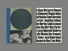
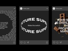
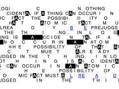
“The typographically-led identity is understated at its core, revolving around a carefully selected typeface that is classic and elegant but still has a playful and modern feel to it. The typographical language relies on differing scales and tactile elements to add interest across the brand applications.”
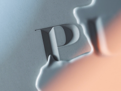
As Wearne “works primarily with limestone, the papers used for this project were carefully selected to mimic some of the characteristics of the ancient stone; incorporating warm white tones and textures that reflect the characteristics of the limestone. An embossed finish has been utilized across the printed collateral to reflect the tactile nature of Lucas’ carved works.”
“The Neighbourhood studio website extends the typographical language used across the rest of the visual identity into the digital sphere, incorporating differing scales and unexpected elements to add interest. This sense of playfulness is furthered by the moving imagery sprinkled throughout and unexpected use of bright orange” adds Both.
To provide a complete new and engaging visual experience Both worked on literally anything.
From the logo through the art direction of a series of images, numerous applications to various packaging touchpoints, a publication presented in an understated format of loose sheets folded to create a booklet that provides an insight into the artist’s work and process, they even designed a distinct packing tape and custom fragile stickers to create an overall visually varied experience that incorporates the core elements of their wider brand identity project.
Check more projects from the branding and visual communication studio co-founded by Brown and Smith in Melbourne in 2010 here.
Tags/ typography, custom, visual identity, branding, website, australia, both


.gif)

