Breakout star: Dennis Hoelscher boldly explores generative type’s immersive outer limits
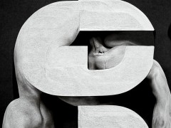
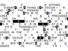
During the inaugural Inscript Experimental Type Festival, the Cologne-based graphic, motion & 3D artist Dennis Hoelscher made magic. Immersive and visually pleasing, Hoelscher’s live demo was a daring machine-powered experimentation made of a hefty dose of pure human artistry distilled through eloquent digital means.
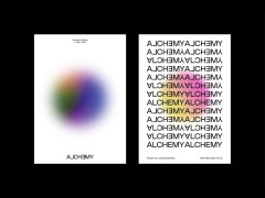
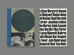
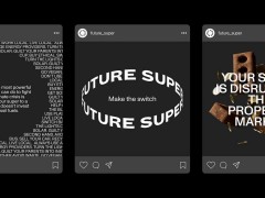
Designer, musician, and above all an upcoming creator who will break away from design-implemented restrictions in order to generate brand new frontiers, Hoelscher’s trailblazing creative path is found in the intersection of typography and abstract, mostly algorithm-based generative form designs — when he is not busy creating virtual places in three-dimensional space as an environment artist.
We caught up with Hoelscher who will constantly set one’s senses in motion with heavy-in-type otherwordly realities and beyond.
Enter the interview below:
Typeroom: First and foremost, what inspired you to enter the graphic design realm?
Dennis Hoelscher: In 2012 I moved to Cologne and did an apprenticeship as a media designer. A friend of mine was working as a graphic designer at that time. I liked what he was doing, so I wanted to try it out basically. I'm not one of those people who have only painted since childhood and always knew what they wanted to be. Basically, I shimmied from one experience to the next. When I graduated after 3 years, I only had experience designing soccer fan catalogs and advertising brochures. When I got my hands on a book by American designer Neville Brody during that time, I realized that there was so much more to graphic design than I had discovered. When I went on to study communication design in Düsseldorf back in 2015, a whole new world opened up.
TR: Which designers from the past are your go-to inspiring practitioners?
DH: In any case, my view of graphic design has been changed by the works of Neville Brody, Irma Boom or David Carson at that time. After all, I learned graphic design as part of a pure sales strategy. In my apprenticeship, I worked on a mail-order catalog for a German postal company, where customers could order office supplies and stamps, and so on. It was a project that demanded clarity, and clear lines, consisting of many tables, many prices, many products on small pages. There was no leeway, no option for experimentation whatsoever. Eventually, the concrete opposite excited me the most.
TR: Motion graphics are all the rage nowadays. How do you see them, five years from now?
DH: All of this will emerge in increasingly new contexts. The fields of virtual reality in the realm of motion graphics and design will become more and more significant and in demand.
TR: Do you prefer to design with type or design type?
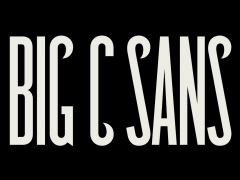
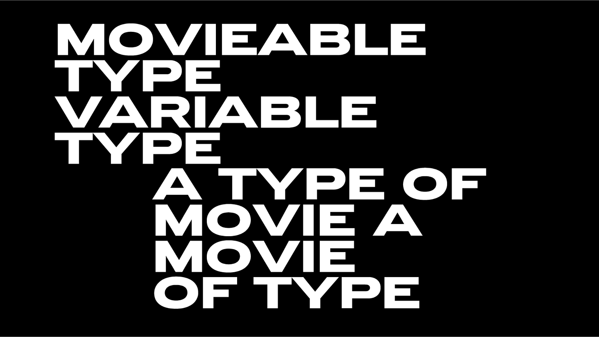
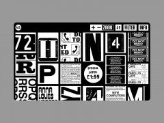
DH: I take an existing font as the base construct of my shape modification. Thus, a kind of new typeface is created, as it is often alienated in origin. However, there is no intention to construct a finished set of glyphs that could be retyped elsewhere.
TR: What is your creative process? How do you get to choose your next typographic endeavors?
DH: I am interested in projects that are not visually defined and preconceived in almost all their features. When I am called in, I appreciate a measure of freedom in the implementation. When there is trust, it usually turns out well.
TR: What is the communal space your music project aka GiiRL shares with your design portfolio?
DH: For me, the band was always a space where I had creative freedom. It was where I tried new things, whether it was putting together music videos or using techniques that led to cover designs. The creations are sometimes very different in approach. I never wanted to limit myself here, this project is about music, not primarily about the graphics — although the visual garb strongly influences the overall appearance of a band in general.
TR: What would you advise an aspiring creative and freelancer that wants to enter this ever-demanding industry?
DH: It’s important to remember that an incredible amount of work results from the network of great contacts from fields that have nothing to do with design. Also finding a niche and crafting an evolving recognizable style might be helpful. And just share everything along the way for fun.
TR: What was your Inscript presentation about?
DH: With the introduction of Geometry Nodes in Blender 3D software, a transition is happening in my workflow. The final result of a creative process is now the product of a procedural system, which can be subsequently adjusted at any point in the pipeline and in turn, delivers a completely new output each time. Actions are stored in a node. These nodes are then wired into networks that define a recipe that can be tweaked to refine the outcome and then repeated to create similar yet unique results.
TR: Which other presentation/ speaker was the most inspiring and illuminating for you?
DH: Cannot name the most inspiring one. The line-up has covered so many interesting aspects of experimental type design. But the presentations of Vera van de Seyp, Yehwan Song and André Burnier have dealt with things that I find particularly exciting!
TR: What are your go-to tools for creating?
DH: Mostly Blender, After Effects, sometimes Processing or MAX/ MSP for interactive stuff.
TR: You have a thing for curvy, warping visuals. How come?
DH: I think it makes an impressive contrast to the very technical claim. The typeface itself is self-contained and pure. Breaking this up usually creates joy for me.
TR: Which emerging technology do you think is the one that will ultimately reshape the industry?
DH: It’s already the case that we use AI tools, whether for static image creation, animation, music, text, or 3D object creation. Imagine what will be at the start in the near future at the current pace of development.
TR: Artificial intelligence and machine learning are radically challenging the relationship between man and machine. Have you played with any tools based on ML yourself? Are you cautious or open to this emerging tech?
DH: I am very open to any new tool. Ultimately, it should speed up processes, not replace them. In the context of design, which I want to control very concretely and in detail and represent three-dimensionally, the tools are not yet as far along as I need them to be in order to speed up my workflow.
TR: You have worked on Barbara Kruger’s seminal work and brought it into the 3D realm. How crucial would you consider design incorporating a voice with social agenda? DH: I can use design to channel and visually summarize larger contexts or the content of a debate on a particular topic. Design is not meant to be a detailed educational work, but is invaluably able to set an impulse, to draw attention to a social or culturally significant issue. As for the Kruger piece, it was a free experiment on taking a static image and transforming it into a full spatial animation.
TR: What is the highest priority in your day-to-day workflow?
DH: Having the ability to leave things for tomorrow so I have enough family time with my kids.
TR: Screen fatigue is an issue with the new technologies and their respective applications. Do you ever get the feeling that the analog world needs to be preserved or are you all into going digital?
DH: The latter. I do have a big whiteboard where I draw storyboards from time to time, but most exploration gets done virtually so I opt for mostly digital. With the latest photogrammetry possibilities, I sometimes like to create stuff with my hands and 3D scan them. That said, working analog sets you free from any software limitations. I’d like to spend more concept time off-screen, that’s definitely something I want to improve in my workflow.
TR: What is the best tune to accompany this interview?
DH: Take the band “Soft Hair” which is the LA Priest/Conan Mockasin collab and the song “Alive Without Medicine.”
Mission accomplished. Enter Dennis Hoelscher’s body of work here.
Tags/ typography, 3d, barbara kruger, neville brody, david carson, motion graphics, kinetic, experimental type, generative type, inscript, dennis hoelscher, irma boom

.gif)

