Swiss design, activism, capitalism & more: 12 must-own books for graphic designers now
For Umberto Eco, the acclaimed thinker, scholar, philosopher author and owner of a huge personal library containing a stellar collection of ancient and modern books that is now owned by Italy’s culture ministry, books are a treasure.
According to Nassim Nicholas Taleb, quoted by Maria Popova at Brain Pickings, Eco’s library contained 30,000 books and “tended to separate visitors into two categories: ‘those who react with ‘Wow! Signore professore dottore Eco, what a library you have! How many of these books have you read?’ and the others — a very small minority — who get the point that a private library is not an ego-boosting appendage but a research tool. Read books are far less valuable than unread ones. The library should contain as much of what you don’t know as your financial means, mortgage rates and the currently tight real-estate market allows you to put there. You will accumulate more knowledge and more books as you grow older, and the growing number of unread books on the shelves will look at you menacingly. Indeed, the more you know, the larger the rows of unread books. Let us call this collection of unread books an antilibrary.”
Library or antilibrary, as 2022 draws to a close, Typeroom’s must-own pile of books is growing faster than the speed of light.
From old to new releases, from Swiss Design to Modernism and the evergoing exploration in creative coding of John Maeda, here are some of our favorite books any graphic designer and typophile should know — if not hold dear.
-
Off the Grid: Histories of Belgian graphic design, edited by Sara De Bondt (Occasional Papers)
This book offers a collaborative panorama of Belgian graphic design history from a multiplicity of perspectives, with essays on type design, colonisation and labour relations among other subjects. Contributors include historians, practicing designers, teachers and first-hand accounts.
With hundreds of previously unpublished illustrations such as posters, signage, typography, book design, logos and archival photographs the book features interviews with Sophie Alouf-Bertot, Rob Buytaert, Boudewijn Delaere, Paul Ibou, and Herman Lampaert and essays by Jo De Baerdemaeker, Pia Jacques and Leroy Meyer (Belgian Institute Graphic Design), Sara De Bondt, Jan Ceuleers, Katrien Van Haute, Richard Hollis, Jean-Michel Meyers, Hilde Pauwels, Hugo Puttaert, and Katarina Serulus.
-
Packed with over 200 color photos, this visual journey through Black history and the Civil Rights Movement is told through the objects—buttons, badges, flyers, pennants, posters, and more—designed by activists as tools to advance the fight for justice and freedom, offering a unique perspective on the Civil Rights Movement from Emancipation through the present day.
From Reconstruction through Jim Crow, through the protest era of the 1960s and ’70s, to current-day resistance and activism such as the Black Lives Matter movement, the material culture of the Civil Rights Movement has been integral to its goals and tactics. During decades of sit-ins, marches, legal challenges, political campaigns, boycotts, and demonstrations, objects such as buttons, flyers, pins, and posters have been key in the fight against racism, oppression, and violence.
Making the Movement presents more than 200 of these nonviolent weapons alongside the stories of the activists, organizations, and campaigns that defined and propelled the cause of civil rights. It is a must-read for anyone seeking to learn about Black and African American history in the United States and about strategies to combat racism and the structures that support it.
-
Bolivian-born Swiss poet, writer and publisher Eugen Gomringer (*1925) is often described as the father of concrete poetry. He was an active figure in Switzerland’s post-war design and art scene and was a voice of poetry at the intersection of literature, art and design.
From 1953 onwards, together with Dieter Roth and Marcel Wyss, Gomringer co-published the artist’s magazine spirale, that formed the starting point for his form of poetry.
From an early stage, Gomringer wanted to blur the boundaries of poetry and the language of advertising. Throughout his entire career he remained an advocate of interdisciplinarity, collaborating actively with artists and graphic designers such as Max Bill, Karl Gerstner, Anton Stankowski and above all the Zurich-based design studio E + U Hiestand.
This publication was created following extensive research in archives in Switzerland and Germany. The book combines original images and selected works from Gomringer’s long-standing collaborations as art director and copywriter for various companies. It also contains the theoretical essay “vom vers zur konstellation” (from verse to constellation), Gomringer’s original manifesto published in 1954. With a foreword by Roland Früh.
The book was realized with the support of ECAL/University of Art and Design Lausanne and HES-SO/University of Applied Sciences and Arts Western Switzerland.
-
The History of Graphic Design. Vol 1 and 2 by Jens Müller (Taschen)
History is a complex business. Fortunes boom and bust, empires wax and wane, and change—whether social, political, or technological—has its winners, its losers, its advocates, and its enemies. Through all the turbulent passage of time, graphic design—with its vivid, neat synthesis of image and idea—has distilled the spirit of each age.
This book is an in-depth history of graphic design from the end of the 19th century to the ’50s. It traces the evolution of this creative field from its beginning as poster design to its further development into advertising, corporate identity, packaging, and editorial design.
Organized chronologically, the volume features over 2,500 seminal designs from all over the world, 71 of which are profiled in detail besides 61 leaders in the field, including Alphonse Mucha (chocolate advertisements), Edward Johnston (London Underground logo and typeface), El Lissitzky (constructivist graphics), Herbert Matter (photomontage travel posters from Switzerland), Saul Bass (animated opening titles), and A. M. Cassandre (art deco posters).
With his sweeping knowledge of the field, author Jens Müller curates the standout designs for each year alongside a running sequence of design milestones. Meanwhile, in his introductory essay, David Jury situates graphic design from its point of origin in early printing, engraving, and lithography to striking creative developments in the 19th century.
Each consecutive decade is then prefaced by a succinct overview as well as a stunning visual timeline, offering a vivid display of the variety of graphic production in each decade as well as the global landscape which it at once described and defined.
As we move on from and reflect upon the 20th century, this first volume examines the foundations of what would influence some of the fastest-changing creative fields. Combined with Volume Two—which spans from the 1960s until today—the tomes offer the most comprehensive exploration of graphic design to date and a long-overdue recognition of its enormous contribution to economics, politics, social causes, the arts, media, and the way we see the world.
-
Modernism: In Print, Dutch Graphic Design 1917-2017 by Frederike Huygen (Lecturis)
This book explores modernism in Dutch graphic design of the 20th Century with an emphasis on the varied aspects and meanings of the term modernism. Its publication coincides with an exhibition at the Special Collections facility of the University of Amsterdam. The book comprises three reflective essays, on the periods 1920–1940/45, 1945–1990 and 1990–present.
Modernism: In Print presents a comprehensive picture of the subject, drawn from the collection and the design archives of Special Collections. It interrogates the canon by including some less well-known examples of graphic design work.
As the concept of modernism dominates the discourse on graphic design, this book aims to recognize its often underestimated complexity.
-
David King: Designer, Activist, Visual Historian by Rick Poynor
Exploring an unjustly overlooked figure in 20th-century British visual culture, this book offers a comprehensive overview to the work and legacy of David King (1943-2016), whose fascinating career bridged journalism, graphic design, photography, and collecting.
King launched his career at Britain’s Sunday Times Magazine in the 1960s, starting as a designer and later branching out into image-led journalism.
He developed a particular interest in revolutionary Russia and began amassing a collection of graphic art and photographs-ultimately accumulating around 250,000 images that he shared with news outlets.
Throughout his life, King blended political activism with his graphic design work, creating anti-Apartheid and anti-Nazi posters, covers for books on Communist history, album artwork for The Who and Jimi Hendrix, catalogues on Russian art and society for the Museum of Modern Art in Oxford, and typographic covers for the left-wing magazine City Limits.
This well-researched and finely illustrated publication ties together King’s accomplishments as a visual historian, artist, journalist, and activist.
-
CAPS LOCK, How capitalism took hold of graphic design, and how to escape from it by Ruben Pater
Capitalism could not exist without the coins, notes, documents, graphics, interfaces, branding and advertisements; artefacts that have been (partly) created by graphic designers. Even anti-consumerist strategies such as social design and speculative design are being appropriated within capitalist societies to serve economic growth. It seems that design is locked in a system of exploitation and profit, a cycle that fosters inequality and the depletion of natural resources.
CAPS LOCK uses clear language and striking visual examples to show how graphic design and capitalism are inextricably linked. The book contains many case studies of designed objects related to capitalist societies and cultures, and also examines how the education and professional practice of (graphic) designers supports the market economy and how design practice is caught within that very system.
The content of CAPS LOCK is structured in chapters with titles of professions that designers can occupy (such as Educator; Engineer, Hacker, Futurist, Activist, etc.). These titles respond to the importance of not just how designers make work, but also how they perform daily economic and social roles.
Each chapter is divided into coherent articles in which diverse examples of objects and design practices are relayed. The book also features examples of radical design collectives, that work towards alternatives between design, community and reciprocity.
-
Letraset: The DIY Typography Revolution by Tony Brook & Adrian Shaughnessy (Unit Editions)
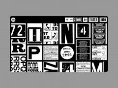
A publication four years in the making, Letraset: The DIY Typography Revolution is the first comprehensive history of Letraset, the rubdown lettering system that revolutionised typographic expression.
The book tells the Letraset story from its early days as a difficult-to-use wet system, to its glory years as the first truly democratic alternative to professional typesetting and also looks at Letraset’s present-day revival amongst a new set of admirers who recognise the typographic excellence of the system’s typefaces.
The book comes with a gatefold Letraset timeline. It has an introduction by Malcolm Garrett, and features in-depth interviews with Mr Bingo, Erik Brandt, Aaron Marcus, David Quay, Dan Rhatigan, Freda Sack, Andy Stevens and Jon Wozencroft.
Essays by Colin Brignall, Dave Farey and Mike Daines – all key members of the Letraset team – provide expert insight into the rise of Letraset as a typographic and commercial powerhouse. A central essay by Adrian Shaughnessy examines the typographic and cultural impact of the system.
The book’s design is by the Spin team of Tony Brook and Claudia Klat. It uses many rare specimens from Letraset’s past – catalogues, press ads, mailers, storage units, and of course, sheets of classic Letraset typefaces.
-
The Visual History of Type by Paul McNeil (Laurence King)
The Visual History of Type is a comprehensive, detailed survey of the major typefaces produced since the advent of printing with movable type in the mid-fifteenth century to the present day. Arranged chronologically to provide context, more than 320 typefaces are displayed in the form of their original type specimens or earliest printing. Each entry is supported by a brief history and description of key characteristics of the typeface.
This book will be the definitive publication in its field, appealing to graphic designers, educators, historians and design students. It will also be a significant resource for professional type designers and students of type.
-
100 Years of Swiss Graphic Design by Museum für Gestaltung Zürich (Lars Müller Publishers)
100 Years of Swiss Graphic Design takes a fresh look at Swiss typography and photographics, posters, corporate image design, book design, journalism and typefaces over the past 100 years.
With captivating illustrations and illuminating essays by prominent experts in the field, this book, designed by the Zurich studio NORM, presents the diversity of contemporary visual design while also tracing the fine lines of tradition that connect the work of different periods.
The changes in generations and paradigms as manifested in their different visual languages and convictions are organized along a timeline as well as by theme.
The various fields of endeavor and media are described, along with how they relate to advertising, art, and politics. Graphic design from Switzerland reflects both international trends and local concerns. High conceptual and formal quality, irony and wit are its constant companions. This is a comprehensive reference work on the phenomenal Swiss design.
-
Dream in Color: 30 Posters of Power, 30 Black Creatives by Tre Seals (Chronicle Books)
This large-format book features 30 removable posters by 30 inspiring Black creatives from around the world. Artists and designers including London-based muralist Lakwena, and South Africa-based artist Huston Wilson, among others, are included in this inspiring book of ready-to-frame artwork.
Each poster is aesthetically unique; the selection ranges from illustrations to typography featuring phrases expressing positivity, hope, and strength, all through the lenses of internationally acclaimed and emerging Black creatives working today.
According to Tré Seals, the curator and designer of the book, “we see Black as a palette, a mixture of every color and every form of light. This is our true definition of Black, and this is why we Dream in Color.”
-
Slanted Magazine #40—Experimental Type
Experiments open our horizon, let us enter the undiscovered, and feed our lust for more. With Slanted Magazine #40—Experimental Type, the editors open eight doors, each one offering a glimpse into spaces that were explored by pushing conventions, limitations, and thoughts to the next level as the discovery of new areas, technologies, and thoughts are a constant source of inspiration, research, and experimentation for those that follow.
Tactile Realism shows works with tactile character, adding material properties to the typeface. The Anti-Reader-Friendly typography becomes the “readymade” of the type world—and in doing so, a form of denying the possibility of defining art. In the Deliberate Imperfection & Serendipity space, disassembly, and assembly of type leads to great discoveries. While Coincidence & Intention brings the accident into the design process and explores works based on mistakes and inaccuracy. The Ever-Changing room showcases experiments of kinetic typography breaking away from its static state by adding movement and three-dimensional stereoscopy, and the fourth dimension: time. Cutting Edge drives attention to state-of-the-art technologies and their impact on design experiments. Off the Screen explores physical space in which writing becomes material, object, and sculpture. Last but not least, Push to the Limits engages to think finitude differently, breaking boundaries of learned symbolisms and triggering new stimuli.
More book recommendations and features here.
Tags/ typography, graphic design, books, branding, modernism, swiss design, publications, david king, library, john maeda, creative coding



.gif)

