The joyful logic of Benoît Bodhuin on typographic playgrounds
In the world of typography, where precision and structure often reign supreme, Benoît Bodhuin dares to dance along the edges, where the logical meets the playful, and the rigid lines of design are softened by whimsy and exploration. His approach to type is an open-ended experiment, a journey through protocols and constraints that he sets for himself, only to find freedom within them.
For Bodhuin, type is not a static artifact but a living, breathing form. Each letter is a character in its own right, with the ability to move, evolve, and express something beyond its mere shape. He creates modular elements, often working from construction-like processes, where the act of building is as much a part of the art as the final outcome. Each project becomes a playground for invention, where rules are invented just to be bent, broken, or expanded into something new and unexpected.
His typography is adventurous and generous, imbued with a sense of joy that comes from this process of constant discovery. So, in this interview, we delve into Benoît Bodhuin’s fascinating approach to typography, exploring how he crafts his imaginative systems and how constraints, rather than limiting him, become the spark of creativity. His world is one of joyful rigor, where the lines between logic and play dissolve, and type emerges as a vibrant, moving expression of human curiosity.
TR: Your process of starting with capital letters, particularly with HARBER, is unique. Why did you choose to begin with H, A, R, B, and E, and how did that guide the evolution of the font?
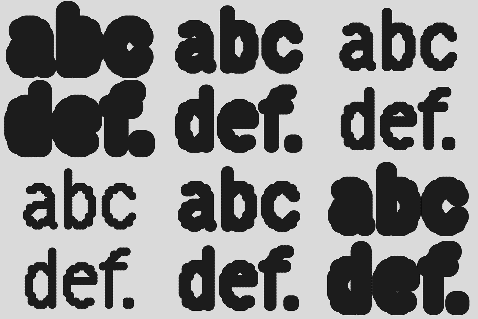
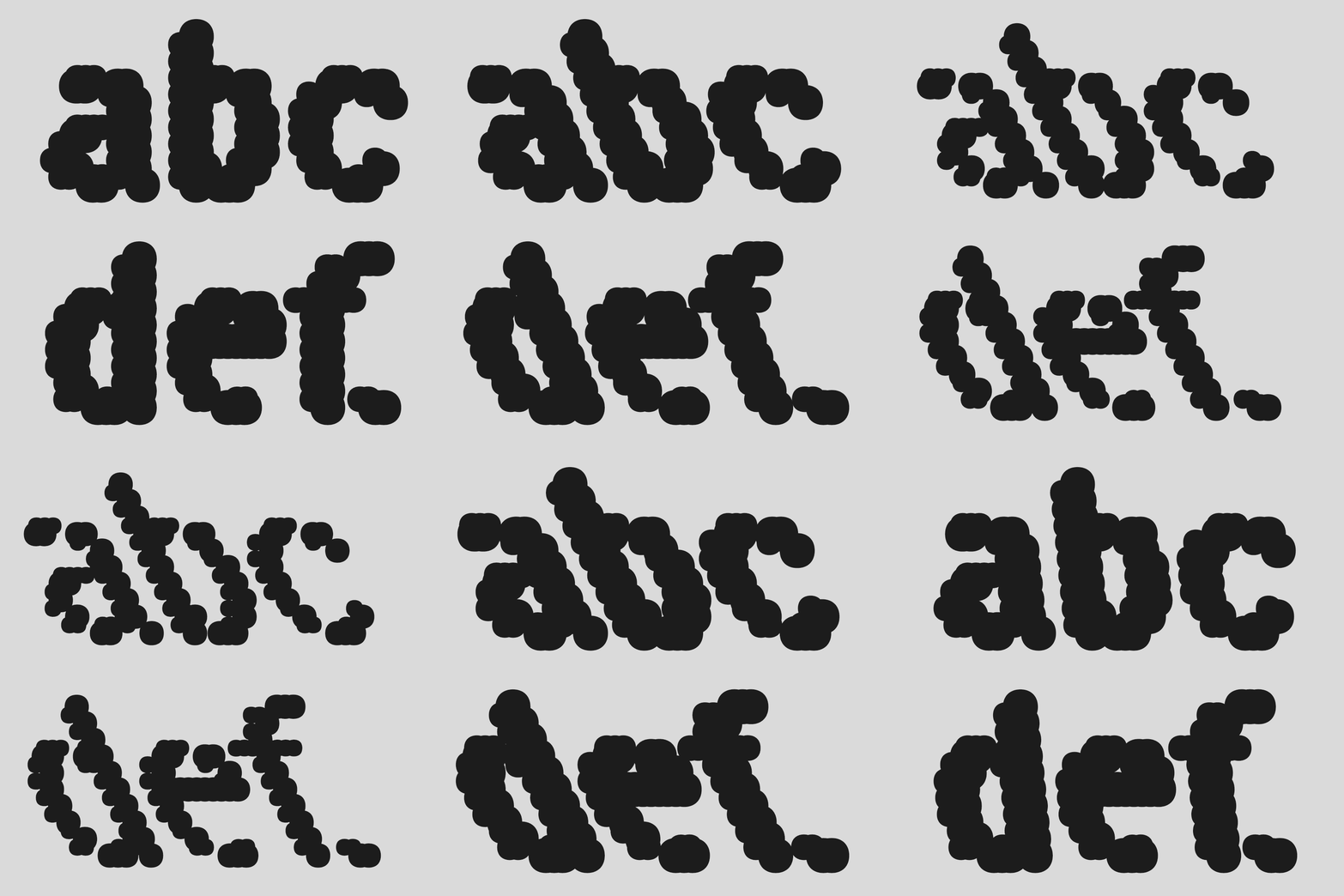
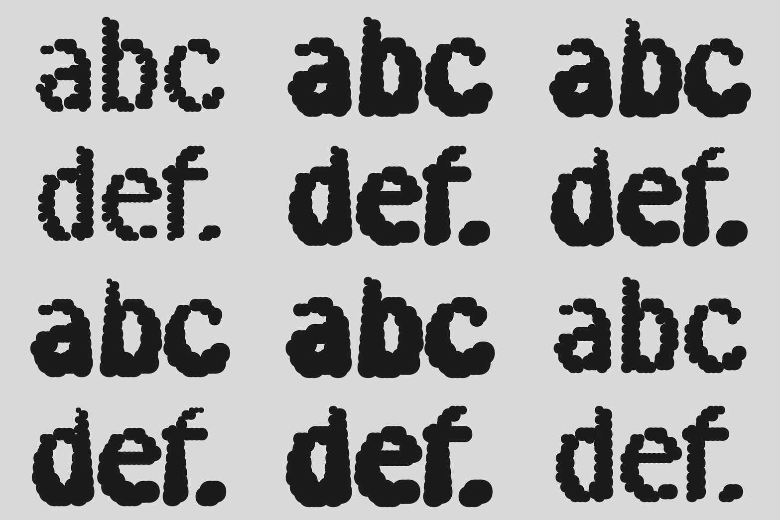
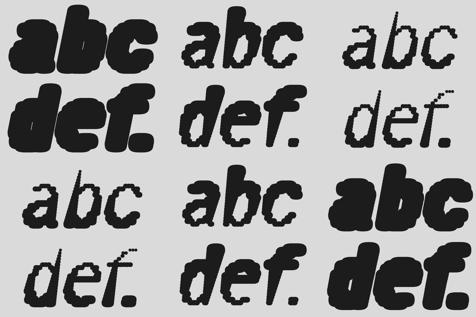
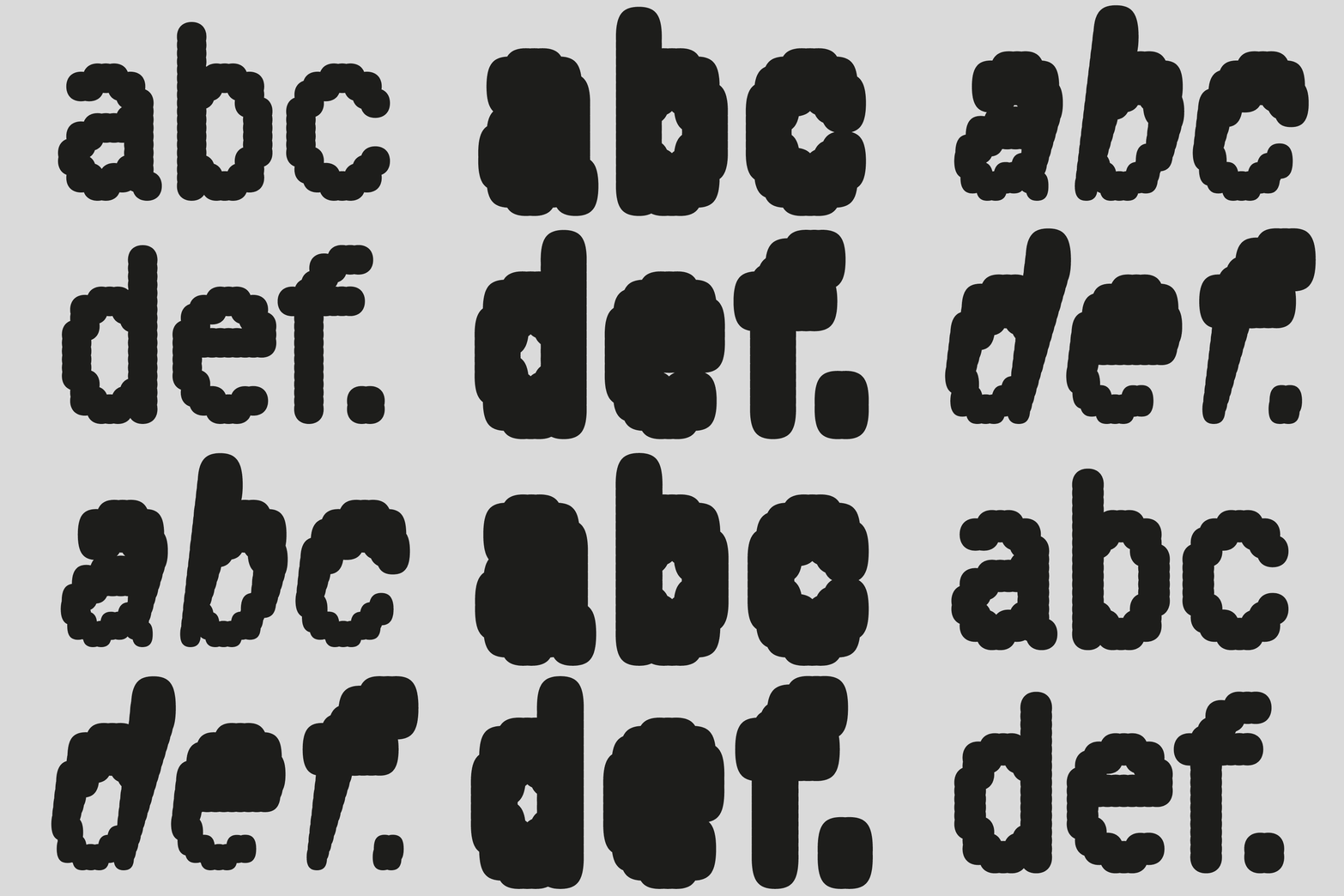
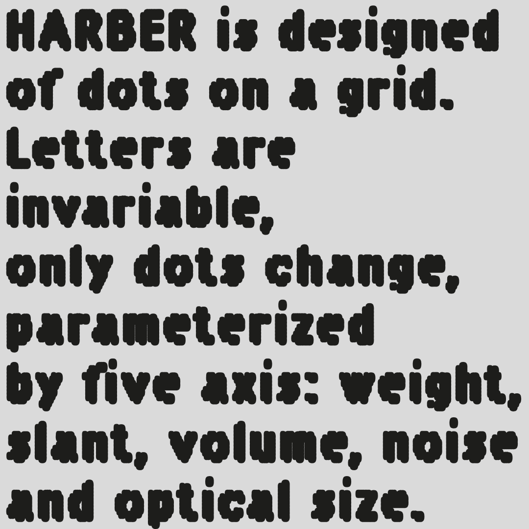
BB: Usually, I start by drawing the lower case but for HARBER, I first drew only capitals for a small project for which there wasn't a lot of time. Besides, I much prefer writing in lower case which is livelier. For HARBER I drew the H and E because it is quick to draw and it helps me define the width, the B and R because they are cousins and to test rounding and the A to test the diagonals and the width necessary for the opening of the A. I probably drew the O very quickly as well. These letters serve as a basis for drawing the others but have evolved as I progressed to be consistent with the whole. The letters of this typeface are drawn according to the maximum and minimum sizes of the dots. The Bold determines in many cases the width so that the counterform is plugged and the Light defines in a finer way the positioning of the dots to try to bring the accidents outside of the letter for expressiveness and regularity inside for readability.
TR: You often set self-imposed constraints when designing. Could you tell us more about the creative freedom you find within those constraints and how they help shape your designs?
BB: These constraints are a game, a starting point. I try to see where they lead the drawing. It is a working basis. They can evolve depending on the interest I find in them. Once well defined, they are the ones that will guide the drawing and give the character of the typography. Defining the constraint well, the one that allows you to draw all the letters while limiting hesitation as much as possible, is the biggest part of the creative work, then all you have to do is follow the drawing that they impose.
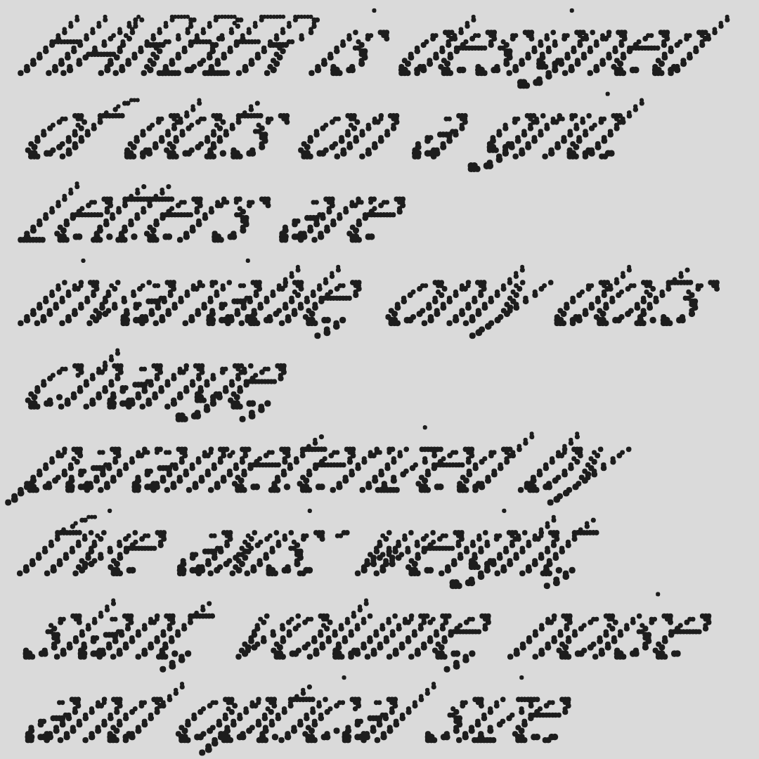
TR: HARBER is built on a dot grid where the letters stay static, but the dots grow and move based on five axes. How do you balance this system of movement with maintaining the legibility and functionality of the font?
BB: The 5 axes mistreat the drawing, knead it in all directions. It is the main constraint of HARBER that helps me define the shape of each letter so that it resists best to each change. And then there are good surprises, happy accidents that inspire me. The 5 axes are the framework that allows me to concentrate on the best drawing for each letter (according to my own judgment).
TR: The axes of weight, slant, volume, noise, and optical size in HARBER introduce an element of variability. What are some of the challenges you encountered while working with these axes, and how do they contribute to the personality of the font?
BB: HARBER is the opposition of 2 things: a very simple drawing of dots organized according to a grid and a great flexibility given by these 5 axes. The biggest challenges are when 2 axes 'collide'. For example, Noise cannot distort the letter as much in Light as in Bold, so I have to define the Noise in Light and Bold. And it gets more complex with Noise and Volume that is drawn with small and large dots. A very simple idea sometimes complicates the work much more than you might imagine. But it is this type of challenge that perpetuates the discovery, both of new ideas and new forms. Multiplying the axes complicates the work and forces you to find solutions (graphic or technical), but that is the main interest of this typography.
TR: Your fonts often seem to have a playful and experimental edge. How do you approach the challenge of blending playfulness with the practicality that typography demands?
BB: Typography imposes only 1 constraint: readability, resulting from habit (letter shape, spacing, width, etc.). I add 1 constraint with my system, which will bring a particularity, a personality: expressiveness. So finally, it is quite simple, there are only 2 constraints which boil down to succeeding in finding a system that allows reading.
TR: You’ve mentioned that your design process involves inventing rules of conduct. How do these "rules" inform your work, and do you ever find yourself breaking them to push creative boundaries?
BB: There are 2 types of constraints, those with a vague definition (drawing rule, more or less all typography) and strictly defined rule (grid for example). Concerning the first, I like to make exceptions to these rules which bring small charming exceptions common in typography (finer punctuations, etc.) and concerning the second, I do not make any exceptions, in case of difficulty, either I find a drawing trick within the framework of the constraint which often triggers a set of solutions for the whole typography, or I think about redefining the constraint a little differently.
TR: Modular elements and construction processes seem to play a major role in your work. Can you tell us more about how these concepts influence your designs, especially in creating a cohesive typeface?
BB: This follows somewhat from what precedes. Fuzzy constraints are problems for me because I don't like spending an infinite amount of time shifting a vector or widening a letter and then condensing it. These arbitrary choices tire me. Drawing according to a grid, modules or a system does not prevent the finesse of the drawing if the typographic subtleties are integrated from the start (I also sometimes ignore certain subtleties in order to emphasize the brutality of the system). The system decides for me and when I don't like it I modify it. In fact, it is a question of removing arbitrariness as much as possible. Other than that, I like geometry. It's something that comes quite naturally to me. And then typography is a few shapes that repeat themselves with subtle differences, so I find that this type of geometric method lends itself well to it.
TR: Your typographic work is often described as adventurous and generous. How do you strive to evoke emotions and energy through something as structured as a font?
BB: I think that it is a question of work, desire, curiosity, I knead my work in all directions before finding a satisfactory solution, it is tenacity. And I think that from that emerges what you call generosity. That is what interests me to dig the thing so that it really works, to find little tricks for the letters that pose difficulties… It seems to me that investment and passion can have more weight (sometimes) than talent and creativity (but finally everything is linked).
TR: As a designer who enjoys exploring new typographic forms, what excites you most about the future of type design, especially as technology continues to evolve?
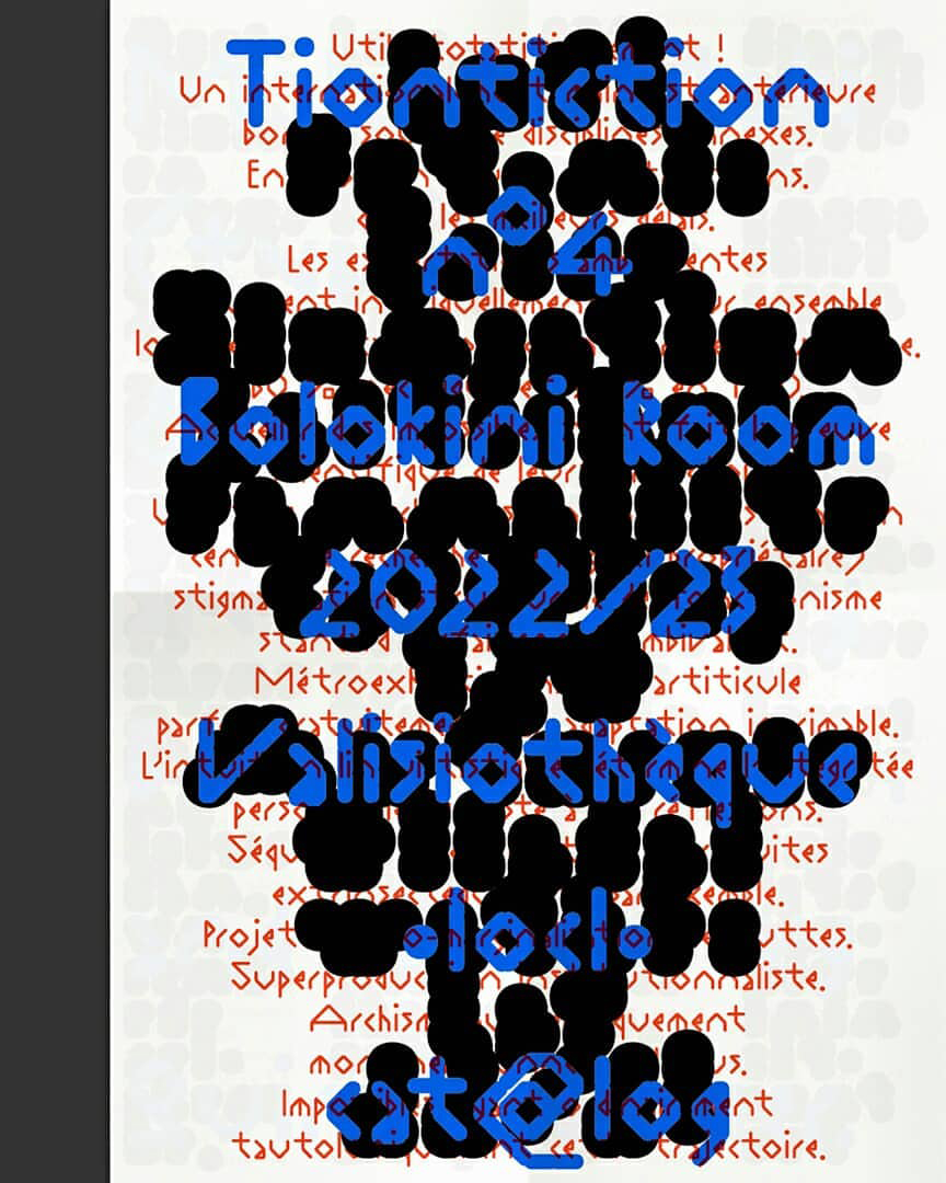
BB: Things have been speeding up in recent years. For example, in typography, there are of course variable fonts, but also all sorts of new tools (or creators) that integrate code and that's great. It's sometimes even too fast for some graphic designers who don't have time to integrate all that (variable fonts which are still slow to be accepted). What fascinates me the most is the code. Coding a font would be like writing the concept. And then once the code works, the potentials are endless. For example, HARBER could be much more versatile (with more axes) if it were coded. But I'm procrastinating on that :-)
TR: What advice would you give to young designers who are looking to challenge traditional methods and explore new directions in typography?
BB: Go for it and don't look for immediate profitability (financial or in reward for likes), it's a trap! Beautiful things take time.
Benoît Bodhuin participated recently at Inscript Type Festival
Benoît Bodhuin's work here
Interview by: Giannis Papaioannou | Typeroom
Tags/ culture, 3d typography, technology, interview, innovation, experimental, inscript

.gif)

.jpeg)
.jpeg)
.jpeg)
