Alphabet alchemy: Transforming words into art with Michael Doret
A captivating visual journey through the life and work of the legendary lettering artist behind iconic designs for Disney, Kiss, the Knicks, and more.
Michael Doret, a prominent figure in the world of custom lettering and graphic design, has made an indelible mark on pop culture through his unique and exceptional artistry. His book “Alphabet City” which is published by Letterform Archive, serves as a visual autobiography that chronicles his journey from the streets of 1950s Brooklyn to the vibrant creative landscape of 2000s Los Angeles. This richly illustrated work not only showcases Doret’s iconic designs for famous clients such as Kiss, Disney, and the New York Knicks but also provides insight into his creative process.

“Alphabet City” is a treasure trove of over 700 images that highlight Doret’s evolution as an artist. The book captures the true essence of his work, presenting everything from initial pencil sketches to final artworks, alongside rejected proposals that reveal the often unseen aspects of his artistic development. The artist’s ability to transform words into striking visual forms is illustrated through various projects, including magazine covers and film title graphics, showcasing his fantastic blend of lettering and illustration.
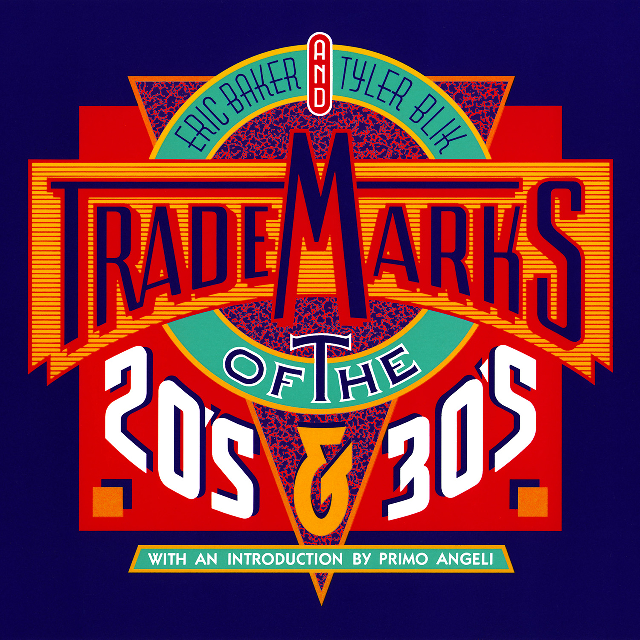
Beyond any nostalgic appeal, “Alphabet City” may serve also as an educational resource for aspiring artists and designers. It features original photo tutorials that delve into classic lettering techniques, bridging the gap between traditional craftsmanship and modern digital practices. With a foreword by type expert Nick Sherman and a freshly commissioned cover by the “master” himself, the book is both a celebration of his legacy and a great source of inspiration for future generations.
On the occasion of this wonderful release from Letterform Archive we had a little chat with Michael Doret about a lifetime in the service of graphic communication.
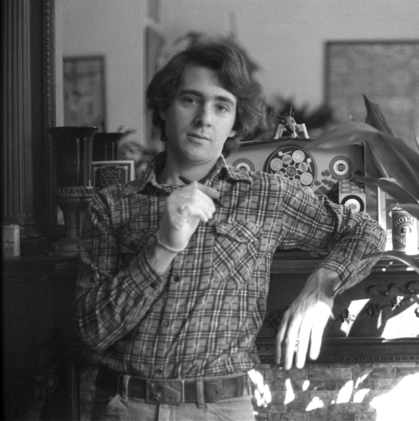
TR: When you were a kid, did you have the sense of what sort of creative path your life might take?
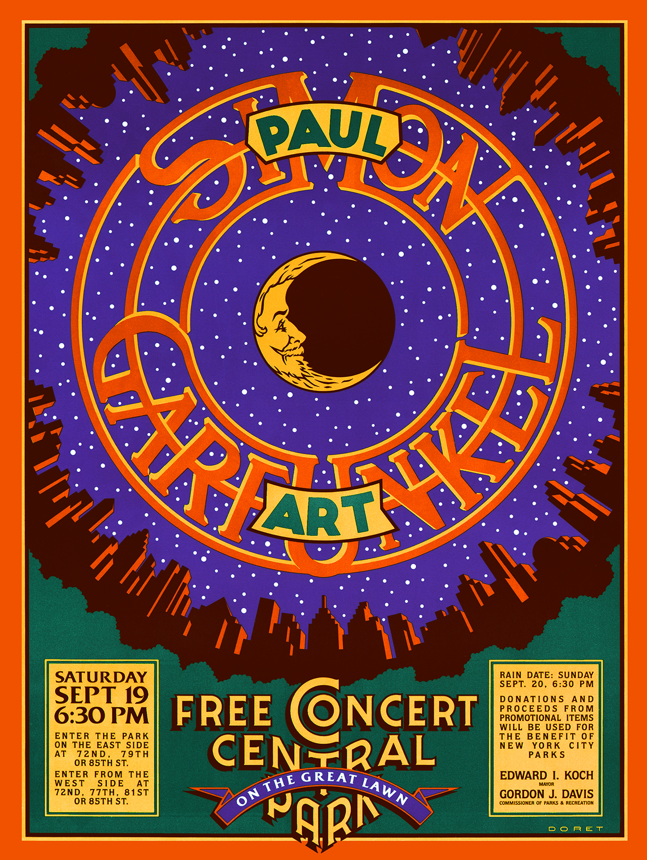
MD: Growing up, I dreamed about becoming either an artist or an astronomer. I really loved to draw, but I was also fascinated with observing the heavens through the primitive telescope I purchased with my skimpy allowance. I would train my telescope on the sun, the moon, and the planets, and would even make drawings to record my observations. As I worked my way through high school I learned more about art, and was encouraged by my art teachers to pursue that direction—which is what I did. But you can still find that behind all my work are the disciplines of mathematics and geometry—and the machinations of the heavens which I so loved observing when I was a kid. (fig. 2)
TR: Your work is said to reflect a strong influence from the amusement parks of South Brooklyn. How did growing up near Coney Island shape your personal taste and design style?
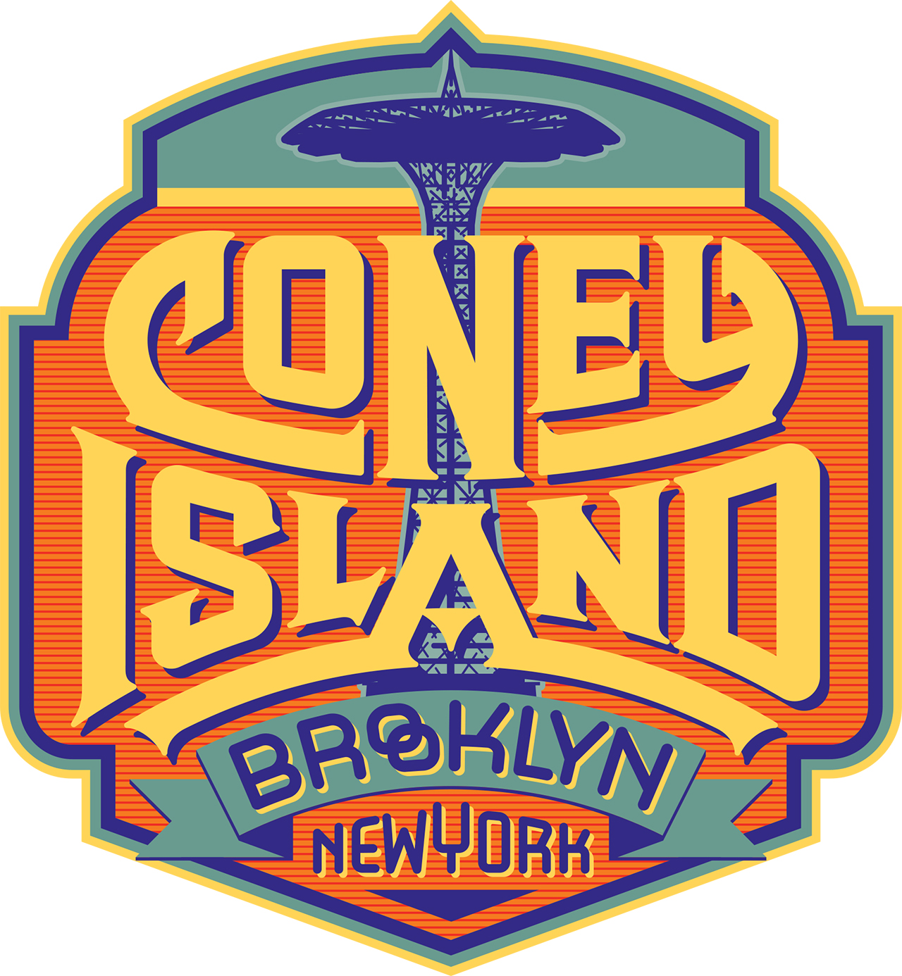
MD: Well, it was said by . . . me! It wasn’t just the wild sights, crazy sounds and colorful signage of Coney Island the affected how I saw the world. It was also the amazing environment of Times Square in the 1950s and 60s. My dad worked there, and I would on occasion take the subway into the City to visit him in his office at MGM. Emerging from the subway I was always amazed and dazzled by all the gargantuan billboards blowing smoke rings into the street, the monumental waterfalls, the neon signs and gigantic figures looking down at the hordes of people on the street—all vying for my attention. It was all larger than life, and affected and influenced me in ways that I was unaware of until I was well into my career. (fig. 3)
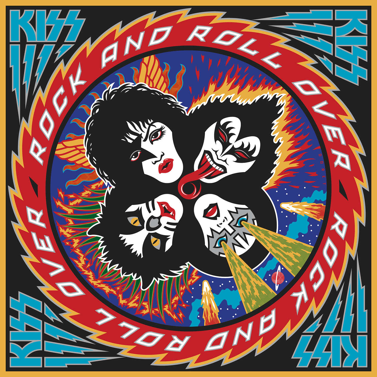
TR: Your album cover for Kiss’s Rock and Roll Over (fig. 1) left a lasting impression on many, including aspiring designers. What was your creative process behind this design, and how did you balance its iconic yet “badass” aesthetic?
MD: Honestly, I really don’t know how to describe this “creative process”, because it changes for each project, and is mostly intangible. If I could tell others how the creative process works I’d be a rich man—but it really cannot be described. I do not (and cannot) consciously strive to make something “iconic” or “badass”—I just try to solve the problem at hand, and provide compelling pieces of art to my clients.
TR: Your work often blurs the lines between illustration, lettering, and layout. How do you approach projects that integrate these disciplines, and do you have a favorite among them?
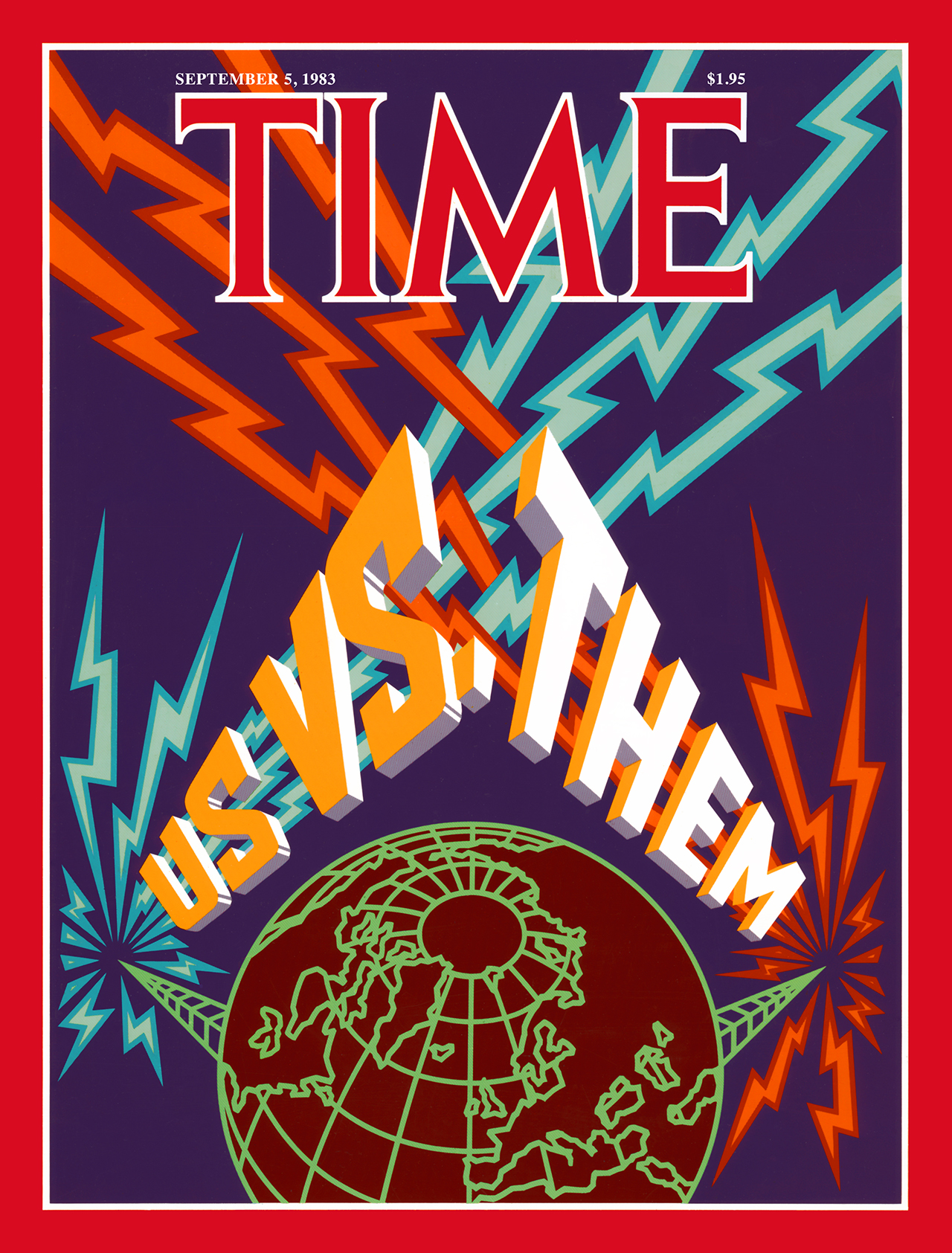
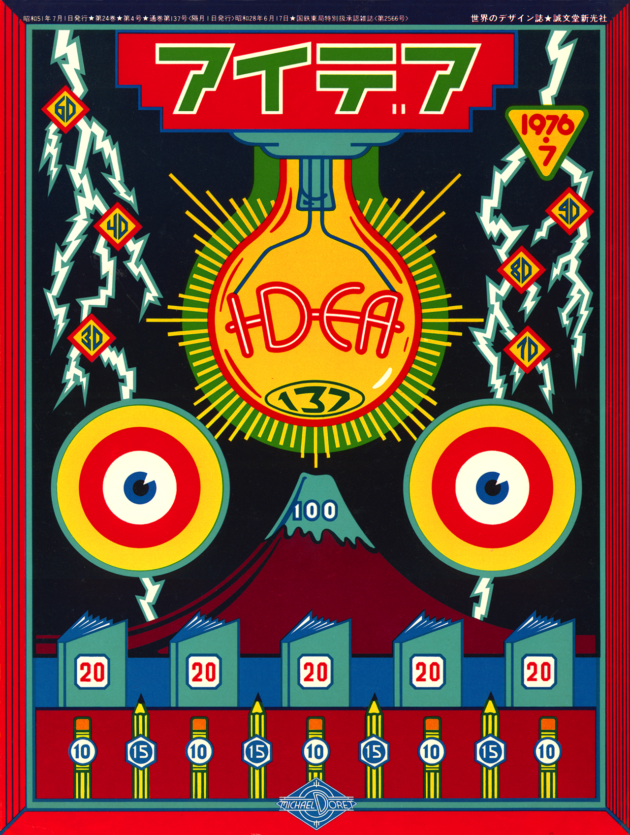
MD: When I was starting my freelance career, those who hired me usually wanted a piece of lettering that they could use in conjunction with somebody else’s photograph, illustration or design. But that’s not where I wanted to go with my work. If I was hired to design a magazine cover, I wanted to design and provide artwork for the entire cover—with lettering and, if necessary, illustration. I didn’t think that designs should be created piecemeal—taking elements from different sources and throwing them together. Good (and early) examples of this are the magazine covers I did for TIME Magazine. (fig. 4)
TR: You’re known for using unusual color palettes and finding a balance between abstract and representational styles. How do you decide on the visual language of a particular project?
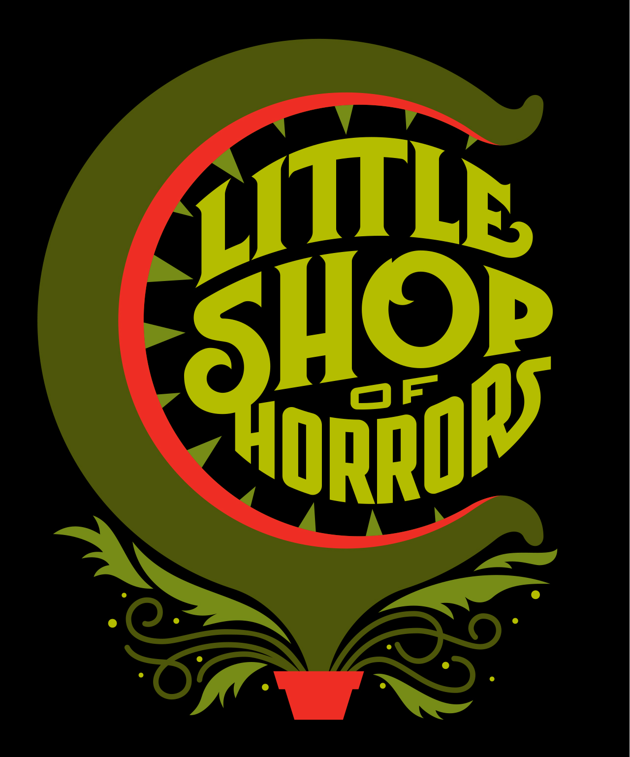
MD: I do not understand this question. And I do not understand what is meant by “abstract and representational styles”. I don’t have a style—It’s just how my work naturally manifests, but I don’t consciously try to give it a particular look. A far as color palettes are concerned, I usually try to keep a piece to no more than five or six flat colors. I love limited color, first noticing that in fabric design. If this seems “unusual” it may be because most designers/illustrators don’t like to limit their choices—but I find that the most successful pieces are those where I work within extreme constraints. (fig. 5)
TR: You’ve been praised for mastering traditional design rules and then subverting them in bold, innovative ways. Can you share a specific project where you intentionally worked against classical norms to achieve something unique?
MD: If I’m doing any of those things that are mentioned, I am not aware of it. I do not “work against classical norms”, but rather just try to solve problems in a way that comes naturally to me. If I am breaking norms along the way, I am not aware of it. (fig. 6)
TR: Many admire your analog mechanical art and drafting skills. How has your experience with analog techniques influenced your approach in today’s digital design era?
MD: I feel lucky to have started my career in the analog world, having transitioned to digital media almost halfway into my career.
Most of my analog work was done as mechanicals with multiple drafting film overlays. In 1995 I took a weekend seminar to learn Adobe Illustrator. I found that my working in an analog manner with drafting film layers gave me the perfect introduction and transition to working digitally in layers with Adobe Illustrator. I took to Illustrator like a fish to water.
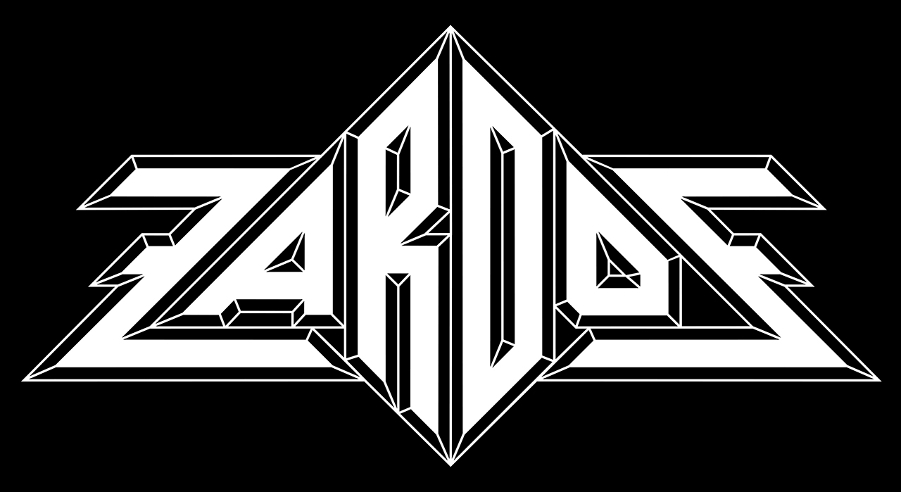
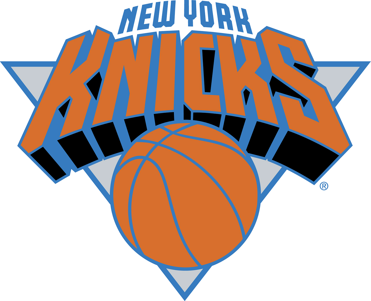
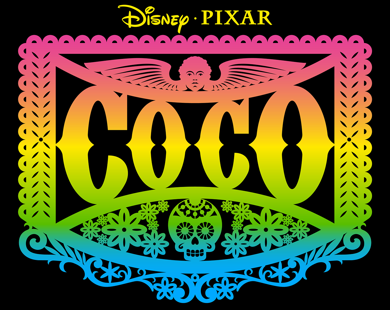
TR: From Wolfen to Zardoz to designing for the Knicks (fig. 7a, fig. 7b), your portfolio spans vastly different cultural spheres. How do you adapt your creative approach to such diverse projects while maintaining your signature style?
MD: I do not have a signature style that I strive for. The look that all my work has—it’s style—is not something that I consciously strive for. The style that people perceive in my work is just a natural expression of my thinking process and problem solving. It’s just how I visualize things, and not a result of conscious decisions on my part.
TR: Your work has inspired countless designers, even before they knew your name. How does it feel to hear about the influence your designs have had on aspiring creatives over the years?
MD: In recent years I have been hearing from many designers about how my work has influenced them, and how that influence turned into their decisions to pursue a career in design. One example is how my record jacket design for the Kiss album Rock and Roll Over (fig. 1) is constantly mentioned as a childhood influence by many current designers. They talk about how it showed them that there were other ways of looking at design other than what they were familiar with. Hearing all this has been very gratifying. As designers we don’t usually hear from the general public about how our work is received. I have had the unique opportunity to hear from those who my work has affected, and to know that what I do has been understood, and appreciated.
TR: Over the decades, how has your personal style evolved, and how have changes in technology or culture influenced your work?
MD: Many of these questions here seem to be addressing this idea of “personal style”. Let me be clear about this: I have never tried to develop a style or look for my work. Whatever people think of as “my style” grows out of the limitations of a particular project, and how those limitations interact with my personal aesthetics: I would never try to direct the look of a piece to conform to what others think of as a style.
My transition from analog media to digital—which one would think would affect the style of my work—did not. Here are two pieces: one created earlier in my career with pen, ink, drafting equipment and typesetting, and the second created with Adobe Illustrator. I defy anyone not familiar with when these pieces were created to tell which was which! Because my two methods of working were so closely aligned, the way I designed and solved problems remained virtually unchanged. But working digitally did open up other ways to achieve certain looks that were too difficult to do with the older technology. (fig. 8a, fig. 8b)
TR: If you were to design something today inspired directly by the amusement parks of your youth, what would it look like, and what emotions or memories would you want it to evoke?
MD: I would never try to do anything like that outside of my assignments. But if I had one where it was important for me to reference those amusement parks to solve a graphic or communication problem I would strive to design a piece that was compelling. But I wouldn’t know how to make that piece evoke memories or emotions. (fig. 9)
TR: How does your approach to lettering differ from designing a typeface? Do you find one more creatively liberating or technically challenging than the other?
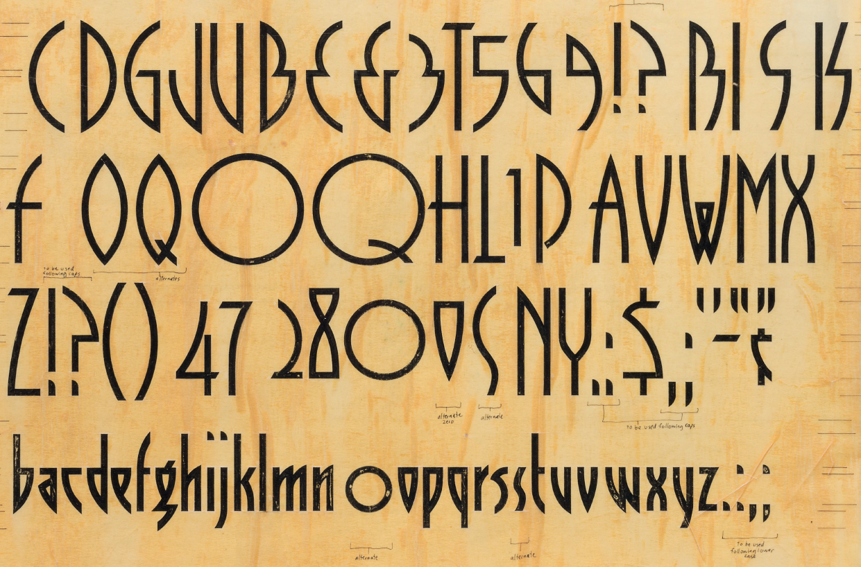
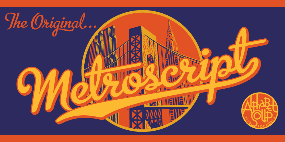
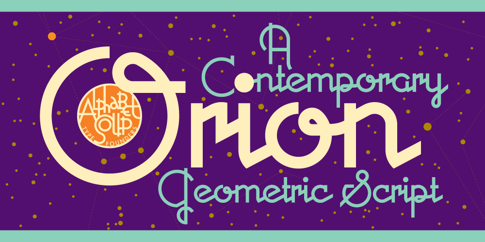
MD: When I first began to design fonts I believed that the two disciplines were very closely aligned. I was partly wrong about that. With lettering you basically have free reign to compose letters and shapes that can do whatever you want them to do. With font design you have very strict limitations about what you can or cannot do. The basic difference is that with font design you need to understand that the letters, when set, will be mostly in rigid straight lines, one next to the other—like soldiers. That’s the way typefaces were conceived. But with digital typesetting every year brings innovations that allow one to escape the tyranny of setting type in a straight line. But I do not believe that typesetting will ever approach the freedom or look of designing a hand-lettered piece. I also discovered that designing fonts can be quite technically challenging, and it is also quite boring and mind-numbing. Additionally, there are now so many newer fonts that it is becoming extremely difficult to create a good one that gets noticed and purchased. For myself, I have decided not to spend any more time designing fonts, as I would never be able to make a living doing that. It’s too strict for me to enjoy the process, and don’t feel it’s rewarding enough. (fig. 10a, fig. 10b, fig. 10c)
TR: Your lettering work often carries a strong sense of personality. How do you translate that same individuality into a typeface meant for broader, versatile use?
MD: Honestly, I do not know how to do that. When I designed fonts, I always designed fonts that I would like to use myself. Apparently that doesn’t always translate into sales. I would leave the job of designing mass-appeal typefaces to others who are more suited to do that. I love what I do, and would rather devote my time to creating work that I enjoy.
TR: How do you nourish your creative life when you’re not working?
MD: Almost everything I do relates to my passion for letterforms.
TR: To what extent can design, typography, music or art be subversive today, up to the point of changing our understanding of today’s world altogether?
MD: I am not qualified to answer that question. I do not know anything about being “subversive”.
TR: For young designers who are inspired by your ability to break norms and create unique visuals, what advice would you offer about finding their own style and voice in the industry?
MD: The first bit of advice I would offer about finding your own style is this: be true to yourself, and do not try to consciously create a “personal” style . . . just let it evolve. The style of your work will emerge from who you are, and from those things that have influenced you from a very young age. Additionally, concentrate your studies more on the history of design, and on design and color theory. Focusing too much on the computer will lead you down a dead-end path. Computers are only tools—kind of like a set of paints, or pencil and paper. Computers can’t solve your problems, do your work, or think for you. I see far too much focus from students on how to master the computer, and not enough on problem-solving or coming up with interesting ideas. Find out who your design heroes are, and study how they solved problems. Perhaps that will help you discover a roadmap to help you move forward. (fig. 11)
“Alphabet City” is available at: Letterform Archive
Check out Michael Doret’s work here
Interview by: Giannis Papaioannou | Typeroom
Tags/ music, typefaces, lettering, branding, logo design, letterforms, design and typography, graphic arts, sports branding





.gif)

