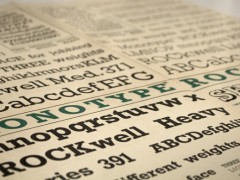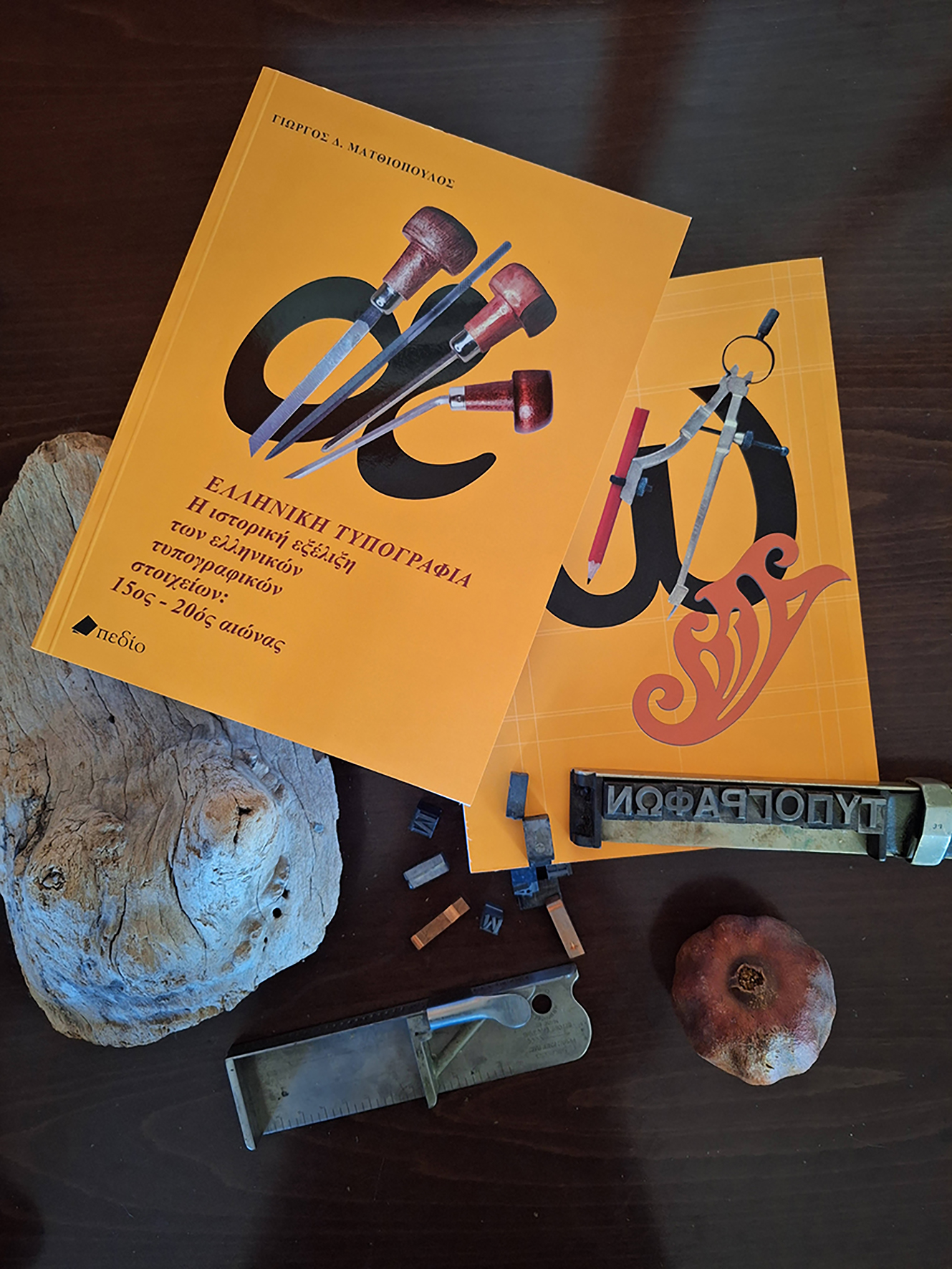
Preserving Type Heritage - A Primer of Greek Typography
Join George D. Matthiopoulos as he reflects on the artistry, heritage, and evolution of Greek typography. His latest book stands as the definitive guide to Greek type design, chronicling historic type foundries, influential typefaces, and the rich typographic tradition.
George D. Matthiopoulos, a founding member and typeface designer of the Greek Font Society (1992), has significantly contributed to the preservation and evolution of Greek typography. In his latest work, Greek Typography (Pedio publications), Matthiopoulos delves into the historical journey and intricate artistry of early Greek type design, offering insights into a legacy that bridges centuries of cultural and aesthetic evolution. This interview unveils his perspectives on the challenges, inspirations, and future of Greek typography in a rapidly digitalizing world, celebrating the delicate balance between innovation and heritage.

TR: How do you think the art of typography has influenced Greece's cultural identity over the centuries, and how do Greek typefaces reflect our enduring relationship with writing and aesthetics?
GM: From the initial adoption and adaptation of the revolutionary Phoenician alphabetic system for the needs of the Greek language, the 24 letters went through many variant forms that spanned more than two millennia before the invention of printing. When the printed book became the new agent for the dissemination of information and knowledge, type cutting and casting became pivotal factors of the new visual communication. At first, the art of typography in Europe emulated the old and familiar letter-symbols used by the scribes in the medieval codices; in fact, the simplicity and modularity of the gothic letters were crucial factors for the functionality and success of Gutenberg’s invention, in terms of their relatively easy and cheap production.
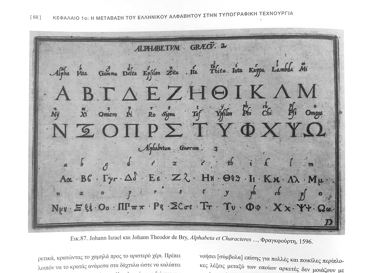
The printing of books appeared in Western Europe only a few years before the Eastern Byzantine Empire collapsed, when the Ottoman Turks invaded and occupied the Balkan peninsula. As a result, the first Greek texts were printed in Renaissance Italy instead, by type cutters ignorant of that “exotic” script, replete with numerous intricate ligatures and accents. For more than 20 years their best solution was to reduce the complex and Greek Byzantine script to simple 24 lower case letters; surprisingly, it took two amateur Cretan priests to dare abandon the simple modularity of the early letterforms and attempt a hitherto unthinkable feat: to produce a full byzantine font with more than a thousand ligatures, variant sorts and all the accented vowels for two small editions, in 1486. A few years later, their example was heeded by Aldus Manutius, the most prominent publisher in Venice, who printed the whole ancient Greek literature corpus using new fonts which followed the hand of his contemporary Greek scribes, full of Byzantine ligatures. His unprecedented success set the standard for every Greek book printed in Europe hence and that trend culminated in Paris, a generation later. Sponsored by King Francis I, the royal printer Henry Estienne commissioned the production of a new Greek type by Claude Garamont, the master typecutter, in collaboration with the erudite Cretan scholar and renown calligrapher, Angelos Vergikios, who was invited from Rome to organize and enlarge the Greek manuscript collection of the Royal Library. The resulting fonts, in three sizes, became known as Grecs du roi and were immediately praised for their beauty by scholars and printers alike, thus becoming the new stylistic standard to follow in Greek type design for the next two centuries.
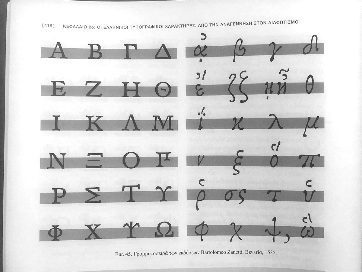
In the 18th century, during the era of the cultural Enlightenment and aesthetic innovation in Europe, several University scholars, publishers and printers started increasingly the simplification of the Greek texts and the retiring of the old-style Greek fonts. By the beginning of the 19th c., cutting and typesetting the numerous Byzantine ligatures were abandoned altogether and a new stylistic paradigm appeared for the Greek scholarly editions in England, France and Germany. Predictably, it followed the prevailing neoclassical fashion of maximum contrast between thick and thin strokes of their contemporary Latin fonts: Cambridge University Press commissioned a mildly oblique font based on Prof. Richard Porson’s much admired hand-writing, Firmin Didot introduced an upright, round Greek font in Paris and Karl Tauchnitz in Leipzig reprised with his also round, but excessively inclined letterforms; those three distinct styles became the almost exclusive Greek type used in each respective country until the mid-20th c. for every philological, archeological or theological edition.
This simplification of the Greek typecase brought an abrupt end to the continuity of the Byzantine script and its cultural ties with the past, but in retrospect, it greatly benefitted the Press as the voice of the Greek Revolution during the successful War of Independence against the Turkish Empire (1821-1828) and, thereafter, it helped to bring Greek society closer to the European modernity by quickly increasing the literacy rate in the new Greek Nation-State by the end of the 19th century.
TR: What are the biggest challenges you faced in trying to "translate" the complexity of Byzantine script into digital typefaces? Is there a risk that the simplicity of digital design might sacrifice the historically rich detail?
GM: The Byzantine script from about the 9th to the 17th century period had lost its functionality as an easy and quick system of symbols for storage of cultural, scientific or civil content, which any alphabetic notation implies. The intellectual needs of the middle and late Byzantine Empire were mostly confined into a tightly regulated and exclusive religious cast; their scribes had slowly regressed the art of writing back to a numerous and densely complicated, almost hieroglyphic, system of symbols that it was unpenetretable by the uninitiated majority. The best scribes did, however, develop spectacular, often sublime, visual compositions in the codices and their aesthetic quality as human artifacts impresses us to this day. The written text acquired its beauty not by repetition and standardisation, but from a seemingly chaotic, yet surprisingly harmonic, interplay of visual clues. One can certainly trace in them the constant influence of the Arabic visual culture and scribal practices filtered over the ages.
As I already mentioned, the irregularity of this complex writing labyrinth and the mechanically repeated modularity that the Gutenberg’s system introduced were difficult to be reconciled at the beginning. As the importance of Greek printed books increased exponentially, along with the wave of the Renaissance’s thirst to retrieve, unlock and absorb the achievements of the Greek Antiquity, the visual quality of the contemporary Byzantine-Greek writing system had to be addressed and emulated. The process of that trajectory reached its apogee with the Grecs du roi, in 1544. After that, as the Greek scribes were steadily reduced in number and the Greek speaking regions remained captive under the medieval militaristic reign of the Turks, there was no replenishing of new ideas and developments to sustain any growth of that complicated writing system. When, during the age of Reason, the lure of the exotic East started to fade and the European publishers got tired incurring the high cost of printing Greek texts, the long gone tradition lost its gravitas while rational and more productive practices replaced the former Byzantine scribal rituality.
In our present Unicode environment for digital font generation, however, many hundreds of unique ligatured combinations could be added as alternate glyphs and with simple encoding they would replace any string of single letters. Therefore, the incorporation of the historical Byzantine tradition can be reintroduced, and its appeal and use is open to all those who have a scholarly interest in the field of Paleography or to aspiring type designers and typographers with an artistic vision for its application. As such, any further research into the medieval scribal handwritings or the historical font variations of the printed Greek books will broaden our perspective and may offer visual ideas to the coming generations.
TR: How do you see the evolution of Greek typography in the modern digital environment? Are there new trends or techniques that inspire you, or do you believe that certain traditional principles of typographic art are irreplaceable?
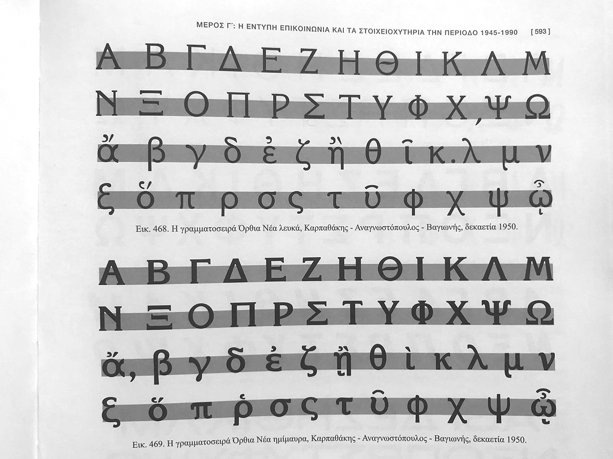
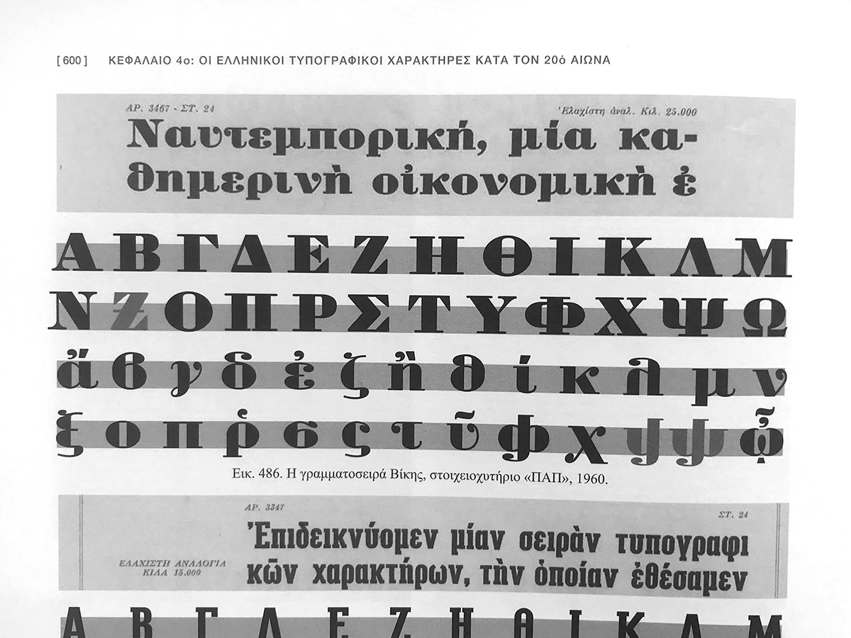
GM: Since the 1990s, the first efforts to design digital type families were overwhelmingly concerned with the transition of the phototypesetting font collections to the new processes and only a small number of type designers were involved in a more experimental approach. Since Gutenberg’s times and up until the digital era, type cutting and casting technology had been a highly specialized field which was out of reach for the small and underdeveloped Greek industry. It was only during the inter-War period that two Greek type foundries were able to outprice successfully the European competitors. The new type designs, however, were limited to display fonts for the needs of newspapers, periodicals and advertisements. Types for continuous texts have been traditionally and almost exclusively confined to two 19th century designs: Didot’s upright Greek (1804) and an upright variant form of Tauchnitz’s inclined (1898) under the name Elzevir Greek. From the beginning of the 20th c. to this day, the Didot typeface has remained the default choice for most editions in Literature and the Arts, while the rival Elzevir –reinvented and superceded by Monotype’s Times Roman Greek (1950s)– managed to secure its presence in the Sciences.
From the early years of the present century the fast and easy availability of digital font applications and the growing global interest in Typography triggered an increasing number of younger designers in Greece, as well as abroad, to enter the fray and inspired them to include the Greek alphabet in their typefaces. Yet, as the universal trend is to design a font with the same aesthetic details across at least three different alphabets (Latin, Greek and Cyrillic), the hardest visual problem everyone faces is how to reconcile the many vertical, serifed stems of the Latin lower case letters with the serifless and full of curves Greek strokes; an impossible task.
Many have done their due diligence and returned back to resurrect the stylised Byzantine past (Grecs du roi), but revoking that obsolete aesthetic trend with its unmistakably inclined look cannot be a direct substitute for modern Greek text fonts. Undoubtedly, the proven principles of legibility, consistency of strokes, the harmonious balance between the x-height and ascenders/descenders or the white space in the counters as juxtaposed with the stems of each letter remain paramount factors in Greek type design, too. Nonetheless, after the interminable conditioning of numerous generations to read with those two seemingly infallible fonts, any new proposition is stacked against long odds in gaining majority acceptance. The only typeface that seems to me to have achieved this status is Minion Greek, designed by Robert Slimbach in the 1990s as part of the Minion Pro font family. Like its perennial rivals before, the typeface has enjoyed strong corporate backing, extensive and expertly designed family members, easy accessibility in all the operational systems and the fact that it has wisely retained many aesthetic details of the older pair. It is equally contemporary and traditional; it points to new directions without “rocking” the visual boat.
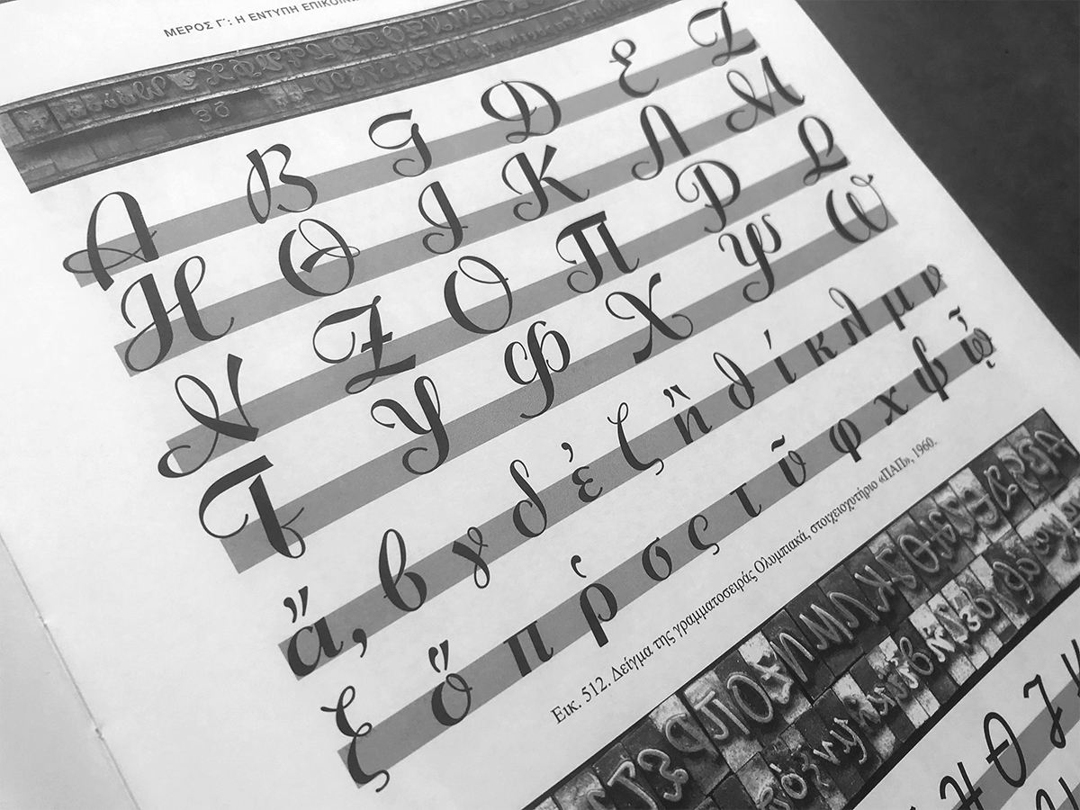
On the other hand, in the Interwar era, most sans-serif Latin and Greek typefaces fare a great deal better as they share several design characteristics; the shift started with New Hellenic (Monotype, 1927) and its derivatives, Ellade (Nebiolo, c. 1928), and Metrolite (Linotype c. 1930), then Europe (Deberny & Peignot, c. 1932), and the first Greek made font, Olympia (Karpathakis, 1939). After WWII, Monotype introduced the Gill Sans Greek (1950) and Univers Greek (1967) series, Attika and Artemis by Hermann Zapf (Stempel, 1953) and Folio Greek (Intertype, c. 1965); later, Matthew Carter designed Helevetica Greek for phototypesetting (Linotype, 1972). Since, their popularity continuously rises and there is now a large pool from which to choose well designed sans-serif Greek fonts.
TR: Is there an emotional or aesthetic difference for you between handcrafted type and digital fonts? How can we preserve the vitality and "human touch" of typography in the modern technological context?
GM: One way or another, there is a sentimental attachment towards the traditional metal type aesthetic to everyone who was part of that milieu. Yet, the transition to the digital technology has offered many advantages; it allowed a much larger number of talented designers to enter the field and this “democratization” of the means has brought fresh ideas and new directions in type design. As historical research increases and is disseminated to designers, their sensitivity to the finer aspects of type aesthetics will continue to grow. The unquenched need for fast production of visual communication in the digital environment, however, will be more concerned and occupied with display types rather than the minute details of the typographic microcosm, which the metal age had to address. That will remain a niche field for a small number of readers.
TR: Do you believe that the choice of a typeface can influence the understanding or perception of a text? Is there a specific typeface that, to you, embodies a deeper philosophy or aesthetic statement?
GM: Indeed, the choice of a typeface can be pivotal to both, legibility/comprehension and intellectual appreciation of the content. A graphic designer needs to always increase his/her sensitivity of the general feeling of the content and, if possible, factor in a typographic layer to help expressing it. Each typeface carries a specific cultural identity and it can play a role in supporting the text and the author’s intentions. As I mentioned before, Greek typeface design developed for centuries in a non-native environment and these distortions have irrevocably shaped its identity and future path. My personal choices are determined by the limitations of my generation’s visual education and application, i.e. the unending oscillation of the 19th century paradigm: between the irrational beauty of the French “Didot” and the rational pragmatism of the German “Elzevir” types.
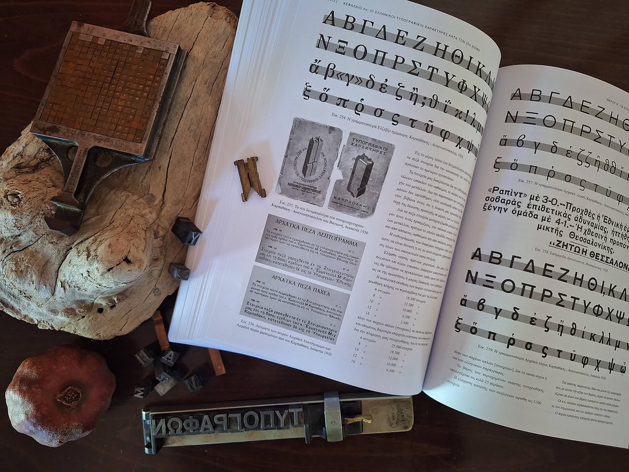
TR: In your book, you document typefaces that are at risk of being lost to history. What was the most moving or thrilling discovery you made during this process of preservation?
GM: Allas! There was not any hidden diamond in the historical ruble, that I can claim to have unearthed! I am concerned, principally, in exploring and preserving the historical process and visual paradigms, so the younger designers will be able to delve in and form their own conclusions on how to experiment with the Greek letters, informed by the efforts of many past generations. My intention was to collect and make available a wide historical perspective on Greek type design that my generation had no access to study and be informed by it.
TR: Do you remember the first typographic element or font that inspired you to dedicate your life to the art of typography? What is your personal "letter" within the Greek alphabet, and why?
GM: My personal interest in the art of Typography hails back to my College years, when I was first introduced to the significance of cultural history on the design process. By a happy coincidence the University Library housed the extensive Perry R. Long Collection on Printing & Graphic Design, which gave me the opportunity to expand my research in many significant and hard to find books on Typography. Soon after, in the mid 1980s, the introduction of Personal Computers prompted further my experimentation, and I started “drawing” bitmap typefaces with an Amiga 2000, and then “graduating” to experimental digital type design in an Apple-Mackintosh. My continuous search on books or other material chronicling the Greek typographic developments revealed that there was a dearth of studies on the subject and sparked my interest to investigate further. By then, I had moved to London for a training course in the London College of Printing, where I met Klimis Mastoridis, a fervent researcher in Typography and long lasting friend. After returning to Greece, Klimis introduced me to Dr. Michael Macrakis, who was setting up the Greek Font Society with the support of the Greek Literary and Historical Archive. GFS’s main goal was to collect and archive any material available on Greek type history and design, and to proceed to introduce digital designs of old and new Greek typefaces for free use in the publishing industry, as well as in the many University Departments of Greek Classical Studies worldwide.
My “favourite” Greek letter is Phi (Φ/φ), because in design terms it involves equally the round and vertical strokes in a demanding combination, both in majuscule and miniscule forms. In addition, it is the international mathematical symbol for the Golden ratio (φ), which further endears it to me on account of its rich roots in nature’s architecture, and its aesthetic application for millennia by the human intellect.
TR: Do you believe that Greek typefaces hold the place they deserve in the international typographic landscape? What is needed to elevate Greek typography on a global scale?
GM: The Greek alphabet and Classical literature were an indispensable tool for the scholars of the Italian Renaissance and Greek studies blossomed through the typographic arts in the European Universities. This long-lasting international presence, although weakened during the second half of the 20th century, allowed Greek type design to follow the modern European developments. Now, due to the digital revolution, the international design community have shown great interest again and include the full Greek character set in most new typefaces. In Greece, too, there is a fast-growing group of excellent young practitioners of the craft and I am very optimistic that their dedicated industry will keep our alphabet well served in the future.
TR: If you were to imagine Greek typography 100 years from now, how would you like it to have evolved? Is there a particular fear or hope guiding you?
GM: Typography is principally the visual tool of a language and the oral developments in the use of any given written system will inform the future changes of its forms. Therefore, considering the dizzying speed of change in the fields of AI and quantum computing within a single generation, a hundred years projection is clearly beyond the reach of any meaningful prediction. The transmission of visual information content will almost certainly be conducted through faster bio-technical channels in a global environment. The Greek written symbols will probably retain their purchase for cultural identification and assimilation, but the Greek letters and text will be more useful in the art-expression spectrum or in cultural studies.
TR: What does it mean to you to teach the art of typography to a generation raised in the digital environment? What values of the craft do you aim to pass on to them?
GM: Indeed, teaching the principles of Typography to the younger generations, born and raised in the 21st century, is more challenging. Human society quickly shifted from an almost exclusively text-on-paper reading environment (i.e. books, periodicals and newspapers) to a predominantly screen-based, visual-oral information system that demands different approaches to type use; small amounts of text matter and increased attention to display characteristics of the letters or short phrases. The universal reading culture, which guided the education and socialization processes in the previous generations, exerts much less influence, anymore. The fields o literature, philology, history, journalism, etc. have been significantly weakened as foundations of social recognition or aspiring career paths, and consequently the majority of the young grow in their formative years ignoring or underestimating the invaluable contribution of knowledge for a constructive and disciplined development of their talents. This is the crux of the issue in the applied arts and it takes a lot of effort and persistence to develop personalities with self-powered enthusiasm and dedication into building a methodical, critical mind that will feed their creativity during their life.
TR: What do you believe is the most important skill young type designers should cultivate today, and what message would you like to leave for all students who will carry on the art of typography?
GM: Digital type design has emerged as a modern and exciting skill to acquire, i.e. exploring the beauty and accuracy of digital shapes, the modularity of common characteristics, the clear engineering objectives, the methodical approach, encoding filters, the variable possibilities etc., but these traits are only the tip of the iceberg in the field. If aesthetic and engineering experimentation are to be fused in new meaningfull ways, one must also develop a permanent personal interest into studying the cultural issues that shaped human history in each period; the art of typography has always been factoring in all these currents and without them any future typeface will most likely remain a heap of superficial decorative drawings destined to fade away without a trace. Talent and a critical mind constantly need the nutrients from their cultural roots to blossom and this is my advice to all aspiring type designers.
Book Orders: Pedio Publications
Interview by: Giannis Papaioannou | Typeroom
Tags/ typefaces, greek, analog typography, foundry, historical types, type specimen, hellenic