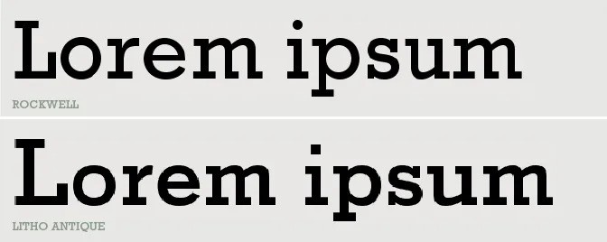
Litho Antique, Rockwell Antique, Stymie Bold: Can you tell the difference?
The origins
Have you ever heard of Litho Antique? Or are you more familiar with Rockwell Antique? What about Stymie Bold, does it ring a bell? Did you know that these legendary typefaces are all connected?
It is pretty common in the history of typography and type design for typefaces to evolve and function as an inspiration and a foundation for new ones to be born. Litho Antique is a typeface with a very rich legacy and evolutionary history, but let’s start from the beginning.
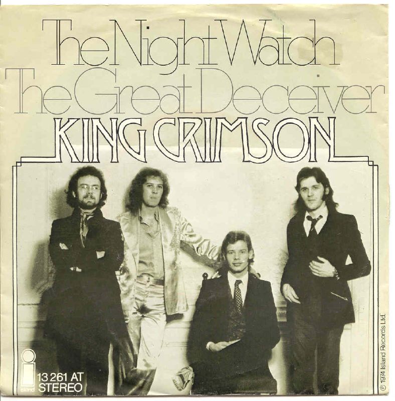
So, let’s go back to 1910. According to Mac McGrew, Litho Antique was cut by William Schraubstadter for Inland Type Foundry and it was advertised as the “newest typeface; one of our best; closely imitating steelplate and lithography”. The typeface has been a part of the broader trend of distressed and hand-crafted looking typefaces that provide a sense of history and authenticity. Litho Antique’s style became super popular during the 1920s and as a result a lot of similar typefaces started popping up.
In 1931, Rockwell Antique appeared. Rockwell Antique was a reissue of Litho Antique by Morris Benton of ATF, with several extra alternate characters added. However, Benton was not satisfied with Rockwell Antique’s success and came up with a new version called Stymie Bold. This version had some refined characters and more tight fit. Stymie could be described as Futura with serifs.
Morris Benton is considered to be one of the most prolific American type designers with more than 260 typefaces credited to him. But, he was mostly known for forming the ‘type family’ concept as he was designing ranges of fonts that only existed in one weight version. And that is what he did with Stymie Bold too. In 1931, he designed Stymie Light, Mediums and Italics and in 1935 he added Stymie Extrabold. According to David Consuegra, he designed eight Stymie variants overall.
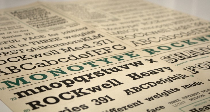
The story gets more interesting when Monotype entered the game, shortly after Stymie Bold was released. Stymie Bold and Rockwell Antique are sometimes mixed up and it is difficult to tell one from another. This happened because Monotype published a version of Rockwell but called it Stymie Bold in some literature. The actual Stymie Bold was also replicated by Monotype in 1936.
They also published Sol Hess’ Stymie Extrabold in 1934, expanding the family in a way and not only duplicating Benton’s work. Then in 1935 and 1936, Hess and Monotype produced Stymie Light Condensed, Medium Condensed and Extrabold Condensed. The last member of the family, Stymie Bold Condensed, was designed by Gerry Powell and published in 1937 and it was the first version that was differentiated from the basic family characteristics.
Stymie also had extra-large sizes, with some of the typefaces of the family being cast up to 144-point. According to Meggs & McKelvey, Stymie Compressed was cast in 288-point from drawings by Wadsworth A. Parker of ATF.
The legacy
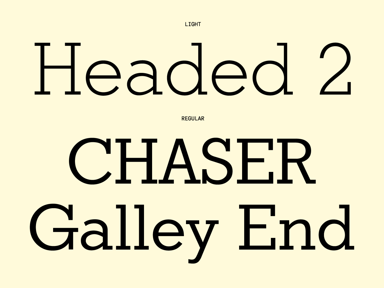
The Rockwell® Nova family is a sturdy, optically monoweight design with blunt, straight-edged serifs. Based on the original Monotype Rockwell suite of fonts, Rockwell Nova is a versatile display design that can be used for headlines, subheads - or virtually anyplace where a strong presence is required. Rockwell Nova OpenType® Pro fonts have extended character set supporting Greek, Cyrillic, most Central European and many Eastern European languages, in addition to providing for the automatic insertion of ligatures and fractions.
Litho Text by Parachute Typefoundry
Litho Text traces its roots to Rockwell Antique, released by ATF in 1931 and originally inspired by Litho Antique from Inland Type Foundry in 1910. ATF later reissued it as Stymie Bold after various modifications, and Monotype adapted Rockwell for its typesetting machines. PF Litho Text isn’t a direct revival; rather, it’s a refreshed take with its own distinct style.
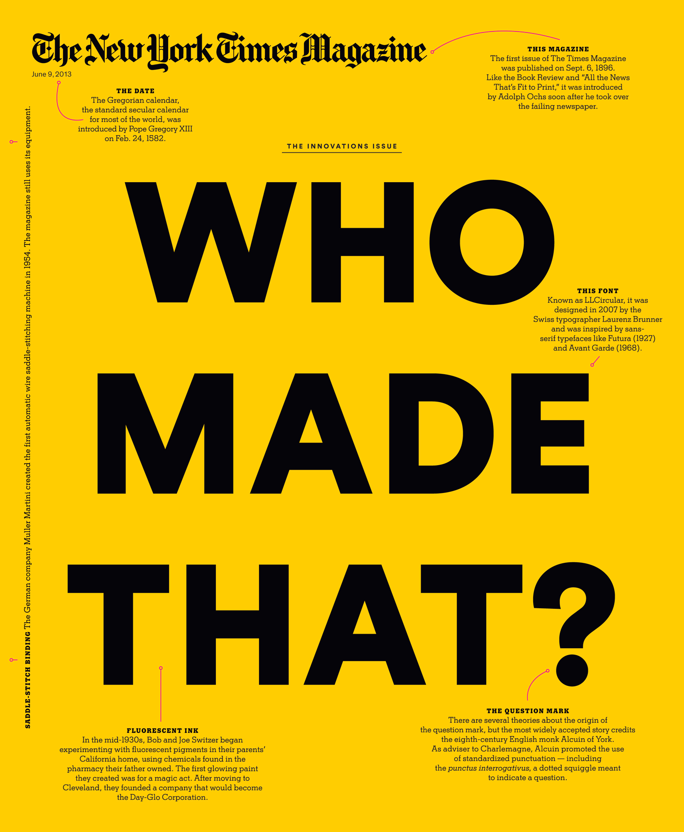
A custom Stymie designed by Matthew Carter for the New York Times. Carter & Cone has designed some celebrated typefaces and award-winning custom fonts. They have produced custom typefaces for a range of major publications, companies, and institutions, including the New York Times.
L&C Stymie Hairline by ITC & Letraset
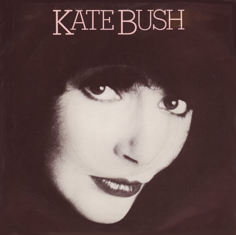
An extralight extension of Stymie, designed by Herb Lubalin and Tom Carnase. Listed in an undated Conways specimen as L&C Stymie Hairline and sold by Letraset as L&C Stymie Liteline. Released by ITC in 1972, with alternates for ‘afAR’. Digitized by Shin Oka (Daylight Fonts, 2019).
Tags/ typography, typeface, history, monotype, typographic history, litho antique, rockwell, stymie bold
