Stylorouge X Blur: celebrating the seminal logo of an eternal British band
This is Britpop 2.0! Blur are back! The acclaimed British band has announced dates for a summer 2023 comeback.
The reunion is the first since 2015 and comes 35 years after Blur’s 1988 formation therefore this is a reason to celebrate one of the music industry’s most successful logos in a visual throwback to an era when Britpop dominated the charts, the media, and the culture of the 90s.
Utterly efficient and distinct, the Blur logo was created by Stylorouge studio, one of the UK’s most respected creative consultancies in music and media founded by Rob O’Connor.
Simple yet complex and time-bending, the simple logo serves the image of the band for decades now. Although the music group continuously experiments with its soundscapes — blending post-rave psychedelia, the sixties pop, electro-pop, Cool Britannia, and more — the logo remains the same, proving what an everlasting effective brand image should look like.
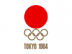
Written in lowercase letters, the logo’s latest version for the band’s new gigs reminisces the mod spirit of post-war Britain and the visual artist’s Brian Pike graphic emblem for The Who (1964) and its shape hints at the iconic CBS logo’s eyemark created back in 1951 — while the logo is commonly attributed to William Golden, some design work may have been done by CBS staff designer Georg Olden, one of the first African-Americans to attract some attention in the postwar graphic design field.
Blur’s logo has since become widely recognized, always functional in the past three decades that encapsulates the band’s music endeavors.
Stylorouge studio, founded by O’Connor in 1981, designed each and every one of the artworks of the Blur releases from 1990 until 2013. A creative practice that has also worked for Siouxsie and the Banshees, David Bowie, The Cure, Stereophonics, Simple Minds, and more, Stylorouge was commissioned by Food Records to design Blur’s visual identity.
“We were asked by Food Records boss Dave Balfe to see his new band Blur playing at a college gig, where the four members paraded themselves in a confusing but engaging melange of post-punk swagger and floppy-haired baggy sensibility, with the lead singer adding a dangerously unshoegazey propensity for climbing over speaker cabinets and lighting trusses, seemingly intent on self-destruction” notes Stylorouge.
“The brief to us was to distill whatever this band embodied into a logo. At this point I should say that Mr. Balfe has an insatiably demanding character – many months of creative deliberation, toying with pop art, psychedelia and photocopied punk design experimentation ended when we finally came to the conclusion that what the band needed was to be presented in a (probably ironic) way like more of a user-friendly household product rather than the coolest band in town. The logo begets the first album sleeve and so on. Stylorouge designed the first four Blur album sleeves and accompanying singles packaging and tour publicity, as well as a generous amount of special releases for foreign territories” explains the creative consultancy.
“The years immediately following Blur’s emergence brought a huge amount of Britpop interest to Stylorouge, and for that we shall remain eternally grateful…” adds the design practice.
Rob O’Connor aka the Creative Director of Stylorouge has designed numerous album sleeves for many acclaimed artists and he was art director for the now iconic posters for Danny Boyle’s Trainspotting movie campaign.
O’Connor studied graphic design at Brighton Art College and much later enrolled to study film direction under Jim Pasternak at UCLA. He set Stylorouge up in London in 1981. His work in video and television has included promos and documentaries for Pink Floyd’s David Gilmour, Manic Street Preachers and The Shires as well as TV commercials for Universal, Sony and BMG. He has also taken much of the photography used in Stylorouge’s design work and commissions include: UB40, Imelda May, The Cure, Show Of Hands, Squeeze and Baaba Maal.
For more on the fundamentals of the London-based creative consultancy company's “astounding success over several decades, the importance of creative collaboration, freedom and why total democracy is not always the best method of running design projects” listen to this O'Connor in his guest appearance at the Creative Condition podcast hosted by illustrator and writer Ben Tallon.
“The collaboration between Blur and Stylorouge is unique in rock history - uniquely symbiotic uniquely long-lasting, and uniquely British…” writes Andrew Collins in ‘Delicious: The Design and Art Direction of Stylorouge’ (Gestalten), a volume that celebrates the creative practice’s lasting influence on the music and design community. “There is something about the coming-together of the two that says something about the cultural and political times in which they worked” he adds. We couldn’t agree more.
As for Britpop 2.0, Blur announced a second date at Wembley Stadium on Sunday 9 July 2023 due to “phenomenal demand” with even more appearances scheduled across Europe.
For more Stylorouge inspiration check here.
Tags/ graphic design, music, visual identity, logo, logo design, britain, cover art, record label, podcast, album art, sleeve art, blur, stylorouge, rob oconnor

