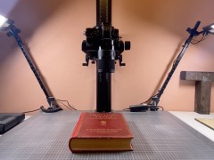
A book, a day: Archigraphiæ, Rationalist Lettering and Architecture in Fascist Rome by ECAL
“Letterforms carry messages – in public space, they are powerful propaganda tools” note the editors of ECAL’s publication aptly named “Archigraphiæ: Rationalist Lettering and Architecture in Fascist Rome”, a book which chronicles and presents the various findings that occurred back in September 2018, during a Summer School at the Swiss Institute in Rome, when a team of scholars and historians accompanied ECAL MA in Type Design and ISIA Urbino students into a typographic journey to a dark place of history.
“During the fascist era in Italy (1922–1943), the rise to power of Benito Mussolini made his revolutionary political party a ruling institution, which had, as its ambition, the creation of an empire modeled on ancient Rome. The visual aesthetic of the Caesars was captured and used by the fascists to position themselves as successors to a glorious tradition.”
“Imagery and photography also played a part in this endeavor, as did architecture and inscription letters. The buildings and monuments of the 1930s frequently display mottos and texts carved in white marble. In ancient Roman tradition, Latin and Italian were used, and full capitals. While the design of these letters is based on Ancient models, their shapes are definitely modern; sans serif geometric letterforms.”
“In the first instance, Archigraphiæ sought to collect images of inscriptions on monuments, public buildings, graveyards, and street plaques in Rome. Then some of those original designs were digitized to reveal their construction, and the ways in which small elements can be capable of turning a neutral geometrical font into a very Italian-style fascist symbol.”
“By mapping this conspicuous feature of fascist propaganda, the Summer School aimed to deconstruct the mechanisms used to promote political ambitions, and to compare this font with other modernist sans serifs of the time. An analysis of the storytelling behind the use of the letterforms allowed students to develop critical thinking about the current (political, commercial, militant) uses of type and lettering.”
“This book presents the results of a Summer School held at the Istituto Svizzero in Rome. The workshop focused on questioning the period from 1922 to 1943, when Italy was ruled by Benito Mussolini under his fascist regime. Considering himself as a successor to the Roman emperors, Mussolini developed an iconography and an aesthetic in his propaganda that was mimicking and reinvesting those of the Caesars, including an extensive use of public inscriptions, cut in marble or moulded in concrete, imposing his person and regime as the Third Rome on the public space.”
“While more discreet than imagery and pictures, type and lettering could equally serve as propaganda weapons. Analyzing inscriptions, their aesthetic and their contexts can help the contemporary reader to question their own time, and the possible use of type design to convey political views. The texts collected in this publication give a historical overview of the time. How was fascist culture oriented? How was the New Typography received in Italy? How did Italian graphic designers manage to navigate through such a complicated time?”
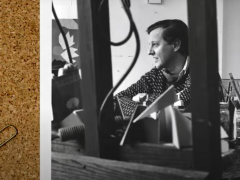
Co-edited by type designer and Head of Master Type Design at ECAL Matthieu Cortat with Davide Fornari and designed by Cortat himself, “Archigraphiæ: Rationalist Lettering and Architecture in Fascist Rome” is an insightful project that should be discovered by anyone interested in the power of typography,
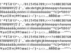
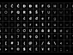
The book that honestly reflects on ECAL’s interest in “fostering critical practices along the students' education” is complemented with a selection of essays by lecturers and researchers Chiara Barbieri, Gianluca Camillini, Joëlle Comé, Jonathan Pierini, Paul Shaw, Alessandra Tarquini, and Carlo Vinti. The publication features a presentation of several typefaces produced by the students themselves.
Published by ECAL/University of Art and Design Lausanne with texts in English and Italian, “Archigraphiæ: Rationalist Lettering and Architecture in Fascist Rome” is available for purchase here.
Tags/ typography, book, publication, italy, ecal, typedesign, fascism, propaganda, matthieu cortat

