Auteur, typophile, trailblazer: how Jean-Luc Godard used typography to revolutionize an era
One of the most influential directors in the history of cinema and arguably the most trailblazing artist in the Nouvelle Vague tribe of filmmakers, Jean-Luc Godard reinvented cinema in unpredictable, heavy in type, ways.
The French-Swiss filmmaker who found fame in the late 1950s and beyond, started his trailblazing career with a “girl and gun” in his 1960 debut Breathless (À Bout de Souffle), and ever since his visual explorations on the big screen continued in his signature jump cut technique coupled with (mostly) sans serifs.
Grabbing the viewer's attention throughout his portfolio of artistry, Godard reinvented the movie language using largely the power of typography across his works. A huge cinephile and typophile, Godard was a radical figure and a filmmaker whose imaginative typographic title sequences and intertitles inspires. The unique typographic treatment in his films does justice not only to the story that unfolds onscreen but to the industry that he revolutionized altogether.
From neon signs through signage, graffiti, handwritten letters, posters, or political pamphlets to his purely typographic intertitles, Godard employed typography to enrich his narrative. Set in Fonderie Olive's Antique Olive (Pierrot le fou, 1965) or a custom version of Futura (Masculin féminin: 15 faits précis, 1966), type is the auteur's absolute asset in providing a unique visual manifesto where letterforms reign.
“We could argue that typography in silent films is actually performing the voice of the actors when there was none. Under this perspective, Typography played an essential role in making sense of a movie from the very beginning of Cinematography. But, as the introduction of synchronized sound in the movies industry led to the death of the Silent Film era typography also became, as some known stars from the grand Cinéma muet, degraded and was almost forgotten as a means of expression -with some exceptions. One of the greatest examples where typography and cinematography coexisted in a meaningful ensemble is in the celebrated work of Jean-Luc Godard” writes Typical Organization's Joshua Olsthoorn in his Cinematography: The voice of typography essay on the occasion of the studio's collaboration with Parachute Typefoundry.
“The renowned French-Swiss auteur uses Type, Image and Sound with equal respect and he is regarded by many the most typographic sensible filmmaker of all, an attitude which he may have inherited from his Swiss heritage. Godard uses type with the respect he uses images and sounds for him type is not just illustrative or introductive but constructive in the art of cinematography. The way he subverts meaning, playing with letters and words, shows that Godard sees those elements as visual content and not merely as sub-scripting some cinematic grand idea” he adds.
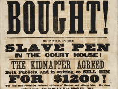
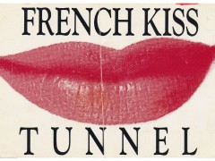
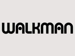
The typography of Jean-Luc Godard. ⁰Various title frames in no particular order / 1960—2018.@DesignMuseum #fontsunday #frenchfonts #bastilleday pic.twitter.com/j6SkPoWjM2
— Selected Works (@selectedworks_) July 14, 2019
“If Jean-Luc Godard is the cinema itself, he is also heir to the printed page. Layout design, and in particular typography, is for him the privileged means of experiencing at every opportunity the paradoxical relationships of text and image. A particular facet of his graphic work concerns the use he makes of type fonts. Three stages emerge through his filmography, marked by the use of a unique typography, whose subtle choice indicates significant aesthetic and political stakes” explains Paule Palacios Dalens in her essay for Pampatype.
“For the first two phases it is about the very French Antique Olive, designed by Roger Excoffon between 1965 and 1967, which was followed by the symbol of Swiss typography, Helvetica, from the 1980s to 2010. The third phase is distinguished by the use of so-called screen fonts (Tahoma or Verdana) designed by Matthew Carter” she adds. For Dalens “Godard's underlying question, whatever the medium (video, paper or film), is a painter's preoccupation: How to represent thought and what colour (political and pictorial) to give it. How to print a thought in movement and free oneself from the fixation of the text on the page? How to make a book while making a film? Typography is the privileged visual mediation through which Godard tries to put an end to the competition between text and image in the production of thought.”
Bold and revelating, “the type for the film titles have a subtle yet charming ruggedness about them, the words look almost hand-drawn or as though the letters have been cut out with a scalpel and these imperfections give it a feeling of identity and craft” writes Tom Jarrett.
“Even though French New Wave stood for spontaneity and going against cinematic standards, it also adhered to certain consistencies.... Simple impactful type was used and with a color palette that mainly consists of the red, white and blue of the French flag. The words are sometimes broken, obscured or flipped out of position and often with wild kerning, yet the type always remains flat and legible. This natural and playful style has stood up to the test of time and is still as sharp as it was 50 years ago” he adds.
“The cinema of today is a screenplay cinema” said the auteur who unified the power of printing with the power of editing to deconstruct the very fabric of cinema through typographic means. “The cinema of today is a screenplay cinema. After Gutenberg, the text triumphed. There was a long struggle, marriage or link between the painting and the text. Then, the text overcame. Cinema is the last art of pictorial tradition. Much is said about images, but there is nothing else, but text.”
Tags/ typography, movies, jean-luc godard, cinematography

