Cooper: Origins, Legacy and Iconic Moments
The origins
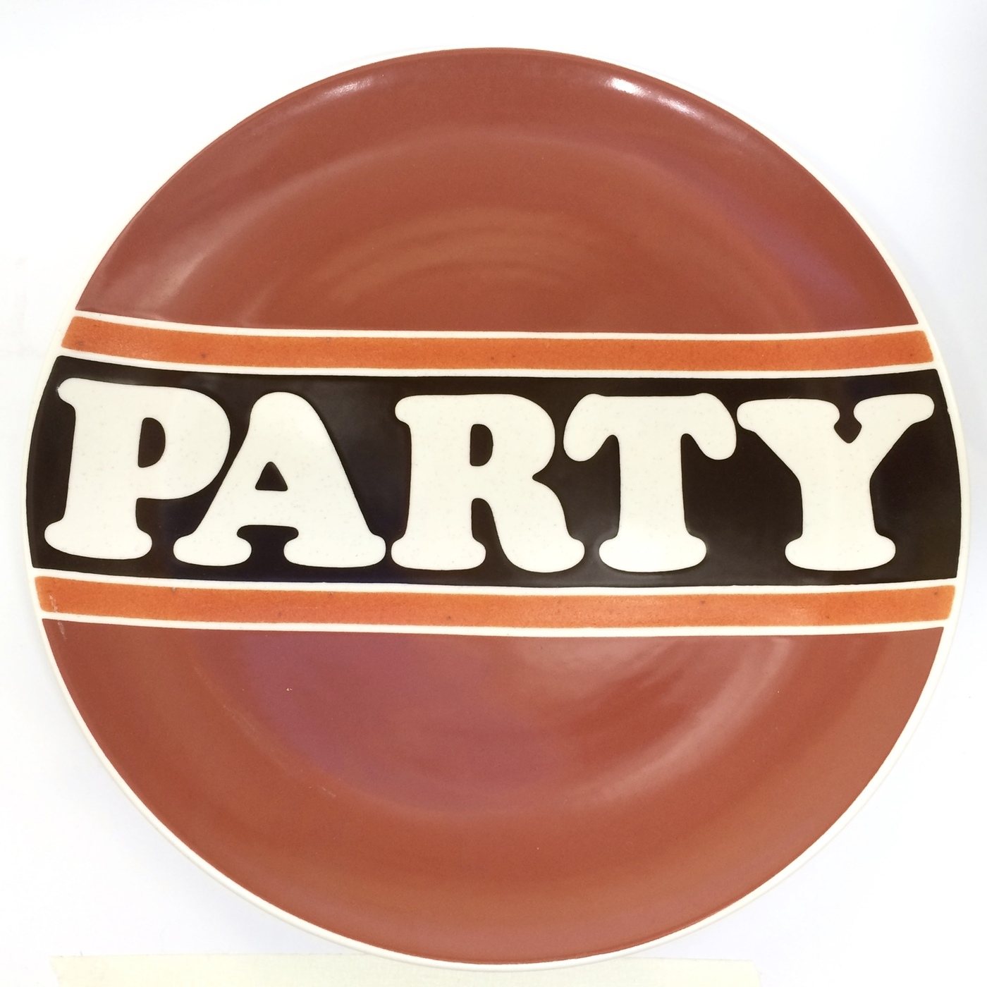
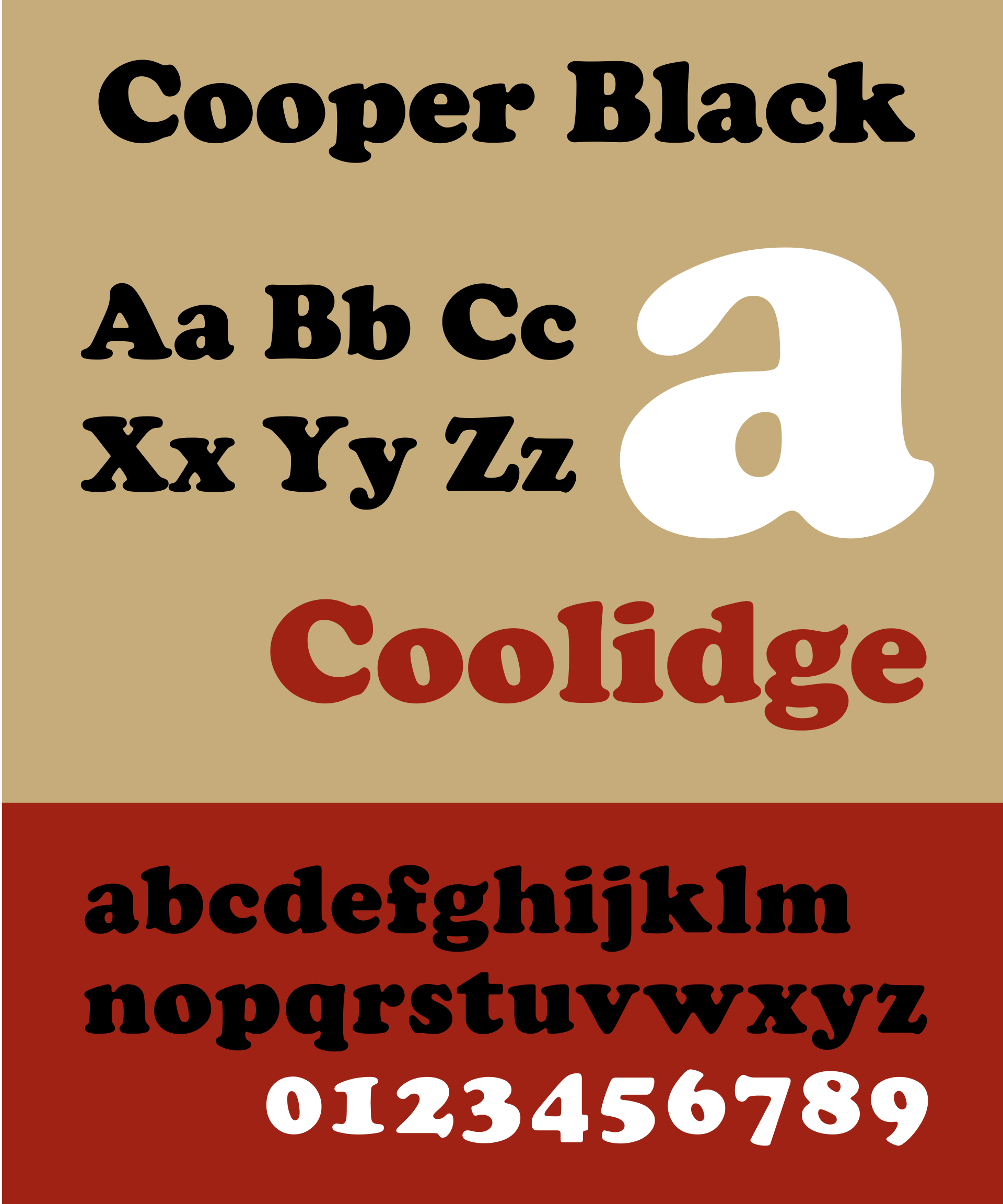
When we hear the name Cooper, most people think of Cooper Black. Cooper Black is a classic, emblematic, ultra-bold serif display typeface designed over a hundred years ago that is still being used in signs, covers, logos, shows and advertisements. But what about its lightweight counterpart? Did you know that it even exists?
Let’s go back to the history of the Cooper Old Style Family and start from the beginning. The font family was designed by Oswald Bruce Cooper back in the early 1920s. Oswald Bruce Cooper attended Chicago's Frank Holme School of Illustration and after studying letters with Frederic Goudy, one of the most prolific American type designers and director of Holme’s Type Department, he became a type design professional too. Over time, Cooper also became Director of the Correspondence School of Typography for the Holme School but he will always be remembered for designing the Cooper Old Style Family. This family gave us the beloved Cooper Black but this ultrabold version is not the only alternative that Cooper designed.
Through the years Oswald Bruce Cooper designed a total of seven typefaces with distinctive characteristics, belonging to the Cooper Old Style Family. The first typeface of the family was released in 1913 by one of Morris Fuller Benton’s staff artists at the American Type Founders, without Cooper even knowing it. Apparently, Benton was impressed with Cooper’s work for Packard Motor Car advertisements and wanted to redraw the typeface that was labeled simply as Packard. Then, in 1918, Cooper gained control of his designs and released Cooper, which was later named Cooper Old Style, for the Barnhard Brothers & Spindler Foundry (BB&S). This was the first typeface with rounded serifs.
Afterwards, BB&S asked Cooper to design a full family and that is when he came up with more alternatives and Cooper Black, the ultra black version of Cooper Old Style, was released in 1922. Cooper Black was instantly a big hit in the advertising world, and continues to be today a classic and effective choice for certain applications. However, Cooper himself thought of Cooper Black as being too mainstream and called it a type “for farsighted printers and nearsighted customers”.
Cooper Black was followed by Cooper Italic (1924), a typeface that has some hints of the irregularity of hand-lettering, Cooper Hilite (1925) that had simulated highlights in white, Cooper Black Condensed (1926), described as “condensed but not squeezed”, Cooper Black Italic (1926) and Cooper Fullface (1029) - later renamed Cooper Modern. Cooper Fullface was probably Cooper’s most bold design. He said that “it is unusual in that it combines the sharp contrast of main and minor lines with the free rendering of pen drawn characters”. Each of these typefaces added unique features and variations, contributing to Cooper's lasting influence in typography.
The legacy
It is common for all timeless classics to be revived and reimagined throughout the years, so it makes sense to check some of the most important Cooper revivals and familiarize ourselves with the Cooper legacy.
- Cooper Old Style™ by URW Type Foundry
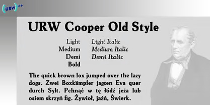
URW's Cooper Old Style is considered to be a historically accurate revival of Oswald Cooper's original typeface. However, thin lines have thickened, and certain details have become rounded off, while the lowercase "g" and the number "3," do not exactly match the original, likely due to poor-quality references. Indestructible Type’s Owen Earl suggests that the historical inaccuracies could have been avoided with better reference materials that are now accessible to designers.
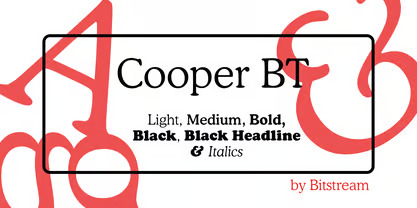
Bitstream Cooper was designed at Bitstream in 1986 by means of adding light, medium, and bold styles, with the corresponding italics, to the existing black ones. This means that the Bitstream version was created based only on Cooper Black and it was not really a revival of the whole Cooper Old Style Family, rather than a re-imagination. As Earl points out, “the original Cooper evokes the time period from which it comes: the 1920s. Cooper BT on the other hand evokes the 60s and 70s, decades that famously saw a resurgence in popularity for Cooper Black. It is a well constructed font with a personality and identity of its own, and when used properly is pleasing and stylish”.
- Cooper Black SH & SB by Scangraphic Digital Type Collection
The Cooper Black Font Family is a family published by the Scangraphic Digital Type Collection based on Oswald Bruce Cooper’s designs. There are two versions available. The first one, SH - Scangraphic Headline Types, is created for headline typesetting, with the other one, SB - Scangraphic Bodytypes, is created for text typesetting. As you can imagine they are pretty different when it comes to spacing, because the Bodytypes edition must be suitable for reading, while the Headlines one is more narrow in order to be suitable for headlines. To prevent the smear effect on acute angles in small type sizes, for the Bodytypes version, fine spaces were created. For a number of Bodytypes, hairlines and serifs were thickened and the whole typeface was adjusted to meet the optical requirements for setting type in small sizes.
- Cooper Black by Mecanorma Collection
Cooper Black is the most ‘famous’ typeface of the family and as a result there are a lot of important and valuable versions of it that have been designed through the years. One of them is the Cooper Black version designed by Mecanorma, which contains three styles and family package options. Mecanorma was a manufacturer of dry transfer lettering based in France that left the graphic art market in the 1990s.
- Cooper Nouveau Font Family by Dave West, Dave Foster and House Industries
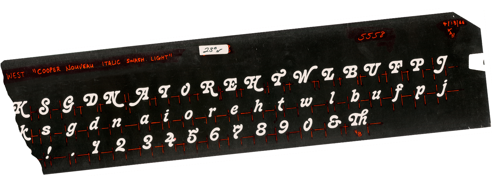
Cooper Nouveau was created by Dave West in 1966 but it is a very special Cooper version. It was based on Oswald Cooper’s original Italics, featuring an energetic pitch, simple contours and a plump figure, uniform strokes and generous curves. The typeface has a playful silhouette that makes it perfect for logos, posters, ads and captions, with swashed characters and ligatures. It is at the same time a fresh note and a cult classic.
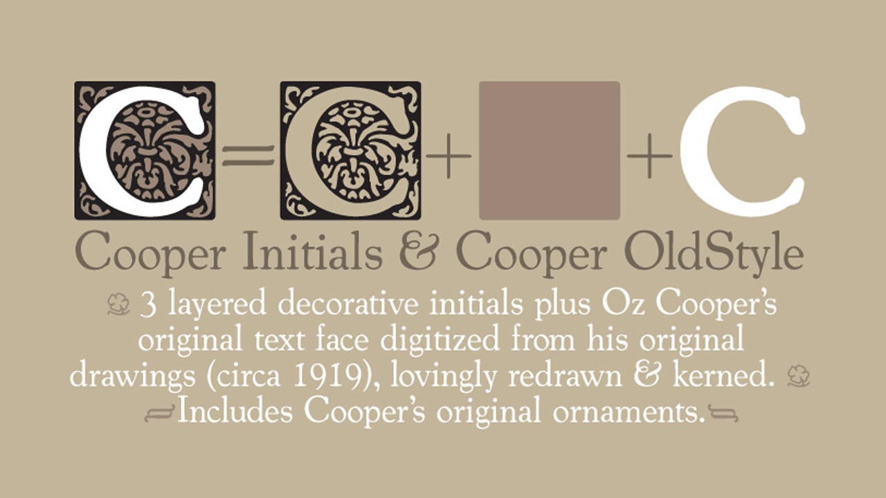
Cooper Text is composed of four fonts: Cooper OldStyle, Cooper Initials, Cooper Ground and Cooper Capitals. Cooper OldStyle is a round-serif text typeface, redrawn from Oswald Bruce Cooper’s original drawings and mechanical proofs. Cooper Initials are ornamental capitals designed for use as complementary drop caps, drawn from a sample in the seminal monograph of Cooper’s work, The Book of Oz.
- Cooper* by indestructible type
Cooper* is a digital revival of Oswald Cooper's original letterforms, drawing from various sources like the 1923 Barnhart Brothers & Spindler catalog, the 1934 American Type Founders catalog, and the 1949 Book of Oz Cooper. Its lighter weights with organic, flowing forms are reminiscent of Art Nouveau, while the normal weight's exceptional legibility despite its expressivity, makes it suitable for books and lengthy text sections. Cooper Black's italic and the unique lightweight italic— which Oz Cooper commended for its uniqueness and closer resemblance to pen forms —are included in the typeface too. It’s also worth mentioning that italics are available in all six weights from Cooper*.
Tags/ typeface, history, font, cooper
