Noble, smart & sharp: introducing PF Expo, Parachute Type Foundry’s latest serif release
The independent type design studio Parachute Typefoundry has released a brand new type design that aims for “condensed, stark elegance” — introducing PF Expo.
“Eschewing ornamentation, PF Expo’s design is nobly rooted in simple, rational, and absolutely functional Roman forms” explains Parachute’s head designer and founder Panos Vassiliou.
“Circa the 17th century the contrast between the thick and thin strokes of letters increased, oblique stressing transformed into upright stressing, round letterforms were compressed and bracketed serifs grew edgy and delicate. During that period and throughout the late 19th century, wood type manufacturers marketed design variations more quickly than type founders did, by devising a system to condense or expand type and creating secondary styles to bracketed serifs such as triangular shapes.
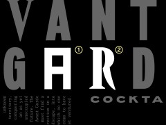
Expo takes its cues from several condensed typefaces of that period, particularly Latin Condensed as well as mid-20th century designs such as Vendome Condensed, and conveys a sharp elegance that creates a cohesive family with solid and provocative quality. The typeface’s abundance of thoughtful details excels at display sizes bringing its extravagant nature into the limelight.
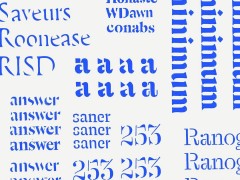
In particular, PF Expo’s carefully modeled serifs follow an artful logic of triangular symmetry, whilst at x-height, the slanted one-sided serifs in letters such as (n), (p), (r) blend effortlessly into the stems to foster a distinct identity.
The abrupt cut at the joints — a visual trick that adds a certain flair to its type design, especially when used at large sizes- provides a unique functionality as it compensates for over-inking in lowercase. The type family’s narrow proportions offer an economy of space — a critical issue for headline use. In addition, the italic version alters dramatically the texture and rhythm with razor-sharp terminals that transform from dual-sided serifs to triangular upstrokes.
Expo provides advanced typographic features including alternate glyphs with its character set extended for pan-European Latin support, Greek and Cyrillic.
Exuding an intense, contemporary, and energetic personality, PF Expo’s modernized novelty is Parachute’s latest typographic installment to ensure an exemplary visual outcome.”
Explore its many qualities, test drive, download Expo’s comprehensive PDF specimen which includes additional information and all the details and advanced features about this typeface that could not fit into the online presentation and purchase Parachute’s latest serif release exclusively from the studio’s multi-awarded online presence.
FYI, PF Expo is one of the nominated type designs in the ongoing Typography Guru Font of the Month competition. Vote for it here.
Tags/ typography, typeface, parachute, serif, typedesign, roman, parachute fonts, parachute type foundry

