In memoriam: Gerrit Noordzij (1931-2022)
“The internationally acclaimed typographer and type designer was known as someone who stepped outside the box. The ‘beauty of imperfection’ that he pursued taught us to look at the obvious” writes NRC Handelsblad’s Kester Freriks in the event of Gerrit Noordzij’s passing earlier this month.
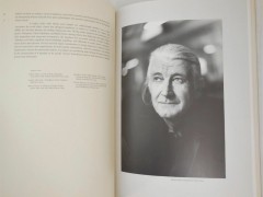
Born in Rotterdam on 2 April 1931, the Dutch typographer, type designer, researcher, letter carver, calligrapher, and writer Gerrit Noordzij began his career as a graphic designer and as a bookbinder's apprentice. Ever since 1956, when he was hired by the Amsterdam publishing house Querido, Noordzij designed and authored dozens of books on typography and design, influencing the very mindset of understanding type.
Noordzij wrote and edited Letterletter, a journal in English for ATypI on the subject of typography and for 30 consecutive years -from 1960 to 1990- he was a professor of typeface design at the Royal Academy of Fine Arts in The Hague, Netherlands and director of the writing and lettering programme at the graphic design department from 1970 to his retirement.
The traiblaizer type designer introduced his own method of teaching typography and type design at the Royal Academy of Art, based on his theoretical system ′The stroke of the pen′.
Grids, type & brilliance: Roots is the tribute to Dutch graphic design icons to own
He presented this system in a booklet called The stroke of the pen: fundamental aspects of western writing (1982), and further developed it in the Dutch booklet De Streek: Theorie van het schrift (1985) -which was translated to English in 2005, called The Stroke: Theory of Writing.
Even though this theoretical model mostly concerns the written word, Noordzij applies it to printed type as well, as he defines typography as “writing with prefabricated characters.” For Noordzij most printing typefaces have their roots in handwriting.
“Typography is the basis for all thinking about form, shape, balance and rhythm of letters on paper” he said. “Letters always arise from the interaction between black and white, between the black of the ink and the white surrounding it. From the way someone draws letters, you can tell how form-conscious he or she is.”
Watch Erik van Blokland explain how the Noordzij cube revolutionized typeface design
“He praised the ‘beauty of imperfection’ and praised students when they did something ‘wrong’ and especially when they went off the beaten path. It was his belief that you had to learn to look at the obvious” writes Freriks.
“That is what makes his typographical work so impressive: it seems to have been designed naturally, effortlessly, but if you look closely you see the ingenuity and above all the balance in which the letters stand to one another. Because that was one of his convictions: a letter never stands alone but always in cohesion.”
A true architect of type, Noordzij claimed that “writing is not a series of strokes, but space, divided into characteristic shapes by strokes” -he proved it through his work. This is Noordzij's acceptance speech when awarded the TDC Medal on October 10, 2013 via Typemedia:
“I thank the Type Directors Club for awarding me their prestigious medal.
Some day, I believed, I would become famous. To anticipate disappointment I also believed that the expected fame could only turn up after my death when frustrating paradigms would be dead as well. New ideas of the sort that could justify fame not only require more than a lifetime to be accepted; they also require a new point of view. I could never persuade a living audience to change their point of view, were it only for a while. To put it decently: a new conception demands for a new generation. In this sense something new is not old enough.
But this award of yours changes my prospect with the chance that I might enjoy fame while still in this world.
I must have obstructed fame myself. In my publications I drew myself effectively into the margin. Letterletter must have puzzled those readers who still believed that writing could be studied by simply looking at letters and scripts. The journal neglected this illusion; instead of keeping a learned distance to writing I tried to describe what happens under the hands of the craftsman in making and arranging the elements of writing. My questions were never answered by the other party; of course not; I was talking the esoteric language of a foreign world.
I found my discussion partners in my own classes in the academy. Students are great company. As professional ignorants they are entitled to making the stupid remarks I needed and to interrupt me for expressing their justified doubts. I found them ever simpler tasks. At the summit of my career I only had to ask students to make a single stroke with a pen and to describe its properties, thus approaching Humpty Dumpty’s wisdom:
In autumn when the leaves are brown/ take a pen and write it down.
Outside the circle of my students I found little understanding until graduated students had begun to impress the world with their skill and their mature approach of writing issues. The last word is from a poem in the middle of the Bible. Tradition attributes this text to ‘Moses the man of God,’ but the coda better suits a common craftsman than a great ruler. In the King James Version it reads:
Establish thou the work of our hands upon us/ yeah, the work of our hands establish thou it.”
Noordzij passed away on the 17th of March, 2022, at the age of 90.
Tags/ typography, type design, atypi, type directors club, dutch design, in memoriam, gerrit noordzij


.jpg)


