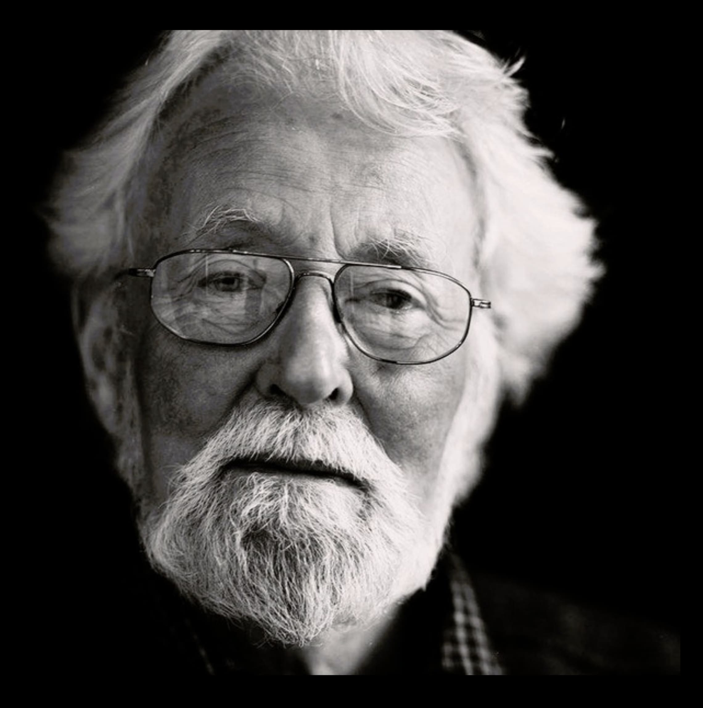
All that jazz, all those letters: remembering British type designer Michael Harvey
A designer's designer, English lettering artist, teacher and writer specialising in lettering, type design and letter cutting Michael Harvey MBE (11 November 1931 – 18 October 2013), was admired by other graphic artists and letter carvers yet he was little known outside these circles.
His work appears in many English cathedrals and on the National Gallery, London.
Originally inspired by reading Eric Gill's Autobiography, Harvey started out as a stone carver in the 1950s, working under Gill’s first apprentice, Joseph Cribb.
An admired of and between 1955 and 1961 he worked as wood engraver, engraver, designer, typographer and painter Reynolds Stone's assistant in the 1950s. Influenced by German font designers Georg Trump and Hermann Zapf, Harvey's career was dominated by book jacket design.
As a freelancer, Harvey produced around 1,500 elegant typographic hand-lettered book jackets for major publishing houses such as Heinemann, Hodder & Stoughton, MacMillan, Chatto & Windus, Hamish Hamilton, Methuen, The Bodley Head and Cambridge University Press.
As technology changed Harvey was determined to be relevant entering into the digital age in the early 1990s when Adobe gave him an Apple computer and sent him to California for training in type design software.
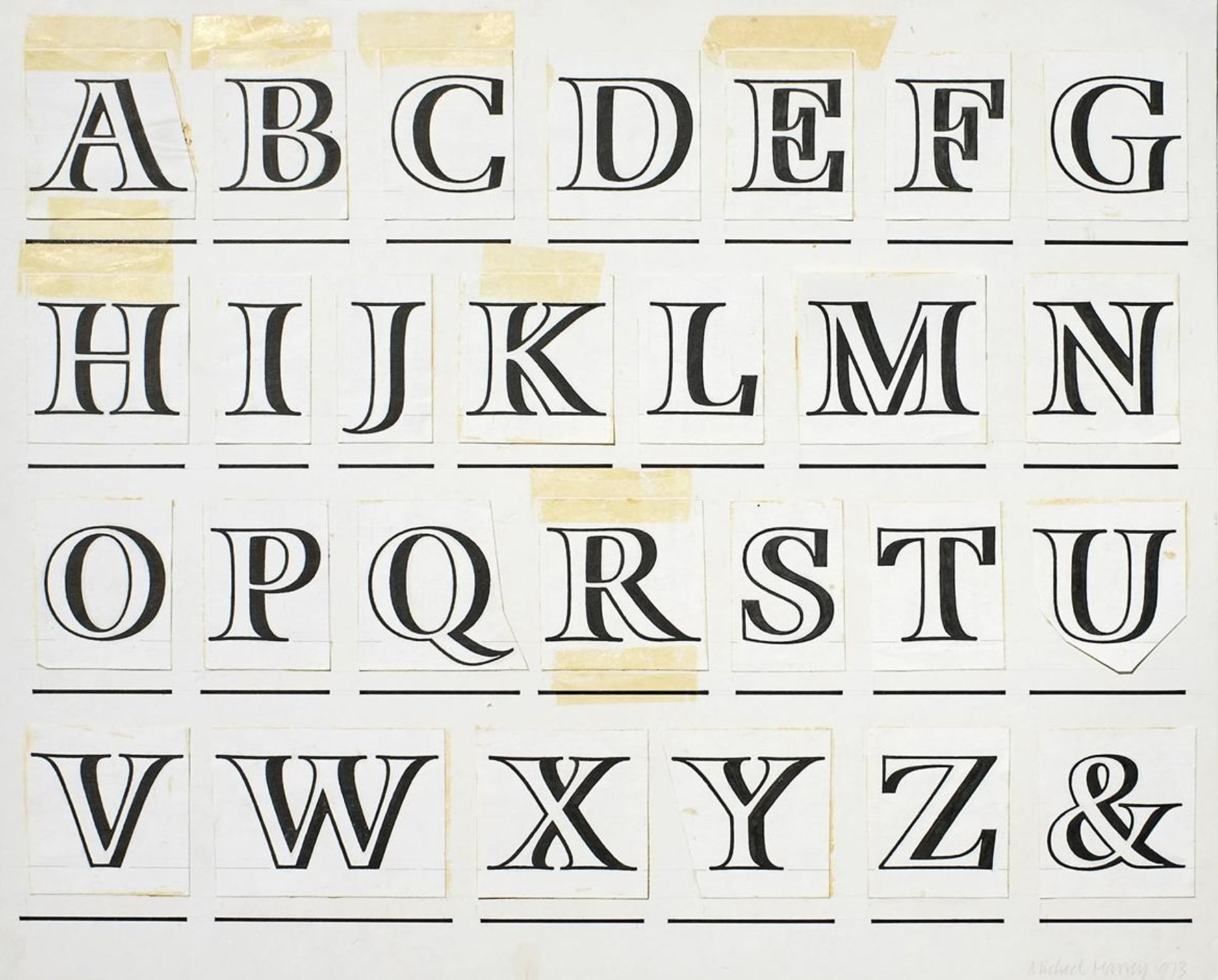
Harvey designed a number of typefaces, including Zephyr, Andreas, Mentor, Strayhorn and Ellington for Ludlow, Monotype, Adobe, and and later, with Andy Benedek for his own foundry, Finefonts.
An avid lover of jazz, Harvey's interest in music is evident in the titles of his typefaces (Ellington, Strayhorn, Congra Brava, Mezz and Braff.)
In this interview with letter designer and design historian, Paul Shaw, Harvey explained the link between his two passions:
"Jazz and letters. Designing book jackets late at night in the 1950s I’d have Armstrong or Basie on the player. Jazz men were improvising on well-known tunes, while I improvised on well-known letters. Two abstract artforms. I love this connection which is why I have given my typefaces jazz names. The Louis Armstrong Foundation wouldn’t let me use Satchmo, while Adobe thought Jelly Roll’s sexual connotations were unacceptable. The French lawyer in charge of the Django Reinhardt estate banned Django. I have more Ruby Braff CDs than any other jazzman. The melody is the most important thing in his music, on which he builds lovely variations. Dizzy [Gillespie] doesn’t give me that."
Perhaps the best place to see his work is outside the Sainsbury Wing of the National Gallery commissioned by architect Robert Venturi.
"In 1990/1 Harvey designed the most ambitious lettering commission of the decade" writes Tanya Harrod. "This was a frieze of names of early Renaissance painters carved (with the help of Brenda Berman and Annet Stirling of Incisive Letterwork) into the ashlar limestone wall alongside the grand staircase in Robert Venturi’s National Gallery extension. Harvey used robust vernacular letter forms based on Victorian display typography, neatly alluding to the Victorian rediscovery of early Italian art. The grandeur of conception went hand in hand with an element of parodic irony, which honoured the playful allusive character of Venturi’s architecture."
A teacher at the University of Reading, Harvey run the course Letter-forms inspiring many with his skill and knowledge.
This is Harvey's philosophy of lettering in his own words.
"Lettering is full of possibilities; decorative, expressive etc. only limited by the varying requirements of legibility in which familiarity is a strong factor.
• The predominance of the typographic letter since the 16th century, and the general use of a fairly narrow range of letterforms together with the fact that what interests one culture does not interest a later one, means that over the period in which the alphabet has served civilization many forms, once favoured have been forgotten.
• Each individual artist working at lettering brings a unique talent and way of handling and seeing line and form. This is true even when that artist is content to work in a very conventional way.
• A culture of letters exists, as does a culture of music or, say, architecture, within which are many subcultures. A culture has a past. The past can be an inspiration as well as a burden. The individual artist who works within, or with, material from a culture must decide how to deal with it. Initially the past may seem oppressive, but with growing confidence in his developing mastery it can become an inspiration.
• So on the one hand there is the artist, brand-new, wanting to make his individual mark which says, ‘I am here!’ and on the other the existing culture of forms, forgotten forms and practices. It is when this artist gets to grips with this culture that new possibilities open up, and the culture is re-vitalised [sic], extended."
"Michael Harvey is the most important figure in British book-jacket design of the 1960s and 70s, and the leading British type designer between the death of Eric Gill and the millennium" argues Shaw whose archive of Harvey's "Teaching Notebooks 1983–1995" needs to be discovered.
"Drawing frees the hand from the demands of the broad-edged pen, the sign-writer’s brush" Harvey wrote in his 2012 memoir, Adventures with Letters. "The pencil is neutral. Eye and mind are in control."
Tags/ typography, london, lettering, british, stone carving, eric gill, book covers, typedesign, michael harvey



.jpg)


