Matthew Carter: 10 things to know about
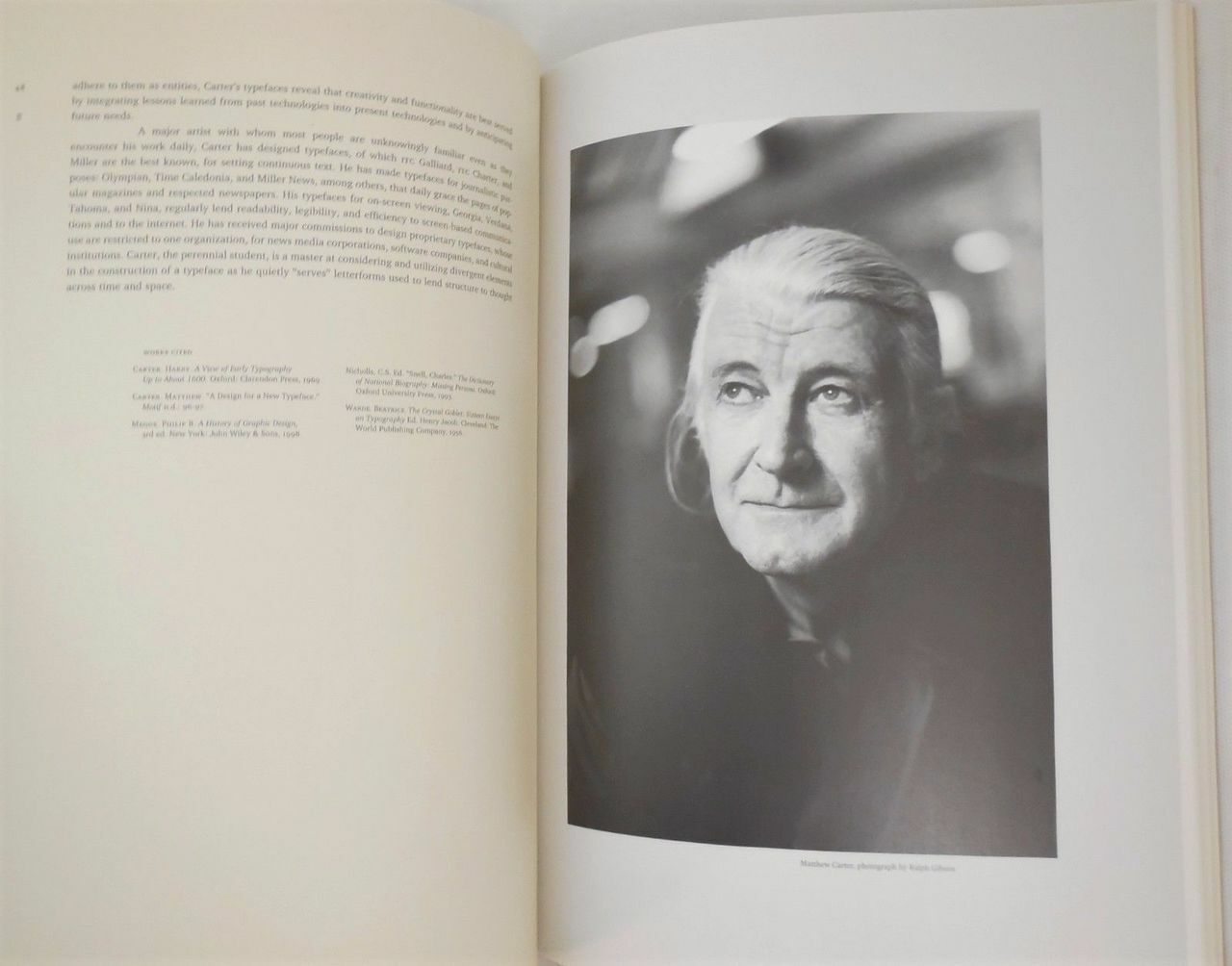
1. A self-taught type designer par excellence, Matthew Carter was born in London, England in 1937, son of the typographic historian Harry Carter. On leaving school in 1955 he spent a year at the Enschedé type foundry in the Netherlands learning to make metal type by hand—a skill that proved to be commercially obsolete. To earn a living he had to adapt to drawing alphabets for modernist designers in London who were frustrated by the lack of contemporary sans-serif typefaces in Britain at that time. Therefore, Carter’s background is a technical one.
2. Carter’s work spans many decades and his apprentice is beyond any method. Over the course of his career he designs type by essentially all the methods ever used: metal by hand, metal by machine, photoset, digital, desktop, screen and woodtype for letterpress posters.
3. It all started back in 1965 when he was hired by Mergenthaler Linotype in New York as staff designer with the job of exploring the implications of photocomposition, the change from type as a three-dimensional metal object to a two-dimensional photographic image. A decade later, when AT&T began to use pioneering high-speed digital systems to accelerate production of the US telephone directories, the company’s existing typeface performed badly. Mergenthaler was commissioned to design a new, digital type so Carter had to teach himself on the field. With no computer tools that could convert an analog image to a digital bitmap available Bell Centennial’s fonts had to be drawn on graph paper, pixel by pixel, and encoded at a keyboard. The task was epic and Carter delivered whilst educating himself on digital type when others could not.
4. AT&T's brief called for a typeface that would fit substantially more characters per line without loss of legibility, dramatically reducing the need for abbreviations and two-line entries, increase legibility at the smaller point sizes used in a telephone directory, and reduce consumption of paper. Bell Centennial was designed to address and overcome most of the limitations of telephone directory printing: poor reproduction due to high-speed printing on newsprint, and ink spread which decayed legibility as it closed up counterforms. Carter's design increased the x-height of lowercase characters, slightly condensed the character width, and carved out many more open counters and bowls to increase legibility. To anticipate and blunt the degradation caused by ink spread, Carter drew the letters with deep ink traps, designed to fill in as the ink spread onto newsprint fiber, leaving the characters' counterforms open and legible at small point sizes.
Printed in the smaller point sizes used in telephone directories, the ink traps are not visible, having done their job; filling in and smoothing out the character stroke. However at larger point sizes, and on coated paper stock there is not enough ink spread to fill in the traps and the shape of the traps remain noticeable.
Bell Centennial is an example of a typeface designed to address a particular need, much like Chauncey H. Griffith's Bell Gothic (AT&T's earlier telephone directory face); Adrian Frutiger's Frutiger, designed for signage at Charles De Gaulle Airport; or Erik Spiekermann's FF Meta Sans commissioned by the Deutsche Bundespost (the German federal post office), but not adopted. Bell Centennial is only one of several typefaces Carter designed to address specific technical limitations, including CRT Gothic (1974), Video (1977), Georgia (1996), and Verdana (1996).
A leader in sustainable design before the term ever existed, Carter’s Bell Centennial was “accidentally ecological” before its time.
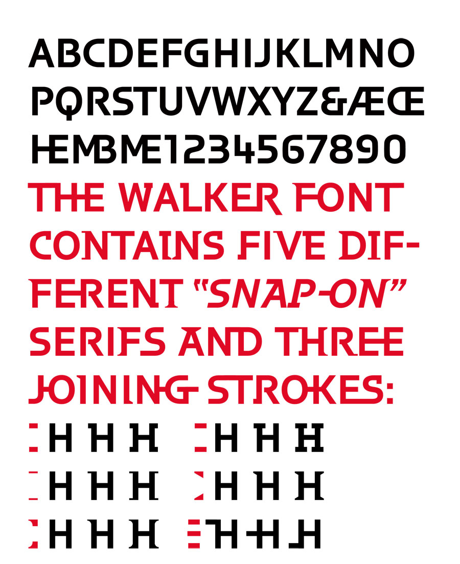
5. Long associated with the Linotype companies, Carter designed ITC Galliard, Helvetica Compressed, Shelley Script, Olympian (for newspaper text), and faces for Greek, Hebrew and Devanagari. By 1981 he co-founded Bitstream Inc., a digital type foundry, in Cambridge, Massachusetts and in 1992 he launched with Cherie Cone, Carter & Cone Type Inc. With a clientele that many would drool over (enter Apple Time, Newsweek, U.S. News & World Report, Sports Illustrated, Business Week, The Washington Post, The Boston Globe, The Philadelphia Inquirer, The New York Times, The Guardian and Le Monde) Carter provided custom typefaces for the Walker Art Center, the Museum of Modern Art, and Yale University.
Typeface for the Walker Arts Center, Matthew Carter (type designer), Laurie Haycock Makela (design director), Matt Ellis (designer), 1994 @DesignMuseum #FontSunday #ConnectedbyDesign @walkerartcenter https://t.co/AwfeypmJDe pic.twitter.com/Iq15Pc1paB
— Michael Bierut (@michaelbierut) October 11, 2020
6. In the 90s he started working with Microsoft to develop the legible “screen fonts” Verdana and Georgia. “Matthew Carter is often described as the most widely read man in the world. Carter designs typefaces” commented The New Yorker back in 2005.
7. A scholar and educator Carter has taught a class at the Yale graphic design school for more than 30 years and he has frequently shared his knowledge at conferences, colleges, and chapters of the American Institute of Graphic Arts.
8. A Royal Designer for Industry, a member of AGI, and chairman of the type designers’ committee of ATypI, Carter has received the Frederic W. Goudy Award for outstanding contribution to the printing industry, the Middleton Award from the American Center for Design, a Chrysler Award for Innovation in Design, the AIGA medal, and the Type Directors Club medal. He holds the honorary degree of Doctor of Fine Arts from the Minneapolis College of Art and Design and in 2010 he was named a MacArthur Fellow by the John D. and Catherine T. MacArthur Foundation. Carter was appointed Commander of the Order of the British Empire (CBE) in the 2020 Birthday Honours for services to typography and design.
9. “Anything that forces you into a close relationship with letterforms – in may case it was making type, but it could have been calligraphy or stone cutting – gives you a different perspective. It’s so easy to change one’s mind on the computer, and though that’s a great thing – for me, design is about changing your mind until you get it right – I think it’s useful if you’ve had in you past the experience of having to make up your mind once and then do it. If you’re cutting lettering in stone, you’ve got one shot, and if you blow it you’ve lost a day’s or a week’s work. So you have to think very hard before you commit yourself. Similarly if you know you’ve only got 14 point and 24 point in the case, you’ve got to work with those. Although I tremendously enjoy the luxury of the unlimited choices you get with the computerised medium we have today, I still think it helps if you’ve learned in a situation where you have fewer choices and only one chance to get it right” he told to Erik Spiekermann for Eye Magazine.
“My working like has two parts. First there is speculative font design, that is designing new faces for the retail market. You design them, you put them out, and you hope someone buys them. It’s going to take a long time for you to recoup your outlay on that, particularly if you print type specimens and try to do it properly. At the same time I also have commissions for new faces from computer companies and publishers and so on. I didn’t know this would happen when I started, but it’s lucky it has since it is cash on the nail and it’s sometime relatively well paid. Although we said earlier that selling large libraries of type will not pay for the development of new faces, I think doing commissions possibly might, particularly since we only sell a period of exclusivity, so once the clients have banged the face about for four or five years and got bored with it the right revert back to us. I’m glad of that because I suspect most type designers don’t have an infinite number of ideas.”
“I do think there is bad type, but not all bad is type is type that has been created overnight. There are as many bad typefaces that have taken years to produce and are part of the canon of typography as there are among student work. And more importantly, there are graphic designers who are capable of making any typeface look bad.”
10. In his TED talk -which we urge you to watch in full frame- Carter said “the letters are different because the designers are different. That's all. Zuzana wanted hers to look like that. I wanted mine to look like that. End of story. Type is very adaptable. Unlike a fine art, such as sculpture or architecture, type hides its methods. I think of myself as an industrial designer. The thing I design is manufactured, and it has a function: to be read, to convey meaning. But there is a bit more to it than that. There's the sort of aesthetic element. What makes these two letters different from different interpretations by different designers? What gives the work of some designers sort of characteristic personal style, as you might find in the work of a fashion designer, an automobile designer, whatever?”
The answer is after the jump.
Tags/ typography, typeface, type design, matthew carter, ten things


.jpg)


.jpg)


![Bitstream Charter is a serif typeface designed by Matthew Carter in 1987 for Bitstream Inc. Charter is based on Pierre-Simon Fournier’s characters, originating from the 18th century.[3] Classified by Bitstream as a transitional-serif typeface (Bitstream Transitional 801), it also has features of a slab-serif typeface and is often classified as such.](assets/original/2021/10/01/Screen-Shot-2019-01-21-at-5.03.52-PM-860x541.png)


