Happy birthday Mr. Gridnik: remembering Wim Crouwel
Hailed as the grand seigneur of the Dutch design world, the highly influential designer and cofounder of Total Design, Holland's first real multi-disciplinary design studio, Wim Crouwel was born on the 21st of November, 1928 in the Netherlands.
Graphic designer, scholar, type designer and architect by heart Willem Hendrik 'Wim' Crouwel worked in the fields of exhibition, graphics, and product design before co-founding Total Design, the multi-disciplinary design firm that served many prestigious clients, such as the Dutch Post Office (PTT) and Schiphol Airport.
The swinging sixties adored his visual language and eventually Crouwel helped design the Dutch pavilion at EXPO ’70, the 1970 World’s Fair in Osaka, Japan.
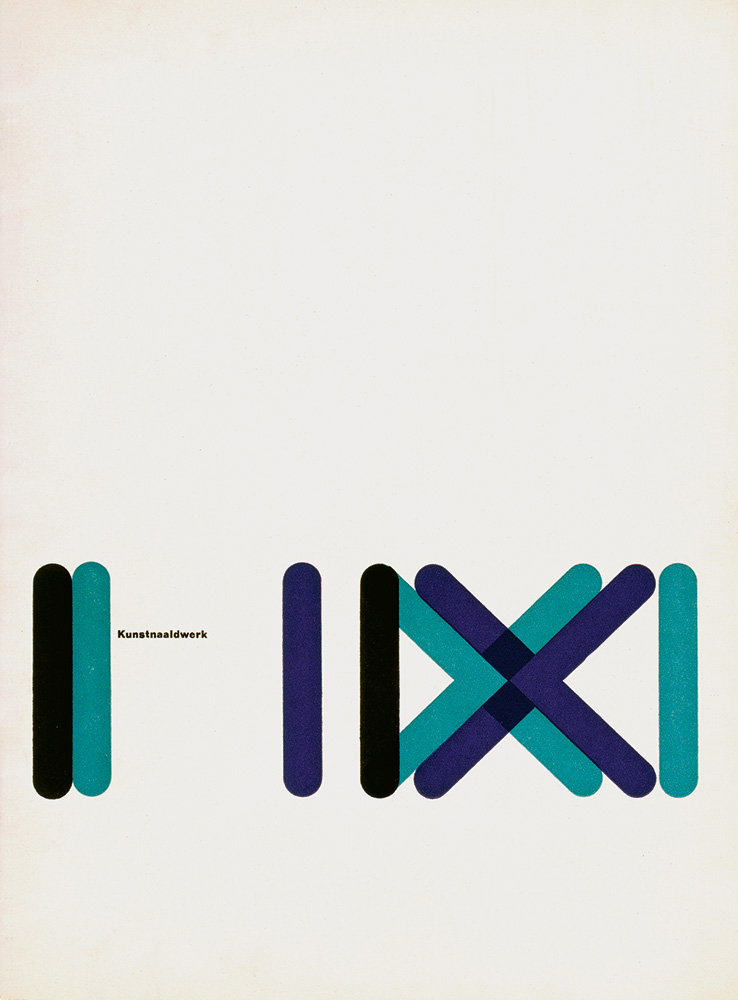
He succeeded the renowned Willem Sandberg as a designer at the Stedelijk Museum in Amsterdam, where he based the Stedelijk’s visual identity on a unique modular grid system and designed almost all of the museum’s posters and catalogs from 1963 to 1985.
A lover of clarity and machine-like simplicity, Crouwel was solely interested in typography which “puts communication on paper in such a way that a message gets across plainly and clearly to the reader.”
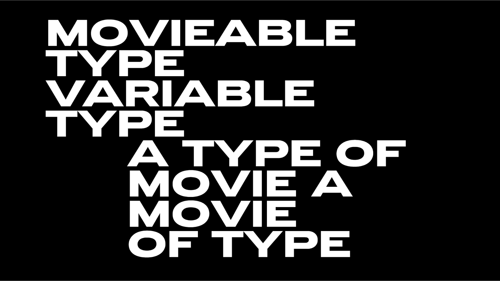
A dreamer of a simplified alphabet in which upper and lower case might become one, punctuation could be reduced, and type weight and width could be easily adjusted as needed indeed Crouwel gained a reputation for basing designs on grids, even when designing typefaces like Gridnik, Fodor, and especially his New Alphabet reports TDC.
His New Alphabet parametric typeface, released in 1967, embraced the limitations of the display technology that it was displayed on by only using horizontal and vertical strokes aka the cathode ray tube technology used by early data display screens and phototypesetting equipment, therefore some of the letters had little resemblance to the letters they were supposed to represent. New Alphabet was a deeply personal, experimental project of the iconic Dutch designer who went totally against the norm.
Crouwel “wanted to adapt his design to work for the new technologies, instead of adapting the technologies to meet the design” so his glyphs were pretty much unconventional with most of the letters based on a grid of 5 by 7 units, with 45-degree corners.
For many Crouwel went too far -the designer himself stated back in 2009 that this design was an exercise in theory of type saying “the New Alphabet was over-the-top and never meant to be really used. It was unreadable” - yet for others, this was a groundbreaking design that proves typefaces ARE an art form -at least when they are designed by a Dutch artist named Crouwel. New Alphabet is, in Crouwel's words, “over-the-top and never meant to be really used,” a statement on the impact of new technologies on centuries of typographic tradition.
“In the infancy of digital typography—as lead type, set by hand in heavy lead blocks or by machines that generated lines of metal type, was giving way to text set on screens—Crouwel saw an opportunity for an interesting experiment” writes Museum of Modern Art (MoMA).
A stoic force in visual culture, he was “profoundly influenced by the Swiss school of graphic design, whose rational, minimalist approach was organised around a grid system” notes the Stedelijk Museum in its tribute to Crouwel, the sole designer of the museum’s visual communications from 1963 to 1985, with a selection of his typographic oeuvre from the 28th of September 2019 until the 22nd of March 2020.
“Crouwel employed the grid structure in his designs for the Van Abbemuseum in Eindhoven (1956-1964) and later for the Stedelijk Museum. At Total Design, grid sheets provided templates for the abundance of typographic work produced for the Stedelijk. Crouwel has always favored an analytical approach, believed in technology and progress, and promoted design as an independent profession. His preoccupation with grid systems was the subject of the exhibition Wim Crouwel: Fascinated by the Grid, which was on show in Japan in 2017 and 2018. Crouwel’s design projects for the museum comprise a monumental oeuvre that has cemented his reputation.”
“We had an ideology, an ideology of grids. I loved grids so much it verged on the neurotic,” he once stated.
A teacher during most of his career, beginning in the 1950s at the Royal Academy for Art and Design through Erasmus University in Rotterdam where he taught until his retirement in 1993, Crouwel has received numerous awards.
“Since the beginning of his career, Wim Crouwel has been strongly influenced by the modernist notion of Functionalism. The principle that architects should design a building based on the purpose of that building. Wim Crouwel designed posters, brochures and catalogues for 2 major art museums, first for the Van Abbe Museum in Eindhoven - and from 1964 to 1985 for the Stedelijk Museum in Amsterdam” reports Dutch Profiles.
“When he started to work for the Stedelijk Museum he took a totally different path than his predecessor, director and designer Willem Sandberg. In 1956 Crouwel saw the results of the first digital typesetter. They looked so bad that he designed a type face, called New Alphabet, that better suited the capacities of this machine. In 1973 visionary Wim Crouwel - influenced by the early digital developments at the time - introduced the term Form Preparation.”
“I like designers who think about their work,” he once said. “I get examples sent to me all the time by people asking for an opinion. Recently I received a typeface and I told the boy I didn’t like the uneven word shapes and thought it was unnecessary. He wrote back to me saying he did it because he was bored and wanted something new. I hate that … when they work from their stomachs like chickens without heads. I much prefer the thinking types.”
“Nobody is seeking out the universal anymore. I want to see the next big idea and less of this convenient adjustment to circumstances. It’s that sort of commercial approach that has caused Dutch graphics to lose so much influence. It’s lost its edge and has become so much less visual.”
“I still believe that people need sharp, well defined ideas that they can follow and work from, and which help them to believe in something. I’d love to be able to witness the birth of a great new style, a direction that we all can look towards for new solutions” added the Dutch cultural icon, and perhaps the country’s most important graphic designer.
Crouwel's influential take in type design will continue to shape and reshape the practice of many young designers throughout the world and The Wim Crouwel Institute continues his systematic design legacy.
All images via 'In remembrance of Wim Crouwel (1928-2019),' a tribute site launched by Stedelijk Museum after his passing, on the 19th of September 2019.
Tags/ graphic design, typeface, wim crouwel, dutch design, icon


.jpg)


