100 Books Famous in Typography: a Grolier Hundred exhibition to explore online
This was then: in 1902 the Grolier Club mounted an exhibition entitled “One Hundred Books Famous in English Literature.” The exhibition and its accompanying catalogue were a major success. To this day people refer to books distinguished by inclusion in that show as milestones in the history of writing in English. The show spawned a series of Grolier Hundred surveys, including books famous in early American literature, science, medicine, twentieth-century fine printing, and children’s literature. Each of these compilations has become a key reference in their respective fields.
This is now: the Grolier Club hosts One Hundred Books Famous in Typography, a most fitting addition to the venerable list of Grolier Hundreds.
As noted the Grolier’s mission is to “foster the study, collecting, and appreciation of books … their art, history, production, and commerce.” What could be more essential to the production of books than type? And therefore, what topic more suitable for a “Grolier Hundred”?
On view from May 12 – July 31, 2021, the exhibition follows the format of the five previous Grolier Hundred exhibitions. Presenting pivotal books on the subject of typography, the show highlights milestones in the development and study of the art and discipline of printing, surveying five hundred years of major publications relating to this significant art form. Drawn from major institutional libraries and private collections, the one hundred books were selected by noted typographer and book designer Jerry Kelly in consultation with an international panel of experts.
New first floor exhibition https://t.co/ubFwmXPNaX
— The Grolier Club (@GrolierClub) May 12, 2021
Typography—a term derived from a Greek phrase that means roughly “writing with figures cast in relief”— is an essential component of bookmaking. Encompassing the art and science of printing types, including type manufacture and type design, typography has a long and distinguished history. It begins with Gutenberg’s ingenious development in the 1450s of a system for the mass-production of texts, and then moves through the centuries to spotlight new technologies such as hot-metal line casting, phototype, and the desktop computer composition of today. In addition to ground-breaking examples, the exhibition is a rich trove of volumes relating to the study of typography, showing how numerous practitioners, such as Garamond, Baskerville, Bodoni, and Zapf, raised the work of type designers and typographers to the level of a fine art.
FYI, an online version of the exhibition is accessible as of May 12 on the Club's virtual exhibition site here.
In the exhibition, a treasury of typography is available for all to explore, featuring many highly important and influential books in typography such as:
– Gutenberg Bible (Mainz: 1455): the first book in the West printed from moveable type, and the first practical system for replicating texts. An example of fine typography in a printed volume and a notable monument in the history of typographic practice
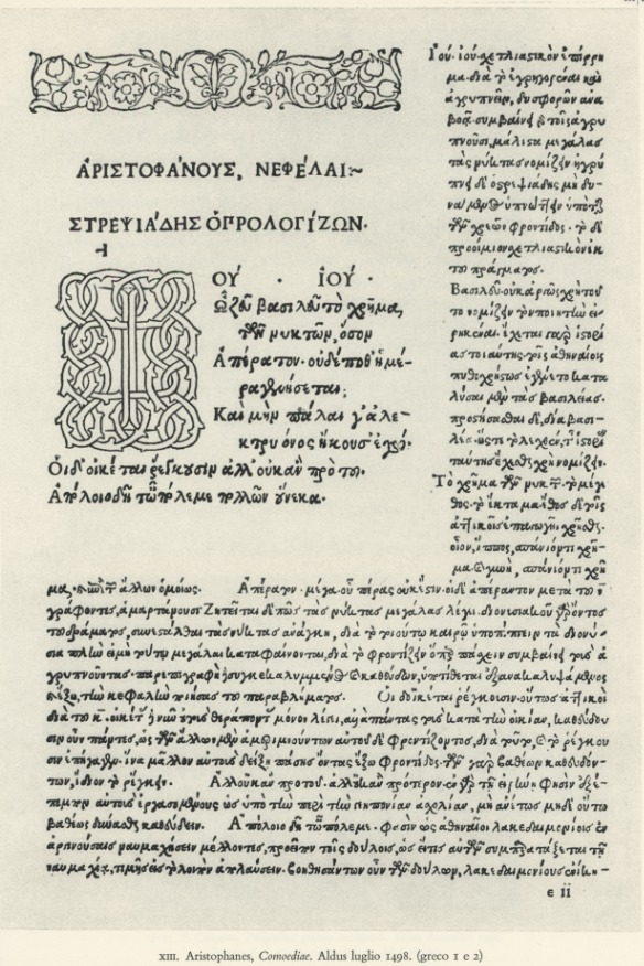
– Aldine edition of Virgil (Venice: 1501): the first book printed in italic type, with a tremendous impact on type design
– Geoffroy Tory’s edition of Champ Fleury (Paris: 1529): the book that standardized the written French language
– Estienne’s edition of Appianus (Paris: 1551): showing all three sizes of Garamond’s famous and much-imitated grecs du roi type
– Joseph Moxon’s Mechanick Exercises (London: 1683): the first, and for a long time the most complete, printer’s manual in English. An important volume relating to the history and study of typography
– Baskerville’s edition of Virgil (Birmingham: 1757): a volume that shook European book culture, and drew the praise of printer Benjamin Franklin and others in the colonies. A major influence on the art of type design
– Pierre-Simon Fournier’s Manuel Typographique (Paris: 1764-6): the origin of the point system of standardized type sizes, and a key specimen and manual in other regards
– Giambattista Bodoni’s Manuale Typografico (Parma: 1818): published by the widow of the legendary type designer shortly after his death, one of the most attractive, and perhaps the most elaborate, type specimens ever made
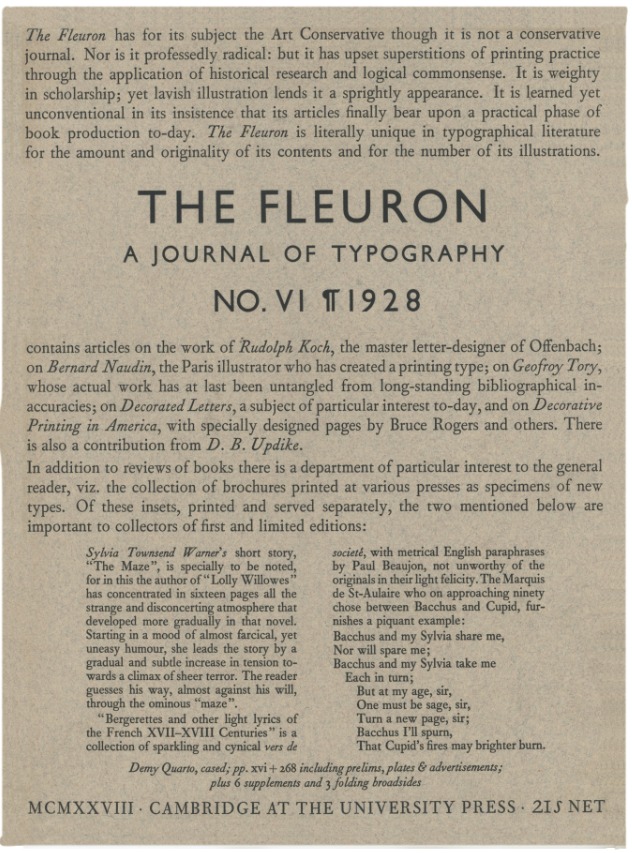
– D.B. Updike, Printing Types (Cambridge: 1922): still an indispensable work, almost a century after its first appearance and an influential study relating to the history of typography
– Jan Tschichold, Designing Books (New York: 1957): timeless advice and examples from this modern master, the codifier of the “New Typography,” as well as a superlative book designer
– Hermann Zapf, the two editions of his Manuale Typographicum (Frankfurt, 1954, and 1968): two of the most beautiful books ever printed, showcasing the work of a man considered perhaps the greatest type designer of all time
– Peter Karow, Digital Formats for Typefaces (Hamburg: 1987): the basis of today’s digital computer typefaces, by the man who pioneered their development
– Robert Bringhurst, The Elements of Typographic Style (Vancouver: 1992): perhaps the best-selling book ever on typography, translated into eleven languages—and counting
“An overview of this important art, encompassing its history and study, is what we have endeavored to display with these one hundred prime examples…We look forward to future practitioners who will create work worthy of inclusion in another exhibition and catalogue of One Hundred More Books Famous in Typography,” concludes curator Jerry Kelly.
A fully illustrated catalogue is published in conjunction with the exhibition.
Explore more here.
Tags/ typography, typeface, books, exhibition, bible, hermann zapf, baskerville, jan tschichold, giambattista bodoni, grolier club, pierre-simon fournier


.jpg)


.jpg)


