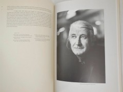
Stanley Morison: 10 things to know about
1. Born on the 6th of May, 1889 in Essex, England, Stanley Arthur Morison was an English typographer, scholar, and historian of printing and a true master of modern typography. Morison is particularly remembered for his design of Times New Roman aka "the most successful new typeface of the first half of the 20th century."
2. Following an elementary-school education, largely self-taught Morison became interested in the study of typography and type design after reading a printing supplement in The Times in 1912. The supplement also contained an advertisement for a new periodical, The Imprint, the purpose of which was to raise the standards of printing.
3. Answering an advertisement in the first issue, Morison joined the publication, which, although short-lived, gave him important typographic experience and led to his employment by the publishers Burns and Oates where he had the opportunity to design books. He later joined the Pelican Press (1919–21) and Cloister Press (1921–22), a path of knowledge that eventually led him to be appointed typographic adviser to the Monotype Corporation in 1923.
4. His experience and eye for type design was instrumental in the adaptation of numerous important typefaces of the past to machine composition. Morison reworked many of the old Renaissance typefaces for more modern printing such as Bodoni, Garamond, Fournier, Baskerville, Poliphilus, and Bembo. That same year Morison, was appointed typographic adviser to Cambridge University Press, a position he held until 1959.
5. An influential figure since the beginning Morison became a founding member of the type-centric Fleuron Society along with Francis Meynell, Holbrook Jackson, Bernard Newdigate and Oliver Simon in 1922. The typographic journal The Fleuron published seven volumes between 1923 and 1930, each contained papers, illustrations, specimens and essays by contemporary authorities on typography and book design.
6. In 1929 Morison publicly criticized The Times for being poorly printed and typographically antiquated. Eventually he was hired as a consultant and commissioned in 1931 to develop a new, easy-to-read typeface for the newspaper. In A Tally of Types, published in 1953, Morison wrote that he "penciled the original set of drawings, and handed them to Victor Lardent, a draughtsman in the publicity department of Printing House Square." The drawings were then used by Monotype to cut the punches for the first set of Times New Roman types.
Guardian: Times New Roman wins big in the war of the fonts
The serif typeface designed for use in body text appeared for the first time on Oct. 3, 1932 and was conceived by Morison in collaboration with Victor Lardent, a lettering artist in the Times' advertising department. Yet back in 1994, printing historian Mike Parker published findings that showed Times New Roman was based upon a design originally made by William Starling Burgess in 1904. The controversial story can be found online here in the article titled "The history of the Times New Roman typeface" on the FT Magazine web site.
In 1931 Stanley Morison created Times New Roman, a custom font for the @TheTimes newspaper
— The Times Pictures (@TimesPictures) January 28, 2020
He was hired as typographic advisor to The Times in 1929 and created what has since become one of the world's most popular typefaces
???? @NewsUKArchives; Times photographer @glossophoto pic.twitter.com/Ubmf7IK65I
Although no longer used by The Times, Times New Roman is still very common in book and general printing, is one of the most popular and influential typefaces in history and a standard typeface on desktop computers.
Times, a default system typeface Times' raw aesthetic is a cliché of contemporary graphic design used by many -from Kendrick Lamar to Beyonce and more- and Morison's font is the most beloved typefaces of the 20th century for authors per Guardian.
7. Morison's extensive and influential writings include Four Centuries of Fine Printing (1924) and First Principles of Typography (1936).
8. "Typography is the efficient means to an essentially utilitarian and only accidentally aesthetic end, for the enjoyment of patterns is rarely the reader’s chief aim. Therefore, any disposition of printing material which, whatever the intention, has the effect of coming between the author and the reader is wrong" writes Morison in his highly influential essay First Principles of Typography. The essay became the absolute industry manual of book typesetting standards, especially in USA.
9. A prolific scholar and practitioner of the graphic arts Morison is highly regarded the most important theoretician, designer and historian of print in the twentieth century.
10. Morison was offered a knighthood in 1953 and the CBE in 1962, yet he declined both. He died on October 11, 1967 at the age of 78. Watch Nicolas Barker's lecture on Morison, a master of modern typography for more:
Tags/ typeface, type design, times new roman, monotype, fonts, stanley morison


.jpg)


.jpg)


