Small and massive: Jan Tschichold's brilliance in Deutsche Nationalbibliothek's latest virtual exhibition
Considered one of the pioneers of New Typography and one of the most important designers of the 20th century Jan Tschichold (1902-1974) left a legacy that still inspires many.
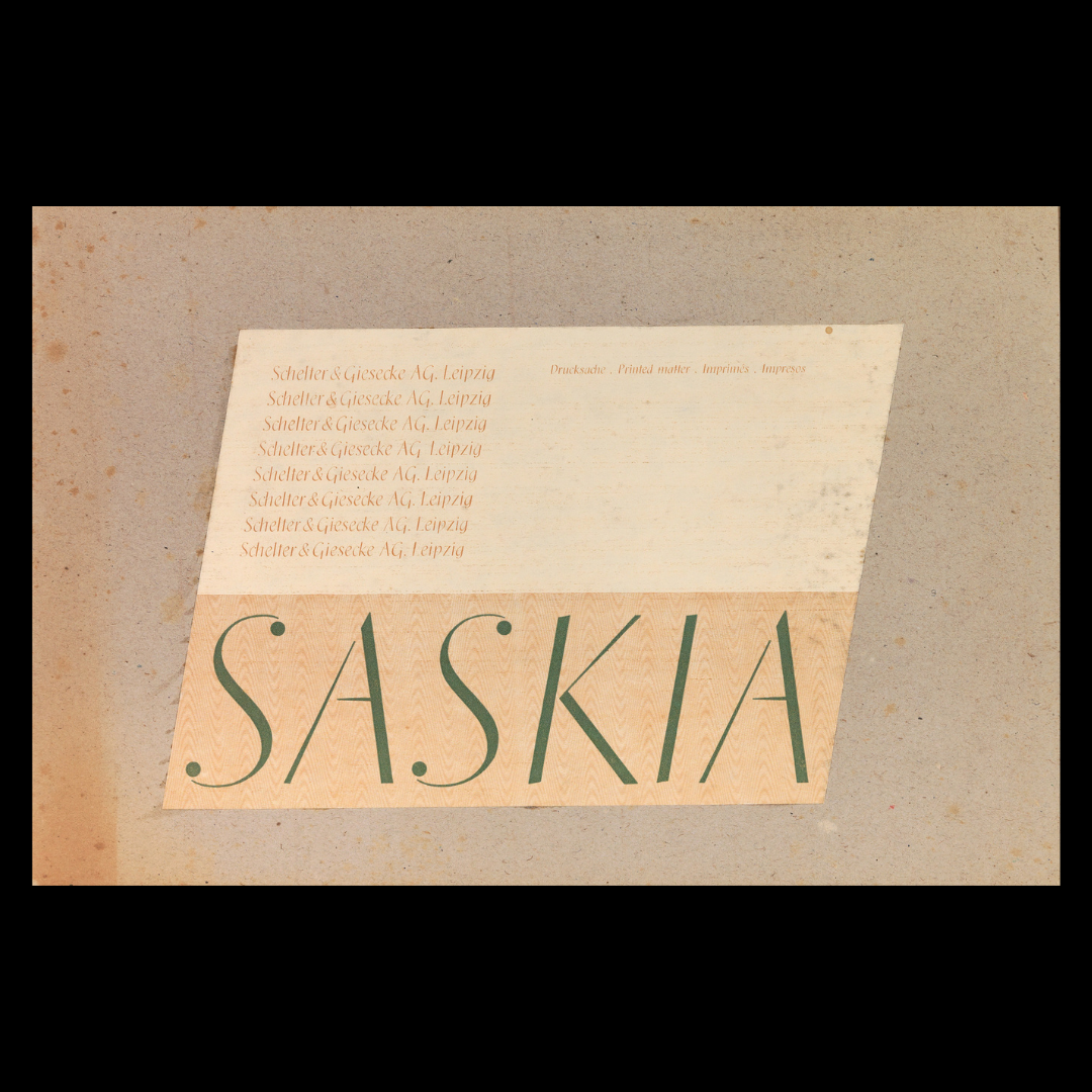
Now his design classic are featured in a virtual exhibition open to all thanks to the German Book and Type Museum of the German National Library (DNB aka Deutsche Nationalbibliothek) in Leipzig which has preserved the estate of Jan Tschichold since 2006.
A precious online treasury the exhibition filters Tschichold's creations by format.
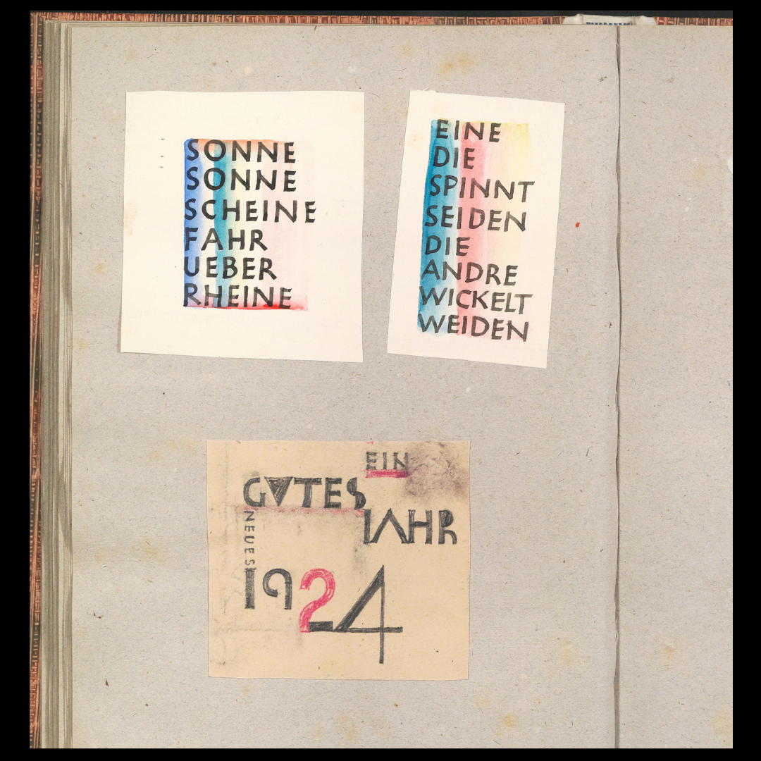
From business cards to New Year wishes the exhibits are mostly ephemera that fit in one's pocket.
"The objects pass from hand to hand, then into trouser pockets, purses. Or they are enclosed in the post - as a short, quickly forgotten greeting. Often they quickly end up in the rubbish - it is as if their brief raison d'être is reflected in their small format. So the small things preserve themselves much more rarely than the big ones. Their rarity offers an opportunity: the artist's famous works move into the background and the unknown becomes visible" notes DNB.
Jan Tschichold was born Johannes Tzschichhold on 2 April 1902 in Leipzig. He studied typography at the Leipzig Academy. At the age of 23, he wrote his manifesto "Elementary Typography" on functional graphic design.
By 1925, the booklet was so popular that made Tschichold famous and literally the spokesman for New Typography in Europe. Tschichold lived and worked in Munich from 1926 and fled to Basel in 1933.
The renowned calligrapher, typographer and graphic designer devoted himself to a classical style in the tradition of British book design.
Jan Tschichold: the father of modern typography in his own words
Sabon, his most famous typeface, was launched in the sixties.
The old-style serif typeface designed by the German-born typographer and designer in the period 1964–1967 was released jointly by the Linotype, Monotype, and Stempel type foundries in 1967. The design of the roman is based on types by Claude Garamond (c. 1480–1561), particularly a specimen printed by the Frankfurt printer Konrad Berner. Berner had married the widow of a fellow printer Jacques Sabon, the source of the face's name, who had bought some of Garamond's type after his death. The italics are based on types designed by a contemporary of Garamond's, Robert Granjon. It is effectively a Garamond revival, though a different name was chosen as many other modern typefaces already carry this name.
A classic typeface for body text, Sabon's longstanding popularity has transcended its origin as a commission to fit a tight set of business requirements. Tschichold was commissioned by a coalition of German printers to create a typeface that could be printed identically on Linotype, Monotype or letterpress equipment, simplifying the process of planning lines and pagination when printing a book. The italic and bold styles were to take up exactly as much space as the roman, a feature imposed by the duplexing system of Linotype hot metal typesetting machines of the period. Finally, the new font was to be five per cent narrower than their existing Monotype Garamond, in order to save space and money.
Sabon's name was therefore considered appropriate: a Frenchman who had moved to Frankfurt, he had played a role in bringing Garamond's type into use in German printing four hundred years before.
Tschichold died in Ticino, Switzerland, on 11 August 1974.
Explore more of his brilliant take on graphic and type design here.
Tags/ typography, graphic design, typeface, exhibition, leipzig, jan tschichold, germany, new typography, deutsche nationalbibliothek, virtual

.jpg)






.jpg)

