A Design Museum exhibition and a 1 Shilling book bring John Elvin's groundbreaking football design legacy into the limelight
A glorious celebration of the ever-popular football the Design Museum presents the first major exhibition on the design of the world’s most popular sport enter Football: Designing the Beautiful Game.
The exhibition that kicked off in April 2022 showcases the many splendor ways in which design shaped football and is created in collaboration with the National Football Museum in Manchester.
The exhibition opens in the build-up to the 2022 FIFA World Cup, scheduled to take place in Qatar from 21 November to 18 December 2022, and is divided into five sections: Performance, Identity, Crowds, Spectacle, and Play.
Its immersive set design aims to draw out well-known elements of stadium architecture from the player’s tunnel to the stands and take us all through a thrilling journey with more than 500 objects, films, and interviews in sporting performance, kit development, stadium design, and more.
Paying homage to a game with unparalleled cultural significance, the exhibition reveals how designers pushed the envelope to match football’s emotional aspects and thrills.
With kits, posters, programmes, and more shining bright in the Identity section of the exhibition the curators aka Eleanor Watson and Rachel Hasek have collected rare designs worn by legendary players such as Pelé, Zinedine Zidane, and Diego Maradona with some bringing on memories of pain.
Among the banner designs of Craftivist Peter Carney through which he communicated the incredible fan spirit of Liverpool Football Club a Hillsborough Memorial Banner, created by Carney, a survivor himself reminds all of one of football’s greatest disasters -the fatal human crush that occurred at a football game in 1989 in Sheffield, UK, causing 97 deaths and hundreds of injuries. Showing that designers, both known and unknown, played a pivotal role in shaping the sport’s evolution with their craftsmanship was never more obvious.
“Though football’s graphic design roots are relatively simple – as shown by Umbro’s pattern template kit from the 1950s – a complex culture soon developed around it. Some football kits become fan favorites, while others are ridiculed. And shirts with specific sponsors can become collector’s items, like the exhibition’s West Ham home kit complete with a Dr. Martens wordmark” reports Designweek’s Henry Wong.
“This sector also highlights what exhibition curator Eleanor Watson calls the ‘formal and informal design outputs’ within football. A good example of the latter is Liverpool supporter Peter Carney’s banners, made to be displayed at the home seats at Anfield. Carney is not a designer but his oversized banners – crafted for Liverpool’s players, coaches, and victories – now hang in the Design Museum. Perhaps most powerful is a pair of Hillsborough memorial banners; Carney designed the first in the aftermath of the tragedy and the second 20 years later. Another memorable display is a set of hooligan calling cards – designed and printed by rival team supporters. These cards, which usually parodied British institutions like Network Rail, were dropped at the site of brawls by the winning team’s supporters.”
In terms of type design, the exhibition showcases the 2011 Real Madrid typeface and 2005 Fenerbahçe typeface, both designed by Anthony Barnett, highlighting the importance of bespoke type in branding the popular sport.
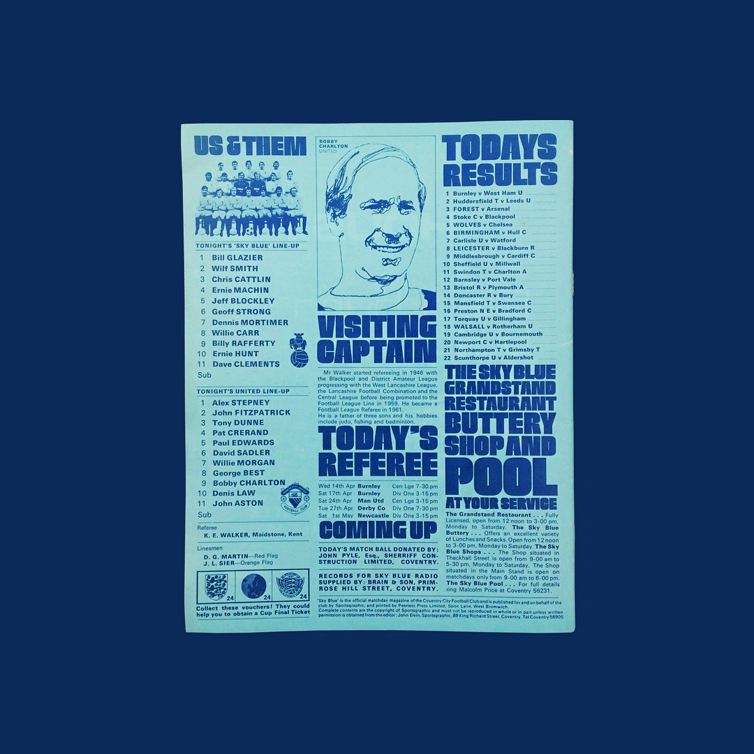
One of the top highlights of the exhibition is a collection of ground-breaking designs which revolutionized the world of football matchday programmes in the early 70s. It is literally hard to overstate how important designer John Elvin was in the evolution of the matchday programme, improvising them with content and proper design.
Elvin’s mini-masterpieces hold their special place in the successfully funded via Kickstarter “1 Shilling - The Book. The football programme design revolution of 1965-85” project, a publication that features some of the forgotten designs shared on @1_shilling, the Instagram account curated by Matthew Caldwell.
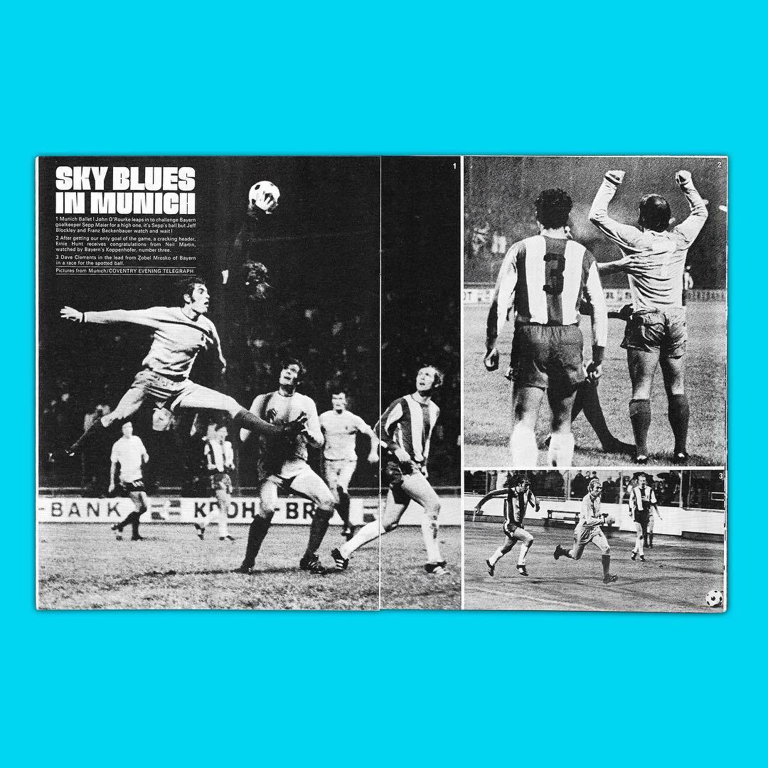
“At its heart, the book is a deep exploration of the work of master creator John Elvin, a designer who broke all the rules. Ignoring the conventions of the day, he chopped up photos, massacred the formal code of lay-outs and blew-up typefaces beyond the imaginable” note the authors of the publication aka Caldwell, a senior designer at North London studio DixonBaxi himself, and Alan Dein, an oral historian and a multi-award winning radio documentary presenter.
“We meet a geezer from West Bromwich called Graham who designed programmes for several First Division clubs (in the same season), while high as a kite on a combo of lighter fuel and magic markers. Then there’s John Elvin’s protégé, Bernard from Birmingham, a prolific powerhouse of dynamic design in the Midlands. And also Don, an art school teacher from Aberdeen who conjured up fantastical images for a few shillings’ worth of beer money. In a collection of essays, 1 Shilling explores the wider cultural, economic, and political backstory of British football over a transformative two decades from the mid-1960s. The book gets to the core of the ritual which saw fans buying programmes that were read at the match, in the pub, at home - and often treasured for years and years.”
A publication with a cause, all profits from this project go to the Huntington's Disease Association. “It was Huntington’s Disease that claimed the life of pioneer designer John Elvin at the age of just 53” notes the team.
“John Elvin went to Coventry in 1970 with a simple mission: to change the way football fans viewed the humble programme” writes Sam Diss in his piece for the Guardian Sport Network.
“Elvin had no formal design education but rather worked from his feel for what looked right. He said he never even learned the rules he was supposedly breaking every week. Back then the matchday programme was seen as largely perfunctory literature to announce the line-ups, printed dirt cheap and treated as such by fans. Elvin felt that needed to change. At Coventry, he came in and pissed everyone off, clashing with the chairman, manager, and fans, then gave them what they wanted before they knew what that was.”
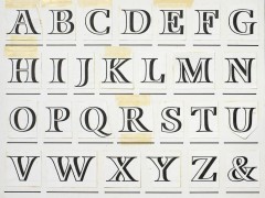
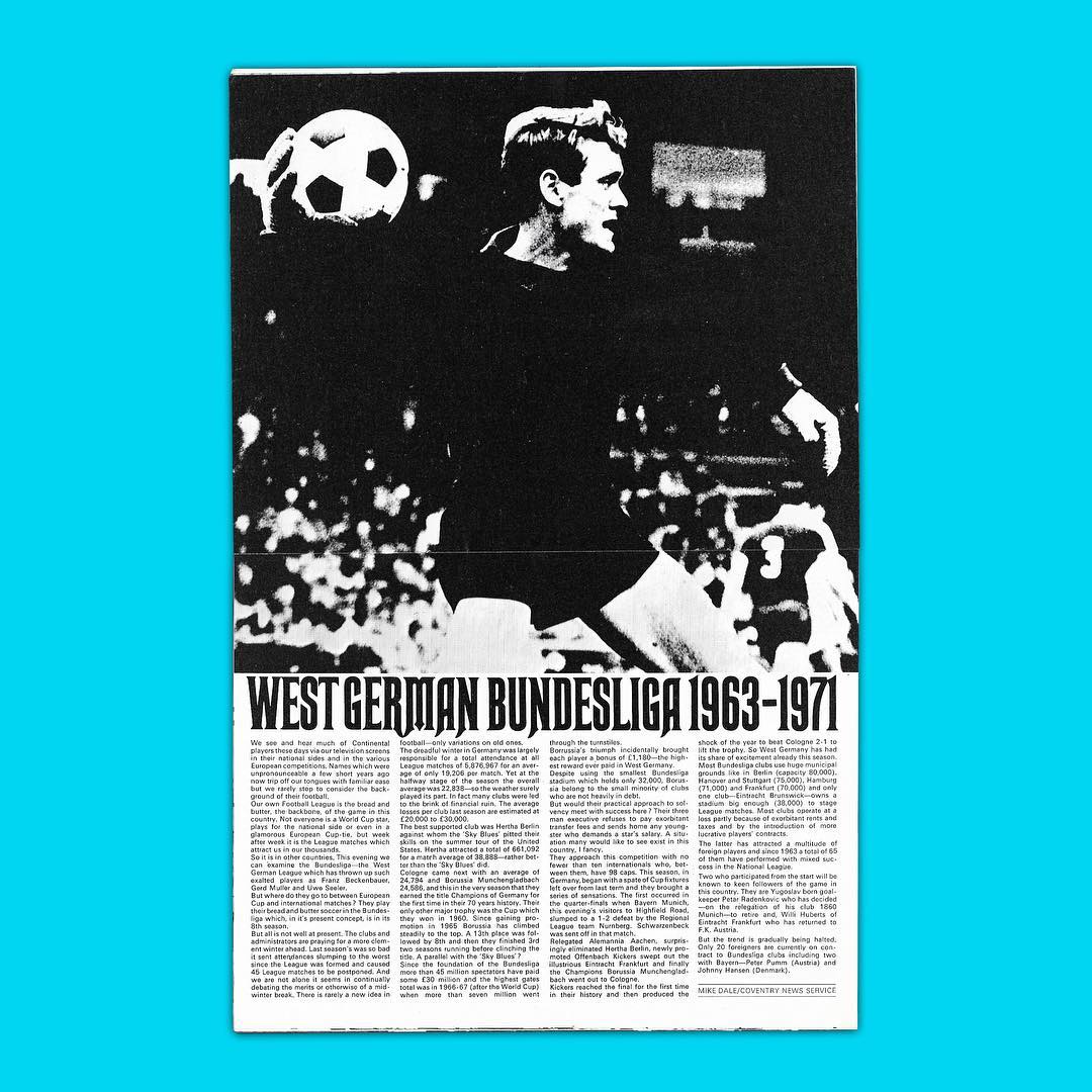
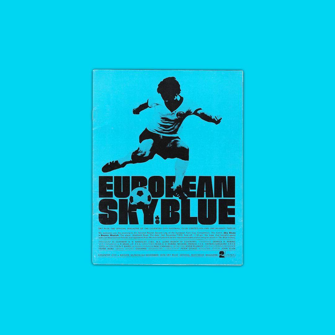
Elvin’s “absolutely cracking typography” was groundbreaking. “Different lettering with different features: something techy for the stats page, something fluffy for Christmas, something chunky and Germanic for Bayern Munich in the Inter-Cities Fairs Cup, a blackletter in the style of legendary German type designer Rudolf Koch. It might seem a bit obvious now, but people just didn’t do that before him. Before that, the programme was just some text and numbers, the odd picture of Jimmy Hill smiling. By 1972, Elvin won a D&AD Award for his efforts. One of the most prestigious awards in design won by a bloke doing a zine for Cov.”
An artist, an artisan, and a designer Elvin’s run at Sky Blue lasted just one season even though his design was voted the best club programme in the country by Football League Review.
“It seems originality breeds contempt,” wrote Elvin in the final issue. “In the 1970s, when footballers are paid huge sums for their skills, the supporters are still treated as though they cannot think for themselves. Coventry City is making a mistake in keeping with their slogan ‘People are Important’, which could not be more inappropriate for me and the 8,000 regulars who bought Sky Blue this season. I wish my successor the best of luck, he’ll need it!”
As Diss writes Elvin left Coventry to join the Radio Times “before ill health necessitated an early retirement in the late 1970s. His dream to make a football magazine called The Saturday Man sadly never came to fruition, but his work remains influential.”
Today, on the occasion of an exhibition and a publication, John Elvin’s design legacy gains its long-overdue recognition. His unique and iconic style of bold typography and striking imagery for Coventry City’s Sky Blue 1970-71 match-day programme showed the world that football deserves a free-spirited design approach, one that honors the sport’s universal prowess in people’s hearts, minds, and soul’s.
Football: Designing the Beautiful Game runs from 8 April – 29 August 2022 at London’s Design Museum. The exhibition is accompanied with a publication aka Football: Designing the Beautiful Game Exhibition Catalogue, a book – the first of its kind – that explores the design story behind football, diving into how design has been used to push the game to its technical and emotional limits.
For more information on opening hours and ticket prices, please visit the museum’s website.
Tags/ typography, graphic design, exhibition, instagram, branding, kickstarter, design museum, britain, football, john elvin


.jpg)
