Revival and Reinterpretation: A Typographic Journey from Geneva
Every country and every culture has its own rich history when it comes to typography and type design. All you have to do is dig deep and conduct thorough research to find it and hopefully highlight it. That’s the case for Typogama’s Michael Parson, a type designer that decided to embark on a journey to explore the printing history of his own city, Geneva, Switzerland.
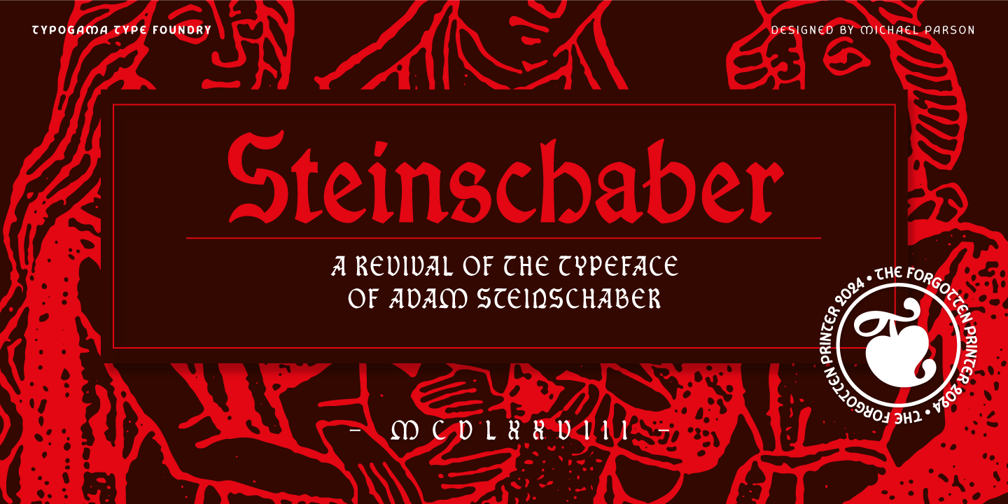
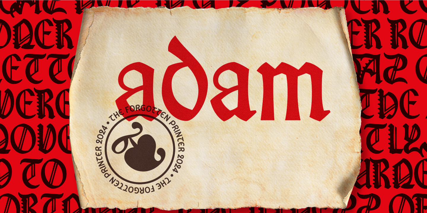
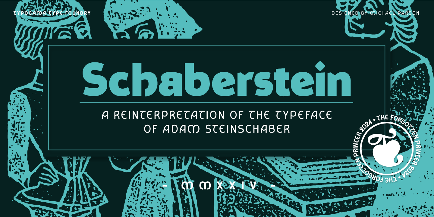
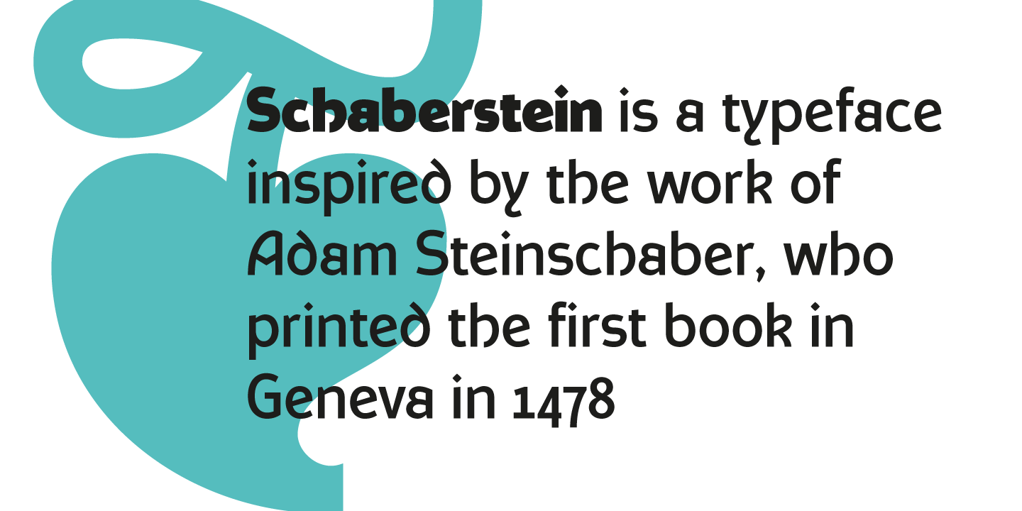
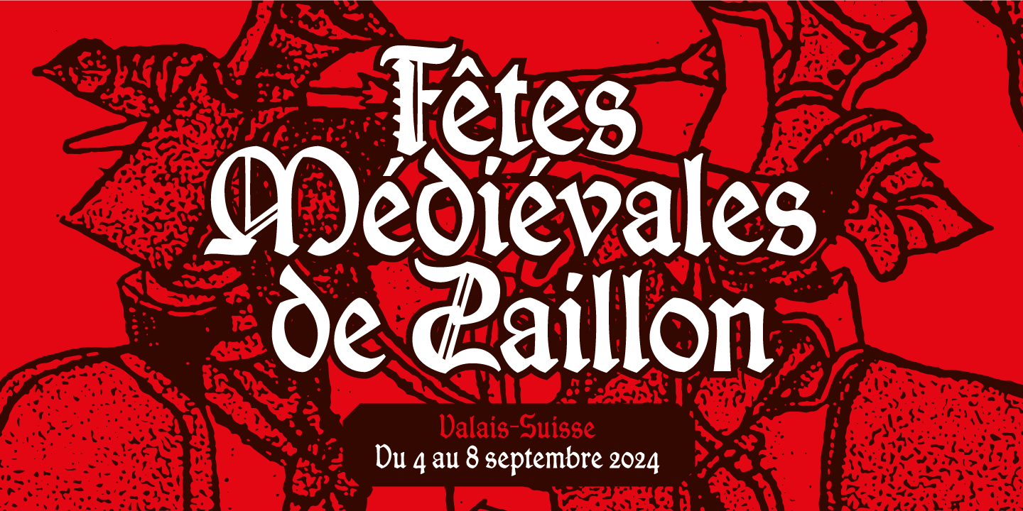
In December 2021, in the beginning of his journey Parson stumbled upon a digital archive containing a scanned copy of ‘Le Livre des Saint Anges’ by Adam Steinschaber. His curiosity about Adam Steinschaber's distinctive letterforms, the originality of his designs and his style that blended gothic traits with Roman or calligraphic inspired forms, led him to focusing his research on Steinschaber’s work. His exploration ended with the creation of two complementary typefaces: Steinschaber and Schaberstein, a faithful revival and an adaptation for modern use.
Adam Steinschabern was an early pioneer in Geneva’s printing history, who left behind unique and distinctive letterforms. His work can be categorized as gothic or proto-gothic, following the trends of his time, blending medieval influences and personal quirks. Steinschaber produced letterforms that were not only functional but also rich in character. His legacy is a testament to the enduring power of typography and its ability to bridge past and present. Through the revival and reinterpretation of his typefaces, modern designers can connect with Steinschaber's pioneering spirit, ensuring that his contributions continue to inspire and influence contemporary design and that’s exactly what Parson managed to do.
The revival
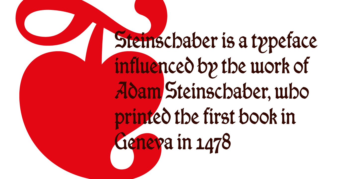
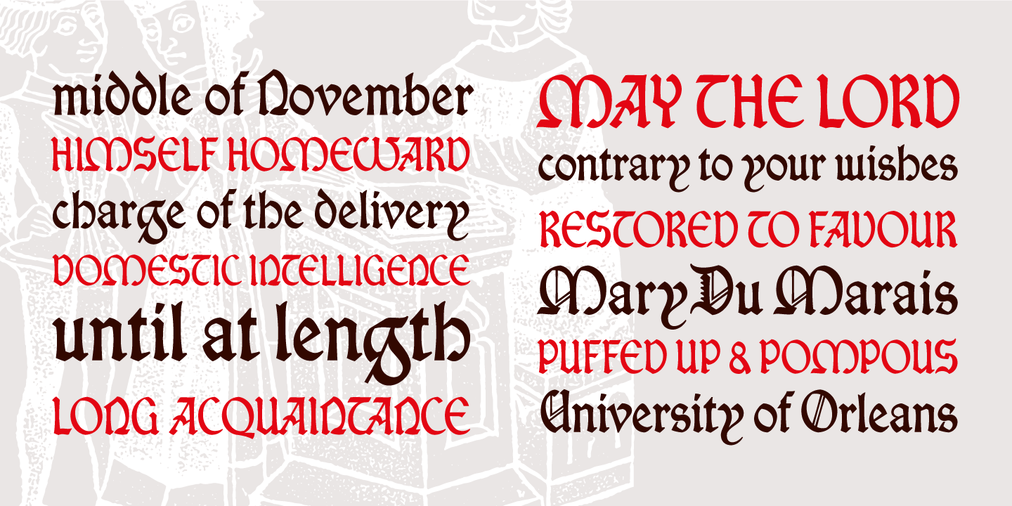
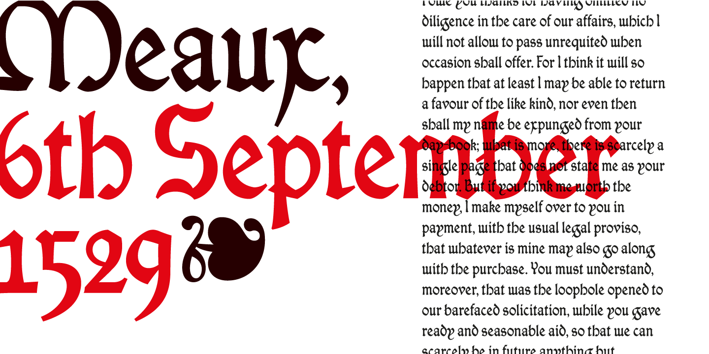
Steinschaber's original letters, created in 1478, were a blend of Gothic and Roman styles, with some special twists such as an inverted 'S'. Person’s revival of Steinschaber's typeface maintains these charming irregularities in a modern typeface that captures the essence of his historical craftsmanship.
“I decided to create a new character that was influenced and modeled after his work rather than trying to recreate it. This small freedom gave me more liberty in my interpretations and inspiration from a creative perspective. I tried to design the letters in keeping with the source material, while at the same time, trying to improve some of the imperfections that I felt affected the design”.
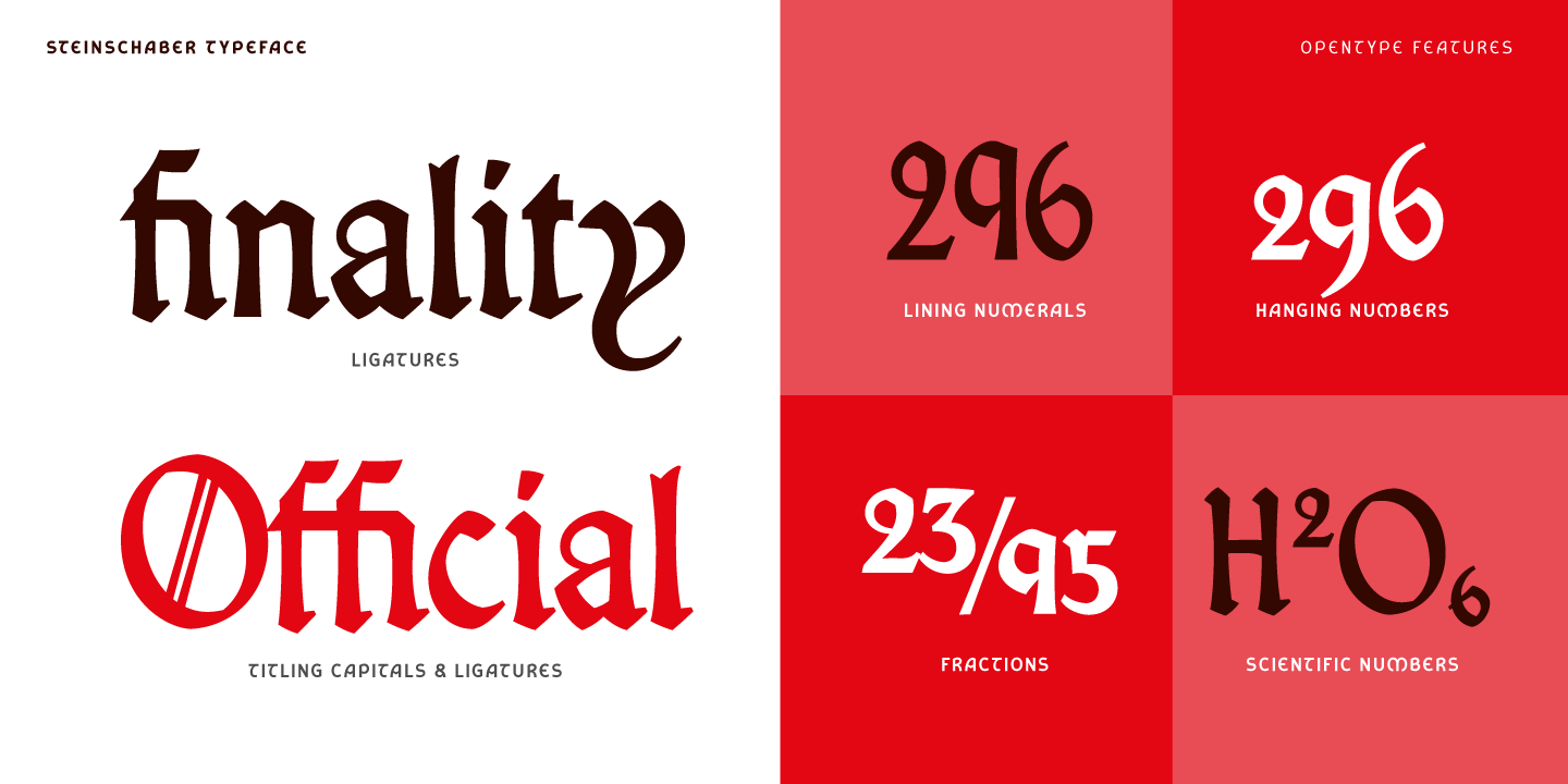
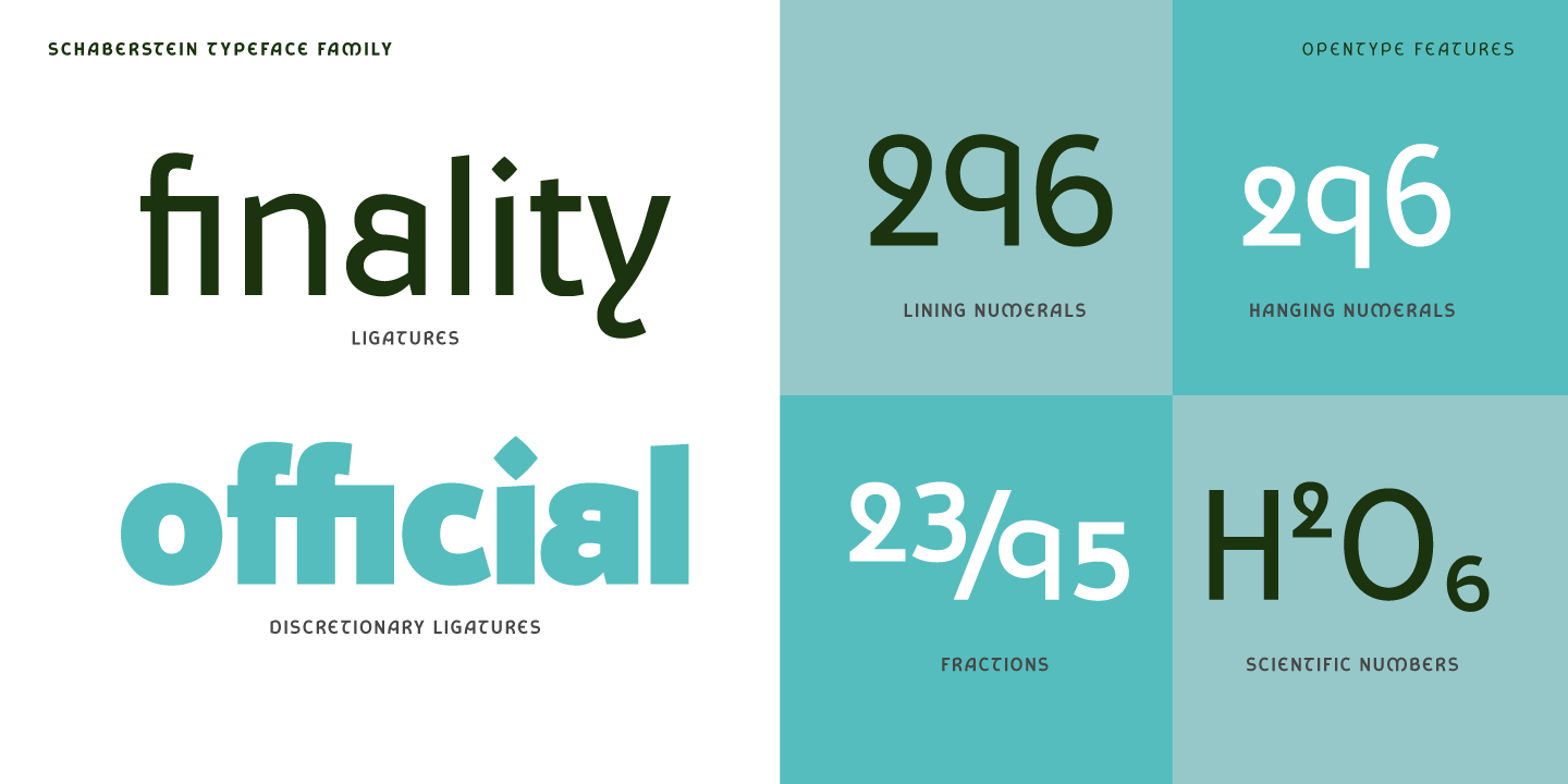
For his Steinschaber typeface, Parson harmonized the forms and refined the strokes, aiming to add some extra functionality to the design and create a typeface that is both visually striking and highly usable. This digital revival, named Steinschaber, includes a full Latin character set, complete with modern punctuation, numerals, and mathematical symbols. Utilizing Opentype features, it offers ligatures and alternate glyphs, such as a historical ampersand and decorative titling capitals reminiscent of Steinschaber's ornate initial letters. This revival pays tribute to the heritage of an early typographic pioneer and brings Steinschaber's vision into the digital era by maintaining and improving his distinctive letter shapes.
The reinterpretation
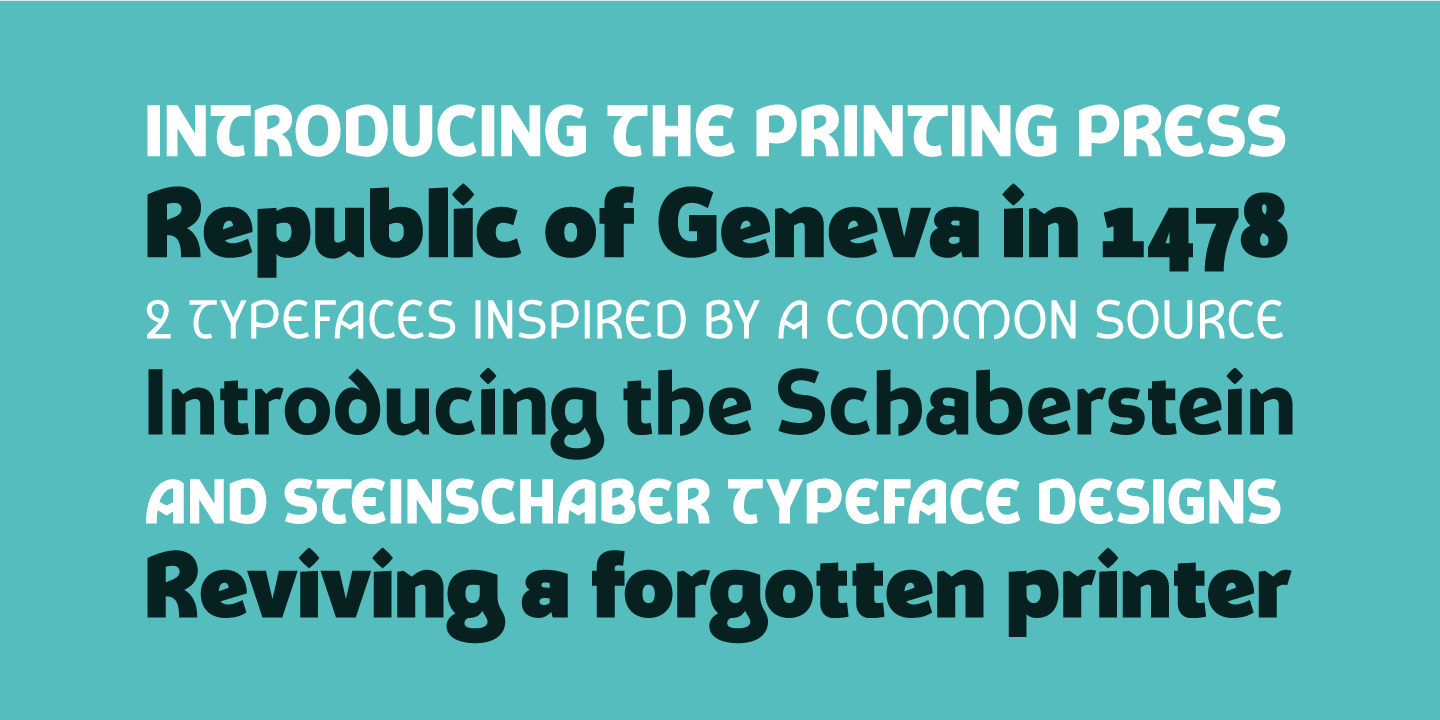
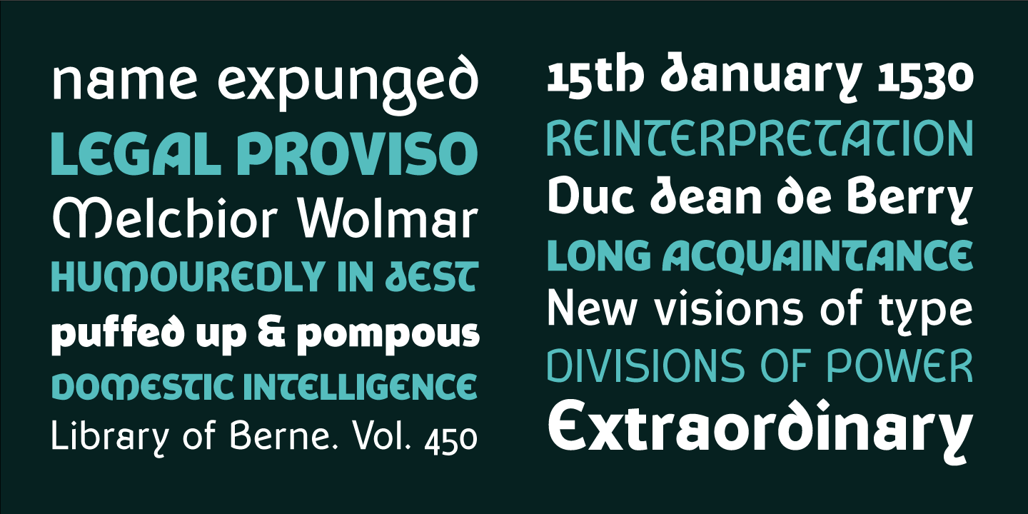
Reviving Steinschaber’s design was not enough. Parson decided to reinterpret it and redesign it in a contemporary light and that is how Schaberstein typeface was created. Schaberstein is a modern reinterpretation of Steinschaber’s work. It is a sans serif typeface, wider than Steinschaber, with open, clear shapes that enhance legibility at smaller sizes. Maintaining the vertical proportions of the original, Schaberstein has the same vertical proportions of the original font, keeping a relatively high x-height with short ascenders, but with longer descenders, notably on the ‘g’. The slight alignment variation between the ascenders and capitals letters was also maintained, giving the uppercase shapes a more dominating role. The lowercase letters are therefore more open, rounded and balanced with a simplified approach to the shapes. But the real character is revealed in the details of each form.
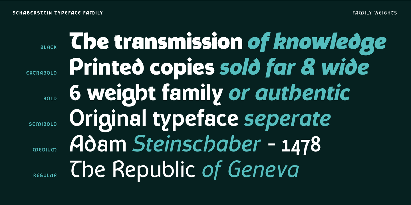
Key features of Schaberstein include the double-storied ‘a’, uncial-inspired ‘d’ and ‘e’, and the pronounced ‘g’ with its curved stem. The historical form of the ‘h’ with the curved righthand stroke was retained and carried over to the ‘k’ too. The distinctive lowercase ‘y’ with its reverse curve was also preserved, along with a range of unique uppercase letters such as the asymmetric ‘A’, uncial ‘E’, and curved-stem ‘T’. Schaberstein expands into six different weights, from regular to black, with corresponding italics that add nuance to text layouts. It is available as both static weights and a variable typeface, leveraging the latest OpenType specifications for maximum flexibility.
Tags/ typography, type design, geneva
 1.jpg)

_page-0009.jpg)


