Fonts report: 12 + 1 fall new releases to know
Sans, serifs, modern, round, sharp, condensed, elegant, simple, or pretty weird, Typeroom highlights some of the latest type releases available to own.
From Monotype to Blaze, Sharp, Optimo, Parachute and more, these are some of our favorite type designs that have been recently released from the world’s celebrated type foundries. These designs excel in features and will surely elevate any design project with carefully crafted letterforms with character.
Bookmark Typeroom’s inaugural Font Report and support the type practitioners who push the envelope of typography forward with the utmost respect for the letterforms and shapes to provide character via design.
Let the namedropping begin.
-
PF Expo by Parachute®
Eschewing ornamentation, PF Expo’s design is nobly rooted in simple, rational, and absolutely functional Roman forms. Circa the 17th century the contrast between the thick and thin strokes of letters increased, oblique stressing transformed into upright stressing, round letterforms were compressed and bracketed serifs grew edgy and delicate. During that period and throughout the late 19th century, wood type manufacturers marketed design variations more quickly than type founders did, by devising a system to condense or expand type and creating secondary styles to bracketed serifs such as triangular shapes.
In particular, PF Expo’s carefully modeled serifs follow an artful logic of triangular symmetry, whilst at x-height, the slanted one-sided serifs in letters such as (n), (p), (r) blend effortlessly into the stems to foster a distinct identity. The abrupt cut at the joints -a visual trick that adds a certain flair to its type design, especially when used at large sizes- provides a unique functionality as it compensates for over-inking in lowercase. The type family’s narrow proportions offer an economy of space - a critical issue for headline use. In addition, the italic version alters dramatically the texture and rhythm with razor-sharp terminals that transform from dual-sided serifs to triangular upstrokes.
Expo provides advanced typographic features including alternate glyphs with its character set extended for pan-European Latin support as well as Greek and Cyrillic. Exuding a strong, contemporary, and energetic personality, PF Expo’s modernized novelty is Parachute’s latest typographic installment to ensure an exemplary visual outcome.
PF Expo is available here.
-
Touvlo by Monotype
Designed by Emilios Theofanous, originally from Greece and now Monotype Studio’s Creative Type Director Touvlo is a modern interpretation of a classic genre - capturing the spirit of the early British grotesque and an homage to its lasting legacy.
Touvlo began with inspiration from historical sources but quickly transformed into a personal interpretation of early grotesque designs from some iconic Victorian British type foundries. Its origins can be found in “Specimens of Book and Jobbing Types; Borders, Initials, Ornaments, etc,” by the turn of the century Fann Street Foundry, Sir Charles Reed and Sons, Ltd., London: 1905. Whilst the grotesque italic designs in this book follow a more calligraphic style than the slanted versions we expect to see in contemporary sans-serif designs. This inspired Theofanous, who extended the same design principles to the backslant styles of Touvlo.
Grotesque sans serifs have been a staple in printers’ toolboxes and designers’ font menus since their emergence and in a sense they defy time and have been used widely across regions for decades. Touvlo enables creatives to grasp the essence and cultural spirit of this classic genre reimagined for contemporary contexts. Its styles offer character, voice and energy that can perform across mediums and design genres, and span applications in contemporary publishing, packaging, display and digital.
With a total of 24 weights in three styles across three variable fonts, Touvlo’s weights range from thin to black, giving it an expressive edge for headlines. The type design offers an array of styles, from clean uprights to characterful italics and exuberant backslants and its lyrical drop caps are, per Monotype, the finishing touch, featuring exquisite birds and creatures inspired from ornaments found in the enchanting type specimen books of the era.
Touvlo is available here.
-
Octave by Sharp Type
Octave, Josh Finklea’s newest release with Sharp Type, is a reconsideration of the modern sans serif typeface. Octave doesn’t indulge in visual flourishes, nor does it cling to steadfast rules that hold other typographic standbys and contemporary revivals in the past. Instead, Octave embraces the overall design ideology of the modern sans serif while reasonably allowing for design structures and aesthetics to be logically reexamined and refined. There have been many expertly drawn revivals of classic typefaces in the last decade, but this isn’t an attempt to revive a classic, nor a comparison with these revivals. Octave is a typeface that harkens to the reliability and sensibility of the mid 1900s and comfortably displays its contemporary improvements.
Octave doesn’t indulge in visual flourishes, nor does it cling to steadfast rules that hold other typographic standbys and contemporary revivals in the past. There have been many expertly drawn revivals of classic typefaces in the last decade, but this isn’t an attempt to revive a classic, nor a comparison with these revivals. Instead, it embraces the overall ideology of the modern sans while reasonably allowing for design structures and aesthetics to be logically reexamined and refined.
Available in 6 weights, 12 total fonts, Octave is available here.
-
Void by Optimo
Lucretius wrote that, “There can be no center in infinity.” Drawing inspiration from the sensation of floating in space and being pulled by gravitational forces, Void is an original and innovative display typeface. Suspended between past and future, its blobby shapes have a magnetic fluidity that suggests otherworldliness.
Designed by Malte Bentzen, Void is the outcome of a research project that looked into abstract typographic shapes that are not defined by standard writing tools. Following interest from a number of designers who wanted to use the lettering, Bentzen developed the project into a complete typeface. Reminiscent of solvent molecules, Void’s shapes challenge the rational basis of the alphabet by exploring the combining of peculiar structural elements in the manner of aqua morphic modules. Through its high-contrast anomalous forms, the design of each letter that makes up Void has a balanced movement of ink that can be described as liquid geometry. Bentzen seamlessly combines a range of references from science fiction to 1990s visual culture to create Void’s visual language.
Engineered both in a variable format and three static weights (thin, regular, and bold), Void is available here.
-
Silvana by Blaze Type
Silvana is a contemporary display serif typeface with sharp and dynamic strokes, strong contrast and delicate pointed serifs. Retaining historic traits while responding to currents of the zeitgeist, it’s a graceful and confident typeface family with an expansive set of both functional and experimental glyphs.
The meticulous drawing process has been influenced by research into transitional typefaces from the 19th century, combining the Old Style spirit of preserving the pen’s influence with the sharper contrast and higher level of refinement introduced in modern style type design.
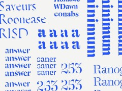
In a type specimen of Pennsylvania published by Schelter & Giesecke during this period, there seems to be an unintended effect, where excess ink has gathered on the right side of the lowercase a, creating a bumpy, dark spot. In the design of Silvana this subtle printing error is transformed into a distinct design detail, adding a fine ink-like fluidity to several letters across the typeface, such as G, S, a and n.
As a supplement to the standard character set, there is a large alternate set with a more charming and expressive style. Here the ink drop detail is applied more broadly, and can be found on the horizontal serifs of letters such as E, T and Z, and on the diagonal crossing strokes found on A, M and R and more. The fluid and dynamic quality of Silvana is fully pronounced in the italic weight palette, which features energetic end strokes, deep junctions and steep calligraphic turns.
Stacked ligatures, like www and xxx, is a refreshing and playful addition to the designers tool kit. With its extensive glyph set, offering versatility and personality, Silvana can give character to a broad variety of printed and digital designs such as brand identities and logo types, book covers, editorial designs, posters, exhibition designs and websites. It’s especially suited for display type purposes, but also reads well in smaller point sizes.
Silvana (10 styles and variable) is available here.
-
NaN Tresor by NaN
In life and to some extent when designing fonts we are confronted with a choice our survival depends on. NaN Tresor’s designer Christoph Koeberlin made the innovative decision — for his own survival — to make no final decision. He offers an anachronous revival, side-stepping natural selection (sorry Darwin), where every glyph variation somehow flourishes in one font.
When reviving historical material one can’t help but rationalize our elders’ inconsistencies. We typically choose one unique structure for each form that is then consistently applied across the design system. Koeberlin made a counter-intuitive decision and birthed a family offering the most historical and fictional variations in structure possible between the different styles of his typeface. This has an interesting outcome for NaN Tresor’s users: navigating through the different styles they can choose the glyph variations they like the most, or even access all different versions from each style, no matter what the default curation.
Tresor is available in three optical sizes: NaN Tresor S with its wider spacing and thin joins is most suited to small sizes and longer form reading. Tresor M has an equitable spacing which makes it shine at most scales. Tresor L with its particularly tight packing lands with the most exuberant alternates by default and is tailored for titles with panache. Licensees of the Complete Family will discover Tresor Swash as an alternative version of Tresor L with ornamental caps and swashes activated by default. With its sometimes eight alternates per glyph plus swashes, a single style of NaN Tresor can take on many different faces.
NaN Tresor is available here.
-
ES Dokument by Extraset
ES Dokument is a superfamily of 60 styles designed by Xavier Erni (Neo Neo) and Arthur Schwarz between 2020 and 2022. Its drawing finds inspiration in the curves of different German industrial grotesques from the early 20th century but offers a contemporary, flexible and original interpretation of the genre. The high-waisted capitals, the outstroked lowercase (a), and the hooked lowercase (r) brings a lot of personality to the character. Thanks to open type features you will find an alternative stylistic set 1 combining capitals (E F L T Z) with a 14% angle stroke on terminals instead of straight cuts in the default set. Stylistic set 2 offers barred (I) and (J) capitals.
Those singular alternates bring the typeface aesthetic closer to the origins of the genre. Finally, for those interested in a more neutral appearance, the alternate lowercase (a) and (r) brings more softness to the text. The complete family is divided in 3 subfamilies with graduating widths: condensed → standard → extended. Each family offers 10 weights from thin to black with their respective italics. The variable font file is offered upon request after purchasing the complete family.
ES Dokument is available here.
-
GT Pressura by Grilli Type
GT Pressura uses the visual gesture of ink spreading under pressure as a stylistic device, bringing the warmth of analog print back to the digital design space. Now with extended weights and a refreshed design, GT Pressura draws inspiration from conceptual art and Constructivist aesthetics.
In 2008, Marc Kappeler and Dominik Huber began designing GT Pressura. The designers of Moiré (a Zurich-based graphic design studio) needed a typeface for a book about conceptual art in the former Soviet Union and decided to design their own. During their research, they were inspired by early Constructivist artists to achieve their vision: a contemporary typographic solution combining utilitarianism and abstract-driven aesthetics. First released in 2012, followed by Cyrillic language support in 2017, this 2022 update is Marc and Dominik’s Swiss Style take on the typeface: grid-driven, polished, and charismatic.
Constructed with strategic half-arcs and straightened elements to form the skeleton of the typeface this new version of comes with three added weights: Text, Medium, and Black as the type design gets a thoughtful update. GT Pressura is available here.
-
Boogy Brut by Bureau Brut
Released in 2020 and recently updated with italics, Boogy Brut is the outcome of a collaboration between Boogy Paper and Bureau Brut.
Julien Priez, aka Boogy Paper, is a calligrapher and type designer, and a member of the “High On Type” collective. His work is heavily indebted to designers such as Oscar Ogg or Berthold Wolpe, who similarly envisioned calligraphy and lettering not necessarily as ends in themselves but as key steps within an overall creative process. This approach has informed parts of the design of Boogy Brut, which is a true contemporary digital typographic family and not merely a typeface influenced by calligraphy. Sharply modeled shapes reveal the structural qualities of the written models but do away with the handmade imperfections caused by the writing tools or the texture of the paper.
Boogy Brut thus is free from any reference to a particular model, rather a synthesis of various types of research and experiments endeavored by Julien over the past few years notes Bureau Brut. Available here.
-
CX80 by 205TF
The CX80 typeface is a “machine” as rudimentary as it is atypical notes 205TF. Four kinds of serifs are combined in the same font: sans serifs, triangular serifs, sharp rectangular serifs, and smooth rectangular serifs. Behind this intentionally economic design, CX80 reveals a unique potential; particularly as weight can be adjusted at will using variable font technology.
CX80 reveals its formal and conceptual sources of inspiration through its modular and composite appearance. The name openly refers to the Codex 80 type classification imagined by French typographer, illustrator, and writer Jean Alessandrini in 1980. A second influence is the modding of scooters. During the 1980s (when CX80’s type designer Damien Gautier was old enough to buy his first Piaggio Ciao), teenagers were in the habit of customizing their mopeds by adding functional and decorative elements. This culture of outrageous tinkering and modding also runs through the typeface.
With CX80, Gautier continues his exploration of vernacular typographical forms produced by amateurs and industrial designers. Forms that he loves for their freshness and ingenuity, that here once again show their surprising potential.
A typeface that echoes other creations by Gautier (such as LeChaufferie, Robin, and Heliuum), CX80 is available here.
-
ABC Repro by DINAMO
Designed by Erkin Karamemet with spacing and kerning by Igino Marini and produced by Dinamo’s Robert Janes Repro is a friendly, flexible sans serif inspired by signage and digital operating systems; it's a typeface that merges clean design with complex font engineering.
The extensive family includes nine weights with italics as well as a monospaced variant and a variety of OpenType features, forming a comprehensive toolkit for users developing experiences both online or off. As a customizable Variable Font, Repro is open-ended, with big system functionality and digital interfaces in mind.
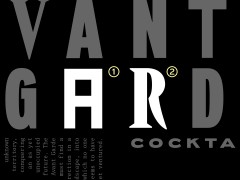
In addition to its range of sharp or soft alternates, the typeface contains a unique tool for circled emphases, offering users a beautiful new way for creating visual hierarchy. And while Repro has an overall geometric feel, its softer and more personable than the mechanical typefaces it shares a community garden with. It’s design is bold, reliable, and recognizable, with a range of alternates, web-specific glyphs, and more, which can be mix-and-matched to create a variety of different rhythms and flavors. ABC Repro is available here.
-
PP Writer by Pangram Pangram
PP Writer is an elegant and dynamic serif drawing inspiration from French Renaissance type. It includes three cuts, text and display styles and a playful italic, and nine weights per cut. Each font includes 744 glyphs with a range of alternates, ornaments and much more. PP Writer intends to provide the user with a legible, traditional text typeface for print and editorial usage with Writer Text being the workhorse of this typeface, its purpose is for text ranging between 6 and 14pt.
PP Writer’s proportions, contrast, modulation and stress embody Renaissance type of 16th Century pushing the style into the 21st century explains Pangram. With different levels of contrast and sharper strokes, the typeface comes in 30 styles. Designed by Fred Wiltshire and Mat Desjardins, PP Writer is available here.
-
Foundry Unie by The Foundry Types
Foundry Unie, born from simplistic pan-European ideals of fraternity and working partnerships, is The Foundry Type’s latest release that is inspired by “the modernist movement in the ‘interbellen’, and the geometric type experiments from De Stijl and Bauhaus. It also reflects the seemingly open, tolerant, friendly, hard-working, and efficient society we live in.”
A geometric sans with an unmistakably European tradition, Foundry Unie was designed on the occasion of the type foundry’s relaunch in 2020 as the studio’s new website needed a new typeface that worked well on screen whilst reflecting its design ethos. “We approached designing the website and typeface with a similar philosophy to the De Stijl art movement” explains the design practice.
“Our desire to create an extremely neutral, seemingly effortless typeface, very round, open, and minimal. Foundry Unie appears geometric, but that belies the amount of time and effort that goes into refining weights, proportions, stroke widths, and terminals to achieve a balance geometric appearance. Ultimately, in the larger sense, Foundry Unie is humanistic in that it reaches back to before the Renaissance to a more classical abstract Hellenistic idea of geometry and proportion.”
The type design’s large x-height, clean appearance, and optical recognition characteristics make Foundry Unie a font that opts for neutrality and clarity. The open terminals of ‘C, G, J, S, a, c, e, f, g, and t‘, do not flare or distort through the weight range and has an even smooth colour when set. With low contrasting appearance and sympathetic shapes, Foundry Unie offers a calming understated feeling that appeals to a spectrum of branding sectors and where applications for print, screen and mobile are at a premium notes The Foundry Types.
Foundry Unie is available here.
Tags/ typography, typeface, monotype, typefoundry, typedesign, sharp type, optimo, grilli type, parachute typefoundry, dinamo, the foundry types, blaze type, nan, extraset, bureau brut, 205tf, pangram pangram

.jpg)

