Creativity beyond the Latin scripts: Digital tools, cultural diversity and India's rich heritage
Typeroom is a platform for type design that is not focused only on the mainstream approaches and established trends, but is constantly trying to promote diverse, radical and innovative designers and ideas. That is why we pay a lot of attention to the creativity blossoming in non-Latin designs! We had a very interesting talk with Vaishnavi Murthy, Creative Type Director of Monotype, about non-Latin scripts, digital tools, cultural diversity and the future of typography.
Typeroom: Can you tell us about your journey in type design?
Vaishnavi Murthy: Type design has been an extraordinary journey for me, affording me the chance to delve deeply into the myriad facets of this discipline before embarking on the actual creation of letterforms. It's often said that we can discover the cosmos in a single grain of sand. For me, the grain of sand came in the form of a little known south Indian script called the Tulu-Tigalari script.
I started working on this heritage script when I chose, somewhat naively, without realising the extent of work it would entail, to create a font for it during my final year at design school in 2004. Back then, knowledge about type design in India, even among the top design schools, was scarce.
Working with historical artefacts like manuscripts and inscriptions also gave me insights into the politics behind historical narratives - it helped me uncover and present a narrative closer to the truth. I discovered that two old scripts, the Tulu script and the Tigalari script, were in fact one and the same. I renamed this as the Tulu-Tigalari script.
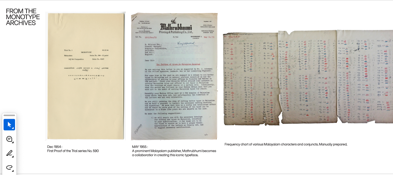
After ten years into this project, I was able to pursue an MA in Typeface Design at the University of Reading, UK due to the generous support from a Felix Scholarship. The archives in the UK were a treasure trove for me, offering access to incredibly valuable Indian manuscripts and records of how some of the early Indian script fonts were made. After completing my MA, I freelanced for nine years until I joined Monotype as a Creative Type Director in April 2024.
TR: What role do you think technology and digital tools play in the design of non-Latin scripts?
VM: Since the era of typewriters, script technologies predominantly centred around Latin script systems. The keyboards acted as bottlenecks that restricted the use of the full spectrum of characters found in other complex script systems that adopted the same technological advancements. Another challenge that presented itself along with this was fitting vertically ligating scripts into narrow horizontal spaces. These are some of the constraints that persisted into the early days of digital fonts. Various complex scripts were modified and standardised to fit into these spaces by breaking the ligatures apart and reducing the number of characters.
Global script systems have recently gained enhanced technical support for complex shaping due to the introduction of the Unicode encoding system, advanced shaping engines, and font file formats such as OpenType and TrueType.
We are also seeing narratives around scripts being built, and discussions about their design evolve beyond those centred on the Western world, acknowledging, for instance, the role of Chinese printers in inventing printing and popular design contests expanding their scope to include global script systems. There is a growing interest in studying the history and evolution of scripts globally, which is allowing for further experimentation around these topics. Region-specific design languages are being developed across several scripts resulting in some reverting to their older scribal forms, which were not technologically supported until recently. For example, the Kerala government introduced a new standardised Malayalam script that is an improvement over the disconnected forms of the typewriter era. This has enabled support of more fluid and readable conjoined characters that are closer to the handwritten manuscript styles.
TR: How does designing multi-script typefaces help in maintaining cultural authenticity?
VM: The intention of several multi-script typefaces today is to closely match the visual harmony across scripts by matching the style of one script to another. Whether this be in proportions, readability, curve quality, weight, or width, etc. Even historically we see several examples where one script adopts the characteristics of another or several others. Today, the dominant styles are the serif and sans-serifs in the Latin context, also called “monolinear” and “modulated” styles, to align with global script paradigms.
Using a robustly engineered multi-script typeface that is created with attention to details, ensures consistent expression of the intended message's personality across different scripts, maintaining a unified visual style. It facilitates visual cohesion of the design language between script systems, making it easier to match the typographic layouts across the languages. This versatility is particularly valuable for maintaining the visual cohesion of a global brand. Multilingual and multi-script platforms are becoming increasingly prevalent and influential.
If a multi-script font supports all the intended symbols for various language systems that use the script, we see greater adoption. The Noto Sans project is a good example for this. It began as a collaboration between Google and Monotype, with an intention of providing global language support in digital typography. Today, it has grown to become one of the go-to typefaces for extended script support around the globe.
TR: How do you envision the future of typography concerning the balance between local cultural and linguistic characteristics and the need for universal design principles?
VM: Cultures, languages, scripts, and their aesthetic preferences have evolved in an interconnected manner. Although they remain closely linked, each has undergone its own complex transformation and development. The role a script plays is therefore highly nuanced. The cultural identity of a community changes more frequently than we think it does. We see several regional scripts and their typographic interpretations adopt popular styles of the time from other scripts environments they are exposed to.
Many writing systems around the world shifted from solid blocks of text with no word spaces or punctuations to ones that use them regularly. With the literacy rates at an all-time high, changes like this have clearly made reading easier and have a global appeal and impact. Similarly, hierarchy, legibility, spacing, colour, etc., have a universal resonance. From the scribes and engravers of the past to the modern printing presses and today's self-publishing platforms, we now have tools that comfortably support expressive and experimental typography.
This recent trend of self-publishing templated formats, enables individuals with minimal design knowledge to create functional and appealing layouts. The next steps would be to enhance general education about typography. This global shift, where design tools have become more accessible, underscores the need for widespread design education. Moving forward, the focus should be on exploring and understanding the power of aesthetics, with readability and accessibility as its core.
TR: How has the design of non-Latin scripts evolved over the past decade? What kind of impact does this non-Latin ‘revolution’ have on diverse communities?
VM: The non-Latin revolution aims to challenge and redefine the term "non-Lati,". Encouraging a shift away from a Latin-centred perspective. It is a phenomenon that has come about due to a post-colonial global participation in the advances in technology. Adapting them to better reflect regional perspectives.
The fluidity between languages and scripts has been historically seen as highly beneficial. With multi-script keyboard support, voice-to-text, and increased tools supporting automatic language translation and transliteration, it has become much easier for people to consume any content in a script and language they are comfortable with. Social media platforms are a great example that displays this capability.
This shift in expression is also reflected in the design of typefaces, which now offer a wider orthographic range along with greater multilingual support with varying stylistic sets. For instance, a single script can be used by multiple language systems. The Latin script, for example, is used by over 140 languages globally. Consequently, newer Latin typefaces support a larger number of characters and diacritics making it accessible to include even minority linguistic communities that use this script. This trend of supporting a greater number of languages within a script system is seen worldwide.
TR: How do non-Latin typefaces assist brands in communicating in a more globalised way?
VM: At Monotype, when working on custom logos and typefaces in regional scripts, it is quite clear that such an exercise results in a significantly higher rate of adoption for the client or brand. From being a top-down model of communication, we are also seeing a bottom-up model emerge, where brands are far more aware of regional preferences. Branding, therefore, has shifted today to be more flexible and inclusive in its approach.
TR: India has such rich linguistic diversity. How do you approach type design in order to cover the need for so many different letter forms and highlight the special character of each one?
VM: Growing up in India with its rich linguistic diversity, my identity is multilingual and this multilingual environment that often surrounds us is a reality that is increasingly recognized globally. Emerging technologies look at enabling a fluid linguistic landscape that addresses the ease of switching between languages and scripts. Type design too is housed within such technology models and is easier to make complex typefaces today than it was ever before.
Monotype has been active in India since the eras of hot metal typesetting and typewriters. Consequently, it has played a role in the standardisation of scripts, contributing to the development of the modern forms of major Indian scripts. We are therefore well-equipped to address the ongoing changes in India's linguistic landscape. In addition, through the Foundry Program, we collaborate with foundries globally and can provide technical support to clients using non-Latin scripts. Recently, the extensive Indic library of the Indian Type Foundry has been made available on the Monotype platform.
Tags/ typography, monotype, non-latin
.png)
 1.jpg)

_page-0009.jpg)






.png)
.png)
