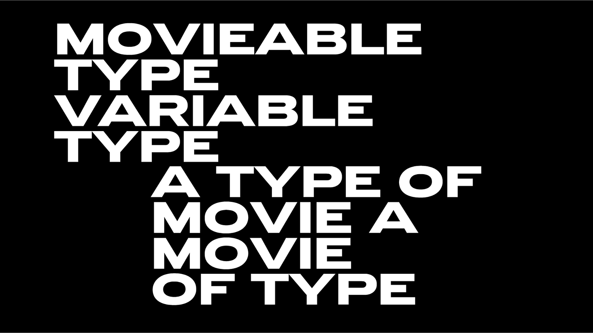
Sans versus serifs! Alan Kitching & Quentin Newark join forces for the world’s first ever fairy tale about typefaces
“We believe this is a first in graphic design history,” says Quentin Newark about his latest collab with the legendary typographic artist Alan Kitching, a fairy tale about typefaces titled Face V. Face that needs our support via its Kickstarter campaign.
“The story begins with the wilful mistreatment of Princess Antique at the hands of the evil Comrade Futura. He and his thuggish sans provoke a battle with Emperor Didot, and all the serif typefaces. What happens? Do the sans extinguish every serif? Do the serifs triumph? What damage is wrought?” notes Newark about this rooted in typography illustrated book, to be enjoyed by children and adults alike.
But what prompted him to write a fairy tale about typefaces? The origins of Face V. Face go back in time, in fact, it all started forty years ago when Newark aka one of the ten leading designers in Britain per Independent on Sunday was a young design practitioner, who confronted by “countless typefaces, sought advice on which ones to use.”
“There was advice in Jan Tschichold’s Neue Typographie, a kind of Bible for any aspiring designer – ‘use only one typeface; preferably sans serif’. One typeface. And Max Bill, founder of Ulm, the post-war Bauhaus, saying ‘anything old is fascist’. And Otl Aicher, also from Ulm, saying ‘to use capital letters is fascist’. Well, that settles it. Sans, and only lowercase. Look at the Swiss, they never weakened. As resolute as iron. It is sans for everything. So it seemed clear. As a designer you should NEVER EVER look at type made to resemble bark with little protruding twigs again, and made out of puppies, unless you want to burn in Hell, or worse, seem tasteless” explains Newark who began to “imagine sans letters in conflict with serifs in his fevered dreams.”
“Like that book by Theo van Doesburg and Kurt Schwitters, The Scarecrow, with the B giving the X a good old kick. Newark saw it as the pure sans, full of hope for a peaceful non-fascistic future, doing away with those evil serifs, the serifs of slavery and empire” reads Kickstarter’s campaign announcement.
“And yet… if you flip open enough books, a few years later in the 1940s, there is Jan Tschichold wearing a bow tie, advocating centered type? Designing Sabon, flagrantly a serif typeface, pretty obviously based on that lettering on Trajan’s column. And more and more typefaces appear like rain, an unstoppable flow, all so tempting. So many choices, weakening the resolve to stick to only one font. And then along comes Aicher designing a serif font, with capitals? And Karl Gerstner, the most rigid of the Swiss, designing a weird-looking blobby font, he called it the culmination of his career, but it has serifs? What? What about fascism? What about good taste? The floodgates are flung open. Does this mean you can use Calypso? If ‘taste’ is that flexible: what about Cooper Black?”
Eventually Newark’s dreams “take a new turn, endless typefaces, like the stars, as countless as the stars. And like the stars, each typeface with its place secure in the infinite heavens.” Face V. Face is the result of all those dreams but not only that.
“Plus a lifetime of research into typography; studying endless fount catalogs, the experiments with letters of El Lissitsky and Hendrik Werkmann, the writings of Guillaume Apollinaire, Robin Kinross on the Roman du Roi, drinking in every nuance of the epic aesthetic clash of Rudy VanderLans and Massimo Vignelli. How can you make sense of all these differing ideas about what typography ‘should’ be? Is there any ‘right’ way? What does it mean that there are daily more typefaces appearing, and it is easier than ever to alter type to create yet more? Is this proliferation good, or bad? Can a typeface be moral? Can choosing one typeface over another actually be fascist? The story in this book puts all this actual history into an imagery landscape. It imagines how a cataclysmic war between sans and serif typefaces comes about, how the war pans out and describes the aftermath” explains the team.
This unique fairy tale is inspiring. “It recounts the speech of Comrade Futura that starts the war – and the speech by Emperor Didot that ends it. The story is told in words, with a matching series of typographic explosions by Alan that are simultaneously verbal, visual, painterly, and printed. There is hours of reading and looking in this book. It packs a considerable cerebral and a huge aesthetic punch.”
“The story is about typefaces, what they mean and how we perceive them, but it is so much more than that. It is about very big things, like the urge to simplify, which seems like a good thing when it is applied to your bookshelf but is a very bad thing when it is applied to society. It is about revolution, starting again versus tradition and muddling through. It is about acting in concert, and about taking risks. Using typefaces as metaphors for people, the story tries to show that it is individuality and not uniformity that makes us fully human. There is no other typography book like it.”
“The book is unusual, to say the least. Is it a children’s book (sort of), is it a design book (yes, but not like any other), is it an art book (we think so)? Conventional publishers like conventional books, anything out of ordinary needs lots of explaining before it finds its readership. We are hoping typophiles will see its value immediately” explains the team.
While the story is written, and many of Kitching’s typographic images are printed, the book itself “remains an ambition, it can’t become a book until we have funds. Once we have enough Kickstarter pledges, we can produce the book, and send a special pristine copy to each pledger” adds Newark.
“There are all kinds of pledges besides the book itself; postcards of Alan’s type-images, with an explanation of the story and fonts used, Alan’s precious hand-printed prints, discounted books, studio-pack of books, and a lunch in Alan’s workshop” he adds.
A project that aims to inspire and educate — the Glossary at the end of the book explains all the terms used in the story; bodkins and hellboxes, transitionals and bracketed serifs as it aims to educate and inform as well — Face V. Face is a beauty to look at with Kitching’s typographic images adding values to the inspiring story.
“Alan read the book repeatedly and made sketches of the parts that he could see in his mind’s eye. He knows, from years of use, which items in his collection or which techniques of inking or printing might expand on the story. For the armada, Alan arranged type with no form locking them in place, so as the roller pressed again and again over the type, the lines of type began to become disarrayed, having the appearance of waves, or boats upon waves. Every typo-image in the book will be explained in a section of the book, what the type is, and what technique Alan used to make it look that way” Newark explains.
So there you have it. A fairy tale like no other that speaks of a creative’s conflict. “The story is inspired by the irresolvable dichotomy: reductiveness versus eclecticism, subtraction versus addition. Which is the right path?” he elaborates.
Featuring Kitching’s original work — a great asset as he is arguably one of the world’s foremost practitioners of letterpress typographic design and printmaking — and Newark’s words — a celebrated British designer and author whose first book about design aka What is Graphic Design? (2002), has sold tens of thousands of copies, and is translated into many languages including Korean, Portuguese and Japanese— Face V. Face is the first ever fairy tale about typography and it needs our support.
Tags/ typography, typefaces, book, fonts, alan kitching, kickstarter, jan tschichold, crowdfund, serifs, quentin newark


.jpg)







.jpg)

