Rui Abreu’s font pays tribute to Portugal’s rich typographic heritage
At first glance, Lisbon, with its 270 days of sunshine a year, laid-back Latin approach to timekeeping and a lifestyle based around the sea, doesn’t have much in common with its northern European counterpart, Berlin” writes Trish Lorenz in her article on Europe's hidden gem. “But, thanks to an influx of young creatives attracted by the city’s affordable rents, thriving café and bar culture and an increasingly bohemian lifestyle, many commentators are beginning to brand Lisbon as ‘the new Berlin’” she adds.
Lisbon is a city filled of typography and the lovers of this form of art do find intriguing the mere thought of visiting Portugal's capital. Picturesque with letterforms being an asset of beauty, Lisbon has many creative devotees. Enter Rui Abreu.
A type designer based in Lisbon, Abreu graduated in 2003 from the Faculty of Fine Arts in Porto, where he studied Communication Design.
A man dedicated to type design Abreu's latest project is a stark reminder of the typographic richness in the city's visuals, past and present.

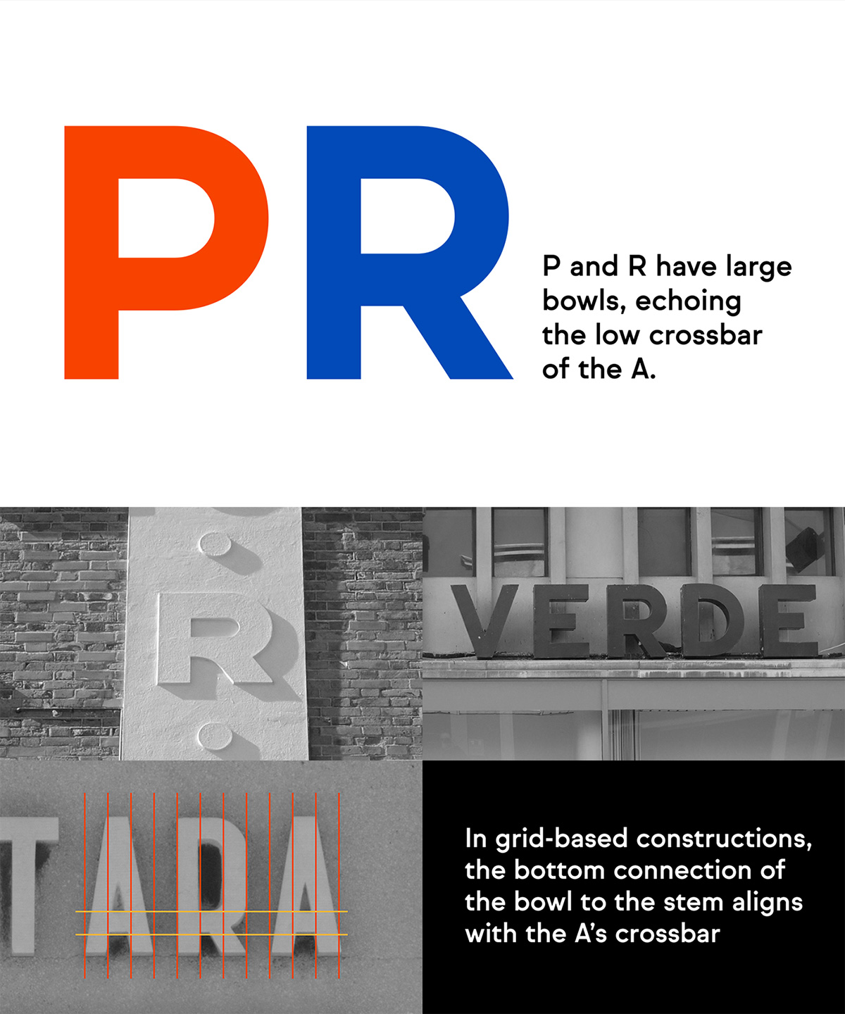
Having launched R-Typography, his type foundry back in 2008, the awarded designer released Sul Sans that is literally a typographic ode to the city.
A geometrically constructed typeface with features observed in capital letters of signs and buildings in Portugal Abreu encapsulated elements that “are obviously not exclusively Portuguese, they can be seen in Italy and Spain, but they do show up together and consistently, on several signs and buildings in Portugal. The name Sul (South), hints to a southern European flavor on a typically northern style of typeface” he notes of a project inspired from the heavy typographic legacy of a city destined to be a place to be as we speak.
Explore more here.


Tags/ inspiration, latin, portugal, atypi, lisbon, porto, communication design, rui abreu, lifestyle, trish lorenz, mediterranean, past and present, r-typography, orbe, type directors club, tdc, sul sans


