From Kodak to The Met the brand new visual identities that matter
How to rebrand a company through all this chaos? How to stand out with a visual language so original that will become your official signature for the year’s to come? How to win the branding game when almost every graphic designer tries to come forward with a unique vision? Well, leave it to some pros to show you the way. Typerooom wishes you a very inspirational 2017 in this presentation of everything that challenged the graphic design scene the year of the Trump, aka 2016. The following logos and rebranding projects took the world by storm -either because they are original or challenging. These new entries are already iconic for all the right (and sometimes wrong) reasons.

The Met
It’s been called a “graphic misfire”, one “pathological and self-loathing” act for an institution such as The Met and a brand new logo that backfired for many. “And giving equal weight to “The” and “Met” only compounds the vibe of insecurity that this gives off” commented the acclaimed contributing editor of Vanity Fair, Paul Goldberger on a rebranding that took the graphic design community by storm.
“Our new logo no longer relies on symbols and, instead, is based on our commonly used name ‘The Met’, which has an immediacy that speaks to all audiences. It is an original drawing, a hybrid that combines and connects serif and sans serif, classical and modern letterforms. In this respect, it reflects the scope of the Museum’s collection and the inherent connections that exist within it” writes the text provided by the institution.
“The logo exploration was led by the choice of the new, more succinct name, The Met. The mark is a unique drawing inspired by the idea of making ‘connections’ — helping users connect ideas across time and culture, across the collection, between themselves and the art they interact with. The letterforms are connected together in bespoke ways and combine both serif and sans-serif letterforms — a deliberate move to incorporate both classical and modern ideas, a nod to the fact that The Met spans 5,000 years of art” adds Wolff Olins, the design studio that is responsible of yet another talked-about identity of the past decade, the 2012 London Olympics.
“The old logo featured the letter M and was based on a woodcut by Fra Luca Pacioli, who taught mathematics to Leonardo da Vinci, had been in use since 1971. Because it was featured for decades on every admission button, the symbol became visually identified with the Met. The old logo worked. It had a rich heritage. It felt dated in the right way. It meant something. It looked good on a T-shirt. The system around it could have been modernized without jettisoning a logo that had a well-earned place in New York life, an icon that adorned millions of lapels. But perhaps that happened because the design wasn’t created by a New Yorker” commented Hyperallergic’s Jennifer Bostic. “Wolff Olins is a UK-based design firm. Sure, they have an office in NYC, blah blah, but basically, Gareth Hague, the London-based designer in charge of re envisioning THE MET’s logo, is not attached to New York. I don’t mean to be parochial, but a museum is an expression of place, of a city. Our city”, she adds in a somewhat patriotic mode.
“Whether we want to acknowledge it or not, anyone evaluating a brand new logo at first glance is — to paraphrase my partner Paula Scher — reviewing a three-act play based on what they see the moment the curtain goes up. Or, to put it differently, they think they’re judging a diving competition when in fact they’re judging a swimming competition. The question isn’t what kind of splash you make. It’s how long you can keep your head above water” concludes Pentagram’s Michael Bierut. We stand by him.
Budweiser
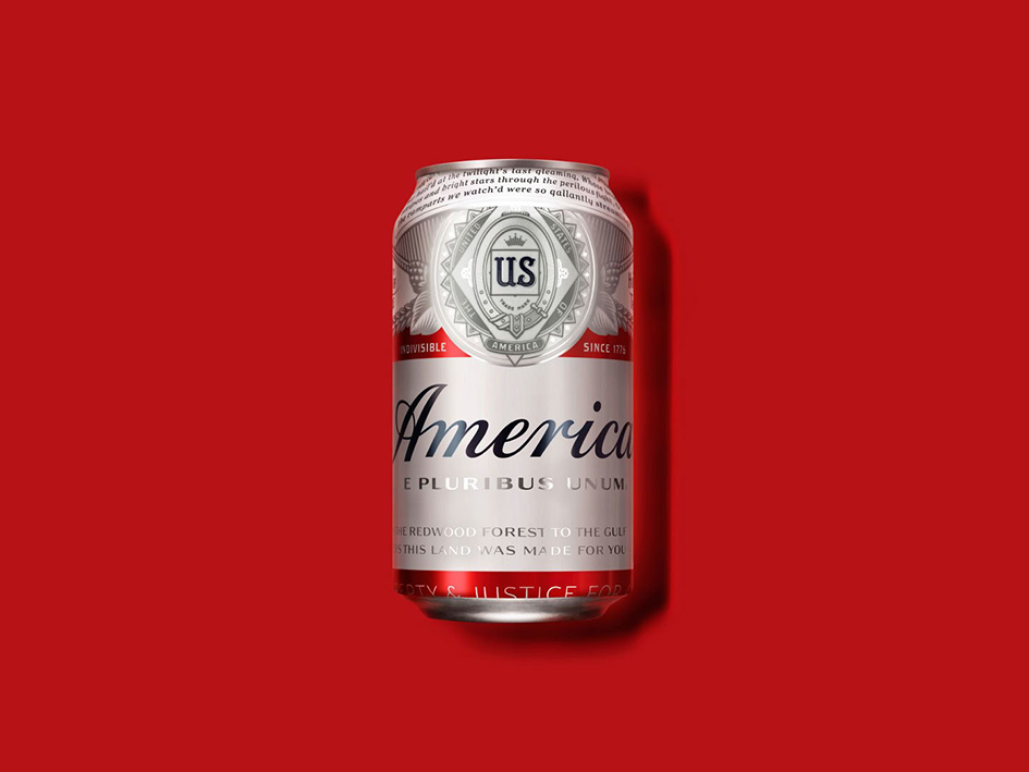
Exploiting patriotism or not, this was a bold move on behalf of America’s No.1 full-flavored lager. Budweiser this summer took its longstanding tradition of patriotic packaging even further by replacing “Budweiser” with “America” on the front of its 12-oz. cans and bottles. The brand even modified Budweiser’s iconic label to add copy that is central to American history, including phrases from the Pledge of Allegiance and lyrics from “The Star Spangled Banner” and “America the Beautiful.”
Designed in partnership with Jones Knowles Ritchie New York, Budweiser’s bold new look serves as the focal point for its summer- long campaign “America is in Your Hands”. The tagline “reminds people from sea to shining sea, to embrace the optimism upon which the country was first built” the company said.
“We are embarking on what should be the most patriotic summer that this generation has ever seen, with Copa America Centenario being held on U.S. soil for the first time,Team USA competing at the Rio 2016 Olympic and Paralympic Games,” said Ricardo Marques Budweiser’s vice president. “Budweiser has always strived to embody America in a bottle, and we’re honored to salute this great nation where our beer has been passionately brewed for the past 140 years.”
Kodak
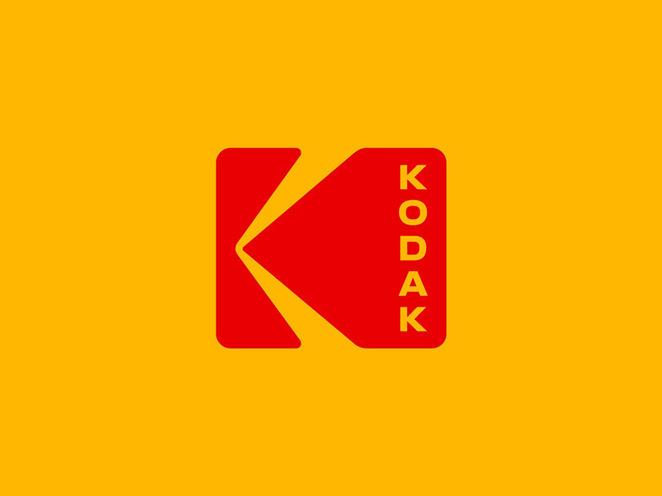
“A reset for a global brand on the mend”. This is how New York-based studio Work-Order described the wide identity reset for Kodak’s precious heritage. “I don’t think of what we’re doing as ‘bringing back’ the iconic identity of Kodak, because in people’s hearts and minds, I don’t think it really went away. It’s simply logical to keep one of the world’s most famous brand marks at the forefront of the company’s image and identity” commented Steven Overman, Kodak’s Chief Marketing Officer.
“Since the early 20th Century, Kodak’s packaging and marketing materials have been blanketed in a warm yellow with red and black features. Our aim was to re-establish this strength and to never abandon the use of yellow on anything” Work-Order say.
Along with the trademarked colors, Kodak’s first official “symbol”, designed by Peter J.Oestreich in 1971, is their most recognized piece of branding. It was used in various forms for over 35 years and had a lifespan well past that in the form of shop signage around the world. This all capital solution honors George Eastman’s invention and his visual appreciation of the letterforms. It brings out the geometry and symmetry and is a clear departure from the past.
Although similar to the the K symbol first introduced in 1971, the new logo displays the word ‘Kodak’ positioned vertically instead of horizontally and it continues a tradition of the past. This new logo features Kodak’s trademarked Dress Red and Dress Yellow colours. The symmetry of the capitol letterforms creates a molecular flexibility that allows the word mark to be be stacked. It is reminiscent of film perforations and street signage. It acts as a manufacturer’s stamp: the logo is the first read and the name is the supporting mark. When small, the name is removed leaving just the icon.
“We wanted to let the logo be new again,” said Work-Order co-founder Keira Alexandra. “We were extremely careful to be respectful to the legacy of the brand, honoring the science and creative vision of Kodak.”
“Both visually and emotionally” Kodak “is a system of scientifically organized resources for creativity. It communicates professional expertise, an expansive sense of shared vision and stands for a company that works seamlessly and efficiently. A unified graphic identity brings cohesion back into the brand” adds the team behind one of 2016 most iconic rebranding.
Mastercard
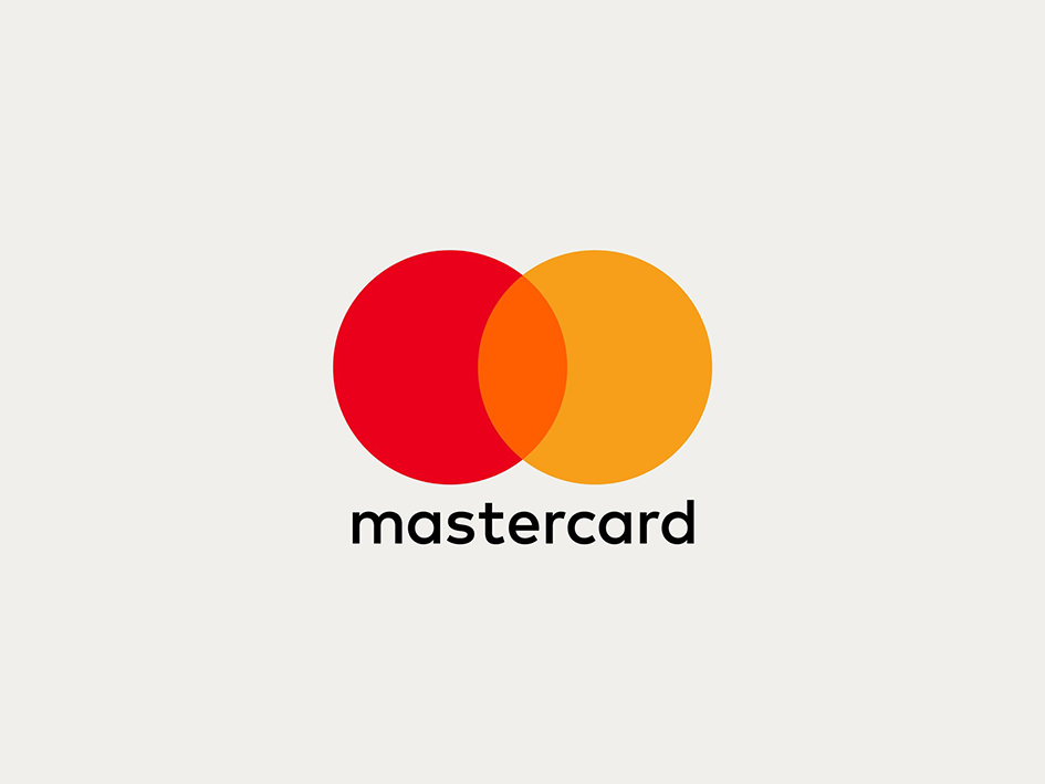
Leading up the trend of minimalistic branding, design agency Pentagram has created a new logo and visual identity for Mastercard. This is the first branding redesign in 20 years for the credit card company.
“The new design retains the two overlapping red and yellow circles, but swaps the stripes in the central portion for a block orange colour. The bold white text that spelled the US company’s name has been replaced with the FF Mark typeface – all lower case – and positioned outside the symbol” reports Dezeen. Along with the logo Pentgram updated Mastercard’s website graphics, information pamphlets, billboards and other marketing materials with the typeface used in a variety of weights across the applications, while circles in different sizes and opacities.
“Everything has changed in the past 20 years,” Pentagram partner Michael Bierut told FastCoDesign. “There was a lot of screw tightening and design tinkering happening [with the logo] in the first 30 years of the company. Then they almost got frozen in 1996. We took their DNA and went through this process of distillation. With each wave of simplification it felt sharper cleaner and more flexible” he adds of the logo which continues the trend for flat design.
Netflix
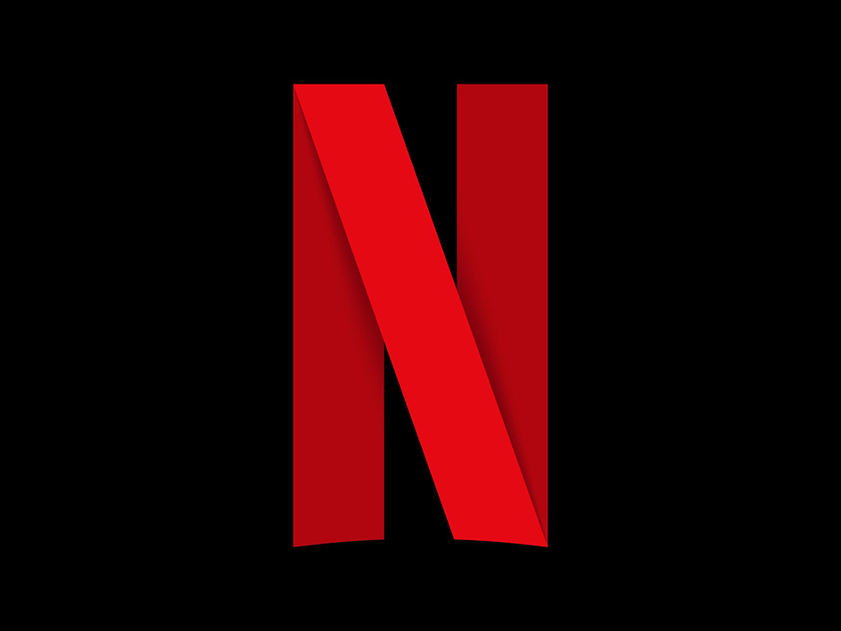
Just like Pandora, Instagram and Uber, Netflix joined the trending wave of companies changing their logos for a more digital friendly use. “The streaming service’s new insignia was revealed on its Instagram, Facebook and Twitter profiles, dropping the -etflix part of its name and going for a more conservative ‘N’ icon” reports Hypebeast.
“Before this update, Netflix had been forced to cram all seven letters of its name onto social networks and the tiny icon of its iOS app” write Co.Design’s Mark Wilson. “Replacing the word with one giant letter allows Netflix to compete better with everything else on your mobile screen. The first thing you notice about that letter is that it isn’t the same “N” you’ll find in “Netflix” itself. It features a rounded bottom that gives a nod to the main logo, but the letter itself pops from the page in 3-D. The letter is built from a single red ribbon, folded over itself with drop shadow”.
“What really strikes me is the logo’s core visual metaphor. What is that ribbon? Is it a red carpet? Is it a celluloid film print? Is it the visualization of Netflix’s own stream, bouncing from them to servers to your own home? It could be all these things at once—not a bad metaphor for a company with astronomical ambition” he adds.
Tokyo 2020 Olympics
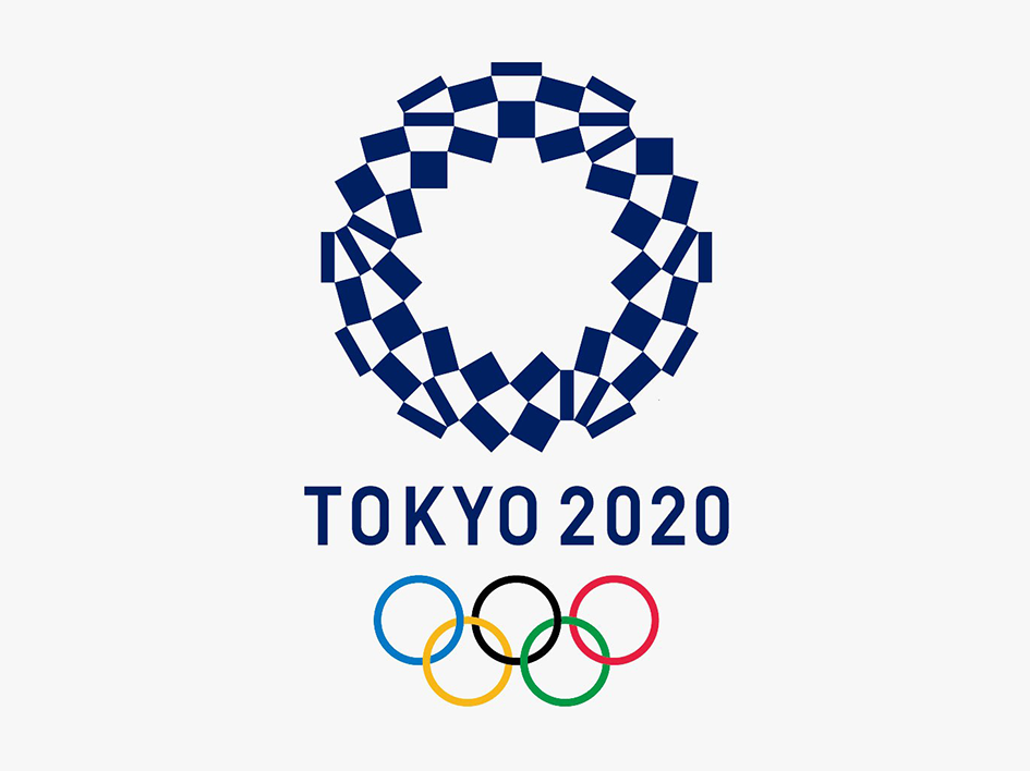
After the plagiarism drama Tokyo 2020 unveiled it’s new Olympic blue and white logo with corresponding design for the Paralympics.
Selecting an emblem they hope will be simple, effective and most of all original, this simple circular logo made up of three shapes of rectangles in indigo blue is entitled Harmonized Checkered Emblem and intends to represent different countries, cultures and ways of thinking, according to its Japanese designer, Asao Tokolo.
Checkered patterns have been popular in many countries around the world throughout history. In Japan, the checkered pattern became formally known as “ichimatsu moyo” in the Edo period, (1603-1867), and this checkered design in the traditional Japanese colour of indigo blue expresses a refined elegance and sophistication that exemplifies Japan.
Composed of three varieties of rectangular shapes, the design represents different countries, cultures and ways of thinking. It incorporates the message of “unity in diversity”. It also expresses that the Olympic and Paralympic Games seek to promote diversity as a platform to connect the world.
Tags/ inspiration, graphic design, logo, work-order, pentagram, museum, michael bierut, vanity fair, the met, wolff olins, mark wilson, netflix, rebranding projects, 2016, paul goldberger, jennifer bostic, paula scher, budweiser, american, jones knowles ritchie, ricardo marques, kodak, steven overman, peter j.oestreich, george eastman, keira alexandra, mastercard, tokyo 2020 olympics, asao tokolo


