Nikelab x Roundel honor Johnston typeface with a cult classic
In 1916, Edward Johnston’s font was introduced by London Transport to bring uniformity across the London city network. The clean simplicity of the lettering stood the test of time and its popularity continued throughout the last century. In 2016, its centenary year, the Johnston font was subtly updated to create Johnston100 for the digital age and this typeface takes center stage in the latest NikeLab x Roundel footwear collection. This collaboration sees the cult classic Nike Air Zoom Spiridon revived with London’s typeface and the launch pays homage to the heritage of both,the model of the shoe and the font, by uniting them in one, unique modern design.
Launched in 1997, the Air Zoom Spiridon was ahead of its time. As one of the first models to incorporate the Air Zoom system, it was lightweight, fast and propelled Nike running technology to prominence.
“The typeface was commissioned in 1913 by Frank Pick, Commercial Manager of the Underground Electric Railways Company of London — also known as ‘The Underground Group’ — introduced in 1916, making its use one of the world’s longest-lasting examples of corporate branding,” explains Jon Hunter, Head of Design, Transport for London.
Edward Johnston, best known at the time as a calligrapher, designed the eponymous font. He’d recently become interested in sans-serif letters and believed that printed material should “bear some living mark of the time in which we live,” making his selection spot-on for the Underground Group’s needs.
“Pick specified to Johnston that he wanted a typeface that would ensure the Underground Group’s posters not be mistaken for advertisements,” says Hunter. “It should have ‘the bold simplicity of the authentic lettering of the finest periods’ and belong ‘unmistakably to the twentieth century’.”
The project succeeded, and for 100 years, the Johnston font has defined London’s Underground — on signage, in pamphlets and more — as well as the city itself. The diamond “tittles,” dotting the lowercase “i” and “j,” and the base of the exclamation point and question mark, are among the font’s most recognizable features. In application, the typeface is most familiar when locked up with the Underground’s famous roundels.
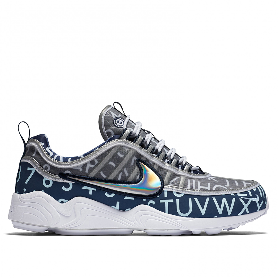
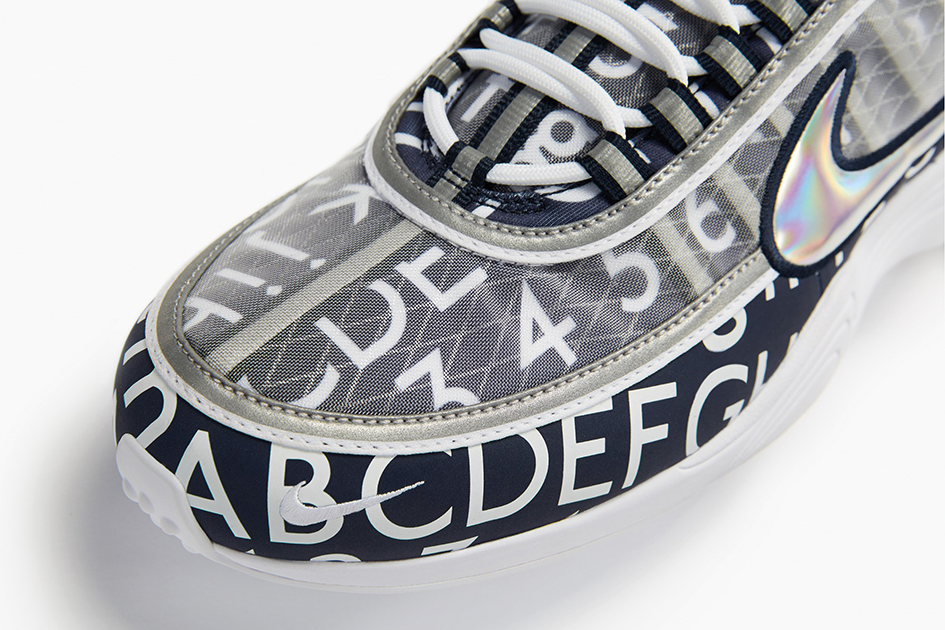
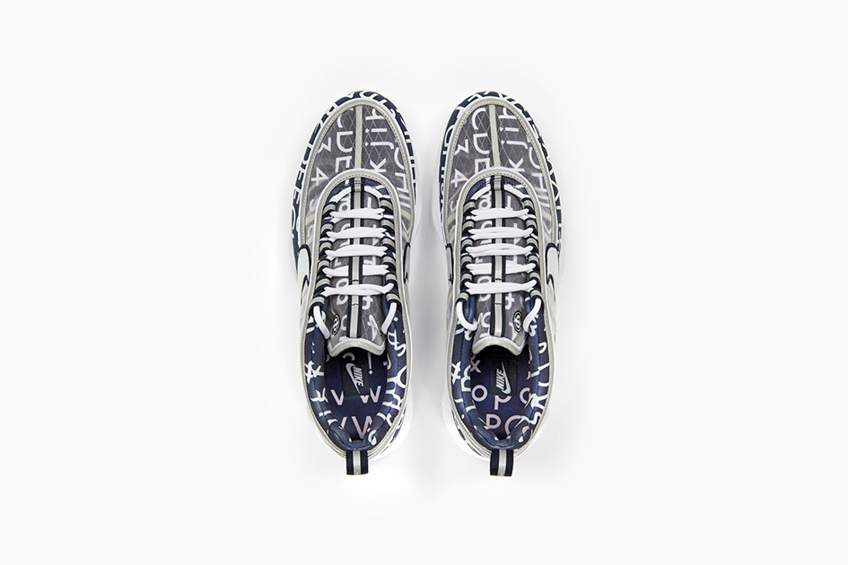
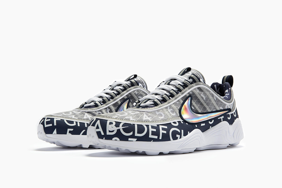
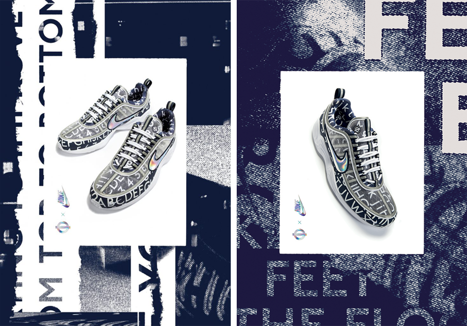
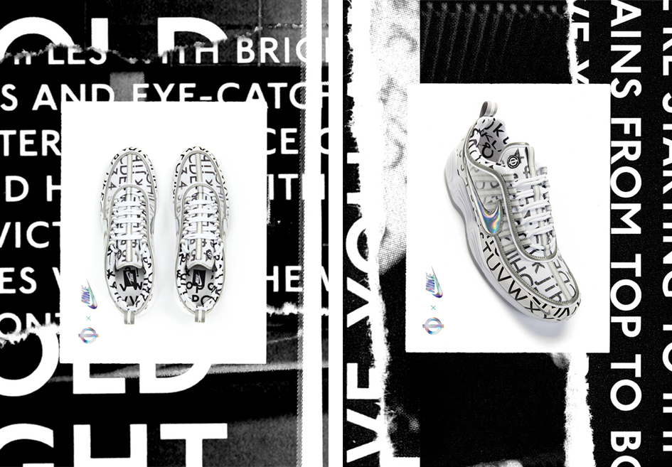
On the NikeLab x Roundel Zoom Spiridon, a sample of the Johnston font is sublimated and printed in a repeat pattern and engineered to cover each shoe equally. A transparent monofilament mesh covers the print on the shoe’s vamp. Further embellishments include an iridescent synthetic leather Swoosh and a fully reflective mudguard, which serve to extend the silhouette’s signature 3M taping and further amplify its reflectivity.
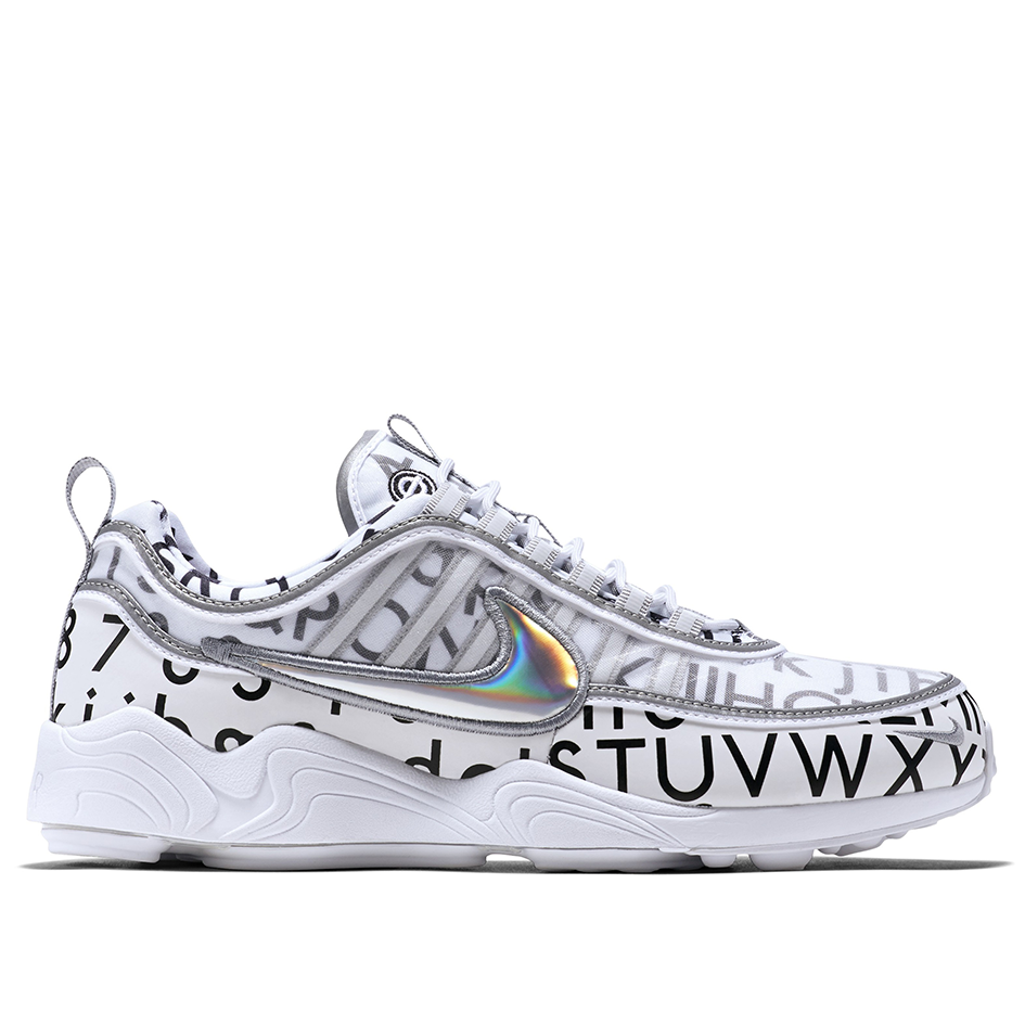
The collaboration includes two contemporary colourways - white and navy, with the upper featuring the Johnston typeface - letters and numbers. The all-over print is a nod to the head-to-toe logo looks which were prevalent in 1990s London, the decade in which the style found its fame.
The final stamp of approval comes from TFL’s celebrated London logo, the Roundel, which is embroidered on the tongue of each limited edition pair. This is the second iteration of the collaboration between NikeLab and Roundel. The NikeLab x Roundel Zoom Spiridon is available in select retailers, globally, later this year.
Tags/ inspiration, typeface, font, london, lettering, nike, edward johnston, frank pick, johnston100, modern, unique, london transport, nikelab, roundel, nikelab x roundel, nike air zoom spiridon, jon hunter, eponymous


